Best Selling Products
Innovative UX Design: Learning from the World's Best Products
Nội dung
- 1. Elements that make a UX design worth learning
- 1.1. User-centric
- 1.2. Clear, intuitive navigation
- 1.3. High consistency
- 1.4. Timely response
- 2. Apple's UX: Minimalist yet powerful
- 2.1. Experience without instructions
- 2.2. High emotional engagement
- 2.3. Comprehensive Accessibility
- 3. Airbnb: The perfect combination of UX and user experience
- 3.1. Smooth booking process
- 3.2. Human interaction
- 3.3. Integrating smart support technology
- 4. Spotify: UX for seamless music experiences
- 4.1. Minimalist but not monotonous design
- 4.2. Strong personalization capabilities
- 4.3. Fast and logical navigation
- 5. Duolingo: Turn UX into a game to keep learners engaged
- 5.1. Fun and entertaining interactions
- 5.2. Flexible UX by level
- 5.3. Instant and clear feedback
- 6.Google Maps: Superior UX in navigation and directions
- 6.1. Simple interface, clear information
- 6.2. Real-time updates
- 6.3. Cross-platform support
- 7. Google Maps UX Design – Data Visualization Optimized for User Behavior
- 7.1 Optimizing the user journey according to context
- 7.2 Real-time feedback and interactive adjustments
- 7.3 Headspace – UX that shapes emotions and tranquility
- 7.4 Emotional design guides the experience
- 7.5 Personalize and simplify to retain users
- 8. Uber – Minimalist but full of necessary information
- 8.1 Simplify the booking process
- 8.2 Clear and updated information
- 9.Medium – Content-centric UX
- 9.1 Minimalist interface, prioritizing reading experience
- 9.2 Flexible but hidden navigation
- 10. UX principles from design worth learning
- 10.1. Design around real user needs
- 10.2. Optimizing the experience according to the usage context
- 10.3. Prioritize simplicity but completeness
- 10.4. Ensure continuous and clear feedback
- 10.5. Personalize the experience
- 11. Lessons from UX Designs Worth Learning
- 11.1 Prioritize users over features
- 11.2 Design should be flexible
- 11.3 Minimalism does not mean sloppy
- 11.4 Feedback and user engagement
- 11.5 Creating emotions from experiences
- 12. Conclusion
Discover the best UX designs to learn from today: From Apple to Airbnb, each product offers a profound design lesson. Learn the details of how they create great user experiences.
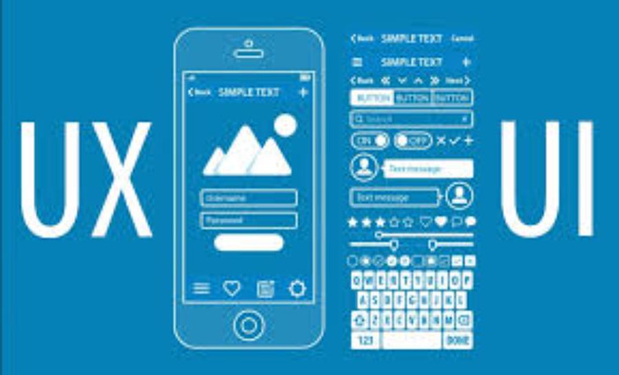
UX design is not just about theoretical concepts or general principles, but about how people experience technology in an easy, intuitive, and emotional way. Successful products all have excellent UX design. In this article, sadesign will take you through typical examples in the industry — UX designs worth learning, with specific analysis and valuable lessons for designers at all levels.
1. Elements that make a UX design worth learning
UX (User Experience Design) is not just about the beauty of the interface but also the combination of convenience, accessibility, usability, and the user's emotions when interacting with the product. A UX design is considered worth learning when it achieves the following factors:

1.1. User-centric
In every design process, the user always plays a central role. From surveying needs, behaviors to testing products, everything revolves around the real experience. Big brands often invest heavily in UX research to ensure that the design is consistent with customer behavior and usage habits.
1.2. Clear, intuitive navigation
A good UX design helps users “read” the product without explanation. Clear navigation, easy-to-understand icons, and logical placement of function buttons help shorten operation time, minimize confusion, and increase user satisfaction.
1.3. High consistency
Consistency in design helps users quickly remember how the product works. From colors, fonts, to transition styles, every element needs to follow the overall design style, helping to create a seamless and professional experience.
1.4. Timely response
Feedback is important to let users know that their actions have been recorded. A notification, a small animation, or a change in color is enough to keep users engaged and make them feel in control of their experience.
2. Apple's UX: Minimalist yet powerful
Apple is an icon of successful UX design, as all of its products follow the philosophy of “Less is more”. The ecosystem from iPhone, iPad to macOS all show consistency and sophistication.
2.1. Experience without instructions
From the original iPod to today's iPhone, users can use it almost immediately thanks to simple, easy-to-understand designs. Apple has streamlined all unnecessary elements so that users are not overwhelmed when approaching the device for the first time.
2.2. High emotional engagement
Animations such as opening applications, transitions, or even slight vibration feedback when touching the keyboard are all carefully invested by Apple. Small details create positive emotions, making users feel happy when using the device every day.
2.3. Comprehensive Accessibility
Apple has always been a leader in integrating accessibility features like VoiceOver, Zoom, and Magnifier. This mindset shows that they truly care about the entire spectrum of users, not excluding anyone.
3. Airbnb: The perfect combination of UX and user experience
Airbnb is more than just a booking platform, it’s a place to evoke the emotions of travel. Their UX design focuses not only on functionality, but also on connecting to a personal experience.

3.1. Smooth booking process
Airbnb does a great job of breaking down the steps in the booking process, avoiding overwhelming users with too much information. From searching, to selecting, to paying, everything is clear and intuitive.
3.2. Human interaction
Emphasizing the host's image, genuine introductions, or reviews from previous guests creates a sense of friendliness and closeness. This not only creates trust but also promotes positive emotions during the service usage process.
3.3. Integrating smart support technology
Airbnb integrates AI and Machine Learning to suggest places based on search history, contributing to a more personalized experience. The interface adapts to each behavior, helping users feel like the platform “understands” their needs.
4. Spotify: UX for seamless music experiences
Spotify offers UX design lessons from understanding music listener behavior and preferences, thereby creating a streamlined recommendation system and interface for millions of global users.
4.1. Minimalist but not monotonous design
Spotify doesn’t cram too many details into its interface, instead opting for a clean, dark theme that helps to highlight the content and album art. This is a strategic choice that helps users avoid eye strain when using it for long periods of time.
4.2. Strong personalization capabilities
Features like “Discover Weekly”, “Release Radar” or “Your Daily Mix” help personalize the experience based on user behavior. Spotify uses machine learning algorithms to predict music tastes, thereby providing suitable playlists, effectively retaining users.
4.3. Fast and logical navigation
Spotify’s navigation menu is neatly organized, and users can get to where they need to be with just a few taps. From searching for songs, creating playlists to listening to podcasts, everything is done quickly without much thought.
5. Duolingo: Turn UX into a game to keep learners engaged
Duolingo is a great example of using UX to change user behavior, specifically when it comes to language learning. With a clear gamification style, the app attracts millions of learners every day.
5.1. Fun and entertaining interactions
Animated characters, motivating sounds, and rewards for completing lessons make users feel like they are playing a game rather than boring learning.
5.2. Flexible UX by level
Beginners will have their own path, different from those who are proficient. This adaptive design ensures that users do not get “exhausted” or bored throughout the learning journey.
5.3. Instant and clear feedback
When an answer is incorrect, Duolingo provides immediate feedback with audio, icons, and explanations. This rapid feedback helps users learn from their mistakes without interrupting the experience.
6.Google Maps: Superior UX in navigation and directions
Google Maps is more than just a navigation tool, it is a prime example of UX in a dynamic environment.
6.1. Simple interface, clear information
Google Maps always prioritizes displaying the necessary information first: routes, arrival times, and transportation options. The rest is hidden so as not to confuse the user.
6.2. Real-time updates
From traffic jams, route changes to weather — everything is constantly updated to ensure reliability. Users feel like they have timely support in unexpected situations.

6.3. Cross-platform support
Whether on desktop, phone, or wearable, the Google Maps experience is seamless. Users can start a search on their computer and continue navigating on their phone without interruption.
7. Google Maps UX Design – Data Visualization Optimized for User Behavior
Google Maps is a great example of UX built on real user behavior and interaction research. It is not just a regular mapping application, but a global travel guide thanks to its top-notch UX.
7.1 Optimizing the user journey according to context
Google Maps provides suggestions based on the time of day, current location, and user search history. The app understands that morning users are often looking for a coffee shop or directions to work, while in the evening they might need a restaurant or gas station. The UX reflects this not only through icons and suggestion lists, but also by minimizing the user's actions.
7.2 Real-time feedback and interactive adjustments
One thing to learn is the ability to provide real-time feedback. Google Maps shows traffic conditions, accidents, or road congestion by changing the color of the route. Users can easily choose an alternative route with just one tap – this experience shows careful investment in dynamic UX.
7.3 Headspace – UX that shapes emotions and tranquility
Headspace is a meditation and mental health app that has set a new standard for UX in the emotional wellness space. More than just a place to listen to guided meditations, Headspace is a poetic UX ecosystem that helps users relax from the moment they open the app.
7.4 Emotional design guides the experience
Using warm tones, minimal illustrations, and soft motion, Headspace conveys a sense of lightness right from the first look. The app’s UX aims to help users feel relaxed and not overwhelmed by information. This is achieved by organizing content in a clear, step-by-step manner, without overwhelming them with choices.
7.5 Personalize and simplify to retain users
Headspace uses open-ended questions and meditation prompts based on your mood or personal goals. Each meditation session is designed as a complete UX journey: introduction, guidance, and ending with a sense of ease. Each step is calculated to maintain positive emotions – a form of therapeutic UX.
8. Uber – Minimalist but full of necessary information
The Uber ride-hailing app is a great example of stripping away the clutter to make way for a smooth, direct, and easy-to-understand experience. In an app where users are only interested in pick-up, drop-off, and cost, the UX needs to serve that need, no more, no less.
8.1 Simplify the booking process
Uber’s UX is built around the “one screen, one action” principle. Each step in the booking process requires only one action from the user, from entering a destination, to selecting a car, to confirming payment. The interface focuses on the essential elements, without being distracted by unnecessary information.
8.2 Clear and updated information
Users can track the driver’s arrival time, vehicle type, license plate number, and route in real time. Providing information at the right time and place makes the experience seamless, reducing the anxiety of waiting for a car – a big plus in the user’s psychology.
9.Medium – Content-centric UX
Medium is a prominent blogging and article reading platform, with a UX philosophy that is extremely instructive: respecting the reader and putting content first. Free from ads or annoying pop-ups, Medium's UX is considered a model for content platforms.
9.1 Minimalist interface, prioritizing reading experience
Medium uses good white space, clean fonts, and a modern layout. The reading experience feels more like reading a digital book than a website. The design is geared toward keeping the user focused.
9.2 Flexible but hidden navigation
Unlike websites that are stuffed with menus and social media icons, Medium keeps things simple. Secondary navigation is hidden away, appearing only when needed, making for a seamless reading experience. The UX here teaches us how to keep it simple while still being effective.
10. UX principles from design worth learning
From the real-life examples above, we can draw out core principles of successful UX design, which are especially useful for designers, developers, and product managers.
10.1. Design around real user needs
Understand what users want – not what they say – but how they act in real-world environments. User behavior research helps build features that are needed, not redundant.
10.2. Optimizing the experience according to the usage context
There is no one right UX for every situation. Design must be flexible to the situation, device, time, and user emotion.
10.3. Prioritize simplicity but completeness
Eliminate distractions, keeping only core functionality – but presenting it clearly and without confusion.
10.4. Ensure continuous and clear feedback
Users need to know where they are in their interaction journey. Visual feedback and clear transition states reduce anxiety and increase trust.
10.5. Personalize the experience
Successful UX systems often allow for personalization of the experience. This could be a time-sensitive interface, custom content suggestions, or a custom welcome message.
11. Lessons from UX Designs Worth Learning
Here are five core lessons that any UX designer should master.
11.1 Prioritize users over features
One of the common mistakes many digital products make is trying to cram in too many features in the hope of “meeting every need.” However, truly effective UX starts with the user at the center: What do they need? Will they actually use this feature? Adding features that users don’t interact with will only create more noise.
11.2 Design should be flexible
The world is no longer limited to the desktop. Users interact with products across multiple devices – from phones, tablets, smartwatches to TVs. This requires a flexible UX that can adapt to different formats, display spaces, and usage scenarios.
11.3 Minimalism does not mean sloppy
The concept of minimalism is often misunderstood as “less is more,” resulting in a bare, unfocused interface. However, successful UX products show that minimalism is about cutting out the unnecessary, not eliminating everything completely.
11.4 Feedback and user engagement
Users need to feel like the product is “listening” to them. A button, a drag-and-drop, or a line of text – all should have clear and timely feedback. Seemingly small details like tap effects, loading states, or confirmation messages are key to maintaining user trust.
11.5 Creating emotions from experiences
UX is more than just functionality – it’s also how it feels. A good experience is one where the user not only navigates smoothly but also feels included and understood. Positive emotions like comfort, trust, excitement, or relaxation are what keep users coming back and engaging with the product.
12. Conclusion
UX design is not only a tool to solve usability problems but also a means to convey brand messages, emotions and values to users. UX designs worth learning from big products such as Apple, Spotify, Duolingo or Google Maps show that investing in user experience is a sustainable development strategy. With specific lessons from leading names, designers can enrich their design thinking and get closer to creating truly excellent products.

