Best Selling Products
Learn How to Mix Colors Effectively in Digital Painting
Nội dung
- 1. Learn color matching techniques through basic principles
- 2. Summary of color mixing techniques in Digital Painting
- 2.1. Similar color scheme
- 2.2. Complementary color matching techniques
- 2.3 Contrast color matching technique
- 2.4. Triangle color scheme
- 2.5. Quadrilateral color scheme technique
- 3. Some notes related to Digital Painting color scheme
- 3.1 The context of the work is aimed at
- 3.2 New topic: Pay attention to learn carefully
- 4. Good with basic color combinations
How to use colors effectively in Digital Painting with diverse similar color mixing techniques. Sadesign provides detailed instructions to help make the work attractive.
Digital Painting is not only the art of drawing with digital tools but also a way to express ideas through colors. An attractive work comes not only from the strokes but also from the harmonious combination of colors. Understanding the principles of color coordination will help you create more vivid, emotional and professional paintings.
1. Learn color matching techniques through basic principles
Color in Digital Painting is not only a decorative tool but also plays a role in conveying messages and emotions. To combine colors effectively, you need to master the basic principles. Color mixing technique is an important element in design and art. It requires a deep understanding of the basic principles to create aesthetic and harmonious products.
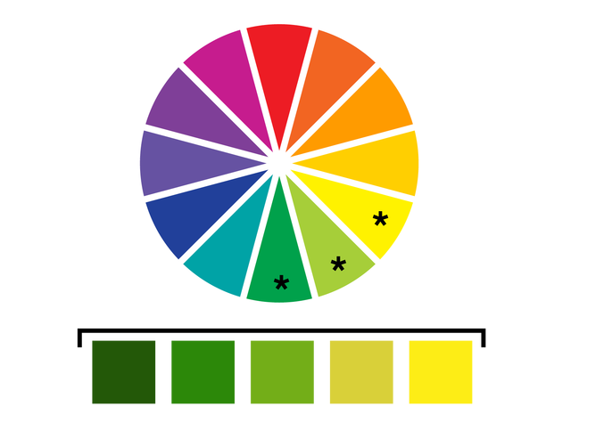
First, you need to master the colors (color wheel) to understand the relationship between colors such as complementary colors, contrasting colors and analogous colors. In addition, applying color matching rules such as monochromatic color matching, contrasting color matching or triadic color matching helps create balance and appeal in the design.
In particular, it is necessary to pay attention to the emotional factors that each color brings to choose the right one for the intended use. The harmonious combination of theory and practice will help you develop the ability to combine colors professionally and creatively.
2. Summary of color mixing techniques in Digital Painting
Color matching is one of the most important elements in Digital Painting, it not only creates aesthetic beauty but also conveys the artist's emotions and ideas. Below is a summary of basic and advanced color matching techniques that you can refer to:
2.1. Similar color scheme
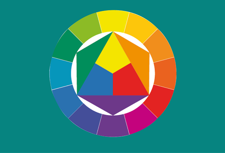
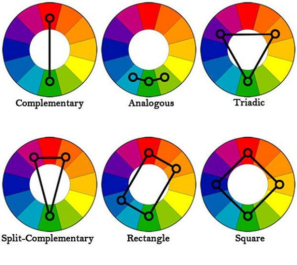
Analogous color schemes combine colors that are next to each other on the color wheel. This creates a harmonious and natural feel, making it suitable for light, relaxing works. For example, combining blue, green, and yellow will create a cool, peaceful feeling.
Analogous color scheme is one of the basic principles in design and art, which helps to create harmony and visual comfort. This method uses colors that are similar in color temperature or brightness.
When applying this color scheme, it is important to choose a main color as the focal point. Then combine it with secondary colors to create balance and emphasis. This not only helps create an overall aesthetic but also ensures professionalism and consistency in the design.
2.2. Complementary color matching techniques
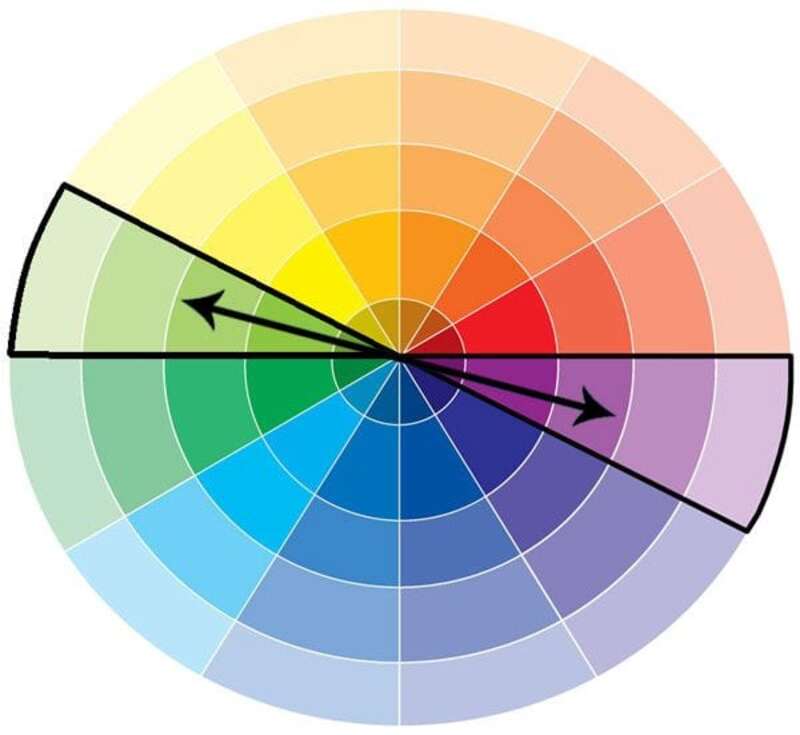
Complementary color scheme is one of the basic principles in design and art, helping to create balance and harmony in color composition. Complementary color scheme is based on using pairs of colors that are opposite on the color wheel. Such as red and green, blue and orange, or yellow and purple.
When combined, these colors not only highlight each other but also create a strong contrast, attracting the attention of the viewer. To apply effectively, it is necessary to pay attention to the ratio of color use and how to distribute them in the design to avoid creating a feeling of being too bright or unbalanced. Understanding this principle will help you improve your creativity and optimize the visual effect in design projects.
Complementary color schemes involve choosing two colors that are opposite each other on the color wheel, such as red and green. This creates emphasis, allowing the main elements in the painting to draw the eye. To reduce the clash, you can add neutral colors like white or gray.
2.3 Contrast color matching technique
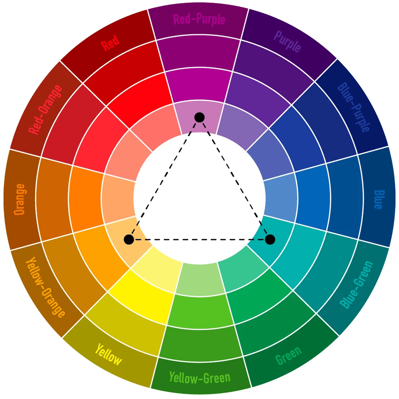
The technique of contrasting colors is one of the basic principles in design and art. This method is based on the use of colors that are opposite on the color circle. For example: Red and green, yellow and purple, blue and orange.
When used correctly, this technique not only highlights key elements but also creates depth and balance in the composition. However, for optimal effect, attention must be paid to the proportions of the colors used. At the same time, ensure that the contrast does not create a feeling of glare or imbalance.
Mastering the principles of contrasting color schemes will help you enhance your creativity and create highly aesthetic products.
2.4. Triangle color scheme
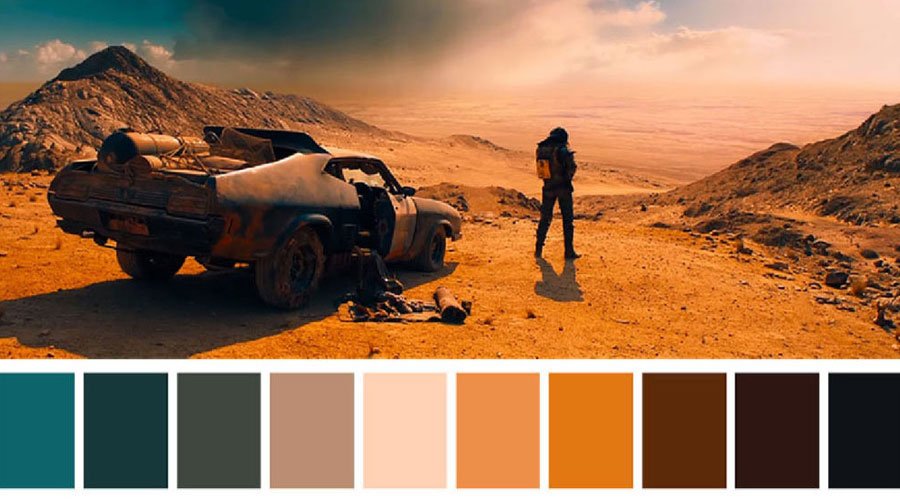
The triadic color scheme is one of the basic principles for creating harmonious and attractive color palettes. This method is based on choosing three colors that are evenly spaced on the color wheel, forming an equilateral triangle. This balance brings variety and balance.
It is suitable for many applications such as: Graphic design, interior design, and fashion. When applying this technique, attention should be paid to brightness, saturation, and the proportion of colors used to ensure optimal aesthetic effect. The triadic color scheme not only helps create contrast but also brings professionalism to creative projects.
Triadic color scheme is a technique of choosing three colors that are evenly spaced on the color wheel, such as red, blue, and yellow. This method helps create balance and richness in a painting. It is often used in works with complex compositions.
2.5. Quadrilateral color scheme technique
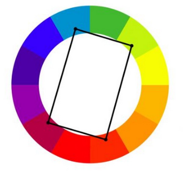
The tetradic color scheme helps create balance and harmony in the use of color. This method uses 4 colors located at the four corners of a rectangle or square on the color wheel. It creates a diverse color palette while still ensuring unity!
When applying, the designer needs to pay attention to choosing a main color. The remaining colors will play a supporting role and create highlights. Understanding the relationship between colors and how they interact will help you create impressive and professional visual products. This method brings diversity and creativity. However, it requires sophistication to avoid making the work messy.
3. Some notes related to Digital Painting color scheme
Here are some notes that users need to pay attention to in order to effectively combine colors in Digital Painting:
3.1 The context of the work is aimed at
When working with color in Digital Painting, it is important to consider the context in which the work is intended. Each context will require a suitable color palette to create the emotion and message the artist wants to convey.
For example, with a nature setting, green, blue and brown tones are often preferred to create a sense of harmony and intimacy. Conversely, if the setting is science fiction, cool tones such as blue, silver grey or neon lights can be used to create a modern and mysterious feel.
Users need to carefully consider the saturation, brightness and contrast between colors. This is to ensure balance and visual appeal for viewers.
3.2 New topic: Pay attention to learn carefully
When working with color in Digital Painting, it is important to do thorough research, especially when dealing with unfamiliar subjects. For these subjects, research before starting is essential. Look for reference images, analyze how other designers use color in the same subject to learn and apply to your work.
Understanding the principles of color coordination, lighting, and color psychology will help you create harmonious and impressive works. At the same time, referring to in-depth documents and analyzing sample works is also an effective way to improve skills and expand creative thinking. Always pay attention to the balance between personal creativity and basic rules to achieve optimal efficiency in each work.
4. Good with basic color combinations
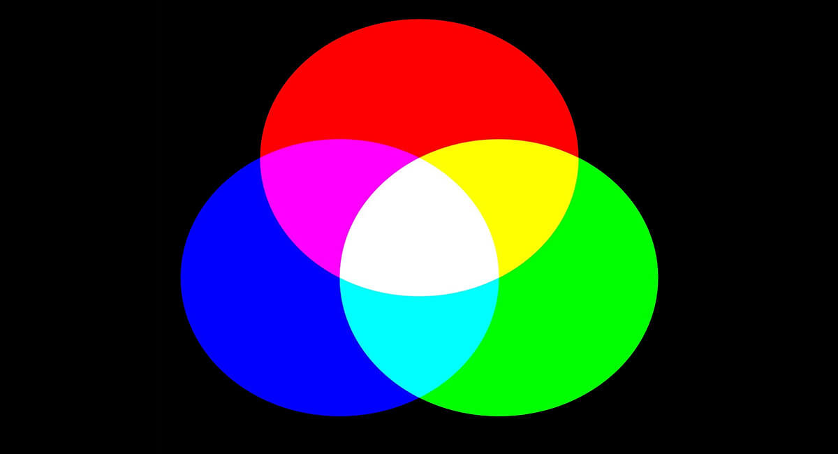
The three primary colors (red, blue, yellow) are the foundation for mixing and creating other colors. Understanding how to mix colors will help you control the color palette in your work and avoid unnecessary clutter.
In the field of Digital Painting, color matching plays an important role in creating harmony and attraction for the work. To achieve good results, you need to master the basic color combination processing. This includes understanding the color wheel, color matching principles such as contrast, complementarity, or uniformity, as well as how to apply them to each specific context. In addition, considering the light, saturation and color tone are also indispensable factors to ensure the work has depth and vibrancy. The subtle combination of these factors will help you create impressive and professional paintings.
5. Artwork needs contrast to be attractive.
Contrast adds depth and interest to your work. You can create contrast with color, brightness, or detailed elements in your work. This technique is useful for drawing the viewer's eye to important areas.
Conclude
Above, Sadesign has shared complete information about color matching techniques. This is the decisive factor for the success of a Digital Painting. When applying color matching principles such as similarity, complementarity, contrast, triangle, or quadrilateral, you will easily create beautiful and professional works. Don't forget to consider the context and research carefully before drawing to convey the right message you want.


