Best Selling Products

Genuine Cheap Canva Pro
39 USD

Genuine Adobe Illustrator account
99 USD

Autodesk All App Account Copyright
120 USD

Freepik Premium Account
59 USD

ChatGPT Plus Account (GPT-4)
16 USD

Windows 10 & 11 Pro Key
36 USD

MidJourney Account
29 USD

Plugin Retouch4me
69 USD

Copyright Adobe Lightroom Account
59 USD

Adobe Premiere Pro Account
99 USD

Upgrade genuine Capture One account
120 USD

Upgrade Genuine Office 365
49 USD

Capcut Pro 1 Year
39 USD

Adobe Photoshop Copyright - Full App
120 USD

Upgrade Duolingo Super
29 USD
Lifetime Secrets Every UI/UX Designer Should Know
Nội dung
- 1. Put important information in the Header
- 2. Brand experience must be memorable
- 3. The numbers speak
- 4. What position for the CTA (call-to-action) button?
- 5. Save time reading and understanding information
- 6. Design Icons that are truly intuitive
- 7. Emphasize your message with eye-catching images and banners
- 8. Speak with your readers
- 9. Applying the Gestalt principles
- 10. Conclusion
User interface (UI) and user experience (UX) design play a vital role in creating engaging and easy-to-use digital products. However, to become an excellent UI/UX designer, you not only need professional skills but also the right tips and habits. In this article, Sadesign will provide lifelong tips that every designer needs to master in order to continuously develop and create the best products for users.
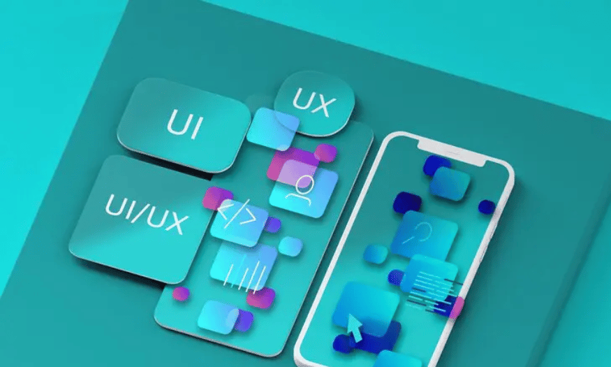
User interface (UI) and user experience (UX) design play a vital role in creating engaging and easy-to-use digital products. However, to become an excellent UI/UX designer, you need not only professional skills but also the right tips and habits. In this article, Sadesign will provide lifelong tips that every designer needs to master to continuously develop and create the best products for users. From understanding users deeply, taking care of every little detail, to constantly learning and updating new trends, you will find useful methods to improve your design skills and thinking.
1. Put important information in the Header
When designing a website, placing the main content in the header not only helps users grasp information quickly but also creates a strong first impression. The header is like an invitation, where the main messages are conveyed in a few short seconds. Especially for websites with a large amount of information such as e-commerce or news, the header needs to be optimized to direct users to the most attractive content.
Designers and marketers work closely together to determine what information should be included in the header. Elements such as phone numbers, social media links, and promotions should be prioritized. An effective header should not only provide information but also attract attention, helping users quickly decide whether to continue reading or not. This is especially important in contexts where users have very little time to scan information.
However, don’t cram too much content into your header. Information overload will confuse users and leave them wondering what’s important. Research shows that the human eye moves from top to bottom, so placing important information at the top of the page will help convey your message more effectively. A well-designed header will not only make it easy for users to find information, but it will also leave a lasting impression of your brand in their minds.
.png)
2. Brand experience must be memorable
A brand identity is more than just a collection of graphic elements; it is how customers perceive your business. To create a memorable brand experience, elements like colors, logos, and typography need to be carefully selected and consistent. These elements not only help identify your brand, but also create an emotional connection with your customers.
When designing the interface of a website or application, these elements must be presented consistently. An attractive and professionally designed brand will create a sense of trust and security for users. They will tend to return and use the service more often if they have a good experience the first time. Creating a strong brand image not only helps a business stand out but also creates a clear competitive advantage in the market.
In addition, market research and user behavior are also an indispensable part of the process of building a brand identity. Understanding the target audience will help you design the most appropriate and attractive graphic elements. Only when the brand is conveyed clearly and easily understood, can customers quickly remember and recognize the brand.
3. The numbers speak
Numbers have a special appeal to users. A study by Nielsen Norman found that readers tend to stop at numbers because they feel more concrete and easier to understand than long paragraphs of text. Not only do numbers provide information, they also create trust, helping users feel like they are making decisions based on data and facts.
Using numbers in interface design can help highlight important information and easily attract users' attention. For example, information about promotional rates, product availability, or user reviews can be presented vividly. This not only makes the content more attractive, but also makes it easy for users to quickly look up information.
Furthermore, providing specific figures will create a sense of transparency and professionalism for the brand. Consumers tend to trust numbers and statistics more than empty advertising. Therefore, leverage the power of numbers in UI/UX design to enhance the effectiveness and appeal of the product.
(1).png)
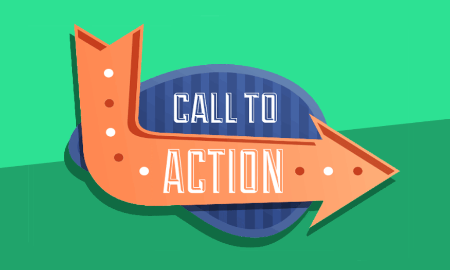
4. What position for the CTA (call-to-action) button?
The CTA (call-to-action) button is not only an important part of the interface design but also a decisive factor for the success of the website. This is where users perform the desired action, such as placing an order, downloading an application, or redirecting to another link. Therefore, determining the appropriate position for the CTA button is essential to optimize the user experience and increase conversion rates.
When designing a CTA, pay attention to the size, color, and placement of the button. The CTA button should be easily visible and not obscured by other elements on the page. If the button is too small or the color is not prominent, users will have a hard time finding and interacting with it. Research shows that users tend to ignore inconspicuous elements, so placing the CTA button in a prominent location, such as in the middle of the page or at the end of the article, can help increase engagement.
It is equally important to ensure that your CTA button is mobile-friendly. Many users now access websites via mobile devices, so the size and placement of the button should be adjusted to accommodate the smaller screen. The CTA button should not only be easy to click, but also not be too distracting for users to move their fingers to interact. Investing time in optimizing your CTA button will pay off in terms of attracting and retaining customers.
5. Save time reading and understanding information
Modern users tend to be impatient when reading information on websites. They often just skim through the content to find the information they need. Therefore, saving time reading information is a very important factor in UI/UX design. An effective design should not only be attractive but also provide information quickly and easily.
To save your readers time, you need to put important information in places where they can easily find it. Patterns like the Gutenberg Diagram, Z-Pattern, and F-Pattern can help you determine the optimal placement of important content. For example, the main information should be placed at the top of the page, while additional information can be located elsewhere. Using visual hierarchy is also an effective way to guide readers to the content they are interested in.
Additionally, using clear and concise headings helps users quickly identify the information they need. Make sure that paragraphs are broken up and highlighted so that they are easy to scan. A well-designed website not only saves users time, but also creates a better experience, making them more likely to return in the future.
.png)
6. Design Icons that are truly intuitive
Icons are an essential part of user interface design. They not only help convey information quickly but also create an enjoyable user experience. A well-designed icon can say a hundred words, helping users easily identify the function they are looking for. However, icon design needs to be done carefully to ensure that it is intuitive and easy to understand.
When designing icons, keep in mind that they should be simple and easy to recognize. If an icon is too complex or confusing, users may become confused and not know how to use it. To increase effectiveness, you can include a short text caption explaining the function of the icon. This will help users grasp the information without having to think too much.
In addition, icons should also be consistent with the overall design style of the website. The color, style, and size of the icon should be in harmony with other elements on the interface. A beautifully designed and suitable icon will not only enhance the aesthetics of the website but also create a sense of professionalism, helping users feel more secure when interacting. Invest time and effort in designing icons, as they can make a big difference in the user experience.
7. Emphasize your message with eye-catching images and banners
Images and banners are important elements in interface design, helping to convey messages in a vivid and attractive way. The saying "A thousand hearings are not as good as one's own eyes" is absolutely true in this context, when eye-catching images can attract viewers' attention more than dry lines of text. Hero banners, with their large size and impressive design, not only highlight the message but also create a sense of excitement for users from the first visit.
Using high-quality images not only makes your website look beautiful but also helps users easily understand the content you want to convey. When viewers are attracted to the image, they tend to read the content below. A well-designed hero banner can create a strong connection with customers, making them feel interested and want to explore more about the product or service. This not only improves the user experience but also contributes to increasing conversion rates.
In addition, it is also important to synchronize the design style between images and content. A website with images and banners that are consistent in color, style and design will create a professional and pleasant feeling for users. When customers feel happy and enjoy browsing the site, they will tend to come back more often. Thus, images and banners are not only decorative tools but also an indispensable part of your communication s.png) trategy.
trategy.
8. Speak with your readers
Copy content is a key factor in attracting and retaining readers. The tone, vocabulary, and writing style must be appropriate for the audience you are targeting. If the content does not reflect the needs and interests of the user, they will likely leave your site and go elsewhere. For example, using formal language in an entertainment app can make users feel uncomfortable, while using casual language in a high-end website can feel inappropriate.
To avoid these mistakes, it is essential to find a professional copywriter who not only writes well but also understands how to communicate with different groups of people. They can help you create engaging, easy-to-understand, and relatable content that will increase engagement and customer retention.
Close collaboration between the design team and the copywriter is also important. When both parties work together, you can create a comprehensive user experience, from the visuals to the content. This will not only create harmony in the design but also enhance the quality of the message you want to convey, making it easier for your brand to leave a mark in the hearts of customers.
9. Applying the Gestalt principles
Gestalt principles are a set of psychological principles that explain how the human brain perceives and interprets visuals. By applying these principles to UI/UX design, you can optimize the user experience effectively. Gestalt principles, such as proximity, similarity, and simplicity, allow designers to arrange interface elements in a logical way, making them easy to recognize and interact with.
When you understand how the human brain works, you can eliminate unnecessary visual clutter while still providing enough information to the user. For example, grouping related elements together makes it easier for the viewer to perceive the relationship between them, thereby improving comprehension and interaction. A good Gestalt UI/UX design will help users feel more comfortable and natural when using the product.
Ultimately, applying the principles of Gestalt not only enhances the aesthetics of an interface, but also creates a smoother, more pleasant user experience. Instead of struggling with unclear elements, users will easily find the information they need, thereby increasing customer retention and building trust in the brand. Remember, good design is not only beautiful but also easy to use, and the principles of Gestalt are the key to achieving this.
.png)
10. Conclusion
In your journey to becoming a professional UI/UX designer, applying these lifelong tips will not only help you create beautiful products but also bring real value to users. Always remember that design is not only about form but also about emotion and user experience. By continuously learning, experimenting and improving, you will not only build a reputation in the design field but also contribute to changing the way people interact with technology. Start applying these tips today to conquer new heights in your design career!


VIP Products


Best Selling Products
Genuine Cheap Canva Pro
39 USD
Genuine Adobe Illustrator account
99 USD
Autodesk All App Account Copyright
120 USD
Freepik Premium Account
59 USD
ChatGPT Plus Account (GPT-4)
16 USD
Windows 10 & 11 Pro Key
36 USD
MidJourney Account
29 USD
Plugin Retouch4me
69 USD
Copyright Adobe Lightroom Account
59 USD
Adobe Premiere Pro Account
99 USD
Upgrade genuine Capture One account
120 USD
Upgrade Genuine Office 365
49 USD
Capcut Pro 1 Year
39 USD
Adobe Photoshop Copyright - Full App
120 USD
Upgrade Duolingo Super
29 USD