Best Selling Products

Adobe Photoshop Copyright - Full App
120 USD

Autodesk All App Account Copyright
120 USD

Upgrade genuine Capture One account
120 USD

Plugin Retouch4me
69 USD

Freepik Premium Account
59 USD

Upgrade Genuine Office 365
49 USD

Genuine Cheap Canva Pro
39 USD

Copyright Adobe Lightroom Account
59 USD

Genuine Adobe Illustrator account
99 USD

Upgrade Duolingo Super
29 USD

Windows 10 & 11 Pro Key
36 USD

Adobe Premiere Pro Account
99 USD

Capcut Pro 1 Year
39 USD

ChatGPT Plus Account (GPT-4)
16 USD

MidJourney Account
29 USD
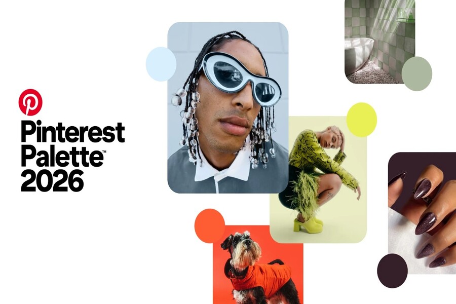
Pinterest Predicts the Dominant Color Palette of 2026
Nội dung
The 2026 color palette is not just a trend but also reflects a shift in the emotional state of the era. From rational cool tones to energetic warm shades, each color carries its own story. Let’s explore how these tones are shaping global design, fashion, and branding.
1. Overview
Unlike previous “safe” color palettes that dominated earlier periods, the 2026 palette delivers a clear statement: the world is moving away from neutrality and silence into an era of emotion, personality, and direct self-expression. This is no longer the time for “safe colors that everyone likes,” but for shades with stance, attitude, and individual storytelling.
Based on data from over 600 million users and billions of searches, saves, and interactions, Pinterest identified five representative tones of 2026: Cool Blue, Jade, Plum Noir, Wasabi, and Persimmon. These colors are not random; they reflect deeper societal needs: the need for calm, balance, expression, visibility, and connection.
The core concept of this year’s palette lies in “emotional utility”: the emotional value of color. In a world overwhelmed by information, algorithms, and pressure, people no longer choose colors purely for beauty, but for how those colors make them feel. Color becomes a tool for emotional regulation, experience shaping, and personal identity expression. This is why the 2026 palette is more expressive, more personal, and more emotionally layered than previous years.
.jpg)
2. Cool Blue: Focus in a Distracted World
Cool Blue is a cold blue tone that feels icy, sharp, and distant. This is not the warm blue of nature, but the blue of digital space, silence, and breathing room in a noisy world. In a context where people are constantly surrounded by information, Cool Blue represents the need to slow down, think clearly, and regain focus.
.jpg)
Color psychology shows that cool blue tones reduce visual stress and create a sense of control. As a result, Cool Blue often appears in tech-oriented, creative, and intellectual designs. In digital interfaces, this shade creates a clean, logical, and trustworthy experience. In branding, Cool Blue conveys professionalism, transparency, and stability.
In fashion, Cool Blue is often used on smooth materials such as cotton satin, light wool, or cool silk, creating an elegant but understated look. In interior design, it appears in minimalist spaces, making rooms feel larger, airier, and mentally balanced. Cool Blue is not a loud attention-grabbing color, but its influence is long-lasting because it connects to a deep human need: the need for calm in a noisy world.
3.Jade : Balance Between Nature and Luxury
Jade is a jade-green tone that feels balanced between nature and refinement. It evokes gemstones, young leaves, and living energy that still carries depth and maturity. Jade reflects the healing needs of modern society, where people seek emotional stability while still valuing high aesthetic quality.
.jpg)
Unlike bright youthful greens, Jade is more muted, more luxurious, and deeper. It is often used in high-end interiors, spas, wellness branding, and slow-living products. Jade creates a sense of relaxation and safety without becoming boring, thanks to its balanced saturation and refined tone.
In fashion, Jade appears on materials such as silk, velvet, or woven knit fabrics, creating an elegant and mature aesthetic. In graphic design, it delivers a premium yet approachable feel, making it ideal for brands that want to express harmony between nature and modernity. Jade is not loud, but it always feels stable and enduring.
4. Plum Noir: Power, Depth, and Seductive Darkness
Plum Noir is a deep purple mixed with burgundy and velvety brown, creating a sense of power, mystery, and inner strength. It is a color of emotional depth, complexity, and personalities that refuse to blend into the crowd. Pinterest describes this shade as “villain energy”: the energy of those who dare to be different, express identity boldly, and step outside their comfort zone.
.jpg)
In color psychology, deep purple tones are often associated with intuition, intelligence, and power. Plum Noir therefore feels both luxurious and mysterious. In fashion design, it often appears on velvet, suede, or leather materials, creating a strong and captivating presence. In branding, Plum Noir helps build a brand identity that is deep, distinctive, and memorable.
In spatial design, it is used as an accent tone to create warmth, depth, and emotional richness. This is not a color for the majority, but when used correctly, it becomes extremely powerful. Plum Noir represents a generation that no longer seeks perfection, but embraces complexity and the beauty of inner depth.
5. Wasabi: Rebellion, Boldness, and Breaking the Mold
Wasabi is an electric chartreuse shade carrying the strongest visual energy in the 2026 palette. It represents experimentation, positive rebellion, and the desire to break visual norms. In a world where aesthetics are becoming overly smooth and uniform due to technology, Wasabi appears as a statement that people still want to stand out.
.jpg)
Wasabi is not an easy color to use, but when applied correctly, it creates extremely strong visual impact. In graphic design, it is often used as an accent color to draw attention and create a modern feel. In fashion, it appears in streetwear, avant-garde, and experimental designs.
In branding, Wasabi signals boldness and innovation, making it ideal for young, tech-driven, or creative brands. It is the color of those who refuse to follow established paths and want to leave a unique mark. Wasabi does not offer safety, but it delivers energy and differentiation.
6. Persimmon: A Symbol of Pure, Innocent Joy
Persimmon is an orange-red shade carrying the strongest social energy in this year’s palette. It represents joy, warmth, and the desire for connection. After years of global uncertainty, Persimmon reflects the need to live fully, to enjoy, and to engage in meaningful relationships.
.jpg)
In color psychology, orange-red stimulates energy, enthusiasm, and positive emotions. Persimmon therefore often appears in community-driven designs, festivals, and experiential environments. In fashion, it creates a vibrant, lively, and expressive look. In branding, it brings friendliness, closeness, and emotional warmth.
In living spaces, Persimmon is used as an accent color to make environments feel warmer and more dynamic. It is a color of life, connection, and authentic experiences. Persimmon is not just a color—it is an emotional state of a world that wants to live more and enjoy more.
The 2026 color trends make one thing clear: color is no longer just decoration, but a tool for expressing identity, emotion, and experience. For designers, understanding this palette means understanding how people perceive the world. And once emotion is understood, design becomes more than imagery—it becomes a living language with depth and lasting influence.


VIP Products


Best Selling Products
Adobe Photoshop Copyright - Full App
120 USD
Autodesk All App Account Copyright
120 USD
Upgrade genuine Capture One account
120 USD
Plugin Retouch4me
69 USD
Freepik Premium Account
59 USD
Upgrade Genuine Office 365
49 USD
Genuine Cheap Canva Pro
39 USD
Copyright Adobe Lightroom Account
59 USD
Genuine Adobe Illustrator account
99 USD
Upgrade Duolingo Super
29 USD
Windows 10 & 11 Pro Key
36 USD
Adobe Premiere Pro Account
99 USD
Capcut Pro 1 Year
39 USD
ChatGPT Plus Account (GPT-4)
16 USD
MidJourney Account
29 USD