Best Selling Products
Revealing 8 Ways to Arrange Layout in Design You Should Know
Nội dung
- 1. What is layout in design?
- 2. The importance of layout in design
- 2.1. Creating Balance
- 2.2. Leading the Viewer's Eye
- 2.3. Enhance User Experience
- 2.4. Create Aesthetic Design
- 2.5. Helps Convey the Correct Message
- 3. Revealing 8 Ways to Arrange Layout in Design That You Should Know
- 3.1. Principle of Balance
- 3.2. Principle of Contrast
- 3.3. Principle of Orientation
- 3.4. Proximity Principle
- 3.5. Simple Principle
- 3.6. The Principle of Repetition
- 3.7. Negative Space Principle
- 3.8. Principle of Proportion and Golden Ratio
- 4. How to Apply Effective Layout in Design
- 4.1. Website Design
- 4.2. Logo Design
- 4.3. Mobile Application Design
- 5. Conclusion
Discover 8 ways to arrange layouts in design to create impressive and professional products. Learn more about principles and applications in design at Sadesign.
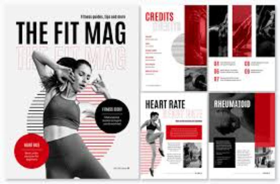
Layout in design plays an important role in creating harmony and easily conveying messages. Understanding how to arrange the layout properly helps you create impressive design products that attract viewers. In the article below, sadesign reveals to you 8 ways to arrange the layout in design that every designer needs to know.
1. What is layout in design?
Layout in design is an extremely important element that helps organize and arrange design elements in a logical and easy-to-read way. Every design has a clear purpose, and layout is the tool to ensure that all elements such as text, images, colors, and space are coordinated effectively.
.jpg)
Layout not only includes the way to arrange objects in the design space but also refers to the reasonable division of space, creating a balance between elements so that viewers feel comfortable and easily receive information.
When designing, you need to pay attention to the basic principles of composition such as balance, proportion, contrast, and unity. These principles will help create a design that is not only beautiful but also effective in conveying a message to the viewer.
2. The importance of layout in design
Layout plays a crucial role in creating a successful design. A good layout not only attracts attention but also makes it easy for users to interact with and use the product. Here are some reasons why layout is so important in design:
2.1. Creating Balance
One of the basic principles of composition is balance. When you arrange elements in your design, maintaining a balance between them will help create a harmonious, pleasing space for the viewer. Balance can be achieved through symmetrical or asymmetrical elements, depending on the message and purpose of the design.
2.2. Leading the Viewer's Eye
A good layout will help guide the viewer's eye along a logical path, from the most important to the less important. This can help the viewer receive information in a coherent way, thereby increasing the effectiveness of the message.
2.3. Enhance User Experience
Layout is not only for the eyes but also affects the user experience. For design products such as websites or mobile applications, a reasonable layout will help users easily find information, interact with functions and save time.
.jpg)
2.4. Create Aesthetic Design
Layout not only has the task of organizing elements in space but also has the ability to create harmony and aesthetics for the design product. A beautiful and pleasant design will leave a deep impression on the viewer, contributing to building the brand and enhancing the value of the product.
2.5. Helps Convey the Correct Message
Every design has a message that the designer wants to convey. Arranging the layout properly helps create emphasis on important elements, making it easier for viewers to recognize and understand the message you want to convey.
3. Revealing 8 Ways to Arrange Layout in Design That You Should Know
To create an engaging and accessible design, you need to understand how to apply the principles of composition effectively. Here are 8 effective layout techniques that every designer should master to apply scientifically and reasonably.
3.1. Principle of Balance
Balance is one of the most important and basic principles of design. When you create a composition, you need to make sure that the elements in the design are evenly distributed or proportional, so that no part is too heavy or too light compared to the rest. There are two main types of balance: symmetrical balance and asymmetrical balance.
Symmetrical balance is when design elements are arranged symmetrically across a vertical or horizontal axis. This approach creates a sense of stability and harmony.
Asymmetrical balance is when elements in a design are not symmetrical but still create a sense of balance through size, color, or shape. This makes the design look more dynamic.
3.2. Principle of Contrast
Contrast is the use of different elements, such as color, shape, size, or font type, to create a distinct difference in a design. Contrast helps draw attention and highlight important parts of a design.
For example, when designing a website, you can use contrasting colors between the background and the text to make it easier for users to read the content. Or when designing a poster, using images that contrast with the background will help increase the prominence of the main message.
3.3. Principle of Orientation
The principle of direction in design refers to how you guide the viewer’s eye in a certain direction. This can be done through elements such as paths, images, or by arranging design elements in a logical progression. Proper direction helps users avoid getting lost and makes it easier to follow content from beginning to end.
.jpg)
A great example of this principle is in website design. You can arrange menu items, images, and information sections in a natural flow so that users can easily move from one section to another without experiencing confusion.
3.4. Proximity Principle
The principle of proximity in design is the practice of placing elements close together to create a connection between them. Related elements should be placed close together so that the viewer can easily see the relationship between them. This principle is useful when you want to group information together without creating distractions in the design.
For example, on a website, product-related information might be placed close together, while contact information or payment details might be located in separate areas.
3.5. Simple Principle
Simplifying your design is one way to make it accessible to your audience. Complex designs with lots of details are not always better. In fact, sometimes simplicity is much more effective. Eliminate unnecessary elements and focus on the strengths of your design. Simplicity does not mean lack of aesthetics, but creating a design that is easy to understand and consume.
A simple website design, with a clean interface and clear information, will help users feel more comfortable when browsing the website and interacting with the site's functions.
3.6. The Principle of Repetition
Repetition is the use of the same elements multiple times in a design to create consistency and organization. Repetition not only creates a harmonious design but also increases brand recognition. You can repeat a color, shape, or font throughout your design.
For example, in logo design, repeating geometric elements or colors will help users recognize the brand more easily.
3.7. Negative Space Principle
Negative space is the “empty” space in a design. It is an extremely important element in highlighting other elements. Using negative space properly helps the viewer not feel confused and can easily focus on important parts of the design. In addition, negative space also helps increase the aesthetics and create an airy feeling for the design.
3.8. Principle of Proportion and Golden Ratio
Proportion and the golden ratio are some of the most popular principles in design. The golden ratio is a special ratio that can help create a harmonious and balanced composition. Using the golden ratio in design helps create visual appeal, making the viewer feel comfortable when looking at the design product.
In website design, applying the golden ratio can help sections such as menus, images, or articles to be arranged more reasonably and beautifully.
4. How to Apply Effective Layout in Design
.jpg)
4.1. Website Design
In web design, layout plays an important role in creating a smooth user experience. A website layout should be easy to navigate, with elements organized clearly and logically. Using a grid layout or vertical layout makes it easy for users to find the information they need without spending too much time.
4.2. Logo Design
Logo is an important element in branding. The arrangement of elements in the logo such as images, letters and colors must be done delicately to ensure recognition and uniqueness.
4.3. Mobile Application Design
For mobile applications, the layout needs to be optimized so that users can interact easily on small screens. Arrange functions and information in a logical order, avoid clutter and ensure convenience in use.
5. Conclusion
Layout in design is not just about arranging elements on a page but also an art that helps convey messages effectively. Each principle and method of arrangement has its own advantages and depends on the purpose of the product. Understanding and applying these principles will help you create designs that are both beautiful and effective. Experiment and be creative with different layout methods to achieve the most impressive results for your project. If you are looking for professional design services, do not hesitate to contact Sadesign to receive advice and support from our experienced design team.


