Best Selling Products

Genuine Cheap Canva Pro
39 USD

Copyright Adobe Lightroom Account
59 USD

ChatGPT Plus Account (GPT-4)
16 USD

Windows 10 & 11 Pro Key
36 USD

Capcut Pro 1 Year
39 USD

Plugin Retouch4me
69 USD

Genuine Adobe Illustrator account
99 USD

MidJourney Account
29 USD

Freepik Premium Account
59 USD

Upgrade Genuine Office 365
49 USD

Autodesk All App Account Copyright
120 USD

Adobe Photoshop Copyright - Full App
120 USD

Adobe Premiere Pro Account
99 USD

Upgrade Duolingo Super
29 USD

Upgrade genuine Capture One account
120 USD
Signboard and Advertising Sign Design: A Complete A–Z Guide
Nội dung
- 1. Overview of Signboard and Advertising Sign Design
- 1.1. What are signboards and advertising signs?
- 1.2. The Importance of Signboard Design
- 1.3. Popular Types of Signboards
- 2. Colors in Signboard Design
- 3. Choosing Easy-to-Read Fonts
- 4. Using Images and Icons Effectively
- 5. Layout and Information Arrangement
- 6. Professional Signboard Design Tools
A beautiful signboard is not only a decorative element but also a powerful marketing tool that helps attract customers. From colors and fonts to layout, every detail directly impacts advertising effectiveness.
1. Overview of Signboard and Advertising Sign Design
1.1. What are signboards and advertising signs?
Signboards and advertising signs are among the most important visual communication tools in business operations. They are not merely boards displaying the name of a store or company but also the “face” that represents a brand in the eyes of customers. A well-designed signboard can communicate a message, position a brand, and capture attention within just a few seconds.
In an increasingly competitive environment, signboards have evolved beyond their identification function and become part of an overall marketing strategy. From colors and fonts to images, every element must be carefully considered to create an effective design.
(1).jpg)
1.2. The Importance of Signboard Design
A beautiful signboard not only helps customers easily recognize a brand but also contributes to building trust and creating a positive first impression. In many cases, the signboard is the very factor that determines whether customers decide to enter a store or not.
Signboard design also directly affects the ability to communicate a message. A clear and readable design helps customers quickly understand the products or services a business offers. On the other hand, a cluttered or difficult-to-read signboard may cause customers to overlook it, regardless of how favorable its location may be.
.jpg)
In addition, signboards serve as a 24/7 advertising tool. Unlike other forms of advertising that require continuous maintenance costs, signboards operate constantly and provide long-term value when properly invested in.
1.3. Popular Types of Signboards
There are many different types of signboards available on the market today, each suitable for specific purposes and budgets.
Lightbox signs are a popular choice due to their illuminated display capability, especially effective at night. With a structure consisting of a metal frame and a face made of acrylic or hiflex material, this type of sign allows content to be changed easily and is suitable for stores, cafés, and shopping centers.
.jpg)
Raised-letter signs create a luxurious and professional appearance. The letters are crafted from acrylic, stainless steel, or aluminum composite panels and mounted onto a background, creating depth and enhancing aesthetics. This type is commonly used for offices and premium brands.
.jpg)
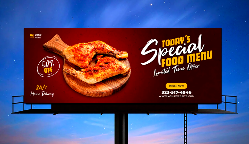
LED signs and electronic displays use modern lighting technology to present dynamic content. Thanks to their flexibility in changing messages, they are particularly suitable for crowded areas such as shopping malls and public squares.
(1).jpg)
Acrylic and aluminum composite signs stand out for their reasonable cost and high durability. They are a popular choice for small businesses or outdoor signage that must withstand harsh weather conditions.
Choosing the right type of signboard depends on many factors, including budget, installation location, advertising goals, and brand style.
2. Colors in Signboard Design
The selection of colors should begin with the brand identity system. Using the correct primary colors ensures consistency and enhances recognition across every customer touchpoint. In addition, each color carries its own psychological meaning. Red often evokes a sense of energy, urgency, and strong attention-grabbing power. Blue creates feelings of trust, professionalism, and stability. Yellow represents cheerfulness, visibility, and positivity, while green conveys a sense of nature, friendliness, and sustainable growth. Understanding color meanings helps guide the message you want to communicate.
Beyond choosing colors, the way they are combined greatly influences design effectiveness. A signboard with harmonious color combinations creates a pleasant and professional impression. Conversely, using too many colors or combining them without control can make the overall design appear cluttered and lose its focal point.
In practice, the 60-30-10 rule is often applied to create visual balance. According to this principle, 60% of the space is dedicated to the primary color, 30% to a secondary color, and 10% to an accent color. This distribution helps maintain consistency while highlighting key elements. Additionally, contrast between the background and text should be carefully considered, especially for outdoor signs, to ensure readability from a distance and under various lighting conditions.
.jpg)
3. Choosing Easy-to-Read Fonts
In signboard design, readability is always the top priority. Viewers typically have only a few seconds to absorb information, so fonts should have simple, clear forms that are easy to recognize from a distance. Highly decorative or complex typefaces may look aesthetically pleasing but often reduce the effectiveness of message delivery.
Font selection should also align with the brand’s style. Modern and youthful brands often prefer sans-serif fonts because of their simplicity and clarity. In contrast, traditional or premium brands may use serif fonts to create a sense of elegance and reliability.
In addition, the number of fonts used in a design should be carefully controlled. Using too many different fonts can make a layout appear cluttered and unprofessional. Generally, one or two primary fonts are sufficient to maintain consistency. Font size should also be chosen according to the viewing distance, ensuring that people can easily read the content even from afar.
4. Using Images and Icons Effectively
In many cases, a suitable image can communicate a message more quickly and effectively than a long block of text. However, images should be selected carefully. They must be high-quality, sharp, and relevant to both the advertising content and the brand’s style. A blurry image, an off-topic visual, or an image lacking connection to the message can diminish the value of the entire design.
A logo is an essential element of any signboard. It serves as the symbol representing the brand and should be placed in a visible position with an appropriate size to ensure strong recognition. A simple, clear, and consistent logo helps customers easily remember and associate it with the business.
(1).jpg)
Additionally, image effects such as shadows, reflections, or dimensional enhancements can add depth and aesthetic appeal to a design. However, they should be used sparingly to avoid visual clutter and maintain the clarity of key information. An effective design is not the one with the most details, but the one that optimizes every element to communicate a message in the clearest and most impressive way possible.
5. Layout and Information Arrangement
First and foremost, information should be organized according to priority. The most important content, such as the brand name, slogan, or main message, should be placed in the most visible position, usually in the center or upper section. Secondary information such as addresses, phone numbers, or services can be placed lower down or in less prominent areas. A clear information hierarchy prevents viewers from feeling overwhelmed when processing content.
Whitespace also plays an important role in layout design. Many people try to maximize the use of every inch of a signboard to include as much information as possible, but this often has the opposite effect. An overly dense design can feel overwhelming and make it difficult for viewers to focus. In contrast, using whitespace effectively creates openness, highlights key content, and enhances overall aesthetics.
(2).jpg)
Furthermore, alignment and grid systems are essential techniques for ensuring that elements are arranged accurately and proportionally. Invisible grid lines help control spacing, positioning, and relationships between design components. When elements are aligned consistently, the signboard appears more professional and visually pleasing.
Another advanced factor is the application of visual principles such as focal points and eye movement. You can guide viewers’ attention from the main headline to supporting information through strategic use of layout, size, and color. This increases communication effectiveness and helps maintain attention for a longer period.
6. Professional Signboard Design Tools
Adobe Photoshop is a popular tool for image editing and raster-based design. It is particularly useful when you need to process images, create effects, or design signboards that contain many complex visual elements. However, for designs requiring maximum sharpness in printing, vector graphics remain the better choice.
Adobe Illustrator is a specialized vector design software, ideal for creating logos, raised letters, and components that need to maintain sharpness at any size. It is widely used in professional signboard design due to its precision and flexibility.
CorelDRAW is also a familiar choice in the printing and advertising industry. The software is known for its fast file processing, strong print output support, and compatibility with a wide range of production equipment.
For beginners or those with limited budgets, Inkscape is a free solution that still provides all the essential features needed for vector design. Meanwhile, Adobe InDesign is better suited for layout and composition tasks, especially when designing consistent signage systems.
For projects that require visualizing real-world installations before production, 3D software such as SketchUp or Autodesk 3ds Max can be extremely helpful. These tools allow you to simulate signboards within actual environments, making it easier to evaluate size, viewing angles, and visual effectiveness before implementation.
Signboard and advertising sign design is not only a technical task but also an art that combines aesthetics and communication strategy. An effective signboard must harmonize colors, typography, images, and layout while remaining aligned with the brand and its target audience.


VIP Products


Best Selling Products
Genuine Cheap Canva Pro
39 USD
Copyright Adobe Lightroom Account
59 USD
ChatGPT Plus Account (GPT-4)
16 USD
Windows 10 & 11 Pro Key
36 USD
Capcut Pro 1 Year
39 USD
Plugin Retouch4me
69 USD
Genuine Adobe Illustrator account
99 USD
MidJourney Account
29 USD
Freepik Premium Account
59 USD
Upgrade Genuine Office 365
49 USD
Autodesk All App Account Copyright
120 USD
Adobe Photoshop Copyright - Full App
120 USD
Adobe Premiere Pro Account
99 USD
Upgrade Duolingo Super
29 USD
Upgrade genuine Capture One account
120 USD