Best Selling Products

Copyright Adobe Lightroom Account
59 USD

Upgrade genuine Capture One account
120 USD

Windows 10 & 11 Pro Key
36 USD

Capcut Pro 1 Year
39 USD

ChatGPT Plus Account (GPT-4)
16 USD

Plugin Retouch4me
69 USD

MidJourney Account
29 USD

Upgrade Duolingo Super
29 USD

Adobe Photoshop Copyright - Full App
120 USD

Freepik Premium Account
59 USD

Upgrade Genuine Office 365
49 USD

Adobe Premiere Pro Account
99 USD

Genuine Adobe Illustrator account
99 USD

Autodesk All App Account Copyright
120 USD

Genuine Cheap Canva Pro
39 USD
The Law of Contrast and How to Apply It in Design to Win Over Customers
Nội dung
- 1. Learn about the Law of Contrast in Design
- 1.1. Opposite Contrast in the Law of Contrast
- 1.2. Contrast Emphasis in the Law of Contrast
- 2. Applying the Law of Contrast in Design by Choosing Colors
- 2.1. Contrast Between Colored and Colorless Objects
- 2.2. Contrast Between Dark and Light Objects
- 2.3. Contrast Between Light and Dark Objects
- 3. Apply the law of contrast in design by using size
- 3.1. Why is size an important factor in design?
- 3.2. Case Study: How Apple uses size contrast in product posters
- 3.3. How to use size to create contrast in design
- 4. Conclusion
The law of contrast and how to apply it in design are important principles that help create prominence and easily distinguish elements in a design product. Let's learn more details through the following article to improve the quality of your work.
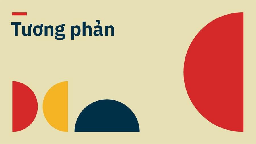
Contrast is a fundamental principle in graphic and web design, playing an important role in creating attention and distinguishing elements in a design product. The principles of contrast not only help clarify the message but also contribute to creating balance and easily attracting viewers. In this article, Sadeign will help you learn about the law of contrast and how to apply it in design to conquer customers.
1. Learn about the Law of Contrast in Design
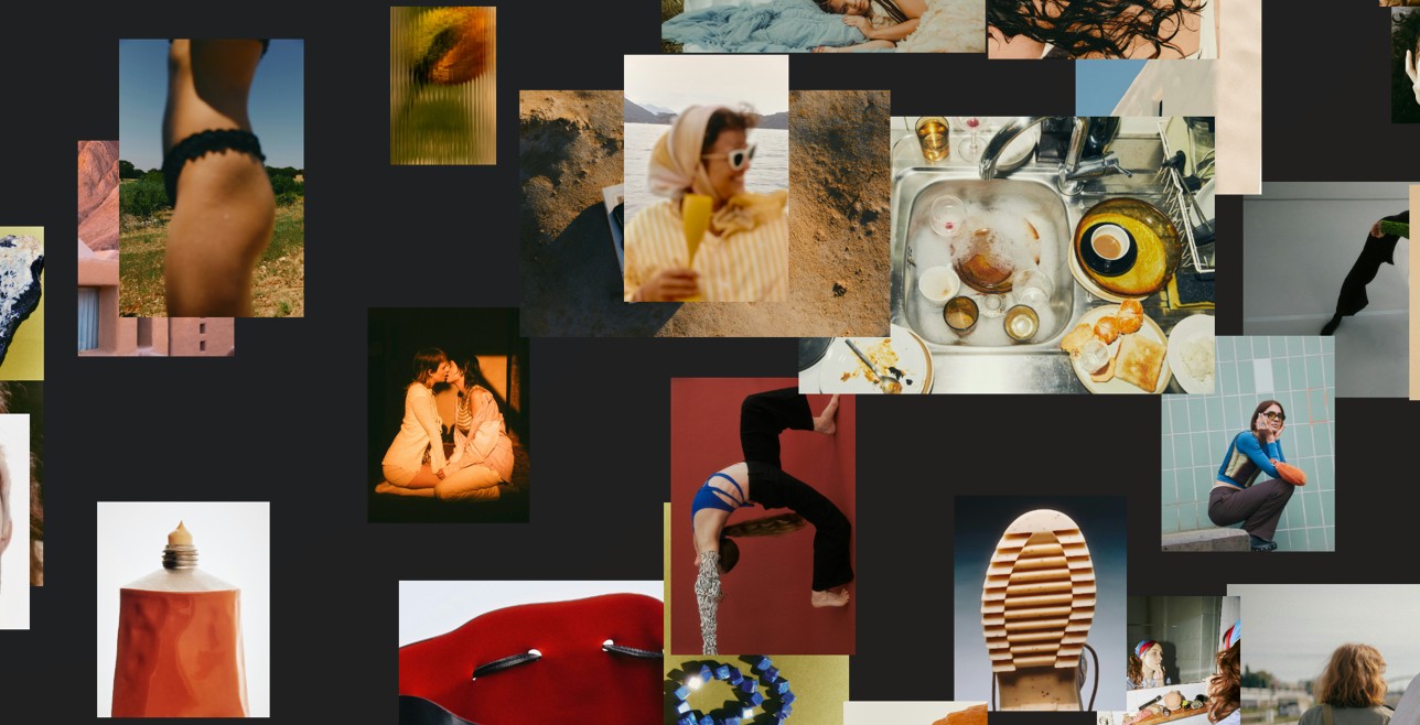
The Law of Contrast can be simply understood as the principles of using elements in a design. There are two common types of contrast: Opposing Contrast and Emphasizing Contrast, two elements that help enhance aesthetics as well as the ability to effectively convey messages.
.jpg)
1.1. Opposite Contrast in the Law of Contrast
Opposing contrast is one of the important elements that helps distinguish objects in design, and at the same time helps viewers easily identify and focus on the most important elements of the design product. This is the strongest type of contrast and easily creates immediate attention thanks to the combination of opposing elements.
Contrast Between Colors
Color is one of the most obvious elements of the law of contrast. Using opposite colors, such as red and green, black and white, or yellow and blue, can create a clear sense of presence. These contrasting colors not only help to clarify each element, but also increase the viewer’s ability to engage. In fact, strong colors can convey emotions and messages clearly, making a strong impression on users.
Contrast of Brightness
The brightness between elements in a design can also create a striking contrast. Using light and dark colors in a reasonable combination not only highlights the elements but also adds depth to the design. Dark areas can highlight light-colored elements, while bright areas help guide the viewer's gaze.
Contrast in Size
The size of objects also plays an important role in contrast. Using large and small elements judiciously can create a clear division between sections of the design. Large elements help to attract attention first, while small elements create more subtle accents. This combination helps to create balance and avoid overwhelming the viewer with information.
1.2. Contrast Emphasis in the Law of Contrast
While contrasting contrast creates a clear distinction between elements, emphatic contrast focuses on creating emphasis on important parts of a design. This is a strategy used to draw attention to the important details that you want the viewer to notice the most.
Using Color for Emphasis
One of the most common ways to emphasize elements in a design is to use color. By applying a bright color to important elements such as buttons, headlines, or other points that need the user’s attention, you can make them stand out from the rest of the design. Bright, bold colors can help create a strong presence, which can help draw the viewer’s attention to the key points of the design.
Border Size and Thickness
Border size and thickness are also powerful tools for creating emphasis. Important elements can be made larger or given thicker borders to draw attention. This is especially useful in web design, when you need to highlight elements like CTA (Call To Action) buttons, icons, or important illustrations.
Light and Shadow
Another way to add emphasis is to use light and shadow. Soft shadows can create depth and help elements in your design stand out. Combining light and shadow properly can create a dramatic highlighting effect, making it easier for viewers to notice important elements.
Distance and Space
Emphasis can also be placed on how you arrange elements in space. Creating a reasonable amount of space between important and secondary elements can help highlight what needs attention. White space, also known as negative space, helps separate elements in a design and creates clarity and ease of information absorption.
2. Applying the Law of Contrast in Design by Choosing Colors
In the field of design, choosing the right color is an important factor in creating harmony and attracting viewers. One of the basic principles in design is the "law of contrast", which helps to clearly distinguish between elements and highlight important details. In this article, we will learn about how to apply the law of contrast in design through color selection, with three main types of contrast: between colored and colorless objects, between dark and light objects, and between light and dark objects.
2.1. Contrast Between Colored and Colorless Objects
.jpg)
Contrast in design is not just about using bold colors, but also about clearly distinguishing between colored and colorless elements. Color is a powerful element in conveying emotions and attracting attention, while colorless elements such as white, black, or gray serve as a backdrop for other details. The combination of color and colorless creates the highlight for important objects in the design.
When designing graphics, choosing a combination of colored and colorless objects can create very different effects. Color is often used to highlight important objects or details in the design. In addition, colorless elements act as a distraction to the viewer's eye and create space for details to stand out.
A simple example is when you design a logo or poster, combining bright colors with a white background will make the object on the logo stand out and be easily recognized. Similarly, in interior design, using white walls with strongly colored objects will help the space become more lively without being confusing.
The application of contrast between color and non-color not only enhances aesthetics but also improves the ability to recognize information, which is especially important in branding or advertising designs.
2.2. Contrast Between Dark and Light Objects
One of the most effective techniques in color design is to use contrast between dark and light objects. By applying this rule, you can easily create clear highlights in your designs without having to overdo it with color. The difference between dark and light brings a sense of depth and structure to any design.
When you use dark and light colors, the visual effect is that it helps the viewer easily distinguish different objects. Dark colors like red, dark blue or dark green tend to attract the eye first and create prominence. Meanwhile, light colors like pastels or white will create a background for the dark colors, reducing visual stress and creating a great balance in the overall design.
For advertising designs or products that require strong attention, using contrast between dark and light objects is an ideal choice. You can use dark colors to highlight the main message, while light colors will create space and background for other details.
2.3. Contrast Between Light and Dark Objects
The contrast between light and dark is one of the most important aspects of using color in design. This contrast not only creates a strong focal point but also brings impressive depth to any design. From light to dark, each element of light and dark plays a role in creating balance and enhancing the overall aesthetic.
Light colors tend to create a sense of spaciousness, openness, and comfort, while dark colors tend to be more powerful, deep, and alluring. By combining light and dark colors, you can create layers between objects, highlight important details, and naturally direct the viewer’s gaze.
In graphic design, the combination of light and dark not only helps to create highlights but also helps to create a reasonable light distribution, increasing the visual effect of the entire product. When designing a website, using a dark background with light-colored text will create clarity and readability, while a light background with dark details will bring a sense of elegance and lightness.
In addition, in interior design, the contrast between light and dark is also used to create a space with depth. The use of soft light combined with dark materials such as wood, stone or metal can create a cozy and luxurious space.
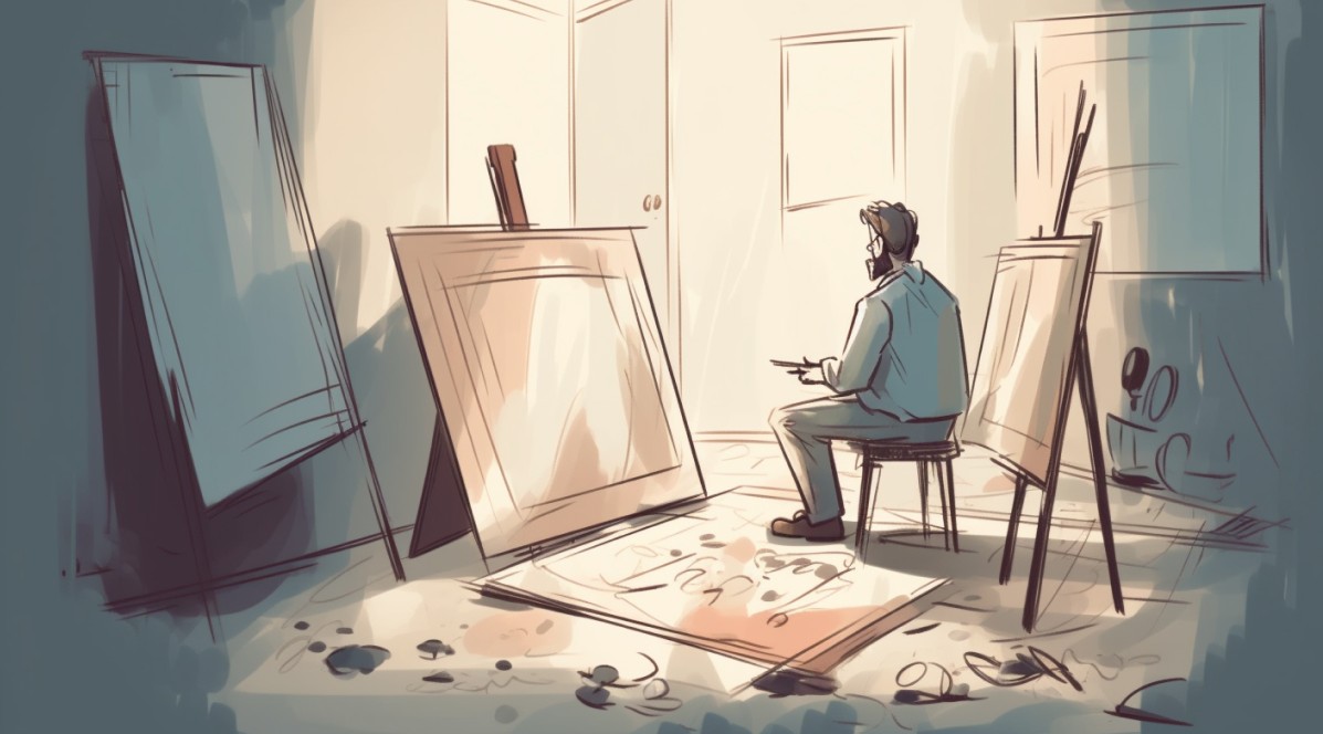
3. Apply the law of contrast in design by using size
Learn how to use size in design to create effective contrast, with real-world examples from Apple in their product advertising campaigns. Discover powerful design principles and how to apply them.
3.1. Why is size an important factor in design?
Size is the first element that the human eye encounters when looking at a design. Particularly in graphic design and advertising, size helps to hierarchy information elements, drawing immediate attention to the most important details. When used correctly, size can guide the viewer from the important to the secondary without creating a sense of clutter.
Size in design can affect the viewer in a number of ways. First, large sizes tend to attract attention, creating a sense of power or importance. Conversely, small sizes can be used to create subtle emphasis, pique curiosity. Combining these two elements will help create a harmonious composition that is both striking and accessible.
3.2. Case Study: How Apple uses size contrast in product posters
Apple is one of the leading brands in applying design principles to its advertising campaigns. Apple's product posters are not only visually striking, but also demonstrate a sophisticated use of size to create strong contrast.
.jpg)
Simple but effective design
In Apple posters, the element of size is used very clearly to guide the viewer's attention. For example, products such as the iPhone, iPad or MacBook are often shown in large sizes, taking up most of the poster area. This helps to create prominence for the product, while affirming the importance and superiority of the product in the eyes of consumers.
In addition, secondary details such as logos, taglines or product information are often designed in smaller sizes and placed in positions that are easily recognizable but do not take away attention from the main product. This combination creates a harmonious layout, allowing viewers to receive information in a coherent and orderly manner.
Using size in communicating messages
Apple is also very clever in using size to convey a clear message. Keywords or slogans in Apple posters always have a clear contrast in size compared to other elements. Short words like "Think Different" or "Innovation" are designed in large size, making a strong impression on the viewer at first sight.
This helps Apple not only create a memorable message but also demonstrate the strength of the core values that the brand wants to convey. In this way, the size not only helps create contrast but also effectively supports the communication of the brand message to consumers.
3.3. How to use size to create contrast in design
To use size effectively in graphic design, you need to understand how to create contrast without disrupting the harmony of the composition. Here are some ways to use size to create contrast in your designs.
Use size to hierarchy information
When designing a product or an advertising campaign, information hierarchy is important. You can use size to highlight important information and draw attention away from secondary elements. For example, main headlines should be highlighted in large type, while detailed descriptions or additional information can be presented in smaller type.
Make a statement with size
Size can also be used to create focal points in a design. Important elements, such as a “buy now” button on a website or a call to action in an advertising campaign, should be larger than the surrounding elements. This helps to draw the viewer’s attention and direct them to the desired action.
Ensure balance between elements
While size can create strong contrast, using size unbalanced can lead to confusion and discomfort for the viewer. Therefore, when using size, you need to ensure that the elements in your design maintain balance and harmony. This can be achieved by using white space wisely and distributing the sizes of elements so that they do not overwhelm each other.
4. Conclusion
Throughout this article, we have learned about the law of contrast and how to apply it in design. These elements not only enhance aesthetics but also contribute to the effectiveness of conveying a clear message. Apply this knowledge to your design work to achieve impressive products that easily attract viewers.


VIP Products


Best Selling Products
Copyright Adobe Lightroom Account
59 USD
Upgrade genuine Capture One account
120 USD
Windows 10 & 11 Pro Key
36 USD
Capcut Pro 1 Year
39 USD
ChatGPT Plus Account (GPT-4)
16 USD
Plugin Retouch4me
69 USD
MidJourney Account
29 USD
Upgrade Duolingo Super
29 USD
Adobe Photoshop Copyright - Full App
120 USD
Freepik Premium Account
59 USD
Upgrade Genuine Office 365
49 USD
Adobe Premiere Pro Account
99 USD
Genuine Adobe Illustrator account
99 USD
Autodesk All App Account Copyright
120 USD
Genuine Cheap Canva Pro
39 USD