Best Selling Products

Upgrade genuine Capture One account
120 USD

Adobe Premiere Pro Account
99 USD

Genuine Cheap Canva Pro
39 USD

Capcut Pro 1 Year
39 USD

Windows 10 & 11 Pro Key
36 USD

Upgrade Genuine Office 365
49 USD

Freepik Premium Account
59 USD

Plugin Retouch4me
69 USD

Copyright Adobe Lightroom Account
59 USD

Upgrade Duolingo Super
29 USD

Autodesk All App Account Copyright
120 USD

Adobe Photoshop Copyright - Full App
120 USD

MidJourney Account
29 USD

Genuine Adobe Illustrator account
99 USD

ChatGPT Plus Account (GPT-4)
16 USD
The Secret to Typography in Posters: Making an Impression and a Difference
Nội dung
- 1. The Importance of Typography in Posters
- 2. Basic Principles of Typography Design
- 2.1. Choosing the Right Font
- 2.2. Reasonable Layout
- 2.3. Use Colors Appropriately
- 2.4. Legibility
- 2.5 Hierarchy
- 2.6. Contrast
- 2.7. Spacing
- 2.8. Consistency
- 2.9. Contextual Appropriateness
- 3. Current Poster Design Trends
- 3.1. Typography 3D
- 3.2. Break the mold with Deformed Typography
- 3.3. Chữ Tay (Handwritten Typography)
- 3.4. Using Retro and Vintage Fonts
- 3.5. Minimalist Typography
- 3.6. Combining Text With Images
- 3.7. Gradient Effects And Outstanding Colors
- 3.8. Kinetic Typography
- 4. Conclusion
Discover the principles and tips for designing poster typography to create unique, engaging pieces that convey your message most effectively.
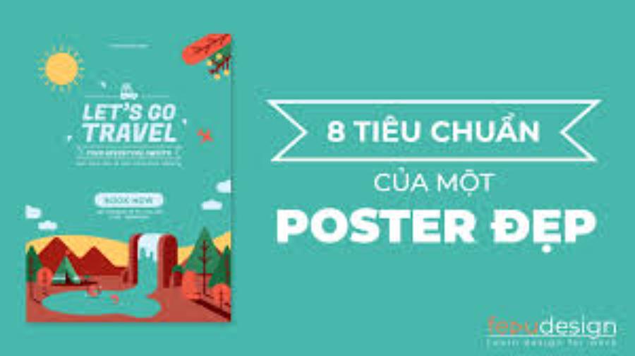
Typography in posters is a key factor in determining the eye-catching and effective message delivery. The combination of typography, layout techniques and contrast is the key to turning a visual brief into a truly popular work of art.
1. The Importance of Typography in Posters
The text in a poster is not only a means of conveying messages but also plays an important role in creating an impression and evoking emotions for the viewer. The harmonious combination of font, size and layout will increase the aesthetics as well as the effectiveness of the poster.
.jpg)
The design of the lettering in a poster plays an important role in conveying the message and making an impression on the viewer. An effective lettering design not only makes the content easy to read but also expresses the style, emotion and meaning of the message that the poster wants to convey. The choice of font, size, color and arrangement must be done carefully to ensure aesthetics and harmony with the overall design. In addition, the lettering design also contributes to attracting attention, helping the message stand out and leave an impression on the viewer's mind. Therefore, investing in lettering design is an indispensable factor in creating a professional and effective poster.
2. Basic Principles of Typography Design
Typography is an important field in graphic design, playing a key role in conveying messages and creating impressions on viewers. A good typography design not only ensures aesthetics but also enhances communication effectiveness, making the content easier to read and more attractive. To achieve this, designers need to master the basic principles of typography design. Below are important factors to note.
2.1. Choosing the Right Font
A properly chosen font not only ensures aesthetics but also enhances readability and emotional connection with the viewer. Factors to consider when choosing a font include the intended use, target audience, design context and harmony with the overall layout. At the same time, attention should be paid to contrast, font size and spacing between characters to ensure balance and readability. Combining fonts also needs to be done delicately, avoiding using too many different types of fonts to maintain professionalism and consistency in the design. Each type of poster serves a different purpose and will have different requirements for fonts:
.jpg)
Event poster: Font should be clear, easy to read and impressive.
Movie posters: Fonts can be soft or highly artistic.
Advertising posters: Choose attractive fonts and avoid overly complicated fonts.
2.2. Reasonable Layout
The layout of the text on the poster needs to be organized logically to direct the viewer's attention and convey the message most clearly. Important layout principles include:
Balance: Use space harmoniously.
Hierarchy: Emphasize important information.
Consistency: Between text, images and colors.
A well-organized layout not only makes the content easy to read but also creates an aesthetic highlight, attracting the viewer’s attention. To achieve this, designers need to carefully consider factors such as the spacing between letters, font size, and how they are arranged in the design space. The balance between creativity and functionality will be the key to creating professional and impressive typography designs.
2.3. Use Colors Appropriately
The color of the text should ensure good contrast with the background, making it easy for viewers to read. In addition, it is necessary to choose colors that match the nature of the event or product being promoted.
2.4. Legibility
Readability is a key element in typography. A font that is too complex or unclear will make it difficult for the viewer to receive information. Therefore, when choosing a font, prioritize fonts that are easy to read, especially in long content such as articles or documents. In addition, the font size should also be adjusted appropriately to ensure that the viewer can read it easily on different devices.
2.5 Hierarchy
Hierarchy in typography helps viewers easily recognize what is the most important information. Using elements such as size, weight, color, or style (bold, italic) creates distinction between sections of content. For example, main headings are often larger and more prominent than sub-headings to attract immediate attention.
2.6. Contrast
Contrast between elements in typography enhances readability and creates emphasis for content. Contrast can be applied through color (light type on dark background or vice versa), style (sans-serif vs. serif), or size. However, it is important to ensure that the contrast does not disrupt the overall harmony of the design.
2.7. Spacing
Kerning, leading, and tracking directly impact the reader’s reading experience. Too little spacing can make content feel cramped and difficult to read, while too much spacing can cause elements to lose their connection. Designers need to strike the right balance.
2.8. Consistency
.jpg)
Consistency in the use of typefaces, sizes, and colors helps create a professional and cohesive design. Changing too many typefaces or styles in the same project can be confusing and detract from the aesthetic. Choose one or two primary typefaces and use them throughout to maintain consistency.
2.9. Contextual Appropriateness
The typeface chosen should be appropriate to the context and target audience. For example, a design for children might use fun and creative fonts, while an academic document or business report should favor formal and professional fonts.
While adhering to basic principles is important, creativity is also essential in typography. Designers should be flexible in combining elements to create unique works that still ensure the effectiveness of conveying the message.
3. Current Poster Design Trends
Nowadays, the trend of lettering design in posters is often towards minimalism, retro style or combining letters with images to create uniqueness. Designers are always looking for new ways to attract the attention of the audience.
3.1. Typography 3D
3D typography is becoming one of the most popular trends in poster design. With the use of light, shadow and depth effects, 3D letters not only create a sense of life but also help attract the attention of the viewer. This style is often applied in modern advertising campaigns, music events or technology products.
3.2. Break the mold with Deformed Typography
The trend of using distorted typography brings novelty and uniqueness to posters. Designers often change the proportions, shapes or even distort the letters to create a strong visual effect. However, it is important to ensure that this deviation does not affect the readability of the content.
3.3. Chữ Tay (Handwritten Typography)
Hand-lettering feels intimate, authentic, and personal. It’s a popular trend in art, fashion, or craft-related designs. The softness and flexibility of hand-lettering makes posters more friendly and emotional.
.jpg)
3.4. Using Retro and Vintage Fonts
Retro and vintage styles are making a big comeback in modern design. Typography inspired by the 70s, 80s or 90s is used to evoke a sense of nostalgia and to differentiate posters. This trend is often used in advertising campaigns for drinks, fashion or cultural events.
3.5. Minimalist Typography
In a world where simplicity is highly valued, minimalist typography still holds its place in poster design. Using clean sans-serif fonts and clean layouts helps convey the message visually and effectively.
3.6. Combining Text With Images
Another interesting trend is combining text with images to create unique and creative designs. Designers often use collage techniques or embed text into images to create a special visual effect. This style is not only impressive but also helps the content stand out.
3.7. Gradient Effects And Outstanding Colors
Gradients are not only used in the background but also applied directly to the typography to create a soft and eye-catching color transition effect. Combined with bright or high-contrast colors, this trend brings modernity and dynamism to the poster.
3.8. Kinetic Typography
Although it has been mostly used on digital platforms, animated text is increasingly being incorporated into poster designs through QR codes or interactive images. This not only adds to the creativity but also provides an enjoyable experience for viewers.
4. Conclusion
Typography in posters is a combination of art and technique. Applying the right principles will help enhance the aesthetic value as well as the effectiveness of conveying the message, thereby helping the poster become successful and make a strong impression on the audience.


VIP Products


Best Selling Products
Upgrade genuine Capture One account
120 USD
Adobe Premiere Pro Account
99 USD
Genuine Cheap Canva Pro
39 USD
Capcut Pro 1 Year
39 USD
Windows 10 & 11 Pro Key
36 USD
Upgrade Genuine Office 365
49 USD
Freepik Premium Account
59 USD
Plugin Retouch4me
69 USD
Copyright Adobe Lightroom Account
59 USD
Upgrade Duolingo Super
29 USD
Autodesk All App Account Copyright
120 USD
Adobe Photoshop Copyright - Full App
120 USD
MidJourney Account
29 USD
Genuine Adobe Illustrator account
99 USD
ChatGPT Plus Account (GPT-4)
16 USD