Best Selling Products

MidJourney Account
29 USD

Adobe Photoshop Copyright - Full App
120 USD

Copyright Adobe Lightroom Account
59 USD

Upgrade genuine Capture One account
120 USD

Upgrade Genuine Office 365
49 USD

Plugin Retouch4me
69 USD

Genuine Cheap Canva Pro
39 USD

Freepik Premium Account
59 USD

Genuine Adobe Illustrator account
99 USD

Autodesk All App Account Copyright
120 USD

Capcut Pro 1 Year
39 USD

Adobe Premiere Pro Account
99 USD

ChatGPT Plus Account (GPT-4)
16 USD

Upgrade Duolingo Super
29 USD

Windows 10 & 11 Pro Key
36 USD
Typography Mistakes to Avoid: Tips for Creating Impressive Graphics
Nội dung
- 1. Not Choosing the Right Font for the Purpose
- 1.1. Fonts Too Classic or Too New?
- 1.2. Too Complex Fonts
- 2. Overuse of Fonts
- 2.1. Principles on Number of Fonts
- 2.2. Lack of Appropriate Combination of Fonts
- 3. Using Fonts That Are Too Small or Too Large
- 3.1. Font Too Small
- 3.2. Font is Too Large
- 4. Ignoring Letter Spacing Rules
- 4.1. Kerning Too Thick or Too Thin
- 4.2. Leading to the "Overlapping Letters" Effect
- 5. Using Too Many Colors for Text
- 5.1. Principles of Using Color for Text
- 5.2. Text Color Not Contrast Enough
- 6. Lack of Spelling and Grammar Check
- 6.1. Check Spelling Thoroughly
- 6.2. Use Correct Grammar
- 7. Conclusion
Discover common mistakes when working with type in graphic design and how to avoid them. Learn how to use fonts effectively to create impressive products.
When working with text in graphic design, choosing the right fonts and using them correctly plays an important role in creating an impressive product. However, many people easily make common mistakes without realizing it, affecting the aesthetics and effectiveness of conveying the message. This article sadesign will point out the mistakes to avoid when working with text, helping you create professional and attractive designs.
1. Not Choosing the Right Font for the Purpose
Fonts play a vital role in design, but choosing the wrong font can reduce the effectiveness of the message and ruin the aesthetic of the design. Many people when working with type often only care about the formal elements, forgetting the application of the font in each specific context.
1.1. Fonts Too Classic or Too New?
One common mistake is to use fonts that are too classic or too new without considering the audience. Classic fonts, while beautiful, may not be suitable for modern or digital designs. On the other hand, new and innovative fonts can be difficult for readers to read if not used properly. Fonts must be chosen to suit the purpose and audience.
.jpg)
Choosing the wrong font for the intended purpose can have a significant impact on how well a design communicates its message. Using a font that is too old-fashioned can make the content seem outdated and unappealing, while choosing a font that is too new or innovative can make it less professional and difficult to read. Therefore, it is important to carefully consider whether the font you choose is appropriate not only for the content, but also for the target audience and context in which it will be used.
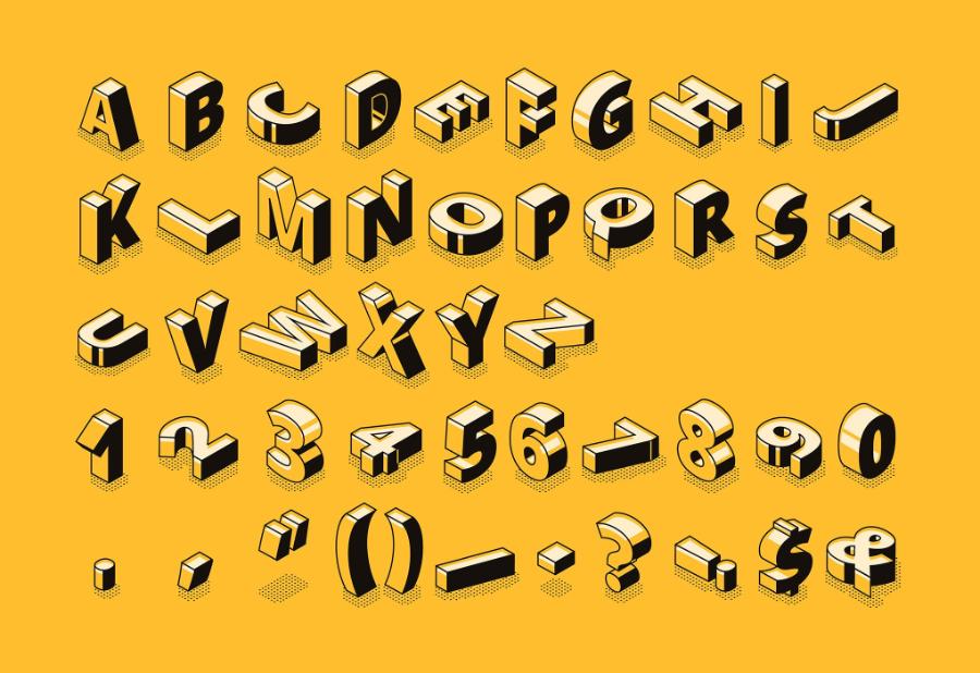
1.2. Too Complex Fonts
When working with type, choosing a font that is too complex can make it difficult for readers to recognize letters, especially when the font size is small. These fonts are often not suitable for long content or informational text that needs to be read quickly.
Choosing fonts that are not appropriate for the intended use, especially overly complex fonts, can negatively impact the ability to convey the message and the reader's experience. Overly elaborate fonts often make it difficult to read and understand, reducing the professionalism and effectiveness of the content. Therefore, it is important to prioritize choosing simple, easy-to-read and context-appropriate fonts to ensure that the message is communicated clearly and effectively!
2. Overuse of Fonts
Using too many fonts in the same design is a big mistake. While it can be exciting to experiment with different fonts, using too many fonts in one design will make the design look cluttered, inconsistent, and difficult to read.
.jpg)
2.1. Principles on Number of Fonts
A basic rule of thumb when it comes to fonts is to stick to two or three fonts in a design. One font for headings, one for body copy, and one for secondary details (like captions or quotes). This keeps the design clean, easy to read, and easy to look at.
Overuse of fonts in design or content presentation can cause confusion and reduce the professionalism of the product. According to basic design principles, the number of fonts used in a document or project should be limited, usually no more than two to three different fonts. A harmonious combination of fonts will help create unity, readability and attract viewers. In addition, it is important to choose fonts that are appropriate to the content and purpose of use, while ensuring balance in size, style and spacing to bring the best message transmission effect!
2.2. Lack of Appropriate Combination of Fonts
Combining fonts that don’t blend well together can be confusing to the eye. Some fonts may not work well together, creating a sense of discord in the overall design. So before using multiple fonts, check that they are compatible aesthetically and readably.
Inconsistency and lack of harmony between fonts can make a layout look confusing, unprofessional and reduce the effectiveness of the message. To achieve balance and appeal, the designer needs to choose a few suitable fonts, ensuring that they complement each other and are appropriate for the purpose of the content.
3. Using Fonts That Are Too Small or Too Large
Font size is an important element in graphic design, directly affecting the readability and appeal of the design. Using fonts that are too small or too large can prevent your message from being properly conveyed.
.jpg)
3.1. Font Too Small
Using fonts that are too small is one of the easiest mistakes to make, especially when designing for print or websites. Reading small text can be difficult for viewers, especially when reading from a distance or on devices with small screens. Make sure your font size is large enough for viewers to easily read without squinting.
3.2. Font is Too Large
While large fonts can be powerful, if used incorrectly they can create imbalance in a design. Fonts that are too large can take up too much space, overpower other elements in the design, and disrupt the overall harmony. It is important to consider and adjust font size to fit the space and purpose.
4. Ignoring Letter Spacing Rules
The spacing between characters (also known as kerning) affects the readability and aesthetics of text. Ignoring this spacing adjustment can result in letters overlapping or being too far apart, making it difficult for the reader to read. However, in some special cases, ignoring these spacing principles can be applied to create a unique visual effect or meet a specific design requirement.
.jpg)
Adjusting letter spacing should be done carefully, based on the design goals and target audience, to maintain a balance between creativity and professionalism. It is important to ensure that the change does not reduce the accessibility and understanding of the content for the reader.
4.1. Kerning Too Thick or Too Thin
When working with type, you need to pay attention to the spacing between characters. If the letters are too close together, the reader will have difficulty distinguishing them. If the characters are too far apart, the reader will have to move their eyes more, slowing down the reading speed. It is important to maintain a reasonable spacing between characters to create balance and readability.
4.2. Leading to the "Overlapping Letters" Effect
One common mistake is not checking kerning when using typefaces. Some fonts may have uneven spacing between letters, resulting in overlapping letters. Make sure you check and adjust letter spacing before finalizing your design.
5. Using Too Many Colors for Text
While color is an important element in design, using too many colors for text can be distracting and detract from the professionalism of the design. It is important to know how to choose colors that are appropriate and do not dilute the message.
5.1. Principles of Using Color for Text
An important rule when working with typography is to use one or two colors for the main text, in conjunction with the background color and other design elements. Using too many colors for text will create chaos and lose the harmony of the design.
5.2. Text Color Not Contrast Enough
To ensure that your text is easily readable, pay attention to the contrast between the text and the background. Text that is too light or too similar to the background will make it difficult to read. Choose a text color that has enough contrast to ensure that your text is clear and easy to read.
6. Lack of Spelling and Grammar Check
Regardless of the type of design, spelling and grammar are important factors in creating a professional product. Misspellings or incorrect grammar can damage the credibility of your design and have a negative impact on your audience.
6.1. Check Spelling Thoroughly
Before finalizing your design, always make sure to double-check your spelling and grammar. A small spelling mistake can detract from the professionalism of your product and make your audience lose confidence in the content you are conveying.
6.2. Use Correct Grammar
In addition to spelling, grammar plays an important role in projecting professionalism. Make sure that the sentences and grammatical structures in your designs are clear, accurate, and easy to understand.
Beautiful Font Warehouse
7. Conclusion
Working with type in design requires not only creativity, but also a keen eye for detail and care to avoid common pitfalls. Choosing the right font, using appropriate size and spacing, and checking spelling and grammar will help you create professional and memorable designs. Remember that type is not only a tool to convey a message, but also an important part of creating a user experience.


VIP Products


Best Selling Products
MidJourney Account
29 USD
Adobe Photoshop Copyright - Full App
120 USD
Copyright Adobe Lightroom Account
59 USD
Upgrade genuine Capture One account
120 USD
Upgrade Genuine Office 365
49 USD
Plugin Retouch4me
69 USD
Genuine Cheap Canva Pro
39 USD
Freepik Premium Account
59 USD
Genuine Adobe Illustrator account
99 USD
Autodesk All App Account Copyright
120 USD
Capcut Pro 1 Year
39 USD
Adobe Premiere Pro Account
99 USD
ChatGPT Plus Account (GPT-4)
16 USD
Upgrade Duolingo Super
29 USD
Windows 10 & 11 Pro Key
36 USD