1. Trends in graphic design combining text and images in the digital age.
Images conveying a textual message have become an indispensable part of modern social media communication. Knowing how to create visually appealing text-based images helps individuals and businesses convey content more effectively, vividly, and resonantly. Instead of relying solely on raw images, the combination of photography and typography creates immense visual power.
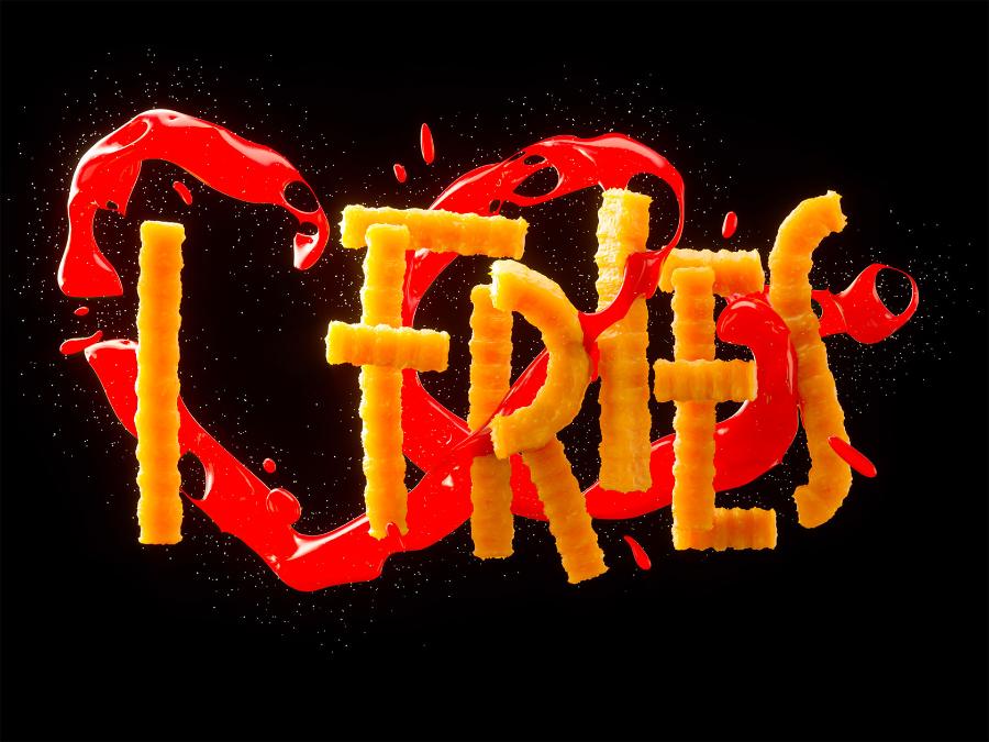
The demand for designing greeting cards, profile pictures, or product advertisements is increasing. Users today no longer want to rely too heavily on expensive specialized software or complex design processes. The emergence of online platforms has made it easy and accessible to all user segments to transform ordinary photos into works of art through creative text.
2. The outstanding advantages of choosing to create beautiful text images online.
The shift from traditional design to online tools offers tangible benefits in terms of both time and final product quality.
2.1. Maximizing time and effort savings
Modern web platforms allow you to complete a design in less than 5 minutes. You simply upload images, choose fonts, and adjust their placement without installing heavy software. This is extremely useful for busy people who still require a polished image.
2.2. A vast resource of artistic fonts
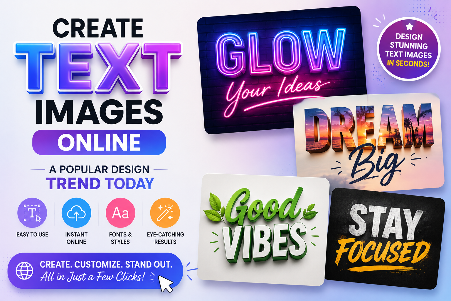
The strength of creating beautiful text images online lies in its diversity. You can access thousands of font sets, from modern minimalist styles to classic calligraphy. Most of these fonts have been optimized to display best on all screen types, ensuring your message always looks sharp and professional.
2.3. Intuitive and easy-to-use interface
These tools are designed with user experience in mind, prioritizing simple drag-and-drop operations. Even if you have no graphic design knowledge, you can still easily adjust the layout, text spacing, and colors for optimal harmony!
3. The basic process for owning an artistic photo with lettering.
A beautiful work of art requires a well-structured development plan to ensure a balance between visual and literary aspects.
3.1. Choosing a high-quality background image
The background image is the "backbone" of your design. Prioritize high-resolution images with ample natural space for text. An image with too much detail will make your text look lost and difficult to read.
3.2. Choosing a font that suits the message
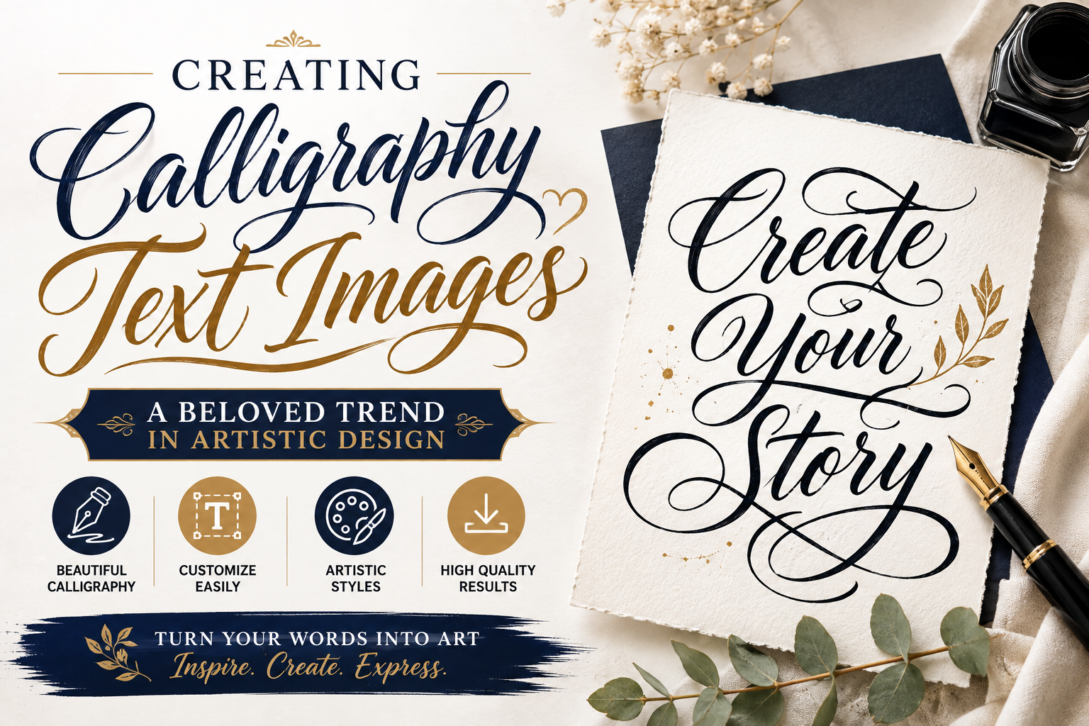
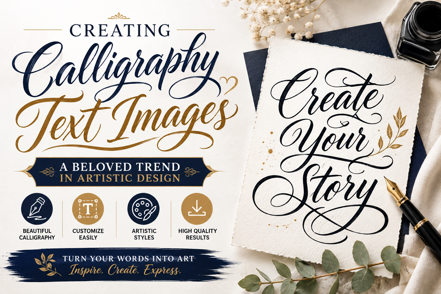
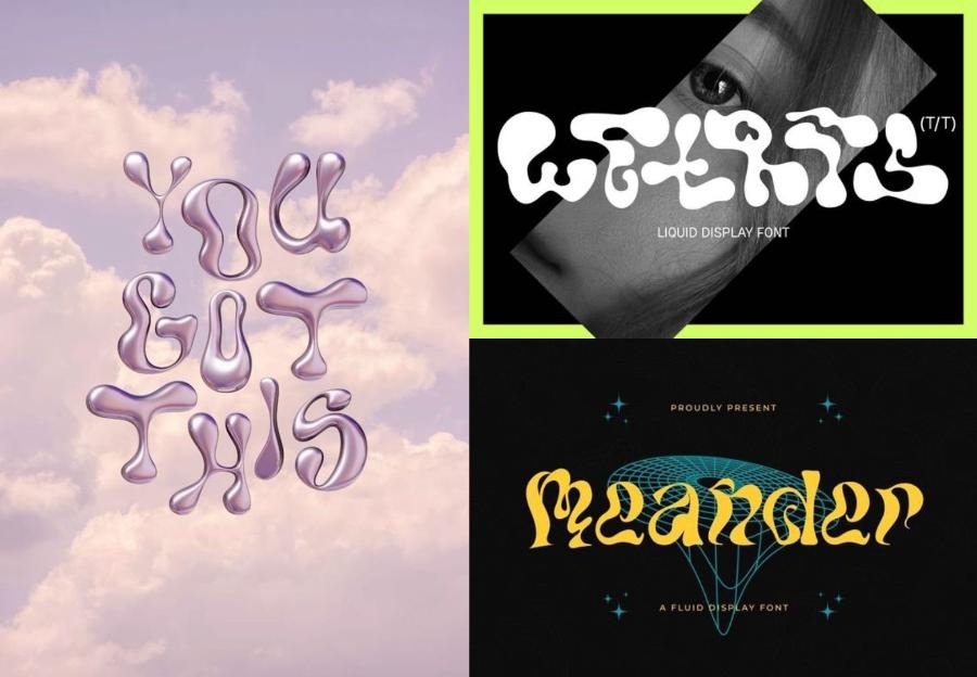
Each font has its own "soul." If you're writing about strength, choose a thick, angular font. Conversely, if it's a quote about love or nature, delicate, flowing strokes will be the best choice for creating beautiful text images.
3.3. Optimizing Color and Contrast
The text color should contrast with the background color to ensure readability. If the background is too bright, use darker text or add a subtle overlay to highlight the text above.
4. The Gold Standards in Typography Design for Images
To make your photos look like they were taken by a professional designer, keep these core rules in mind.
4.1. Visual Hierarchy
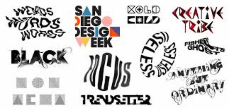
Don't make all the text the same size. Make the main headline large and prominent, while the supporting information should be smaller and use a simple font. This helps guide the viewer's eye to the most important message you want to convey.
4.2. Kerning and Leading (Spacing between characters and lines)
A well-designed image with good lettering usually features ample spacing between the letters. Adjusting this spacing gives your design more "breathing space," creating a much more elegant and sophisticated feel compared to having the letters pressed tightly together.
4.3. Limiting the number of fonts used
A classic mistake beginners make is using too many different fonts in a single image. You should limit yourself to a maximum of 2 to 3 fonts that are similar or contrasting and complement each other to maintain overall consistency.
5. The most popular styles for creating beautiful text images today.
Staying up-to-date with trends helps keep your designs fresh and engaging for the online community.
5.1. Minimalism
Use slender sans-serif fonts against a monochrome background or a blurred landscape image. This style conveys elegance, focusing entirely on the text itself.
5.2. Classic and Vintage Styles
Using serif fonts in combination with vintage, grainy, or film-like effects is a very popular style for nostalgic or artistic photographs.
5.3. Text Masking Style in Images
This technique transforms letters into a frame, and the image is displayed within those letters. This is a way to create incredibly impressive text images, often used for movie posters or magazine covers.
6. Mistakes to avoid when designing text images
Sometimes, it's the small details that ruin all your creative efforts.
6.1. Using too many elaborate effects
Avoid overusing effects like overly bold shadows, thick text borders, or garish gradients. Simplicity often yields better aesthetic results and makes the photo look more modern.
6.2. Spelling and Font Formatting Errors
Always double-check the content before exporting images. Also, make sure the font you choose fully supports Vietnamese characters to avoid font jumping or diacritical marks.
6.3. A cluttered composition obscures the subject of the photo.
The text should not overlap the most important details of the original photo, such as the model's face or the main product. Place the text in the quadrants or according to the rule of thirds to create balance.
7. Elevate your creativity with solutions at appvip.ai
In the search for optimal design tools, access to leading technology platforms is crucial. The website appvip.ai is currently considered a reputable source providing knowledge, reviews, and smart application solutions for tech-savvy users. Here, you can easily find detailed instructions on how to use applications for creating beautiful text images, from basic to advanced levels, helping you master all design tools in a short time. With the support of solutions on this platform, realizing artistic ideas on each frame becomes more professional and faster than ever, contributing to building a sustainable personal and brand image.
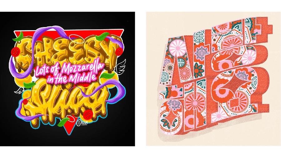
8. Applications of artistic text in business and marketing.
In business, images are not just about aesthetics; they must also create conversion value and brand recognition.
8.1. Designing attractive advertising banners
A well-designed banner ad will help customers grasp the promotion or offer in just a few seconds of glancing at the screen.
8.2. Creating a brand identity on social media
Using a consistent, high-quality typography style for all posts on your Fanpage or Instagram helps customers easily recognize your brand among thousands of other pieces of information.
9. How to choose colors for text according to color psychology.
Colors have the ability to powerfully stimulate the emotions of viewers without the need for words.
9.1. Warm and vibrant colors
Use red, orange, or yellow to create a feeling of excitement, urgency, or youthfulness. These colors are great for text-based images about sports, food, or discounts.
9.2. Professional and reliable colors
Blue, gray, and white often convey a sense of stability and credibility. These are top choices for posts about technology, education, or finance.
10. Conclusion
The art of creating beautiful typography is a perfect combination of technology and personal aesthetic sense. By understanding the rules of fonts, layout, and color, anyone can become a designer of their own story. Tools are merely tools; it is creativity and the message you convey that create lasting value for the image. Hopefully, this article has equipped you with the necessary knowledge to begin your journey of creating the most impressive and professional visual works!