Best Selling Products
Warm and Cool Colors: The Key to Emotional Stimulation in Design
Nội dung
SaDesign is pleased to accompany you on your journey to discover the “language” of colors – specifically warm and cool colors. Understanding these two color groups will help you create design products that are not only beautiful but also convey emotions and messages effectively.
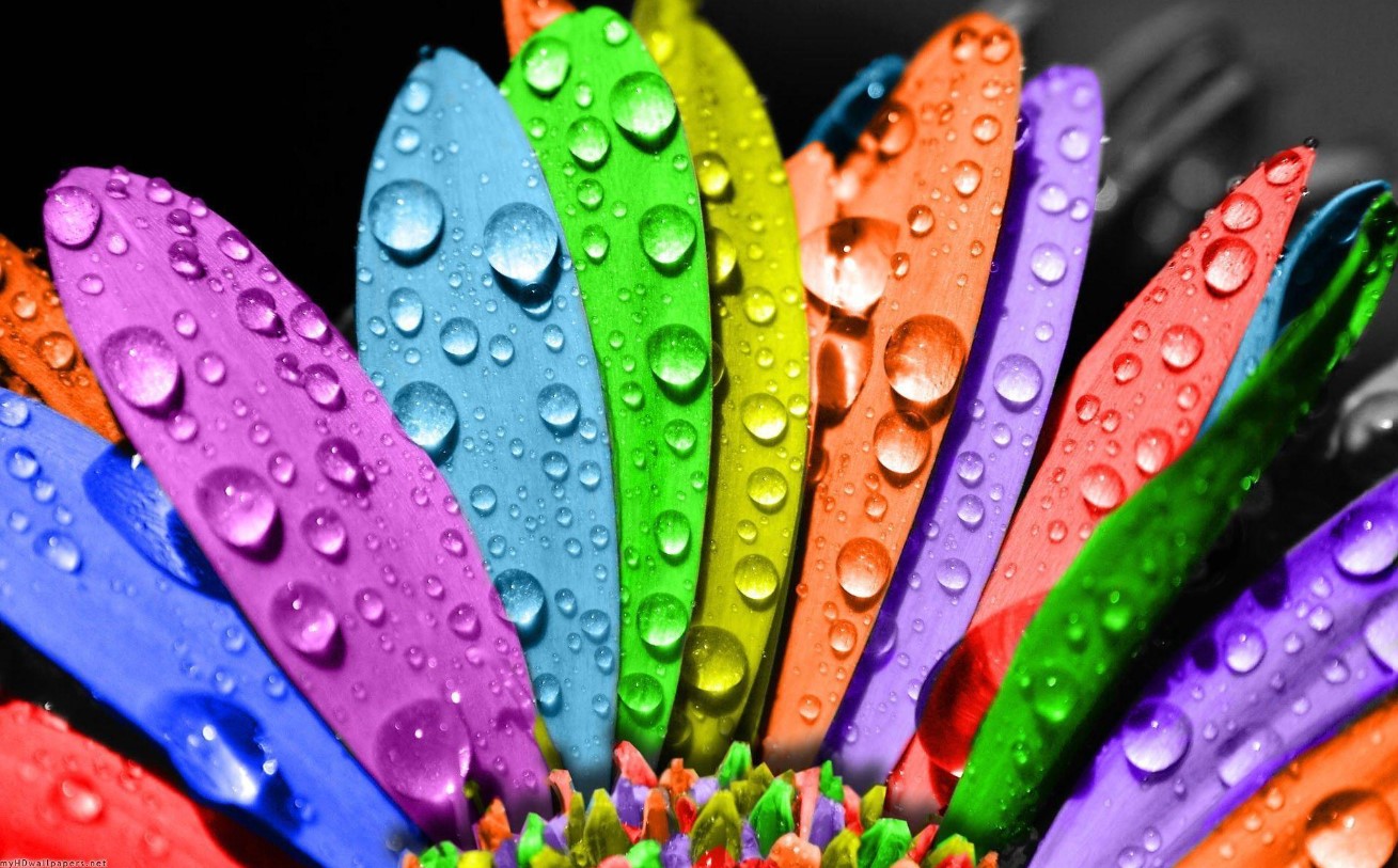
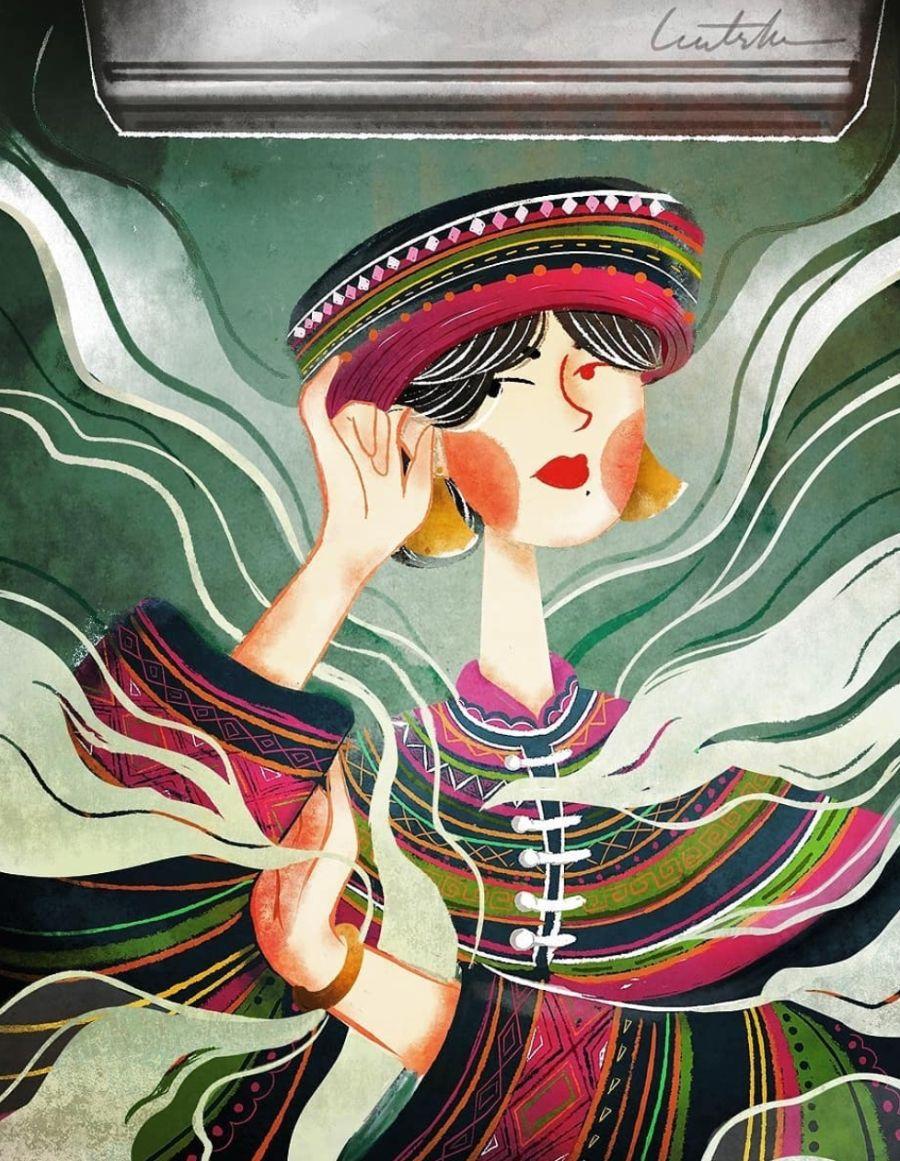
Colors are not just the colors we see every day, but also a subtle means of communication, conveying emotions and deep meanings. Did you know that each color can change mood, stimulate emotions and even influence human behavior? Therefore, choosing the right color in design is one of the important factors to help improve communication effectiveness and attract users.
1. What Are Warm and Cool Season Colors?
1.1. Hot season
Warm colors often bring a feeling of warmth, dynamism and stimulation. These colors often evoke images of sunlight, fire and passionate moments. Typical colors: Red, orange, yellow….
Warm colors are often used to attract attention and create highlights in advertising designs, posters or marketing campaigns aimed at dynamic and energetic young people.
.png)
1.2. Cool Colors
In contrast to warm colors, cool colors are cool, relaxing, and quiet. These colors are associated with water, sky, or nature, and help create a peaceful and professional atmosphere. Typical colors: Blue, green, (and sometimes some shades of purple).
Cool colors are often used to create a trustworthy image, creating a sense of security and comfort for users. They are very suitable for website interface design, office work or interior spaces that require tranquility and balance.
.png)
2. Basic color matching principles in the hot and cold color palette
The reasonable and harmonious combination of hot and cold colors brings beautiful and impressive works. The basic principles for combining hot and cold colors are as follows:
2.1. Principles of implementing achromatic color schemes
In this color scheme, you will use 3 colors black, white, and gray combined together. Only combine these 3 colors and note that you do not use any other color tones.
Analogous color scheme is a color scheme where you choose 3 colors that are adjacent to each other on the color wheel. This is a color scheme that many designers use in their work.
Complementary color scheme is the principle of using the color to the right or left of the complementary color on the color wheel.
.png)
Complementary color scheme is when you apply opposite colors to each other in the same piece of art.
Monochromatic color scheme is where you use one main color to mix similar colors.
Each of the above achromatic color scheme principles has its own distinct characteristics. Therefore, you should study them carefully to apply them effectively in your design.
2.2. Principles of neutral color matching in the warm and cold color palette
This neutral color scheme principle is that you choose one color to be the main color. Then, you will combine this main color with lighter or darker colors.
A partial complementary color scheme is where you use your main color combined with 2 colors on either side of the complementary color.
The basic color scheme is when you choose 3 main colors red, yellow, and blue to combine together. This color scheme is not chosen by many people because it creates few highlights for the space.
.png)
Secondary complementary color scheme is a commonly used color scheme principle based on the warm and cool color palette. You will use the main color to combine with 2 secondary complementary colors.
Tertiary complementary color scheme is when you choose a main color that harmonizes with 2 complementary colors at the tertiary level.
Through this article, we hope that you have gained more useful knowledge about warm and cool colors, as well as understand how to apply them in design projects. Remember, each color has its own "personality" and when used properly, they can turn any idea into a vivid and inspiring reality.


