Best Selling Products

Upgrade Genuine Office 365
49 USD

Upgrade genuine Capture One account
120 USD

Windows 10 & 11 Pro Key
36 USD

Capcut Pro 1 Year
39 USD

Autodesk All App Account Copyright
120 USD

MidJourney Account
29 USD

Freepik Premium Account
59 USD

Adobe Photoshop Copyright - Full App
120 USD

Upgrade Duolingo Super
29 USD

Copyright Adobe Lightroom Account
59 USD

Plugin Retouch4me
69 USD

ChatGPT Plus Account (GPT-4)
16 USD

Genuine Cheap Canva Pro
39 USD

Adobe Premiere Pro Account
99 USD

Genuine Adobe Illustrator account
99 USD
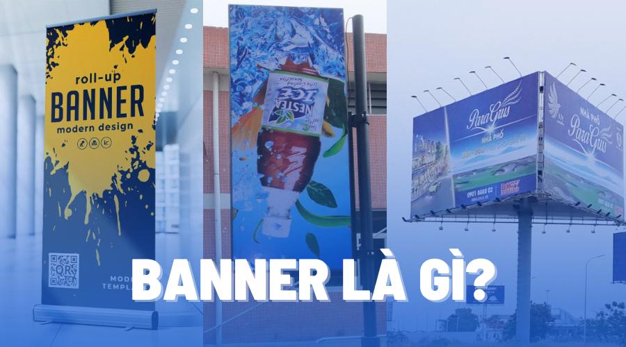
What is a Banner? Tips for Designing Attractive Banners
Nội dung
- 1. What is a Banner?
- 2. Popular Banner Categories
- 2.1. Banner Online
- 2.2. Banner Offline
- 3. The Importance of Banners in Marketing
- 4. Tips for Designing Attractive Banners
- 4.1. Banner Size
- 4.2. Image selection
- 4.3. Color
- 4.4. Reasonable layout
- 4.5. 'Proper' Typography
- 4.6. Negative space - The secret to making a design 'breathe'
- 5. Summary
What is a banner? Discover how to design an attractive banner to optimize advertising effectiveness. Apply creative tricks to make your banner stand out.
Banners play an important role in the advertising field, helping brands reach customers effectively. Designing attractive banners not only increases brand recognition but also promotes high conversion rates. Below, Sadesign provides detailed information about banners and how to optimize the design for maximum effectiveness.
1. What is a Banner?
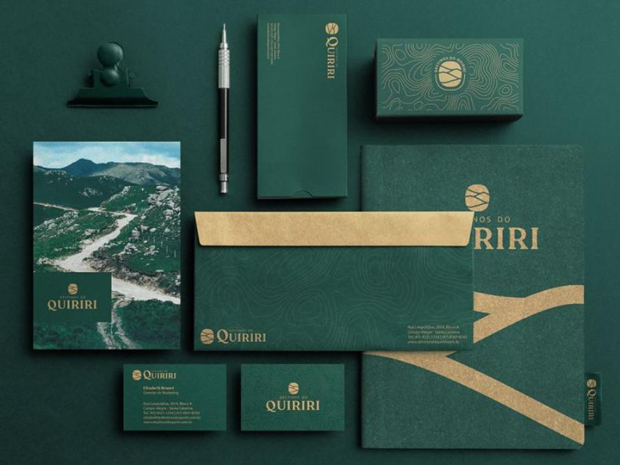
Banners are a form of graphic images used to promote a brand, product or service on online and offline platforms. In the field of marketing, banners help businesses convey messages quickly, effectively and easily attract customers' attention.
.jpg)
Banners can appear in many different forms such as website banners, social media advertising banners, print banners or event banners. Regardless of the format, the main goal of a banner is to make an impression and encourage viewers to take a desired action such as clicking, making a purchase or signing up for a service.
2. Popular Banner Categories
2.1. Banner Online
Banner Website
Website banners appear in various locations, including the header, middle of the content, or footer. This type of banner helps attract users to visit the product or service that the brand wants to promote.
Social Media Advertising Banner
Platforms like Facebook, Instagram, TikTok, and LinkedIn all support banner ads in a variety of sizes. Online banners on social networks often have eye-catching designs, combining images and concise content to optimize reach.
Banner Google Display Network (GDN)
GDN is Google's display advertising system, allowing banners to appear on millions of partner websites. These banners come in many formats such as static, animated or HTML5 images, helping businesses reach their target customers more accurately.
Banner Email Marketing
Email marketing not only uses text content but also combines banner images to increase appeal. Banners in emails can introduce products, promotions or important information, helping to increase conversion rates.
Banner Pop-up & Floating Banner
Pop-up Banner : Appears when users visit a website, helping to convey important messages such as promotions and newsletter subscriptions.
Floating Banner : Moves as the user scrolls, increasing attention without interrupting the experience.
2.2. Banner Offline
Banner Printing
This type of banner is widely used at events, fairs, shopping malls or point of sale promotional campaigns. Popular types of printed banners include:
Standee : Vertical banner, easy to move, suitable for events and seminars.
Backdrop : Large banner, often used as background for event stages.
Poster : Small banner, easy to stick or hang in many locations.
Outdoor Advertising Banners (Billboard, Pano, LED Banner)
These types of banners appear on streets, downtown areas or busy traffic routes. They are large in size and designed to stand out to attract the attention of passersby.
Billboard : Large static billboard, usually placed at intersections or crowded areas.
Pano : Similar to billboard but usually mounted on the facade of a building.
LED Banner : Using electronic screen, can display dynamic content, easy to update.
Point of Sale Banner (POSM Banner)
POSM (Point of Sale Materials) is an advertising item displayed at the point of sale, helping to attract customers directly. POSM banners can be placed on shelves, doors or payment areas to enhance brand recognition.
3. The Importance of Banners in Marketing
Banners play an important role in modern marketing strategies, helping businesses reach their target customers effectively. A well-designed banner not only conveys a message but also contributes to enhancing brand recognition and increasing conversion rates.
.jpg)
Increase Brand Awareness
Banners help businesses affirm their brand image through colors, logos, and slogans.
Uniform design helps brands easily leave an impression in customers' minds.
Optimize Advertising Costs
Compared to other forms of advertising, banners are low cost but highly effective.
Online banners can run ads with flexible budgets, helping businesses optimize costs.
Increase Conversion Rate
Attractive banners can attract potential customers and motivate them to take action.
Banners with clear content and attractive images help improve marketing campaign performance.
Reach the Right Target Audience
Online banners allow businesses to target precisely by age, interests, and behavior.
Printed banners can be placed in strategic locations to reach potential customers.
4. Tips for Designing Attractive Banners
Banner design plays an important role in brand promotion strategy, helping to attract customers' attention and convey messages effectively. Applying standard design techniques in size, image, color and layout will help banners become more professional and attractive.
4.1. Banner Size
Banner size directly affects display effectiveness and customer reach. Choosing the right size helps optimize user experience and avoid display errors on different platforms.
Website banners: Popular sizes include 728x90px (Leaderboard), 300x250px (Medium Rectangle), 160x600px (Wide Skyscraper), 970x250px (Billboard).
Social media banners: Facebook, Instagram, Twitter have their own standards. For example, Facebook Ads are 1200x628px, Instagram Stories are 1080x1920px.
Printed advertising banners: If used for printing, ensure a minimum resolution of 300 DPI for clear images.
Choosing the right size helps the image display fully, sharply and professionally, contributing to improving the effectiveness of brand promotion.
4.2. Image selection
Images are the deciding factor in the appeal of a banner. A banner with high-quality images that match the message will easily make a strong impression on customers.
.jpg)
Image quality: Always use high resolution images to avoid blurring and image breakage when displayed on large screen devices.
Images relevant to content: Images need to accurately reflect the product, service or message conveyed to avoid misunderstandings.
Avoid overly complex images: A simple, focused image is easier to look at than one that is too confusing or contains too many details.
Use copyrighted images: Avoid using copyrighted images, prioritize using self-designed images or purchasing from reputable photo galleries.
Choosing the right image helps the banner become eye-catching, professional and attract customers at first sight.
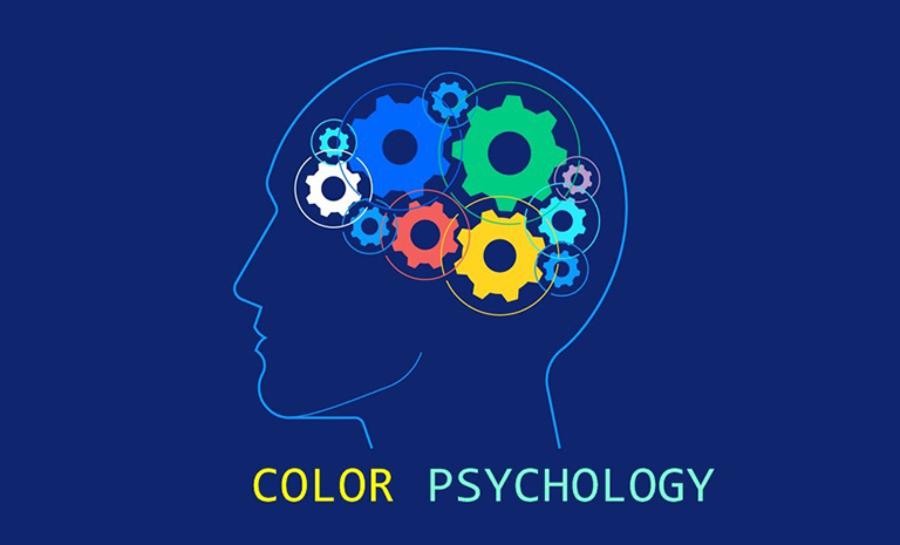
4.3. Color
Color plays an important role in creating emotions and conveying the message of the banner. A suitable color scheme helps the banner stand out and look more professional.
Choose colors according to brand: Colors need to be consistent with brand identity to create connection with customers.
Create reasonable contrast: Contrast between background color and text makes content easier to read and attracts attention.
Don't use too many colors: A banner should only have 2-3 main colors to avoid confusion.
Apply color psychology: Each color can evoke a different emotion, for example: blue creates a sense of trust, red stimulates enthusiasm, yellow brings joy.
Smart color combinations will help the banner have a stronger appeal, while subtly expressing the brand message.
4.4. Reasonable layout
Layout determines how information is presented on the banner, affecting the viewer experience. A clear, easy-to-read layout will help convey the message more effectively.
.jpg)
Organize information in order of importance: Place the title, image, and key message in the most visible position.
Balance between images and text: Don't let too much text obscure the image or vice versa.
Use white space wisely: Make content look airy, easy to read, and not confusing.
Choose an easy-to-read font: Use simple, clear fonts and avoid overly complex fonts that reduce the ability to receive information.
A reasonable layout makes the banner intuitive, attractive and immediately attracts customers' attention.
4.5. 'Proper' Typography
Typography is a decisive factor in the professionalism of a banner. Choosing the right font helps create emphasis and makes the message easily accessible to viewers. Important principles when using typography include:
Choose the Right Font
Use fonts that are clear, easy to read, and consistent with your brand message. Avoid using too many fonts in one design as this can be confusing. Ideally, stick to two to three fonts that work well together.
Proportional Font Size
The font size should be adjusted to ensure that the main content stands out and is easy to read even from a distance. For banner ads, the title is usually larger than the content to attract attention.
Color and Contrast
Using the right colors helps to highlight the typography on the banner. High contrast between the text and the background makes the message clearer. If the background is light, the text should be dark and vice versa.
Line Spacing
Make sure the line spacing is appropriate to make the banner easy to read and not confusing. Line spacing that is too narrow will make the content appear compressed, while line spacing that is too wide can reduce the connection between information.
4.6. Negative space - The secret to making a design 'breathe'
Negative space is an important element that makes the banner look clean and professional. Optimizing negative space helps increase focus on the main content and improves the visual experience.
Keep White Space Reasonable
White space helps balance the design, creating a comfortable feeling when looking at it. Do not cram too much content into a small space because it will lose the harmony of the layout.
Create Highlights with Empty Space
Negative space helps highlight key elements on a banner. If a design has too many details, it will be difficult for viewers to focus on important information.
Arrange the Components Reasonably
Arranging logos, images, text, and other graphic elements in a logical layout makes the most of space without feeling cramped.
Balance Between Content and Images
Images should not take up so much space that they overshadow the main content. Make sure there is a balance between images and text so that the banner conveys its message most effectively.
5. Summary
Banners are a powerful advertising tool that helps businesses reach customers effectively. Designing attractive banners requires creativity and adherence to important principles to ensure maximum effectiveness. Apply the above tips immediately to own the most impressive and professional banner designs.


VIP Products


Best Selling Products
Upgrade Genuine Office 365
49 USD
Upgrade genuine Capture One account
120 USD
Windows 10 & 11 Pro Key
36 USD
Capcut Pro 1 Year
39 USD
Autodesk All App Account Copyright
120 USD
MidJourney Account
29 USD
Freepik Premium Account
59 USD
Adobe Photoshop Copyright - Full App
120 USD
Upgrade Duolingo Super
29 USD
Copyright Adobe Lightroom Account
59 USD
Plugin Retouch4me
69 USD
ChatGPT Plus Account (GPT-4)
16 USD
Genuine Cheap Canva Pro
39 USD
Adobe Premiere Pro Account
99 USD
Genuine Adobe Illustrator account
99 USD