Best Selling Products

Genuine Adobe Illustrator account
99 USD

Freepik Premium Account
59 USD

Autodesk All App Account Copyright
120 USD

Copyright Adobe Lightroom Account
59 USD

Upgrade Genuine Office 365
49 USD

Plugin Retouch4me
69 USD

Genuine Cheap Canva Pro
39 USD

ChatGPT Plus Account (GPT-4)
16 USD

Windows 10 & 11 Pro Key
36 USD

Upgrade genuine Capture One account
120 USD

MidJourney Account
29 USD

Adobe Premiere Pro Account
99 USD

Capcut Pro 1 Year
39 USD

Adobe Photoshop Copyright - Full App
120 USD

Upgrade Duolingo Super
29 USD
12 basic colors that Designers need to master before studying in depth
Nội dung
- 1. The Importance of Color Theory for Designers
- 2. Introducing the Color Wheel
- 3. Explore the 12 Basic Colors and Their Meanings in Detail
- 3.1. Red
- 3.2. Yellow
- 3.3. Blue
- 3.4. Orange
- 3.5. Green
- 3.6. Violet
- 3.7. Red-Orange
- 3.8. Yellow-Orange
- 3.9. Yellow-Green
- 3.10. Blue-Green
- 3.11. Blue-Violet
- 3.12. Red-Violet
- 4. Basic Properties of Color
- 5. Basic Color Systems In Design
- 6. Apply Color Knowledge Before Learning In-depth Machine Drawing
- 7. Practice and Application of Color in Basic Mechanical Drawing
- 8. Tools to Support Color Selection and Management in Computer Drawing
- 9. Conclusion
Discover the 12 basic colors that every Designer needs to understand to build a solid foundation before embarking on a journey of in-depth learning and creative development.
Before diving into the complex world of digital drawing software and advanced design techniques, a solid foundation in color theory is essential for any Designer. Color is not just an aesthetic element but also a powerful tool for conveying messages, creating emotions and building brand identity. Mastering the 12 basic colors and understanding their relationships, meanings and how they interact with each other will help you be more confident when using digital tools and creating professional, effective designs. This article will explore the 12 basic colors that every Designer needs to equip themselves with before embarking on an advanced digital drawing journey.
1. The Importance of Color Theory for Designers
Before exploring each specific color, let's take a look at the importance of color theory in the field of design:
Conveying messages and meanings: Each color has a symbolic meaning and evokes different emotions. Understanding this helps the Designer choose the right color to convey the desired message to the viewer. For example, red often evokes passion and energy, while blue brings a sense of trust and peace.
Creating Harmony and Balance: Color theory provides color matching principles that help designers create harmonious, pleasing, and visually appealing color palettes. Understanding the color wheel and the rules of color matching (complementary, contrasting, adjacent, etc.) is the foundation for creating balanced, professional designs.
Building Brand Identity: Color plays a key role in building and reinforcing brand identity. Choosing a primary color that matches your brand’s personality and values helps create consistency and memorability in the minds of your customers.
Guide the viewer and create emphasis: Color can be used strategically to guide the viewer's eye, create important points, and hierarchy information in a design.
Optimizing User Experience (UX): In user interface design, choosing the right colors can improve the user's readability, navigation, and interaction with the product.
Foundation for advanced digital drawing: When working with digital drawing software, Designers will have to manipulate countless tools and color options. Mastering color theory helps you understand color systems (RGB, CMYK, HSB...), how to adjust color parameters and apply them effectively in the design process.
(2).jpg)
In short, color theory is not only an aesthetic aspect but also a strategic element, directly affecting the communication effectiveness and success of a design.
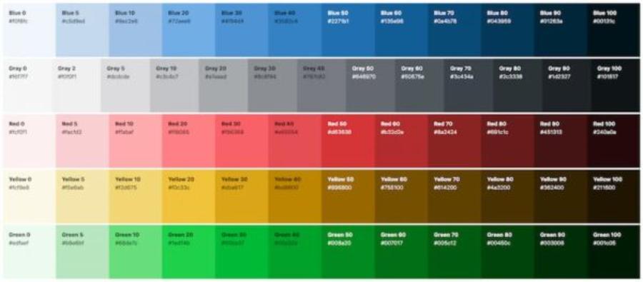
2. Introducing the Color Wheel
The color wheel is an important visual tool for understanding the relationships between colors. It typically consists of 12 basic colors arranged in a circle based on their hue relationships. These 12 colors are divided into three main groups:
Primary Colors: Red, Yellow, Blue. These are the three original colors that cannot be created by mixing other colors. They are the foundation of all other colors.
Secondary Colors: Orange, Green, Violet. These are three colors created by mixing two primary colors in equal proportions.
Red + Yellow = Orange
Yellow + Blue = Green
Blue + Red = Purple
Tertiary Colors: Red-Orange, Yellow-Orange, Yellow-Green, Blue-Green, Blue-Violet, Red-Violet. These are the six colors created by mixing a primary color with an adjacent secondary color.
Understanding where colors are on the color wheel and how they relate to each other is the first step to mastering color theory.
3. Explore the 12 Basic Colors and Their Meanings in Detail
Now, let's dive into each of the 12 primary colors and the meanings commonly assigned to them in design:
3.1. Red
Position on the color wheel: Primary colors.
Common meanings: Passion, energy, urgency, action, strength, love, danger, attention.
Applications in design: Often used to create highlights, calls to action (CTA), to express strength, dynamism or in areas related to food (stimulating taste buds), sports, and warnings.
3.2. Yellow
Position on the color wheel: Primary colors.
Common meanings: Happiness, optimism, brightness, energy, wisdom, attention, warning (combined with black).
Applications in design: Often used to create a sense of fun, optimism, attract attention (but need to be moderate to avoid being dazzling), in areas related to children, food, and important announcements.
3.3. Blue
.jpg)
Position on the color wheel: Primary colors.
Common meanings: Trust, stability, professionalism, peace, honesty, confidence, coldness (depending on shade).
Applications in design: Very popular in corporate design, finance, technology, healthcare, and other fields that need to create a sense of trust and professionalism.
3.4. Orange
Position on the color wheel: Secondary color (red + yellow).
Common meanings: Energy, enthusiasm, warmth, creativity, friendliness, youthfulness.
Applications in design: Often used to create a sense of dynamism, fun, friendliness, in areas related to children, food, and events.
3.5. Green
Position on the color wheel: Secondary color (yellow + blue).
Common meanings: Nature, freshness, growth, health, peace, sustainability, money.
Applications in design: Popular in fields related to the environment, health, organic food, finance (symbolizing growth).
3.6. Violet
Position on the color wheel: Secondary color (blue + red).
Common meanings: Luxury, nobility, creativity, mystery, spirituality, uniqueness.
Applications in design: Often used in fields related to art, high fashion, cosmetics, and unique, creative products.
3.7. Red-Orange
Position on the color wheel: Tertiary color (red + orange).
Common meanings: Energy, enthusiasm, determination, warmth, excitement.
Application in design: Combining the strength of red and the friendliness of orange, often used to create attention and a sense of dynamism.
3.8. Yellow-Orange
Position on the color wheel: Tertiary (yellow + orange).
Common meanings: Joy, optimism, energy, warmth, friendliness.
Application in design: Similar to orange but with a brighter and more youthful shade.
3.9. Yellow-Green
Position on the color wheel: Tertiary color (yellow + green).
Common meanings: Freshness, vitality, youthfulness, optimism, harmony.
Application in design: Often used in fields related to nature, health and fresh products.
3.10. Blue-Green
Position on the color wheel: Tertiary color (blue + green).
Common meanings: Peace, relaxation, trust, nature, balance.
Application in design: Often used in fields related to tourism, spa, health and relaxation products.
3.11. Blue-Violet
Position on the color wheel: Tertiary (blue + purple).
Common meanings: Creativity, intelligence, uniqueness, mystery, luxury.
Design Applications: Combining the reliability of blue and the uniqueness of purple, it is often used in fields related to art, technology and creative products.
3.12. Red-Violet
.jpg)
Position on the color wheel: Tertiary color (red + purple).
Common meanings: Passion, creativity, uniqueness, charm, femininity (depending on shade).
Application in design: Combining the strength of red and the elegance of purple, often used in fields related to fashion, cosmetics and art.
4. Basic Properties of Color
In addition to understanding the meaning of each color, Designers also need to master three basic properties of color:
Hue: This is the name of the color (e.g. red, yellow, blue). It determines the color's position on the color wheel.
Saturation: This is the purity or lightness of a color. A highly saturated color will be vibrant and vivid, while a less saturated color will be duller, closer to gray.
Brightness: This is the lightness or darkness of a color. Adding white to a color increases the brightness (creating a tint), adding black decreases the brightness (creating a shade), and adding gray changes the tone.
Understanding these three properties helps Designers to flexibly adjust colors and create color variations that match the design intent.
5. Basic Color Systems In Design
When working with computer drawing software, Designers will often come into contact with different color systems:
RGB (Red, Green, Blue): This is a light-based color system, commonly used for on-screen display designs (web, mobile apps...). Colors are created by combining three colors red, green and blue at different intensities.
CMYK (Cyan, Magenta, Yellow, Key/Black): This is an ink-based color system, commonly used for printed designs. Colors are created by combining four colors: cyan, magenta, yellow, and black.
HSB/HSV (Hue, Saturation, Brightness/Value): This is a more intuitive color system, based on three attributes of hue, saturation and brightness. It helps Designers easily select and adjust colors based on their senses.
Understanding the differences between these color systems and knowing when to use which is an important skill for Designers working with digital painting.
6. Apply Color Knowledge Before Learning In-depth Machine Drawing
Mastering the 12 basic colors and the principles of color mixing will bring many benefits when you start learning advanced digital painting:
Choose colors with more confidence: You will no longer feel confused by the myriad of color options in the software, but can make choices based on knowledge and design intent.
Adjust color more effectively: You will understand color parameters (Hue, Saturation, Brightness) and know how to adjust them to achieve the desired effect.
Create harmonious and professional color palettes: You will have the foundation to apply color matching rules and create aesthetically pleasing and project-appropriate color palettes.
Convey color messages proactively: You will be able to use color as a powerful communication tool, conveying meaning and creating emotions in your audience.
Save time and improve productivity: Instead of randomly testing colors, you'll be able to make color decisions faster and more accurately.
7. Practice and Application of Color in Basic Mechanical Drawing
Before diving into complex digital painting techniques, let's start by practicing basic color applications in a digital environment:
.jpg)
Get familiar with the Color Palette: Most digital art software provides a color palette with a variety of options. Take some time to explore and familiarize yourself with how to select colors from a digital color wheel, enter color codes (Hex code, RGB, CMYK), and save frequently used colors.
Basic color matching practice:
Monochromatic: Create designs using only one primary color with variations in brightness and saturation. This exercise helps you understand shades and tones.
Analogous Colors: Use colors that are next to each other on the color wheel. Practice creating gradients or harmonious color blocks.
Complementary Colors: Use pairs of colors that are opposite each other on the color wheel to create strong contrast. Experiment with using one color as the dominant color and the other as an accent color.
Triadic Colors: Choose three colors that sit at the three corners of an equilateral triangle on the color wheel. Practice balancing these three colors in your designs.
Create color gradients: A gradient is a smooth transition between two or more colors. Practice creating linear and radial gradients to add depth and softness to design elements.
Using color in basic shapes: Draw circles, squares, triangles and fill them with different colors. Observe how color affects the perception of the shape. Experiment with using color to create simple 3D effects.
Practice creating shadows and highlights: Use lighter and darker variations of a color to create shadow and highlight effects, giving depth and shape to drawn objects.
Copy color palettes from your favorite works: Pick a design or painting that you love and try to recreate its color palette using computer-aided design software. Analyze why the colors work well together.
8. Tools to Support Color Selection and Management in Computer Drawing
As you progress further in digital painting, you'll discover many useful tools that help you select and manage colors effectively:
Color Picker: This is a basic tool that allows you to select colors directly from the screen or from a digital color wheel.
Color Palette Libraries: Many software offers pre-made color palette libraries in different themes or styles. You can use these as a starting point or for inspiration.
Color Harmony Tools: These tools help you create harmonious color palettes based on color matching rules (complementary, analogous, triadic, etc.). Some software has this built-in or there are online websites that provide this functionality (e.g. Adobe Color, Coolors).
Swatches: This feature allows you to store and manage colors that are frequently used in a project. Creating and using swatches helps ensure color consistency throughout your design.
9. Conclusion
Mastering the 12 basic colors and the principles of color theory is an extremely important preparation step before any Designer embarks on the journey of learning in-depth digital drawing. This is not only basic knowledge but also a powerful tool to help you create effective, professional and personal designs. Take the time to learn, explore and practice with colors to build a solid foundation for development in this creative design field.


VIP Products


Best Selling Products
Genuine Adobe Illustrator account
99 USD
Freepik Premium Account
59 USD
Autodesk All App Account Copyright
120 USD
Copyright Adobe Lightroom Account
59 USD
Upgrade Genuine Office 365
49 USD
Plugin Retouch4me
69 USD
Genuine Cheap Canva Pro
39 USD
ChatGPT Plus Account (GPT-4)
16 USD
Windows 10 & 11 Pro Key
36 USD
Upgrade genuine Capture One account
120 USD
MidJourney Account
29 USD
Adobe Premiere Pro Account
99 USD
Capcut Pro 1 Year
39 USD
Adobe Photoshop Copyright - Full App
120 USD
Upgrade Duolingo Super
29 USD