Best Selling Products

Adobe Premiere Pro Account
99 USD

Copyright Adobe Lightroom Account
59 USD

Upgrade Duolingo Super
29 USD

MidJourney Account
29 USD

Upgrade genuine Capture One account
120 USD

Genuine Adobe Illustrator account
99 USD

Capcut Pro 1 Year
39 USD

Genuine Cheap Canva Pro
39 USD

Upgrade Genuine Office 365
49 USD

Plugin Retouch4me
69 USD

Autodesk All App Account Copyright
120 USD

Windows 10 & 11 Pro Key
36 USD

Adobe Photoshop Copyright - Full App
120 USD

ChatGPT Plus Account (GPT-4)
16 USD

Freepik Premium Account
59 USD
Impressive Business Card Design: Things You Can't Ignore
Nội dung
- 1. Defining Goals and Target Audience: The Foundation of Effective Design
- 2. Layout and Information Arrangement: The "Less is More" Principle
- 3. Color: The Non-Verbal Language of Branding
- 4. Typography: The Art of Conveying Messages Through Writing
- 5. Images and Logos: Strong Visual Accents
- 6. Paper Material: A Sense of Professionalism and Quality
- 7. Special Printing and Finishing Techniques: Creating a Distinctive Mark
- 8. Size and Shape: Don't Be Afraid to Be Unconventional While Still Ensuring Usability
- 8. Size and Shape (Continued): Don't Be Afraid to Be Unconventional While Still Ensuring Usability
- 9. Consistency With Brand Identity: Building a Professional Image
- 10. Updated and Accurate Content: Demonstrates Professionalism
- 11. High Quality Printing: Invest in a Lasting Impression
- 12. Reasonable Printing Quantity: Balancing Needs and Costs
- 13. Conclusion
An impressive business card design is an important factor in creating a professional impression. Don't ignore the notes on color, layout and information to achieve optimal efficiency.
Designing a "cool" business card is not simply choosing a few eye-catching colors and printing information on it. It requires careful consideration of many factors, from layout, color, font, paper material, to special printing techniques. If you are planning to own a unique and effective business card, do not ignore the important notes that we will share in detail below. In this article, sadesign will go into detail about each aspect of the design process, helping you have a business card that is not only beautiful but also professional and brings real value to your business.
1. Defining Goals and Target Audience: The Foundation of Effective Design
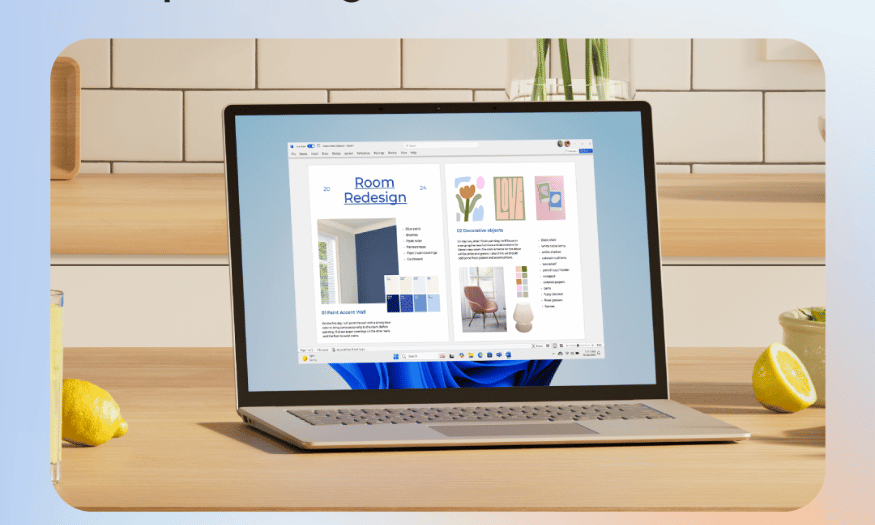
Before you put pen to paper to sketch out any ideas, it is important to understand clearly what the business card is for and who it is aimed at.
.jpg)
What is the purpose of using a business card? Do you want it to simply be a means of exchanging contact information, or do you want it to convey a message about your brand, product/service? Do you want it to appear creative, professional, or friendly? Clearly defining your purpose will help you orient the overall design style.
Who is your target audience? What are their industries? What are their ages, interests, and cultures? A business card for a high-end business partner will be completely different from a business card for a younger client in the creative industry. Knowing your target audience will help you choose the right colors, fonts, images, and materials to connect and resonate with them.
For example, if you work in finance, a minimalist design with neutral colors and a formal font can convey professionalism and trustworthiness. Conversely, if you work in the arts, a business card with bright colors, unique images or unique materials can convey creativity and personality.
2. Layout and Information Arrangement: The "Less is More" Principle
In business card design, the principle of "less is more" often brings high efficiency. A clear, coherent and uncluttered layout will help the recipient easily grasp important information.
Basic information required:
Full name: Place in a visible location, usually center or upper left corner.
Title/Position: Be short, concise, and clearly represent your role within the company.
Company Name/Brand: The company logo should be prominently displayed but not overshadow other information.
Contact information: Phone number, email, website (if available).
Address (optional): If your office address is important to your business.
Social media information (optional): Your official social media channels (LinkedIn, Facebook, Instagram...).
Arrangement principles:
Create information hierarchy: Use different font sizes, fonts, and colors to highlight the most important information.
Ensure negative space: Don’t cram too much information. Negative space helps the reader’s eyes rest and allows design elements to stand out.
Consistency: Ensure consistency in the presentation of information on both the front and back of the business card (if applicable).
Follow the F or Z rule: The human eye tends to read in an F or Z pattern. Use this rule to organize information in a logical and appealing way.
3. Color: The Non-Verbal Language of Branding
Colors have the ability to strongly influence human emotions and perceptions. Choosing the right color palette for your business card not only creates aesthetics but also contributes to conveying the message and personality of the brand.
.jpg)
Understanding the meaning of colors: Each color has its own symbolic meaning. For example:
Red: Energy, passion, attention, urgency.
Blue: Trustworthy, professional, stable, peaceful.
Yellow: Bright, optimistic, creative, dynamic.
Green: Nature, growth, health, freshness.
Black: Luxurious, powerful, mysterious, sophisticated.
White: Pure, simple, clean, modern.
Link to brand: The main color on the business card should be consistent with the brand identity (logo, website, other marketing publications) to create consistency and increase recognition.
Use a harmonious color palette: Choose a color palette of 2-3 colors that work well together. You can use online color palette generators to find beautiful combinations.
Printing Considerations: The colors you see on your screen may differ from the colors you print. Use CMYK (Cyan, Magenta, Yellow, Key/Black) for print designs to ensure accurate color representation.
4. Typography: The Art of Conveying Messages Through Writing
Fonts are not just a tool for displaying text, but also an important element in creating style and conveying a brand's message.
Legibility: This is the most important factor. Choose fonts that are clear and easy to read, especially for important communications. Avoid fonts that are too fancy, stylized, or too small.
Brand Match: Fonts should reflect the brand’s personality and values. A traditional brand might do well with a serif font, while a modern brand might choose a sans-serif font.
Number of fonts: Limit the use of too many fonts on a business card (ideally no more than 2-3 fonts). Using too many fonts can create a confusing and unprofessional feeling.
Size and line spacing: Adjust the font size and line spacing to ensure aesthetics and readability.
Contrast: Create contrast between typographic elements (e.g., bold for names, lowercase for titles) to create emphasis and hierarchy.
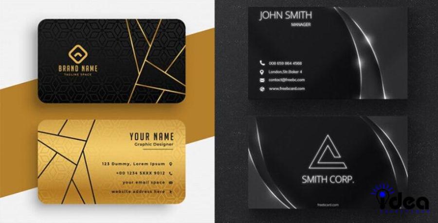
5. Images and Logos: Strong Visual Accents
Using an image or logo on your business card can help increase brand recognition and create a strong visual impact. However, care must be taken to avoid cluttering the layout or detracting from professionalism.
.jpg)
Logo is a must: Your company logo is often an essential element on your business card. Make sure it is clear, sharp, and of the right size.
Images (optional): The use of images should be considered based on your industry and brand style. If you are a photographer, graphic designer, or work in a visual field, a high-quality photo can be a unique highlight. However, make sure the image is high resolution and fits the overall design.
Aesthetics and Relevance: Images or graphics used should be aesthetically pleasing and relevant to your brand or industry. Avoid using low-quality, irrelevant, or overly colorful images.
Position and size: Place the image or logo in a balanced position and appropriately sized, without overshadowing other important information.
6. Paper Material: A Sense of Professionalism and Quality
Paper quality not only affects the durability of your business card, but also impacts the perception of your professionalism and quality.
Thickness (gsm - grams per square meter): Thicker paper often feels more sturdy and premium. Paper with a weight of 250gsm or more is often preferred for business cards.
Paper Type: There are different types of paper with different surfaces and textures:
Couche paper: Smooth surface, beautiful printing, bright colors.
Bristol paper: Slightly glossy surface, thick, sturdy.
Conqueror Paper: The surface has a light grain, creating a luxurious and professional feel.
Kraft Paper: Natural brown color, vintage style and environmentally friendly.
Art paper: Diverse in color, grain and special effects, creating uniqueness and impression.
Finishing: Surface coatings can increase durability, aesthetics and create special effects:
Gloss lamination: Creates a glossy surface, bright colors, waterproof.
Matte lamination: Creates a smooth, luxurious, fingerprint-resistant surface.
UV coating: Creates local or total gloss, highlighting certain details.
Consider the cost: Premium paper and special finishing techniques often come at a higher cost. Consider your budget to choose the right material while still ensuring quality and aesthetic effect.
7. Special Printing and Finishing Techniques: Creating a Distinctive Mark
In addition to the basic elements, using special printing and finishing techniques can make your business card more unique and impressive.
Foil stamping: Using heat and pressure to press a thin layer of metal (gold, silver, copper...) onto the paper surface, creating a sparkling and luxurious effect for logos, names or important details.
Embossing and debossing: Create a 3D effect on logos or text, giving a unique tactile feel.
Laser cutting: Allows the creation of unique, complex shapes or sophisticated designs on business cards.
Raised UV printing: Creates glossy and raised effects for some details on the surface of the business card.
Rounded corners: Create a soft and modern feel to the business card, while reducing the risk of broken corners.
Choosing the printing and finishing technique should be based on your brand style, budget and communication goals.
8. Size and Shape: Don't Be Afraid to Be Unconventional While Still Ensuring Usability
The standard size of a business card is usually 90mm x 55mm or 85mm x 50mm, which fits most card holders. However, you can experiment with different sizes or shapes to create uniqueness.
.jpg)
Standard size: Ensures convenience for the recipient when storing business cards.
Unique shape: Round business card
continues the article "If You Want to Design an Impressive Business Card, Don't Ignore These Notes!":
8. Size and Shape (Continued): Don't Be Afraid to Be Unconventional While Still Ensuring Usability
Unique shapes: Round, square, rectangular business cards with rounded corners, or even shapes related to your industry (e.g. a camera for a photographer, a gear for a mechanical engineer) can make a strong and memorable impression.
Consider practicality: No matter how quirky, make sure your business card can still fit easily in a regular wallet or card holder. Anything too oddly shaped or too large can be awkward for the recipient and make them less likely to keep it.
Non-standard sizes: If you choose a non-standard size, consider the printing and processing costs, as they can be higher than standard sizes.
9. Consistency With Brand Identity: Building a Professional Image
Your business card should not be a standalone entity but rather a unified part of your overall brand identity.
Main color: Use your brand's main color consistently on your business card.
Font: Apply the brand's primary and secondary fonts (if any).
Logo and slogan: Make sure the logo is clearly displayed and the slogan (if any) is placed in the appropriate position.
Design style: Maintain the overall design style of the brand (minimalist, modern, classic, creative...).
Consistency in brand identity increases recognition, reinforces professional image and creates trust with customers and partners.
10. Updated and Accurate Content: Demonstrates Professionalism
A beautiful business card will be worthless if the information on it is inaccurate or outdated.
Double check: Before printing, carefully check every detail of information: name, title, phone number, email, website, address... Make sure there are no spelling mistakes or errors.
Update Regularly: If there are any changes in contact information or job title, update and reprint new business cards immediately. Handing out a business card with outdated information can give a bad impression of professionalism.
Necessary information: Include only information that is really necessary and relevant to the purpose of the business card. Avoid including too much unnecessary information that clutters the layout.
11. High Quality Printing: Invest in a Lasting Impression
Print quality plays an important role in expressing your professionalism and class.
Choose a reputable printer: Look for experienced and reputable printers who can provide high-quality printed products with sharp colors that are not smudged or smeared.
Check a proof: Before printing in bulk, ask your printer to provide a proof so you can check the color, layout, and print quality.
Image Resolution: Make sure images and logos used are high resolution (at least 300 dpi) to avoid pixelation or blurring when printed.
Precise Trimming: Ask the printer to trim the business card precisely, without any skew or jagged edges.
12. Reasonable Printing Quantity: Balancing Needs and Costs
The number of business cards you need to print will depend on your communication frequency and usage needs.
Print Just Enough: Don't print too many business cards at once, especially if you're likely to change the information in the near future.
Consider the cost: Printing costs often decrease when printing in large quantities. Consider your needs and costs to make a reasonable decision.
Test Print: If you are testing a new design, print a small quantity first to evaluate and adjust if necessary before printing in bulk.
13. Conclusion
Designing an impressive business card is a process that requires investment of time, effort and creative thinking. Pay attention to every detail, from the purpose of use, target audience, layout, color, font, paper material, printing technique, to brand consistency and print quality. You can absolutely own a small "powerful assistant" that brings great efficiency to your business.


VIP Products


Best Selling Products
Adobe Premiere Pro Account
99 USD
Copyright Adobe Lightroom Account
59 USD
Upgrade Duolingo Super
29 USD
MidJourney Account
29 USD
Upgrade genuine Capture One account
120 USD
Genuine Adobe Illustrator account
99 USD
Capcut Pro 1 Year
39 USD
Genuine Cheap Canva Pro
39 USD
Upgrade Genuine Office 365
49 USD
Plugin Retouch4me
69 USD
Autodesk All App Account Copyright
120 USD
Windows 10 & 11 Pro Key
36 USD
Adobe Photoshop Copyright - Full App
120 USD
ChatGPT Plus Account (GPT-4)
16 USD
Freepik Premium Account
59 USD