Best Selling Products

Upgrade Duolingo Super
29 USD

Genuine Cheap Canva Pro
39 USD

Adobe Photoshop Copyright - Full App
120 USD

ChatGPT Plus Account (GPT-4)
16 USD

Capcut Pro 1 Year
39 USD

Upgrade Genuine Office 365
49 USD

Upgrade genuine Capture One account
120 USD

Genuine Adobe Illustrator account
99 USD

Adobe Premiere Pro Account
99 USD

Windows 10 & 11 Pro Key
36 USD

Freepik Premium Account
59 USD

Plugin Retouch4me
69 USD

Copyright Adobe Lightroom Account
59 USD

MidJourney Account
29 USD

Autodesk All App Account Copyright
120 USD
20 Beautifully Designed Fonts Suitable for Every Industry in 2025
Nội dung
- 1. The Importance of Choosing the Right Font in Design
- 2. Outstanding Font Design Trends in 2025
- 3. 20 Beautifully Designed Fonts For Industries In 2025
- 3.1. Modern Serif
- 3.2. Minimalist & Versatile Sans-serif
- 3.3. Elegant Script Font
- 3.4. Geometric Font (Geometric Sans)
- 3.5. Stylized Monospace Font
- 3.6. Variable Fonts
- 4. Choose the Right Font for Each Industry
- 5. Basic Principles When Combining Fonts
- 6. Resources for Finding and Testing Fonts
- 7. Note About Font License
- 8. Optimizing Fonts for Web and Apps
- 9. The Evolution of Variable Fonts
- 10. Conclusion
Discover 20 beautifully designed fonts, diverse in style, suitable for all industries, helping to elevate your brand and creativity in 2025.
In the world of graphic design, fonts play a key role in conveying messages, creating brand personality and attracting the attention of viewers. The right font choice can elevate a design, while the wrong choice can ruin the entire creative effort. Moving into 2025, font design trends continue to grow, with a combination of classic and modern features, sophisticated minimalism and impressive innovations. In this article, sadesign will introduce 20 beautifully designed fonts, diverse in style and suitable for many different industries in 2025, helping you have more great options for your creative projects.
1. The Importance of Choosing the Right Font in Design
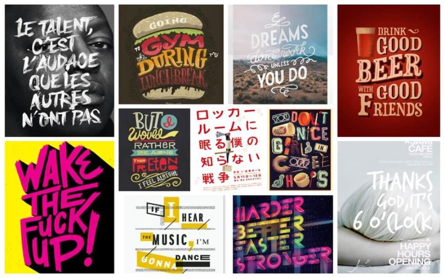
Before we explore the list of 20 potential fonts, let's review the importance of choosing fonts strategically in design:
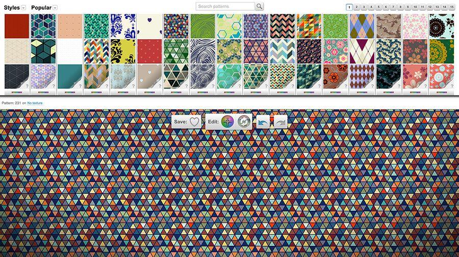
.jpg)
Beautiful Font Warehouse
Conveying brand message and personality: Each font has its own "personality", from formal, professional to youthful, dynamic or classic, luxurious. Choosing the right font will help convey the right message and personality that the brand wants to build.
Create readability and good user experience: A well-chosen font will ensure easy readability across all platforms and screen sizes, contributing to a positive user experience.
Attract Attention and Make an Impression: A unique and aesthetically pleasing font can attract attention and make a strong impression on viewers, helping your design stand out from the crowd.
Build consistency in your brand identity: Using a consistent font set across all your media will help build a strong and professional brand identity.
Enhance communication effectiveness: Fonts are not just writing but also a powerful visual element, contributing to enhancing communication effectiveness and information transmission.
2. Outstanding Font Design Trends in 2025
To choose the right fonts for 2025, it is important to grasp the prominent font design trends:
The Return of the Modern Serif: Serif fonts with sharp, delicate lines and modern structure are making a strong comeback, conveying a sense of luxury, trust and professionalism.
Minimalist and versatile sans-serifs: Sans-serif fonts remain relevant due to their legibility and versatility in a wide range of design applications, especially web and user interface design. The trend is towards geometric and minimalist variations.
Subtle Script Fonts: Soft, fluid script fonts that are still modern and easy to read will continue to be popular in personal, feminine, or creative designs.
Geometric Sans: Sans-serif fonts based on basic geometric shapes (circles, squares, triangles) give a modern, strong, and clearly structured feel.
Stylized Monospace Fonts: Stylized monospace fonts (each letter is of equal width) with unique details will add an interesting accent to technology-related or retro-style designs.
Variable Fonts: Allows adjustment of multiple font properties (thickness, width, slant...) in a single file, providing high flexibility in design.
3. 20 Beautifully Designed Fonts For Industries In 2025
Here are 20 beautifully designed fonts, selected based on trends and applicability in many different industries in 2025:
.jpg)
3.1. Modern Serif
Recoleta: A charming serif font with soft curves and modern strokes, suitable for fashion, cosmetics, high-end restaurants.
Playfair Display: An elegant and formal serif font with distinctly contrasting thick and thin strokes, ideal for headlines, logos and artistic designs.
Bodoni Moda: A modern version of the classic Bodoni font, bringing elegance, sophistication and suitable for the fashion industry, high-end magazines.
Cormorant Garamond: A classic serif font refreshed with delicate and graceful lines, suitable for literature, art, education.
3.2. Minimalist & Versatile Sans-serif
Inter: A sans-serif font designed specifically for user interfaces, with excellent readability on all screen sizes. Suitable for technology, websites, applications.
Poppins: A geometric sans-serif font with multiple weight variations, modern, youthful, and easy to use in a variety of designs.
Montserrat: Inspired by vintage Buenos Aires signage, Montserrat offers a strong and modern geometric look, suitable for logos, headlines and text.
Nunito Sans: A soft and rounded sans-serif font, creating a friendly, approachable feel and suitable for the food, children's, and education industries.
3.3. Elegant Script Font
Sacramento: An elegant and graceful script font with soft strokes, suitable for invitations, personal branding logos, wedding industry.
Playlist Script: A dynamic and modern script font with strong brush strokes, suitable for youthful, sporty, musical designs.
Selima: A semi-handmade script font with a natural and warm look, suitable for crafts, organic food, gifts.
La Sonnambula: A luxurious and charming script font with delicate curves, ideal for high-end cosmetics, fashion, events.
3.4. Geometric Font (Geometric Sans)
Futura: A classic geometric sans-serif with rounded lines and clean edges, giving it a modern, strong, and efficient feel.
Circular Std: A geometric sans-serif font with soft curves and balanced structure, suitable for technology, finance, media.
Josefin Sans: A geometric sans-serif font with tall, thin strokes, giving it an elegant, modern, and sophisticated look.
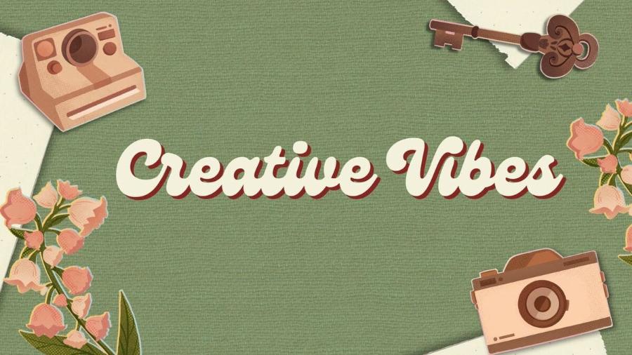
3.5. Stylized Monospace Font
.jpg)
Space Mono: A modern and legible monospace font with clean lines, suitable for web design, coding, and technical projects.
IBM Plex Mono: A versatile and readable monospace font with multiple weight variations, designed by IBM, suitable for technology, scientific, technical documentation.
3.6. Variable Fonts
Recursive Sans & Mono: A versatile variable font with the ability to adjust many attributes, from thickness, width to slant, providing maximum flexibility for design.
Amstelvar: A serif variant font with impressive weight and width adjustment capabilities, creating a variety of styles from classic to modern.
Decovar: A decorative variant font with the ability to create unique graphic effects through adjusting the variant axes.
4. Choose the Right Font for Each Industry
Font selection should be based on the characteristics and core values of each industry:
Fashion and Cosmetics Industry: Often favors elegant modern serif fonts, charming script fonts, or minimalist sans-serif fonts that convey elegance and sophistication.
Technology: Bold geometric sans-serifs, modern monospace fonts, or flexible variant fonts are often appropriate choices, conveying innovation and professionalism.
Food Industry: Rounded sans-serif fonts, warm script fonts or classic serif fonts convey a sense of familiarity, trust and appeal to the palate.
Education Industry: Easy-to-read serif fonts, clear and friendly sans-serif fonts are often preferred to ensure effective communication of information.
Arts and Entertainment: Feel free to experiment with unique, unconventional fonts, artistic script fonts, or decorative variant fonts to express creativity and personality.
Finance and Legal Industry: Traditional serif fonts, serious and trustworthy sans-serif fonts are often chosen to create a sense of professionalism and authority.
Travel Industry: Dynamic sans-serif fonts, emotional script fonts, or adventurous serif fonts can attract attention and convey a spirit of exploration.
5. Basic Principles When Combining Fonts
In many designs, combining two or more fonts can create harmony and effective hierarchy of information. Here are some basic principles to keep in mind:
Create contrast: Combining a serif font with a sans-serif font often creates a sharp, readable contrast.
Choose fonts with complementary styles: Avoid mixing two fonts that are too similar or too different, which can be confusing to the eye. Look for fonts that have the same tone but are different in shape or weight.
Limit the number of fonts: Don't use too many fonts in a design (usually no more than 2-3 fonts) to avoid creating a messy and unprofessional feeling.
Build Hierarchy: Use different font sizes, weights, and styles to create a clear hierarchy between headings, subheadings, and body text.
Ensure readability: No matter what font combination you choose, the most important factor is to ensure that the text is easy to read and easy to digest.
6. Resources for Finding and Testing Fonts
To explore more beautiful fonts and experiment with how they work in your designs, you can check out the following resources:
Google Fonts: A huge library of free and open source fonts, easy to integrate into websites and design applications.
Adobe Fonts (Typekit): A library of high-quality fonts included with the Adobe Creative Cloud package.
MyFonts: A large marketplace with a wide variety of commercial and free fonts from designers around the world.
Font Squirrel: Provides free fonts for commercial use with good quality.
DaFont: A huge library of free fonts with many unique styles.
Fontspace: Offers thousands of free and premium fonts.
Online font testing tools: Many websites allow you to enter text and preview how it will appear with different fonts.
7. Note About Font License
Before deciding to use any font in your design project, especially commercial projects, it is extremely important to check and understand the license.
.jpg)
Free Fonts: Many fonts are available for free for both personal and commercial use. However, always check the terms and conditions. Some free fonts may have certain restrictions (e.g., cannot be embedded in applications, cannot be used in logos, etc.). Reputable websites will clearly state the license information for each font.
Commercial Fonts: These are fonts that you need to purchase a license for in order to use in commercial projects. Using a commercial font without a proper license can lead to serious legal issues. Marketplaces like MyFonts, Adobe Fonts, and font foundries often offer a variety of licensing options depending on the scale and purpose of your use.
Open Source Fonts: Open source fonts often have very flexible licenses that allow you to use, distribute, and modify them freely (often under the SIL Open Font License). Google Fonts is a great example of an open source font library.
Advice:
Always check the license: Take the time to read the license carefully before integrating any font into your project.
Store license information: Keep license information for all fonts you use, especially in commercial projects.
Consider your intended use: Choose the license that best suits your project's needs and scope. If you're unsure, contact the font vendor directly for advice.
Support font designers: If you love a free font and use it regularly, consider donating or purchasing other products from the designer to support their work.
8. Optimizing Fonts for Web and Apps
When designing for web and apps, font optimization is crucial to ensure good performance and user experience:
Choose the right font format: Popular web font formats include WOFF, WOFF2, TTF, and EOT. WOFF2 is often recommended because of its better compression.
Use web fonts wisely: Only load font variations that are really necessary (weight, style). Loading too many fonts or variations can slow down page load times.
Using CSS to manage fonts: CSS allows you to specify fonts, sizes, weights, styles, and other properties flexibly.
Consider using system fonts: Fonts available on a user's operating system can help improve page load speeds and ensure consistency across different devices.
Experiment with display and body fonts: Using a distinctive font for headlines and a more readable font for body text can create hierarchy and interest.
Test for display across different browsers and devices: Make sure your fonts display consistently and without errors across different platforms.
9. The Evolution of Variable Fonts
As mentioned, variable fonts are an important trend in modern font design. They bring many significant benefits:
Smaller file size: Instead of downloading multiple individual font files for different variations (weight, width...), you only need to download a single variant font file.
High flexibility in design: Allows smooth and precise adjustment of font properties via CSS or supported design tools.
Optimize web performance: Smaller file sizes help improve website loading speeds.
Unique Customization: Opens up a wide range of creative possibilities in creating unique and context-appropriate typography effects.
10. Conclusion
Choosing a beautiful and suitable design font is a process that requires careful consideration and understanding of the characteristics of each industry as well as current design trends. The list of 20 fonts introduced in this article is just a starting point, hopefully providing you with useful suggestions for design projects in 2025. Remember, fonts are not just writing but also an important part in telling a brand story and making an impression on the audience. Hope you find the fonts you like and create unique and effective designs!


VIP Products


Best Selling Products
Upgrade Duolingo Super
29 USD
Genuine Cheap Canva Pro
39 USD
Adobe Photoshop Copyright - Full App
120 USD
ChatGPT Plus Account (GPT-4)
16 USD
Capcut Pro 1 Year
39 USD
Upgrade Genuine Office 365
49 USD
Upgrade genuine Capture One account
120 USD
Genuine Adobe Illustrator account
99 USD
Adobe Premiere Pro Account
99 USD
Windows 10 & 11 Pro Key
36 USD
Freepik Premium Account
59 USD
Plugin Retouch4me
69 USD
Copyright Adobe Lightroom Account
59 USD
MidJourney Account
29 USD
Autodesk All App Account Copyright
120 USD