Best Selling Products
5 Tips for Using Typography to Create Professional and Effective Design
Nội dung
- 1. What is typography and why is it important in design?
- 2. Tip 1: Choose the Right Font for the Purpose
- 2.1. Serif
- 2.2. Sans Serif
- 2.3. Script (Handwriting)
- 3. Tip 2: Use Appropriate Font Size
- 3.1. Hierarchy
- 3.2. Create balance with line spacing
- 4. Tip 3: Pay Attention to Color and Contrast
- 4.1. Create clear contrast
- 4.2. Use colors that match your brand
- 5. Tip 4: Ensure Readability and Accessibility
- 5.1. Avoid using too many fonts
- 5.2. Adjust the spacing between letters
- 6. Tip 5: Test and Evaluate
- 6.1. Check readability on different devices
- 6.2. Evaluate user feedback
- 7. Conclusion
Discover 5 tips for applying typography effectively in design, helping to enhance the ability to convey messages and create a strong impression in the eyes of viewers.
Typography is an important element in graphic design, helping to create a prominent and easily accessible message. Choosing and applying typography correctly will help the design product become more professional and attractive. In this article, we will share 5 useful tips for applying typography to design effectively.
1. What is typography and why is it important in design?
Typography is more than just choosing fonts, it is the art of arranging and designing type to suit the purpose and emotion you want to convey. Typography has the ability to greatly influence how viewers receive and understand information, and create strong impressions of a brand, product or service.
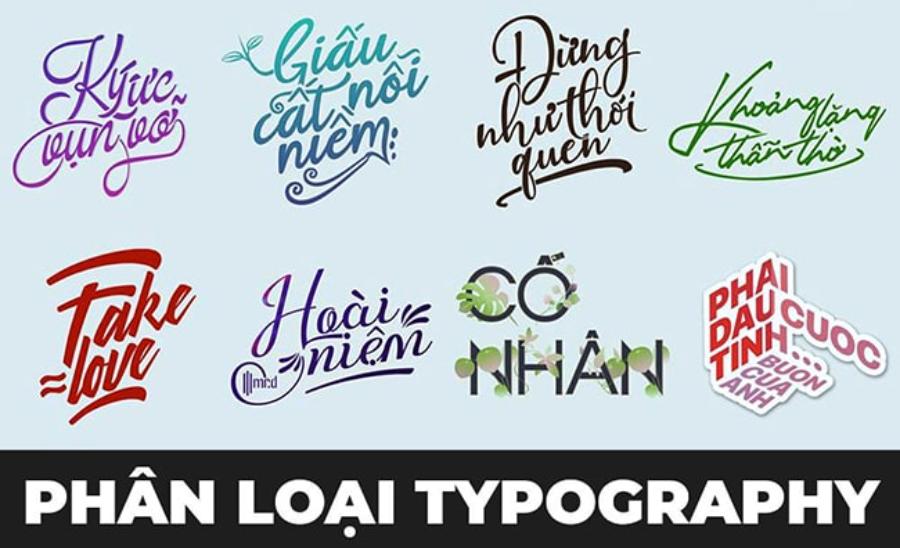
Buy Text Typography Sadesign - 01 Super Cheap Price
A design with reasonable typography will help the content to be easy to read, easy to access and especially attract attention at first sight. Therefore, using typography scientifically and creatively is extremely important in graphic design.
Typography is the art and technique of arranging type to make it legible, aesthetically pleasing, and effectively convey a message. In design, typography plays an important role because it not only affects how viewers perceive content, but also contributes to the style and personality of the design product.
A proper choice of fonts, line spacing, letter spacing, or combination of fonts can enhance the user experience and highlight the core message. On the other hand, if typography is not focused on, the design can become confusing, difficult to read, and reduce the overall value of the product. Therefore, understanding and applying typography professionally is an indispensable factor for any designer.
2. Tip 1: Choose the Right Font for the Purpose
Fonts play a crucial role in conveying a message. When choosing a font, you need to consider the intended use and the audience you want to reach. Fonts can be divided into three main types: Serif , Sans Serif , and Script . Each of these fonts will have a different effect on the reader's perception.
2.1. Serif
Serif fonts (like Times New Roman) give off a traditional and serious feel. Serif fonts, also known as fonts with feet on them, are an ideal choice in many situations because of the professionalism and readability they provide. If you want to create a trustworthy and professional feel, Serif is the choice to go for.
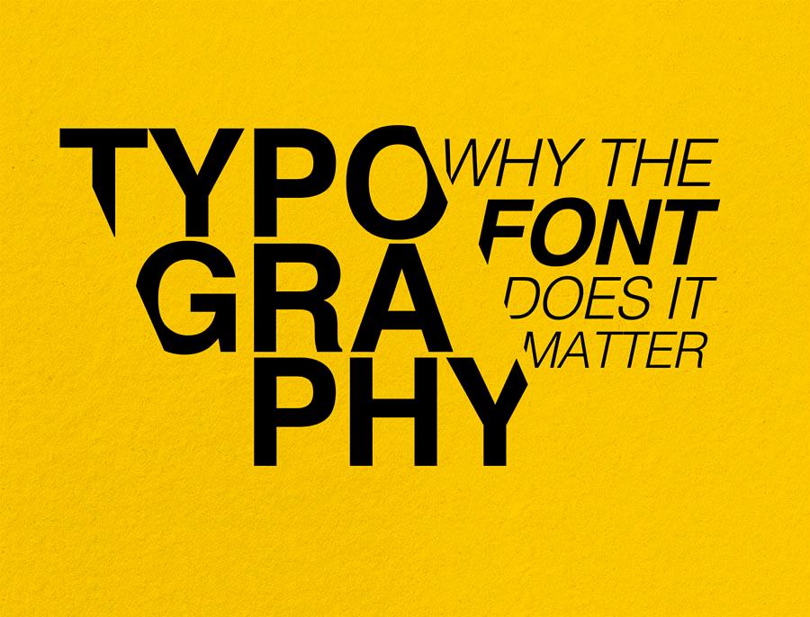
With features such as serifs at the beginning or end of the characters, this type of font is often used in printed documents, books, newspapers, or content that requires formality and seriousness. Choosing a Serif font not only enhances aesthetics but also creates a sense of trust and stability for the reader. Therefore, if your purpose is to convey a message clearly and professionally, a Serif font will be a suitable choice.
2.2. Sans Serif
Sans Serif fonts, also known as sans serif fonts, are an ideal choice for a variety of uses due to their modern, easy-to-read, and minimalistic design qualities. They are commonly used in digital documents, websites, presentations, or advertising publications to create a professional and friendly feel. When choosing a Sans Serif font, consider the size, spacing between characters, and contrast to ensure that the content is conveyed effectively and is easily accessible to readers.
2.3. Script (Handwriting)
Choosing the right font for the intended use is an important element of design and communication. Script fonts, often referred to as handwritten fonts, provide a soft, natural, and personalized feel.
This type of font is especially suitable for projects that require sophistication, artistry, or a sense of intimacy, such as invitations, high-end brand logos, or creative publications. However, it is important to note that the use of script fonts should be carefully considered to ensure readability and appropriateness to the context, and should not be overused in highly technical documents or documents that require clarity and transparency.
3. Tip 2: Use Appropriate Font Size
Font size is an important factor in creating balance in a design. If the font is too small, the reader may have difficulty accessing the information. Conversely, font that is too large can make the design unbalanced and confusing. Choosing the right font size will help your message to be easily conveyed and stand out.
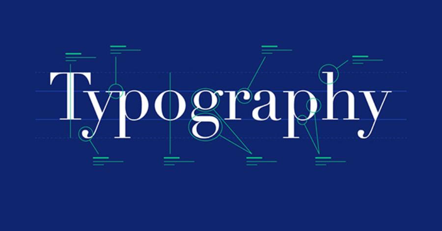
Choosing the right font for the intended use plays an important role in conveying the message effectively and professionally. To achieve this, it is important to choose the right font size, ensuring that the content is easy to read and does not cause discomfort to the viewer. At the same time, it is necessary to consider the aesthetic factor, uniformity and suitability to the context of use, thereby creating harmony and a positive impression in the eyes of the reader.
3.1. Hierarchy
Using appropriate font size plays an important role in creating an effective information hierarchy. When designing content, ensure that font size is adjusted appropriately to highlight key elements, making it easy for readers to identify and access important information.
Typographic hierarchy not only creates clarity in presentation but also contributes to improving user experience, especially in documents, websites or media publications. Therefore, the choice of font size must be done carefully and strategically to ensure the aesthetics and professionalism of the content.
3.2. Create balance with line spacing
In addition to choosing the right font size, line height is also important. This should be wide enough for the reader to feel comfortable receiving information without feeling cramped or uncomfortable.
4. Tip 3: Pay Attention to Color and Contrast
Color and contrast between text and background have a big impact on the readability of a design. A good color combination will not only enhance the aesthetics but also help highlight important elements in the design.
4.1. Create clear contrast
When choosing text and background colors, make sure there is a clear contrast so that the reader can easily distinguish the elements. For example, black text on a white background or white text on a dark background are effective combinations that increase readability.
4.2. Use colors that match your brand
Every brand has its own color palette to build its identity. When using typography in design, you need to choose font colors that match the main colors of the brand. This helps to strengthen the identity and create consistency in design products.
5. Tip 4: Ensure Readability and Accessibility
For a design to effectively communicate its message, typography needs to be legible and accessible. Here are some tips to help you optimize the readability of your design:
5.1. Avoid using too many fonts
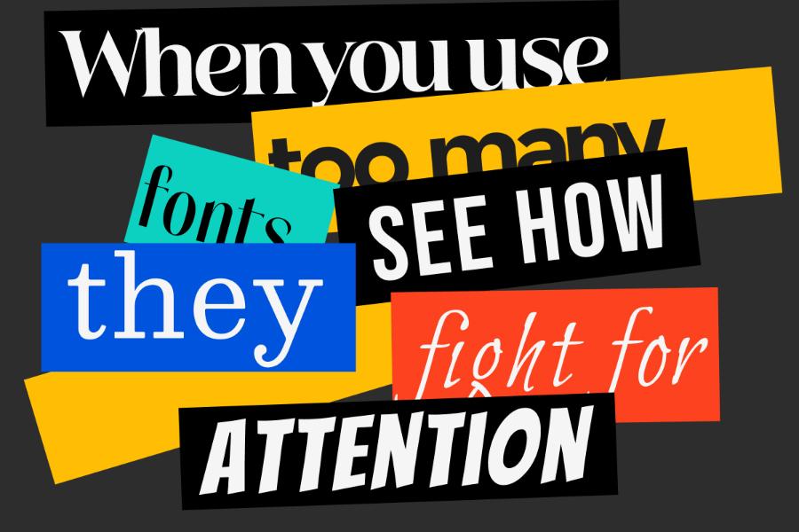
While there are many fonts to choose from, not all of them are necessary in a design. Using too many fonts can make a design look confusing and inconsistent. Typically, you should only use a maximum of 2-3 different fonts in a design, including heading fonts and body fonts.
5.2. Adjust the spacing between letters
Letter spacing (tracking) also has a big impact on readability. If the letters are too close together, they can become a cloud of unreadable text. Conversely, if the spacing is too wide, the design loses cohesion and becomes cluttered.
6. Tip 5: Test and Evaluate
Finally, to make sure your typography really works, test and evaluate your designs regularly. A design may look perfect on paper, but when it comes to the web or other media, it may need to be tweaked to fit the real-world requirements.
6.1. Check readability on different devices
With the rise of mobile devices, you need to make sure your typography looks good on different screens, from desktops to smartphones. Test across multiple devices to ensure your users always have the optimal experience.
6.2. Evaluate user feedback
One of the effective ways to improve typography in your designs is to get feedback from your users. You can conduct surveys or gather opinions from your target audience to evaluate the readability and effectiveness of your design.
Buy Text Typography Sadesign - 01 Super Cheap Price
7. Conclusion
Typography is not only a part of graphic design, but also an important factor that contributes to creating a strong first impression and ensuring that your message is conveyed clearly and easily understood. With 5 tips for effective typography application that sadesign shares in this article, hopefully you will have more useful knowledge to improve your design skills.


