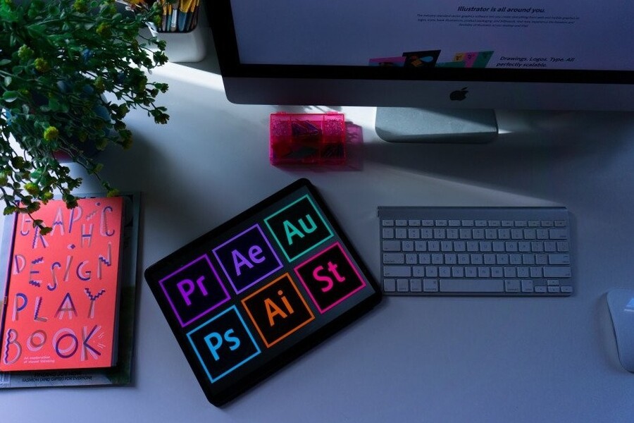
Best Selling Products

Autodesk All App Account Copyright
120 USD

ChatGPT Plus Account (GPT-4)
16 USD

Freepik Premium Account
59 USD

Upgrade Genuine Office 365
49 USD

Windows 10 & 11 Pro Key
36 USD

Copyright Adobe Lightroom Account
59 USD

MidJourney Account
29 USD

Genuine Cheap Canva Pro
39 USD

Upgrade genuine Capture One account
120 USD

Upgrade Duolingo Super
29 USD

Plugin Retouch4me
69 USD

Adobe Premiere Pro Account
99 USD

Capcut Pro 1 Year
39 USD

Genuine Adobe Illustrator account
99 USD

Adobe Photoshop Copyright - Full App
120 USD
50 Fonts Predicted to “Rise to the Top” in Design in 2026
Nội dung
- 1. GT America by Grilli Type
- 2. Söhne by Klim Type Foundry
- 3. Graphik by Commercial Type
- 4. Aeonik by CoType Foundry
- 5. Neue Montréal by Pangram Pangram
- 6. Basis Grotesque by Colophon Foundry
- 7. Maison Neue by Milieu Grotesque
- 8. Favorit by ABC Dinamo
- 9. Sharp Grotesk by Sharp Type
- 10. Diatype by ABC Dinamo
Typography has always been a crucial element in defining the personality of a design. The year 2026 promises many new font trends, ranging from modern minimalism to creative retro styles. This list will help you discover the typefaces predicted to appear most frequently in design projects.
1. GT America by Grilli Type
GT America is one of the most prominent typefaces in modern typography. Designed by Noël Leu together with Seb McLauchlan, this typeface was created with the ambition of connecting two important typographic traditions: 19th-century American Gothic and 20th-century European Neo-Grotesque. These influences differ significantly in both structure and aesthetics, yet GT America successfully distills the strongest qualities of each into a typeface that feels both familiar and fresh.
What makes GT America particularly remarkable is its extraordinary versatility. The font family includes as many as 84 different styles, ranging from delicate lightweight variants to bold, powerful weights. This diversity allows designers to use GT America in a wide variety of contexts, from corporate identity systems to editorial design and digital interfaces.
.jpg)
Another factor that makes GT America so appealing is its balance between modernity and history. The characteristics of American Gothic provide a sense of solidity and practicality, while the European Neo-Grotesque influence gives the typeface a cleaner and more contemporary appearance. This combination makes GT America an ideal choice for brands seeking to project professionalism while maintaining individuality.
Additionally, GT America has been expanded with extensive handwritten character sets developed by Tania Chacana. These additions enable the typeface to support multiple languages and writing systems, significantly enhancing its usability in global design environments.
2. Söhne by Klim Type Foundry
Söhne is a typeface designed by Kris Sowersby of Klim Type Foundry. It draws strong inspiration from Akzidenz-Grotesk, one of the most iconic grotesque typefaces of the 20th century. However, rather than simply recreating a historical design, Sowersby approached the project with greater nuance, blending historical references with contemporary aesthetics.
An important source of inspiration for Söhne was Standard Medium, a typeface widely used throughout New York City’s subway signage system. As a result, Söhne carries a strong, clear, and highly legible character while evoking a distinctive urban atmosphere.
.jpg)
However, Söhne is far from a straightforward revival. Sowersby refined proportions, stroke weights, and small details to create a thoroughly contemporary typeface. The result is a font that feels both classic and modern, perfectly suited to today’s design needs.
One notable feature of Söhne is the way it was built from a semibold foundation upward. This gives the typeface a sense of confidence and solidity, making it particularly effective for branding and headline design. The family also includes condensed, expanded, and monospaced variants, allowing it to adapt to a wide range of layouts.
Thanks to its combination of typographic history and contemporary spirit, Söhne has quickly become one of the most favored typefaces among designers in recent years.
3. Graphik by Commercial Type
Graphik is one of Commercial Type’s most famous typefaces and has become a popular choice across many editorial design projects. Often described as an “extremely simple” typeface, Graphik embodies a minimalist yet highly effective design philosophy.
The typeface combines two typographic traditions: the geometric roundness of modern sans-serifs and the structural qualities of European grotesques. This blend allows Graphik to maintain the neutrality required for editorial work while still retaining a distinctive personality.
.jpg)
One of Graphik’s greatest strengths is its excellent readability in dense layouts. The low contrast between strokes improves legibility on both screens and printed materials. Generous internal spacing within characters creates an open, airy feeling that remains easy to read even at smaller sizes.
Graphik also features refined details such as circular dots and clean terminal endings. These elements contribute to its approachable character and suitability for a wide range of applications, from headlines to long-form text.
Because of its balance between simplicity and versatility, Graphik has been widely adopted in major design projects and remains a typeface to watch in 2026.
4. Aeonik by CoType Foundry
Aeonik is a neo-grotesque typeface developed by Mark Bloom and Joe Leadbeater at CoType Foundry. From its launch, Aeonik attracted attention thanks to its combination of precise geometric structure and the warmth of rounded letterforms.
The typeface features rigorously perpendicular stroke endings, creating a mechanical and precise impression. However, this rigidity is softened by smooth curves and harmonious proportions, ensuring that Aeonik remains approachable and highly readable.
.jpg)
Aeonik includes eight different weights, ranging from the ultra-light Air to the powerful Black. In addition, the family supports variable font technology, allowing designers to adjust weight and width with great flexibility. This is especially valuable for digital interface design, where typography must adapt to multiple screen sizes.
It is no surprise that Aeonik has been adopted by numerous global brands. Companies such as Revolut, Eurosport, Alipay, and Virgin Hyperloop have all incorporated Aeonik into their branding systems. This demonstrates the broad applicability of the typeface.
With its balance between technical precision and aesthetic appeal, Aeonik is certain to remain one of the most closely followed typefaces in the coming years.
5. Neue Montréal by Pangram Pangram
Neue Montréal was designed by Mat Desjardins in 2018 with the goal of creating a versatile grotesque typeface that embodies the spirit of modern typography. Inspired by the city of Montréal—a renowned design hub during the 1960s and 1970s—the typeface reflects an era when graphic design emerged as a major cultural force.
The defining feature of Neue Montréal is its combination of the neutrality of a classic sans-serif with the personality of a display typeface. This makes it suitable for a wide variety of applications, from branding projects to sports communications.
.jpg)
Since 2021, Neue Montréal has served as the official typeface of the football club CF Montréal. The decision by a major sports organization to adopt this typeface demonstrates its ability to communicate both energy and identity.
The Neue Montréal family includes 14 different weights, allowing designers to build rich and flexible typographic systems. Thanks to its balance between classic and contemporary qualities, it is expected to remain highly popular throughout 2026.
6. Basis Grotesque by Colophon Foundry
Basis Grotesque was originally developed for the photography magazine Hotshoe in 2012. Inspired by Akzidenz-Grotesk and early Monotype grotesque typefaces, it carries a strong sense of classic typography while being carefully refined for modern design needs.
One of the most notable characteristics of Basis Grotesque is the consistency of its underlying character structure. Regardless of weight changes from Light to Black, the letters retain the same fundamental proportions and framework. This creates a unified feeling across the entire font system.
.jpg)
At the same time, each weight contains subtle adjustments that give it its own personality. These details prevent Basis Grotesque from feeling overly rigid while preserving the liveliness needed for editorial and branding work.
Through its balance of tradition and modernity, Basis Grotesque has become a widely used typeface across numerous design projects.
7. Maison Neue by Milieu Grotesque
Maison Neue is a comprehensive redesign of the original Maison font family. While the earlier version featured a rather rigid geometric structure, Maison Neue was refined to achieve greater visual sophistication.
The family includes as many as 40 different styles. Variants include condensed, expanded, and monospaced versions, each available in multiple weights. This diversity makes Maison Neue an exceptionally flexible typographic tool.
.jpg)
Maison Neue is frequently used in branding, digital interfaces, and editorial design. Its ability to adapt to different layout types has made it a favorite among many design studios.
8. Favorit by ABC Dinamo
ABC Favorit is a typeface that appears simple on the surface but contains a remarkable amount of personality. Designed by Johannes Breyer and Fabian Harb, it combines strict geometric structures with subtle details that introduce humor and surprise.
.jpg)
Favorit includes five different weights along with italic, expanded, and enlarged variants. Underlines and other small details are cleverly designed to create unique letterforms.
The font family also supports multiple writing systems including Greek, Cyrillic, Hangul, and Arabic. This makes Favorit a truly global typeface.
9. Sharp Grotesk by Sharp Type
Sharp Grotesk is one of Sharp Type’s most comprehensive font families. It began as a hand-drawn typeface created for posters but later evolved into a vast typographic system.
Sharp Grotesk Global includes 12 weights and seven different widths. This combination creates dozens of variants, allowing designers to build highly flexible typography systems.
.jpg)
Interestingly, Sharp Grotesk still retains traces of its hand-drawn origins. Small details in the letterforms prevent it from feeling overly mechanical, a characteristic often found in many modern typefaces.
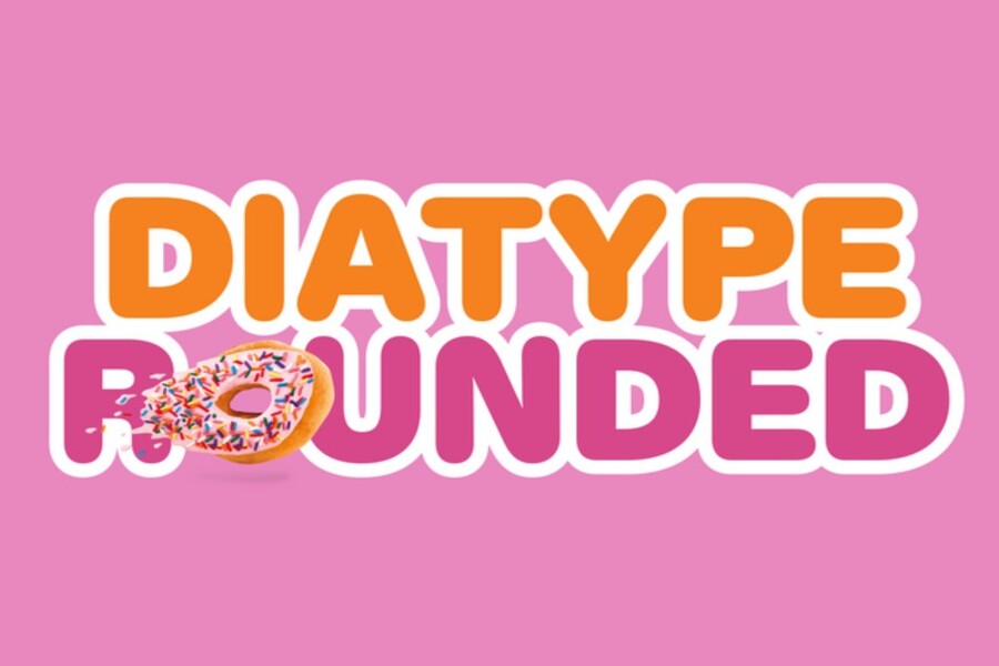
10. Diatype by ABC Dinamo
Diatype is a typeface designed specifically for optimized digital reading environments. Its name references mechanical typesetting machines from the pre-computer era, reflecting the historical inspiration behind its design.
Developed by Johannes Breyer and Fabian Harb, Diatype combines Swiss Neo-Grotesque traditions with the demands of modern digital typography. The characters are designed with exceptional clarity, ensuring excellent readability across various screen types.
.jpg)
One of Diatype’s greatest strengths is its balance between precision and warmth. It avoids the coldness often associated with many digital sans-serifs while maintaining the sharpness required for contemporary design.
Typography remains one of the most important elements in graphic design. The typefaces that achieve widespread adoption are often those that not only look beautiful but also demonstrate a careful balance between functionality and personality.


VIP Products


Best Selling Products
Autodesk All App Account Copyright
120 USD
ChatGPT Plus Account (GPT-4)
16 USD
Freepik Premium Account
59 USD
Upgrade Genuine Office 365
49 USD
Windows 10 & 11 Pro Key
36 USD
Copyright Adobe Lightroom Account
59 USD
MidJourney Account
29 USD
Genuine Cheap Canva Pro
39 USD
Upgrade genuine Capture One account
120 USD
Upgrade Duolingo Super
29 USD
Plugin Retouch4me
69 USD
Adobe Premiere Pro Account
99 USD
Capcut Pro 1 Year
39 USD
Genuine Adobe Illustrator account
99 USD
Adobe Photoshop Copyright - Full App
120 USD