Best Selling Products

Genuine Adobe Illustrator account
99 USD

Adobe Premiere Pro Account
99 USD

Upgrade Genuine Office 365
49 USD

Adobe Photoshop Copyright - Full App
120 USD

Copyright Adobe Lightroom Account
59 USD

Freepik Premium Account
59 USD

Capcut Pro 1 Year
39 USD

Plugin Retouch4me
69 USD

Genuine Cheap Canva Pro
39 USD

Windows 10 & 11 Pro Key
36 USD

MidJourney Account
29 USD

ChatGPT Plus Account (GPT-4)
16 USD

Upgrade Duolingo Super
29 USD

Upgrade genuine Capture One account
120 USD

Autodesk All App Account Copyright
120 USD
60-30-10: Color Rules In UI Design
Nội dung
- 1. 60 – 30 – 10 rule
- 2. Meaning of each color
- 3. Some notes when using colors in UI design
- 3.1 Grayscale Design First
- 3.2 Use natural colors
- 3.3 Don't forget contrast
- 3.4 Find inspiration
- 4. Some useful color matching tools
- 4.1 Coolors.co
- 4.2 Bullets
- 4.3 Paletton
- 4.4 Designspiration.net
- 4.5 Shutterstock Lab Spectrum
- 4.6 Tineye Multicolor
- 5. Conclusion
Color plays an extremely important role in interface design (UI Design) for websites, mobile apps or any digital platform. Not only does it determine aesthetics, color also affects user perception and behavior. Mastering the basic rules of color coordination will help your design products become more balanced, harmonious and professional. One of the most prominent rules in this field is the 60-30-10 rule, which is a simple but highly effective principle in creating attractive and easy-to-use interfaces. Let's find out with Sadesign right after this.

Color plays an extremely important role in interface design (UI Design) for websites, mobile apps or any digital platform. Not only does it determine aesthetics, color also affects user perception and behavior. Mastering the basic rules of color coordination will help your design products become more balanced, harmonious and professional. One of the most prominent rules in this field is the 60-30-10 rule, which is a simple but highly effective principle in creating attractive and easy-to-use interfaces. Let's find out with Sadesign right after this.
1. 60 – 30 – 10 rule
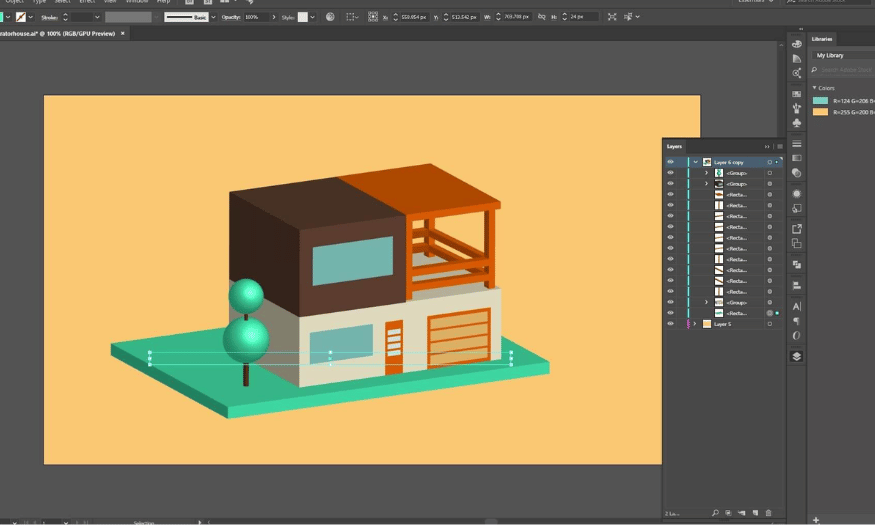
60 – 30 – 10 is the golden rule in color coordination that any graphic designer, whether new to the profession or with many years of experience, needs to master. This rule helps create balance and harmony in the design space. Accordingly, 60% of the space will be devoted to the main color, 30% to the secondary color, and 10% to the accent color. Distributing colors according to this ratio not only brings aesthetic beauty but also helps guide users to important parts of the interface.
60% dominant color : This is the dominant color in the design. It sets the foundation for the entire interface and is often the main background color. The dominant color should be chosen to match your brand and the message you want to convey.
30% Secondary Color : A secondary color that complements the primary color, often used for elements such as frames, backgrounds of content areas, or other interface elements. This color helps to highlight the primary color and create variety in the design.
10% Accent Color : An accent color is a color used sparingly to draw attention to important parts of an interface, such as a call-to-action (CTA) button, link, or key message. An accent color is often chosen to contrast sharply with the dominant and secondary colors.
The 60-30-10 rule is not only popular in graphic design but also widely applied in the field of interior design. For example, in a living space, the wall color can take up 60%, the furniture will be 30%, and decorative accessories such as pillows and lamps will take up 10%. This makes the space more lively and pleasant, while showing the balance of colors. Try applying this rule in your design to see the obvious difference.
.png)
2. Meaning of each color
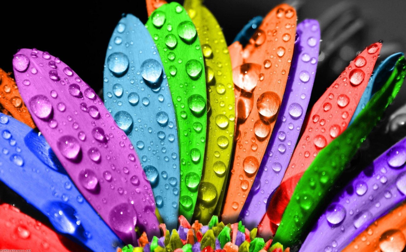
Many studies in the field of psychology have shown that each color brings different emotional states to the viewer. The meaning of colors can change depending on the cultural context, so understanding colors is extremely important in interface design. When designing for digital platforms, you need to consider and choose colors that match the psychology and emotions you want to convey to users.
For example, red is often associated with passion, love, and sometimes danger. Blue, on the other hand, is associated with peace, security, and responsibility. Black often evokes mystery and luxury, while white symbolizes purity and cleanliness. Finally, green is often associated with freshness, nature, and vitality. When you understand the meaning of each color, you will be able to create designs that are not only beautiful, but also deeper and more meaningful, in line with the culture you are targeting.
.png)
3. Some notes when using colors in UI design
When designing a user interface (UI), color selection and color coordination are crucial not only for aesthetics but also for user experience. Here are some useful tips to consider to optimize the use of color in UI design.
3.1 Grayscale Design First
Before adding color to your design, it is important to determine the light to dark tones for each element. The Grayscale design method, also known as the gray scale, allows you to easily establish color gradients. At this stage, all elements are represented in shades of white and black or another primary color such as blue.
By starting with Grayscale design, you can control and fine-tune the contrast and lightness levels for each part of the interface. This helps you clearly define which areas should use warm colors to attract attention and which areas should use cool colors to create a sense of calm. Once you have this done, adding color becomes easier and more logical, avoiding getting lost in a sea of different colors.
.png)
3.2 Use natural colors
One of the most effective ways to create harmonious color combinations is to use colors from nature. The human eye tends to be attracted to familiar colors that we are exposed to every day, such as the blue of the sky, the brown of the earth, or the green of plants. These colors are not only pleasant but also create a sense of closeness and friendliness.
When choosing colors for your UI design, try to use natural color tones to create a balance in the space. You can refer to color palettes from nature or use color matching applications to find the most suitable shades. The combination of natural colors will make your interface more lively and attractive, while also facilitating users to interact with the product.
3.3 Don't forget contrast
Using color in UI design is not just about choosing attractive colors, but also about the contrast between colors. There are colors that work well together, but there are also colors that can create chaos and discomfort for the viewer. Understanding the rules of contrast will help you identify colors that can be combined effectively.
The color wheel is an incredibly useful tool for selecting and coordinating colors for design elements. By referring to the color wheel, you can easily find strong contrasting colors or harmonious complementary colors, thereby creating an interface that is not only beautiful but also easy to access and use for users.
.png)
3.4 Find inspiration
One of the best ways to improve your color coordination is to seek inspiration from a variety of sources. Images from advertisements, videos, or fashion trends can give you fresh and creative ideas for selecting and combining colors for your design products.
Exploring these sources of inspiration will not only give you a richer perspective on color, but will also help you better understand how color can influence emotions and behavior. Don’t hesitate to take note of color combinations that appeal to you, and try them out in your own designs. This will help you develop a unique and personal design style.
4. Some useful color matching tools
In the world of design, getting your colors right is incredibly important. To help you make color selection and color combinations easier, here are some helpful tools you can use.
4.1 Coolors.co
Coolors.co is considered one of the best color matching tools available today. With a friendly and easy-to-use interface, this tool allows you to create color palettes with just a few clicks. You can start by pressing the "Space" button to let the system automatically generate the perfect color combination or you can manually adjust the colors to your liking.
One of the standout features of Coolors.co is its ability to extract colors from images. Simply upload a photo you like, and the tool will automatically analyze it to come up with a color palette that matches it. This is useful when you want to get inspiration from real-life or artistic images you’ve taken or found online.
4.2 Bullets
Kuler, the popular color tool from Adobe, is a great option for those who want to use the Color Wheel to choose colors. This tool allows you to create color schemes based on a variety of color schemes, such as choosing three colors in a triangle, two colors opposite each other on the circle, or four colors in a square.
In addition to creating color palettes, Kuler also allows users to explore color palettes shared by the design community. This not only helps you find unique color combinations but can also inspire new design ideas. With Kuler, color matching has never been easier or more fun.
.png)
4.3 Paletton
Paletton is a powerful color scheme tool, similar to Kuler, but with some unique features. One of the biggest differences is that Paletton allows you to create color palettes that are not limited to just five individual colors. Instead, you can choose from a whole spectrum of colors that range from light to dark, giving you a wide range of options for your designs.
This tool is especially useful for products with complex color schemes. You can easily adjust the colors as you like and preview how the color scheme will affect the entire interface. With Paletton, you have more options to create colorful and attractive designs.
4.4 Designspiration.net
Designspiration.net is a great tool for designers looking for inspiration. If you already have some colors in mind and want to find other designs that include those colors, Designspiration can help you do that. By entering the colors you want, the tool will return a variety of results, giving you an overview of how those colors are used in designs.
Designspiration.net is also a great platform to discover the latest design trends. You can find millions of photos, designs, and creative ideas from other designers around the world, so you will never be short of ideas in your creative process.
.png)
4.5 Shutterstock Lab Spectrum
Shutterstock Lab Spectrum is a great tool for those looking for images within a certain color spectrum. With this feature, you can search for all the photos with the color tone you are looking for, making it easier to find the right image for your project.
One thing to note, however, is that all images on Shutterstock Lab Spectrum have a watermark, which can be a limitation if you want to use the images for commercial purposes. However, this tool is still very useful for finding inspiration and images to support your designs.
4.6 Tineye Multicolor
Tineye Multicolr offers you a rich image library of over 10 million images categorized by color. This tool allows you to search for images based on the colors you desire, from simple combinations to more complex color palettes.
This is great for designers who are looking for examples of color combinations they are considering. With Tineye Multicolr, you will not only find beautiful images but also explore many unique and creative color combinations.
.png)
5. Conclusion
Color can be a challenge for beginners in the field of design, but with the help of these tools, color coordination and combination will become much easier. Apply these tools and turn your ideas into reality!


VIP Products


Best Selling Products
Genuine Adobe Illustrator account
99 USD
Adobe Premiere Pro Account
99 USD
Upgrade Genuine Office 365
49 USD
Adobe Photoshop Copyright - Full App
120 USD
Copyright Adobe Lightroom Account
59 USD
Freepik Premium Account
59 USD
Capcut Pro 1 Year
39 USD
Plugin Retouch4me
69 USD
Genuine Cheap Canva Pro
39 USD
Windows 10 & 11 Pro Key
36 USD
MidJourney Account
29 USD
ChatGPT Plus Account (GPT-4)
16 USD
Upgrade Duolingo Super
29 USD
Upgrade genuine Capture One account
120 USD
Autodesk All App Account Copyright
120 USD