Best Selling Products

Plugin Retouch4me
69 USD

Upgrade genuine Capture One account
120 USD

Windows 10 & 11 Pro Key
36 USD

Upgrade Duolingo Super
29 USD

Upgrade Genuine Office 365
49 USD

Freepik Premium Account
59 USD

Genuine Cheap Canva Pro
39 USD

Copyright Adobe Lightroom Account
59 USD

Adobe Photoshop Copyright - Full App
120 USD

ChatGPT Plus Account (GPT-4)
16 USD

Adobe Premiere Pro Account
99 USD

Capcut Pro 1 Year
39 USD

Autodesk All App Account Copyright
120 USD

Genuine Adobe Illustrator account
99 USD

MidJourney Account
29 USD
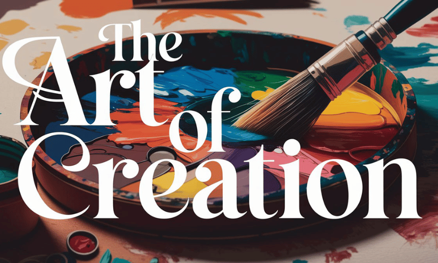
7+ Basic Colors In Design That Designers Need To Know
In the world of design, color plays an extremely important role, not only in creating eye-catching images but also in conveying emotions and messages. Each color has its own meaning, capable of influencing the mood and behavior of the viewer. In particular, basic colors are the foundation for every design, helping designers to combine and create impressive and unique works. In this article, Sadesign will explore with you in depth each color, their meaning and how they can be applied in design.
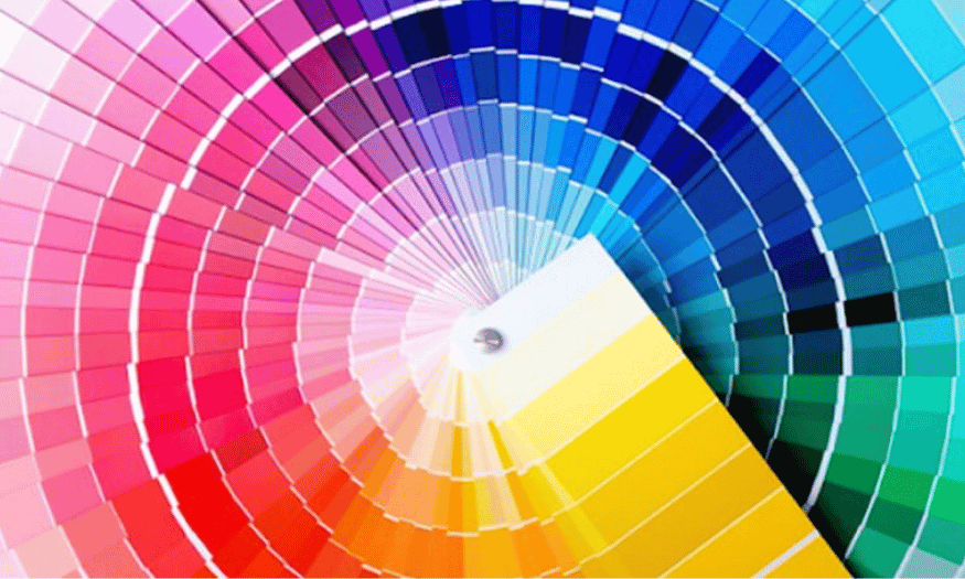
In the world of design, color plays an extremely important role, not only in creating eye-catching images but also in conveying emotions and messages. Each color has its own meaning, capable of influencing the mood and behavior of the viewer. In particular, basic colors are the foundation for every design, helping designers to combine and create impressive and unique works. In this article, Sadesign will explore with you in depth each color, their meaning and how they can be applied in design.
1. Red
Red is one of the primary colors in design, known for its ability to create a strong, warm lighting effect and attract attention. Since ancient times, red has been considered a symbol of vitality, passion and energy. In digital art, red is not just a shade, but also a powerful tool for designers to portray deep emotions. When combined with other warm colors such as yellow and orange, red can create a glowing effect, especially in sunset scenes or dramatic scenes. This not only highlights important elements but also creates drama and tension in the work.
When designers use red, they can highlight details like hair, clothing, or lighting in an action scene. Red is associated with concepts like danger, power, and love, and can help convey emotion and character traits in a powerful way. For example, in battle scenes, red can highlight intensity and tension, making viewers feel nervous, as if they are living every moment of the story. The versatility of red allows it to change its hue to suit any setting, from romantic to dangerous, adding depth and contrast to the work.
Red is not only an important part of the designer’s color palette, but also a deep cultural symbol in many civilizations. It is often used in contexts related to love and passion, but can also represent anger and desire. When applying red in design, creators need to consider carefully to ensure that the message they want to convey is expressed accurately and strongly. The subtle combination of red with other colors can create unique and attractive works of art, conquering the viewer’s eyes at first sight.
.png)
2. Orange
Orange, a warm and energetic color, is often used to depict sunlight and highlight glowing details in digital paintings. Orange not only brings a sense of warmth but also creates vitality and energy, making it a perfect choice for designs that need to express positivity and joy. In particular, orange is a bridge between red and yellow, allowing for smooth and seamless gradients, adding depth and richness to artwork.
In design, orange can be used to create special lighting effects, highlighting light sources such as lamps or flares. It helps create a cheerful, friendly and approachable atmosphere. For example, in dawn scenes, orange can be used to express soft, gentle light, bringing a sense of peace and hope. Moreover, orange also has the ability to flexibly combine with many other colors, from warm to cool tones, creating works with depth and high aesthetics.
Orange is not only a happy color, but it can also be used to express excitement and energy in action-packed settings. It is often used in advertising or product design to attract consumers’ attention. When orange appears in artwork, it can create a lively and energetic feeling that makes viewers unable to take their eyes off what they are admiring. With its power, orange is one of the important shades that every designer needs to master to create unique and impressive products.
.png)
3. Yellow
Yellow, one of the 12 primary colors, possesses the ability to create effective light reflection in digital art. From soft shades to bright colors, yellow can highlight details such as jewelry, crowns, or metallic objects, creating a sparkling and eye-catching look. The ability to reflect light of yellow helps create realistic effects, bringing works of art to life, making viewers feel their mystery and magic.
Yellow is often associated with positive emotions such as happiness, brightness and intelligence. However, it can also have negative meanings such as deception or warning. In design, the choice of shade and the use of yellow can greatly affect the emotions and messages that the work conveys. When applying yellow, designers can create halo lighting effects, bringing a sense of supernatural and power to fantasy works. The versatility of yellow allows it to easily blend into many different contexts, from cheerful scenes to solemn moments.
Yellow is not only a color but also a powerful tool for designers to express ideas and emotions. When combined with other colors, yellow can create unique and impressive works of art, attracting viewers' eyes at first sight. By understanding the meaning and use of yellow, designers can maximize its power, creating works of art that are not only beautiful but also full of meaning and vitality.
4. Green
Green, an important primary color, is often used to create fresh, peaceful and relaxing natural scenes. The richness of green helps designers create realistic and vivid natural scenes in the digital world. From dense forests to vast green fields, green brings a sense of closeness to nature, stimulating relaxation and peace. When combined with natural light, green not only enhances the beauty of the scene but also reminds us of the revival and vitality of all living things.
Green is often used to depict characters associated with nature, such as herbs, elves, and mythical creatures. The variety of shades of green, from emerald to moss green, allows designers to express the richness and diversity of the natural world. Each shade has its own meaning, and designers can choose to convey different messages. Green not only symbolizes freshness and growth, but can also have negative meanings such as jealousy or toxicity, requiring designers to consider carefully when using it.
When using green in digital art, designers need to pay attention to how the color interacts with other elements in the work. Combining green with other colors can create powerful effects, from harmony to contrast. This not only enhances the depth of the work but also creates a lively space, taking the viewer on a journey to discover the beauty of nature and the mystery of life.
.png)
5. Blue
Blue, one of the 12 primary colors, is especially suitable for painting sky and water scenes, bringing a sense of vastness, peace and tranquility. Possessing the ability to create a cold atmosphere, blue helps designers create scenes of ice, snow or mysterious deep seas. This color not only evokes a feeling of relaxation but also stimulates the imagination, making viewers feel the majestic and peaceful beauty of nature.
Blue is also used to draw characters with cold and mysterious personalities, creating a sharp and attractive beauty. The cold light effect that blue creates also adds mystery to the characters, making them stand out and full of life. Blue is associated with emotions such as calm, serenity, trust and stability, but can also bring a bit of sadness in some negative aspects. This opens up many opportunities for designers to exploit different shades of blue to convey the right emotions and atmosphere for their work.
When using blue in design, designers can create beautiful scenes that are captivating and profound. Using blue in combination with other colors, such as white or yellow, can create strong contrasts, enhancing the aesthetics of the work. The ingenuity in mixing and matching shades of blue will help designers create unique works of art that viewers cannot take their eyes off.
.png)
6. Purple
Purple, with its mysterious and alluring qualities, is often used in digital art to create unique and captivating characters. The ability to create magical lighting effects of purple helps designers create surreal scenes, from ancient castles to haunted forests. Purple not only brings luxury but also exudes mystery and enchantment, making it a powerful tool in the hands of designers.
Purple is also used to create depth in dark areas, such as shadows or the light emitted by a gem, giving a shimmering and magical look to the piece. The combination of elegance and mystery of purple makes it an ideal choice for pieces that need to convey strong emotions. Purple is often associated with creativity, spirituality and power, but can also represent emotional coldness or deception, adding depth to characters and stories.
When using purple in digital art, designers can explore different shades to create unique visual effects. Combining purple with other colors such as yellow or blue can create strong contrasts, highlighting important elements in the work. By skillfully using purple, designers not only create beautiful works of art but also bring a deep emotional experience to the viewer, immersing them in the mysterious world of art.
7. Pink
Pink, a gentle color, has always been considered a symbol of femininity and sweetness. In particular, pink is very suitable for drawing feminine characters, bringing a lovely and charming beauty. The ability to create gentle color effects helps designers create soft and romantic works, making viewers feel the elegance and sophistication in every detail. From bright flowers to fluffy clouds, pink can highlight lovely decorative elements, contributing to the charming beauty of the work.
The variety of shades of pink, from soft pastels to vibrant magenta, allows designers to express different aspects of femininity. Each shade carries its own message, from sweetness and romance to playfulness and innocence. Pink is often associated with compassion, playfulness, and love, creating a warm and friendly atmosphere. When using pink in digital painting, designers can create works that are deeply personal, expressing sophistication and unique style.
Pink is not just a color but also a powerful tool in the hands of designers. When used skillfully, it can create deep emotional effects, making viewers feel happy and joyful. Combining pink with other colors, such as white or yellow, can create vibrant and vibrant works of art. The skillful use of pink will help designers convey messages and emotions effectively, conquering the hearts of viewers at first sight.
.png)
8. Brown
Brown, with its warmth and naturalness, is often used in digital painting to create realistic natural landscapes, bringing a sense of earth, stability and rusticity. The ability to add depth to distant objects in a painting helps designers create vivid scenes, from lush green forests to dry grassy hills. Brown not only represents a simple beauty but also brings closeness and reliability, making it a great choice for works that need to convey a sense of security and familiarity.
Brown is also often used to draw character details, such as hair, clothing, or other elements in natural settings. The variety of shades of brown, from light brown to dark brown, allows designers to express many different aspects of nature and people. Brown is often associated with honesty, simplicity, and reliability, creating a warm and close space. However, it can also have negative meanings, such as dullness or conservatism, so choosing the right shade and using brown is very important.
When using brown in artwork, designers can create realistic and emotional scenes. Combining brown with other colors such as green or yellow can create strong contrasts, highlight natural elements and bring depth to the work. The skillful use of brown will help designers create works with a strong natural impression, conveying a sense of stability and security to the viewer.
.png)
9. Conclusion
Understanding the 12 basic colors in design not only helps designers improve their skills but also enriches their creativity. Each color contains its own values and meanings, creating a strong connection with the viewer. When knowing how to use and combine them skillfully, designers can convey messages effectively and create works of art that conquer the viewer. Let colors become an endless source of inspiration in your creative journey!


VIP Products


Best Selling Products
Plugin Retouch4me
69 USD
Upgrade genuine Capture One account
120 USD
Windows 10 & 11 Pro Key
36 USD
Upgrade Duolingo Super
29 USD
Upgrade Genuine Office 365
49 USD
Freepik Premium Account
59 USD
Genuine Cheap Canva Pro
39 USD
Copyright Adobe Lightroom Account
59 USD
Adobe Photoshop Copyright - Full App
120 USD
ChatGPT Plus Account (GPT-4)
16 USD
Adobe Premiere Pro Account
99 USD
Capcut Pro 1 Year
39 USD
Autodesk All App Account Copyright
120 USD
Genuine Adobe Illustrator account
99 USD
MidJourney Account
29 USD