Best Selling Products

Upgrade Genuine Office 365
49 USD

Upgrade genuine Capture One account
120 USD

Genuine Adobe Illustrator account
99 USD

Plugin Retouch4me
69 USD

Upgrade Duolingo Super
29 USD

Freepik Premium Account
59 USD

Autodesk All App Account Copyright
120 USD

ChatGPT Plus Account (GPT-4)
16 USD

Copyright Adobe Lightroom Account
59 USD

Adobe Premiere Pro Account
99 USD

Capcut Pro 1 Year
39 USD

Adobe Photoshop Copyright - Full App
120 USD

Windows 10 & 11 Pro Key
36 USD

MidJourney Account
29 USD

Genuine Cheap Canva Pro
39 USD
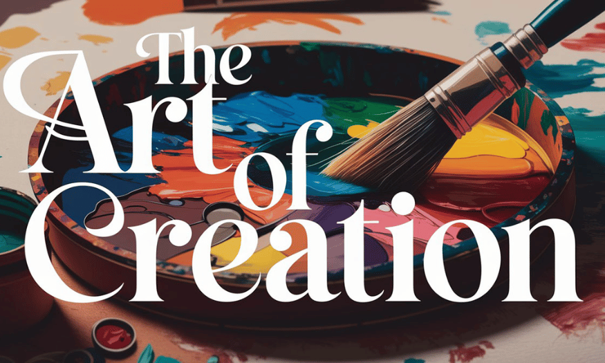
Modern Graphic Design Principles Explained
Nội dung
Modern graphic design principles play an important role in effectively conveying messages, attracting viewers’ attention, and creating a lasting impression. In this article, we will explore the basic principles of modern graphic design, including balance, contrast, emphasis, repetition, and alignment. These principles not only help designers create quality products, but also help viewers understand and feel the message they want to convey. Let’s join Sadesign to solve the design principles!

Modern graphic design principles play an important role in effectively conveying messages, attracting viewers’ attention, and creating a lasting impression. In this article, we will explore the basic principles of modern graphic design, including balance, contrast, emphasis, repetition, and alignment. These principles not only help designers create quality products, but also help viewers understand and feel the message they want to convey. Let’s join Sadesign to solve the design principles!
1. Balance & Composition
Balance in graphic design is an important concept that helps distribute visual weight harmoniously in a composition. A balanced design is not only pleasing to the eye, but also creates a sense of stability, bringing comfort to the viewer. There are three main types of balance: symmetrical balance, asymmetrical balance, and radial balance.
Symmetrical balance is often used in formal designs, such as logos or wedding invitations, with both sides having the same layout. This creates a sense of security and familiarity, suitable for brands that want to convey trustworthiness. In contrast, asymmetrical balance allows for more creativity; uneven elements still create a sense of stability, often seen in modern, dynamic designs. Radial balance arranges elements in a circular pattern, expanding from the center, creating a distinctive appeal, often seen in logos or decorative motifs.
To create effective layouts, designers can apply a grid system. This system helps to organize content in a logical and easy-to-follow manner. For example, a 12-column grid is often used in web design, while a modular grid is suitable for magazines or books. A baseline grid is a useful technique for designing text-heavy layouts, helping to create consistency in text alignment.
The rule of thirds, which divides the frame into nine equal sections, is a useful method for determining the placement of important elements. Placing elements at the intersections of these lines makes the design more interesting and appealing. White space also plays an essential role in design. Not only does it provide breathing space, it also makes the design look more airy and professional. This emphasizes that sometimes, it is more important to leave out elements than to add them. Good design is not just about filling in every space; less is often more effective.
.png)
2. Visual order
Visual order in a design determines how the viewer approaches information. Understanding this order is key to creating an effective design. The general rule of visual order is to start with the largest headline, followed by the subheading, the main content, and finally the secondary details. Creating emphasis for each section through size, contrasting color, and spacing is important in drawing the viewer’s attention.
Size is an important factor in determining the importance of each element. Larger sizes often suggest that the content is more important, while smaller elements will be seen as secondary. Color contrast is also a powerful tool for directing the eye; using bold colors for important elements will help them stand out more in the overall design. Spacing between groups of content is also important, as it makes it easier for viewers to absorb information and recognize connections between sections.
Readers tend to move from left to right and from top to bottom. Therefore, using lines, arrows, or character gazes in a design can guide the viewer’s eye in a desired way. For example, if a character in a design is looking towards a certain element, the viewer will be drawn in that direction. Creating a logical visual order not only makes the message clearer, but also enhances the user experience. A design with a clear visual order will make it easier for the viewer to access and understand the message you want to convey.
3. Color Theory
Color is not just an aesthetic element, but also has a powerful influence on human emotions and behavior. Each color carries its own message and emotion, from red, which represents energy and passion, to blue, which represents trust and calm. Yellow often evokes feelings of optimism and creativity, while green evokes a sense of nature and health. Purple is often associated with luxury, creativity and mystery, making it a popular choice in high-end designs.
To effectively combine colors, designers often use several methods such as contrast, analogy, and monochromatic. Complementary color schemes, with two colors opposite each other on the color wheel, provide prominence and attract attention. For example, combining blue and orange can create a strong visual effect. Analogous uses colors that are next to each other, creating harmony and pleasing to the eye. These colors often work well together, helping to create a smooth and pleasing overall look. Meanwhile, monochromatic color schemes use variations of the same color, bringing consistency and sophistication to the design.
Choosing the right color is not only about aesthetics, but also a powerful form of communication. Color has the ability to convey messages quickly and effectively. Therefore, choosing the right color for the message you want to convey is essential to creating a successful design. Every color decision should be carefully considered, as it can greatly affect the viewer’s perception and the success of the design project.
.png)
4. Typography
Typography, or the art of using fonts, plays an important role in graphic design. Choosing the right font affects not only aesthetics but also the ability to convey a message. There are many different types of fonts, each with its own feel and meaning.
Serif fonts, with feet at the ends of the strokes, tend to have a classic, professional feel. They are a popular choice for printed materials like books and newspapers, as they are easy to read on paper. In contrast, sans-serif fonts have no feet, creating a modern, minimalist feel that is great for on-screen design. Display or decorative fonts are usually reserved for headlines or logos, while script or handwritten fonts are personal but should not be used for long body copy.
Font pairing is an important element of typography. An effective combination might be to use serif fonts for headlines and sans-serif fonts for body copy. For legibility, the minimum font size on web pages should be 16px or larger. Line height should also be considered; 1.5 times the font size is optimal, making text appear more spacious and readable. Furthermore, typography is more than just choosing fonts; how you arrange and position them is also important to effectively convey your message.
5. Contrast & Highlight
Contrast is an important design principle that helps create prominence and draw attention to important elements in a design. When used correctly, contrast not only makes content easier to read, but also adds depth to a design, making it more dynamic and engaging.
There are many ways to create strong contrast. Color is one of the most obvious; using black and white, or a combination of contrasting colors like blue and orange, can create a striking effect. Size is also an effective method; using large type to emphasize headings while keeping the main content smaller will help to clearly separate sections. Brightness is another factor; using bright colors for important elements will help them stand out more in the overall design. Finally, typography can also create contrast; using bold type for headings and thin type for body copy will create a clear distinction.
However, it is important to note that if everything stands out, nothing really stands out. So, choose the right emphasis and use contrasting elements wisely to create an attractive and effective design.
.png)
6. Repetition & Consistency
Repetition is a design principle that helps create cohesion between elements in a design. Repetition not only makes a design consistent, but it also makes a brand more recognizable to consumers. Consistency in design makes it easier for viewers to recognize and remember a brand.
There are many examples of repetition in design. Using the same font throughout all headings and content is an effective way to create consistency. Keeping the same color for headings or important elements is also a good way to promote consistency. Additionally, maintaining consistent spacing and layout between sections of a design is also important in creating cohesion.
However, it is important to note that repetition should not be rigid. Add some variation to avoid boredom. For example, you can change the size or color of some elements in the design to create emphasis while still maintaining uniformity. This not only makes the design more dynamic, but also attracts the viewer's attention, preventing them from feeling bored when approaching the content.
7. Proximity
The principle of proximity in graphic design refers to the fact that elements that are close together are often perceived as related. This is a simple yet extremely effective principle for organizing information and creating clarity in a layout. Applying this principle makes it easier for viewers to recognize relationships between elements in a design.
One common application of the proximity principle is in the grouping of navigation buttons. When navigation buttons are placed close together, users can easily recognize that they are related and can perform actions without having to look too far. Similarly, placing headlines close to their content helps viewers immediately understand the connection between them, thereby improving the user experience.
It is also important to maintain a reasonable distance between elements. If elements in a design are too close together, they can create a cluttered feeling, making it difficult for the viewer to distinguish and receive information. Conversely, if elements are too far apart, the viewer may feel disconnected and have difficulty understanding the overall meaning.
.png)
8. Choose design software
Photoshop is one of the most popular and powerful graphic design software available today. Developed by Adobe, Photoshop has become an indispensable tool for designers, photographers and digital artists around the world. With the ability to edit images, create graphics and design diversely, Photoshop brings endless creative opportunities to users.
One of Photoshop’s greatest strengths is its powerful image editing capabilities. Users can easily adjust the brightness, darkness, color, and contrast of an image. Additionally, tools such as layers, masks, and filters allow users to perform complex edits without losing the quality of the original image.
Photoshop is also very versatile when it comes to creating graphics. Users can design logos, posters, book covers, and many other types of documents with a variety of drawing and shaping tools. Features like vector graphics and typography allow for professional and impressive designs.
In addition, Photoshop also supports many different file formats, from JPEG, PNG to PSD, making it easy for users to store and share their work. With a large user community, many learning resources, tutorials and supporting plugins, Photoshop becomes the top choice for those who want to improve their design skills.
In short, Photoshop is not only a photo editing software, but also a comprehensive design tool, providing users with unlimited creativity. With powerful and flexible features, Photoshop deserves to be the top choice for anyone passionate about graphic design.
.png)
9. Conclusion
In short, mastering the principles of modern graphic design is essential for anyone who wants to succeed in this field. Principles such as balance, contrast, emphasis, repetition, and alignment not only enhance the aesthetics but also enhance the message of a design. When applied correctly, they can transform simple ideas into vibrant and meaningful works of art. In an increasingly competitive landscape, understanding and applying these principles will help designers stand out and attract the attention of their target audience.


VIP Products


Best Selling Products
Upgrade Genuine Office 365
49 USD
Upgrade genuine Capture One account
120 USD
Genuine Adobe Illustrator account
99 USD
Plugin Retouch4me
69 USD
Upgrade Duolingo Super
29 USD
Freepik Premium Account
59 USD
Autodesk All App Account Copyright
120 USD
ChatGPT Plus Account (GPT-4)
16 USD
Copyright Adobe Lightroom Account
59 USD
Adobe Premiere Pro Account
99 USD
Capcut Pro 1 Year
39 USD
Adobe Photoshop Copyright - Full App
120 USD
Windows 10 & 11 Pro Key
36 USD
MidJourney Account
29 USD
Genuine Cheap Canva Pro
39 USD