Best Selling Products
Alignment In Design: 4 Types Of Alignment Every Designer Needs To Know
Nội dung
With a list of 4 basic alignment types, this article will help you quickly grasp the essential tools for building coherent design layouts.
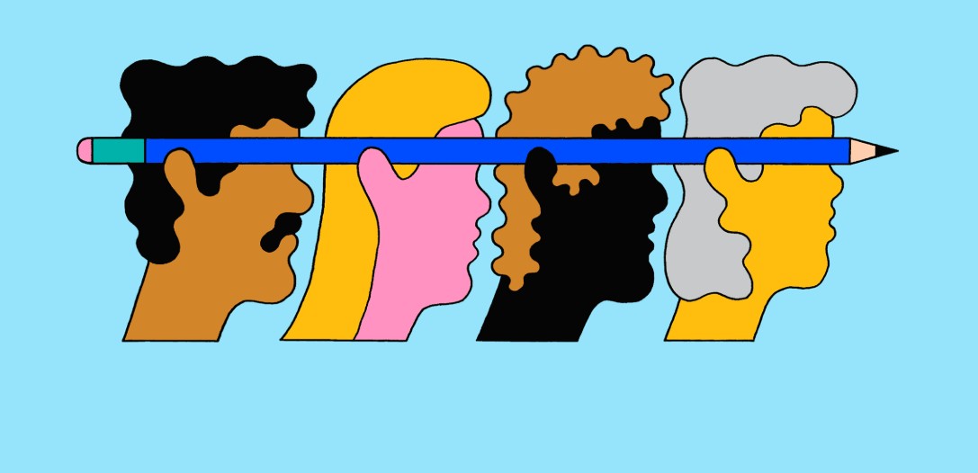
Design is more than just the arrangement of images or text on a surface. It is the art of creating connections between visual elements to provide a smooth visual experience for the viewer. In the design process, one of the basic but extremely important tasks is alignment – the process of positioning elements so that they are harmonious, balanced and easily accessible.
Imagine you are reading an article or viewing a website. If the paragraphs, images, and icons are not arranged properly, it will be difficult to attract the eyes and easily cause eye fatigue. It is thanks to reasonable alignment that users can easily follow the information, thereby helping them grasp the content quickly and effectively. This article will go into the aspects of alignment with you to provide practical knowledge to help you apply to your design projects.
1 Alignment Definition
Alignment, in graphic design, is the process of arranging elements such as text, images, icons, etc. so that they create a clear visual connection. This not only makes the layout neat, but also helps the viewer easily follow the main content of the design. Alignment is not simply placing elements in a straight line, but also carefully considering the distance, position, and relationship between elements in the overall layout.
.png)
2. Meaning and importance of alignment
Alignment plays a key role in creating a professional design. When elements are properly aligned, they help create consistency and balance, which:
Increases professionalism: A well-aligned design always exudes sophistication and professionalism. It helps viewers feel that the information is presented in a careful and organized manner.
Directing the viewer's eye: A well-aligned layout will direct the viewer's eye to important points of the design, helping to convey the main message more clearly.
Reduced clutter: When elements are well-organized, users don't feel overwhelmed or confused by information, resulting in a smoother and more pleasant visual experience.
Create a sense of balance: Alignment helps create a visual balance between elements, bringing a sense of harmony and unity to the entire design.
3. Types of Alignment in Design
The types of alignment that are currently being searched by many users are as follows:
.png)
3.1. Vertical and horizontal alignment
Vertical and horizontal alignment are divided into different types that users should refer to such as:
3.1.1. Vertical alignment
You need to create vertical alignment when the middle and top and bottom points of Elements are aligned on an invisible horizontal line. This is called vertical alignment because the vertical space in an element is aligned with another element, not because of invisible horizontal lines. You should also think about direction when drawing a line from top to bottom.
Because it is not always necessary or possible to have a row of elements aligned vertically along the top, bottom, and center. Your elements will also often have variable heights, so you need to decide how to align them vertically.
3.1.2. Align vertically top or bottom
If there is a significant difference in height between multiple elements, then vertical alignment should be preferred to the top or bottom. You have a vertical top alignment on the main content and sidebar. In this case, you should notice how both the container and the header are aligned to establish a connection between the two elements.
.png)
3.1.3. Vertical centering
Center vertical alignment makes sense if the height of an Element can change but not significantly. You have center vertical alignment for each navigation element in the header in the example above.
3.1.4. Horizontal alignment
You should create horizontal Alignment when the center, left, and right sides of the elements align on an invisible vertical line.
3.1.5. Left and right horizontal alignment
The easiest way to ensure left and right alignment in your layout design is to set a maximum width for all your content at the beginning. This ensures that your elements will align well whether pushed to the right or left.
3.1.6. Horizontal centering
For horizontal centering to be beneficial, you only need a single element in a row. Call to Action text is a common use case for this in UI design.
However, text needs to be aligned to the left if the viewer reads from left to right. Left alignment helps the eye move from line to line in a predictable way. Since readability begins to decline with centering or right aligning after a few lines of text, designers should take this into account when designing.
.png)
3.2. Aligning Media Objects
A very popular UI pattern these days is the Media Object. However, for icons with variable widths, it is very easy to get misaligned. So, to align Media Objects, you need to center the icons and left-align all the text. Also, you should note that in this particular case, the Printer is aligning the same items even though the fourth element does not have an icon but is still left-aligned with the text above.
3.3. Edge Alignment
When you create vertical and horizontal alignment from one or more corners, edge alignment occurs. It is easier to guide the eye from one Element to the next by anchoring the Elements at each corner.
3.4. Optical Alignment
Top, bottom, left, right and center alignment is not the answer in some cases. Designers often encounter cases where Elements are perfectly aligned. However, the reason is not because the visual weight distribution of an Element is uneven.
.png)
So, Designers need to use their eyes and adjust the alignment to make it more suitable. The left icon is centered vertically and horizontally within the inner circle. The bottom of the icon is heavier than the top. To create balance, the right icon has been optically aligned within the inner circle.
4. Challenges and solutions to alignment errors
Although alignment is a fundamental principle in design, we don't always apply it perfectly. In fact, alignment sometimes encounters some common challenges and errors that affect the aesthetics and effectiveness of the design.
4.1 Common alignment errors
Uneven spacing:
One common mistake is uneven spacing between elements. When the spacing between paragraphs or images is uneven, the overall layout becomes cluttered and difficult to follow.
Deviation between elements:
If elements are not aligned according to a common rule, it will create a disjointed feeling, reducing the cohesion of the design. This is especially noticeable when designing user interfaces, where consistency is key.
.png)
Not suitable for content:
Sometimes, using a certain alignment style for inappropriate content can detract from the visual flow of the message. For example, using center alignment for a long paragraph can cause the text to “break up” and make the reader feel tired.
4.2 Solution
Check and adjust regularly:
During the design process, take the time to double-check each section of your layout. Comparing sections will help you quickly spot alignment errors and make timely adjustments.
Using the alignment aid:
As mentioned in the previous section, design software has automatic tools to help with alignment. Using these tools not only saves time but also ensures accuracy during the layout process.
.png)
Seek feedback from colleagues and customers:
Sometimes we can be “blind” to our layouts. Having someone else review and give feedback will help you spot any flaws and improve your design in the best way possible.
Learn from real case studies:
Successful design projects are always a valuable source of inspiration. Regularly research and analyze case studies to draw lessons and apply them to your projects.
Through the above solutions, you will see that fixing alignment errors is not too complicated if you pay careful attention and apply the correct design process.
Alignment is the “golden key” to making your design perfect and professional. Whether you are working in the field of printing, web interface design or branding, mastering the principles of alignment will help you create impressive and memorable products.


