Best Selling Products

Adobe Premiere Pro Account
99 USD

Capcut Pro 1 Year
39 USD
Upgrade Genuine Office 365
49 USD
Autodesk All App Account Copyright
120 USD

MidJourney Account
29 USD

Genuine Cheap Canva Pro
39 USD

Freepik Premium Account
59 USD
Upgrade genuine Capture One account
120 USD
Genuine Adobe Illustrator account
99 USD

Copyright Adobe Lightroom Account
59 USD

ChatGPT Plus Account (GPT-4)
16 USD

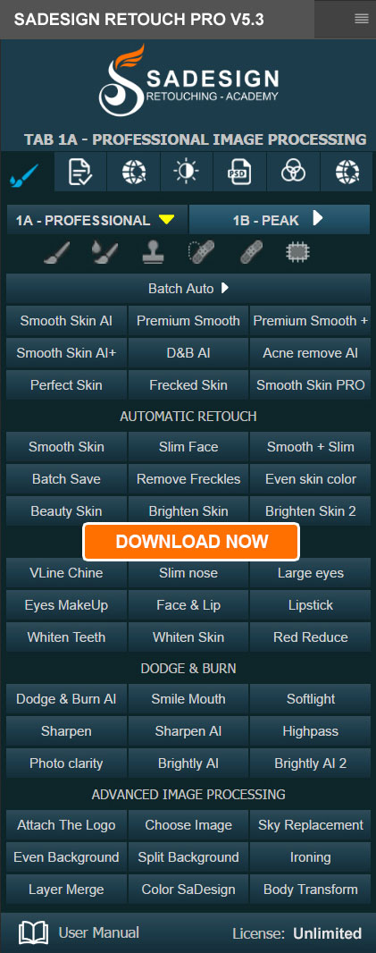
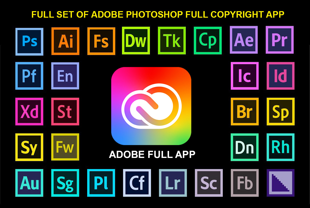
Adobe Photoshop Copyright - Full App
120 USD
Upgrade Duolingo Super
29 USD
Plugin Retouch4me
69 USD
Windows 10 & 11 Pro Key
36 USD
Basic Elements of Design: Principles and Applications
Nội dung
Learn important elements of graphic design like balance, rhythm, contrast and how to apply them to create impressive compositions.

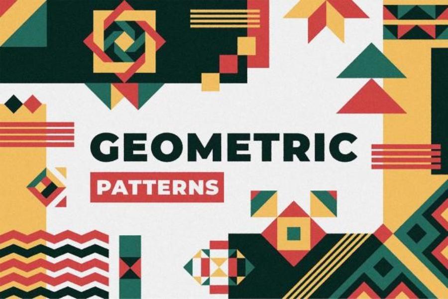
1. Quickly systematize basic knowledge (Part 1):
Before we get into the advanced elements, let's briefly review the basics covered in part 1. These are the important foundations that we will continue to build and develop in this part:
(2).jpg)
Line: A trace of a moving point that can create shape, texture, and lead the eye. Lines have different meanings depending on their thickness, direction, and presentation.
Shape: A two-dimensional area enclosed by lines or changes in color or texture. Basic shapes (square, circle, triangle) carry distinct meanings and emotions.
Color: A property of light that has a powerful ability to evoke emotions, create attention, and convey messages. Understanding the color wheel and the principles of color coordination is important.
Texture: The feel of an object's surface, which can be real (tangible) or virtual (visual). Texture adds depth and interest to a design.
Space: The empty area around and between objects in a design. Space can be used to create balance, focus, and hierarchy.
Value: The lightness or darkness of a color. Changes in value create depth, shape, and emphasis in a design.
All of these elements do not exist independently, but interact and complement each other. Understanding how they work individually and in relation to each other is a solid foundation for effectively applying the advanced design elements we will explore below.
2. Advanced Basic Elements of Design
2.1. Layout
Layout in design is the way visual elements (such as text, images, shapes, colors) are arranged and organized in a given space. A good layout not only makes the design harmonious and beautiful, but also ensures that information is conveyed clearly and effectively, guides the viewer's eye and creates a pleasant visual experience.
.jpg)
Basic principles of composition:
Balance: Creates visual stability in design. There are three main types of balance:
Symmetrical Balance: Elements are evenly spaced on either side of a central axis, creating a sense of formality, stability, and order. For example, a website with a logo in the center and content elements evenly spaced on either side.
Asymmetrical Balance: Dissimilar elements are arranged in a way that still creates a sense of visual balance. This is often achieved by using elements that are different in size, shape, or color but have similar “visual weight.” Asymmetrical balance feels more modern, dynamic, and interesting. For example, a poster with a large image on one side and several smaller paragraphs of text on the opposite side.
Radial Balance: Elements are arranged radiating from a central point, creating focus and often decorative. For example, a circular pattern or a logo design with elements revolving around a center.
Contrast: A distinct difference between visual elements to create prominence, attract attention, and provide hierarchy. Forms of contrast include:
Color Contrast: Use colors that are opposite or significantly different on the color wheel.
Size Contrast: Use large and small elements to create emphasis and distinction.
Shape Contrast: Combine different shapes (e.g. round and square) to create interest.
Typographic Contrast: Use fonts that differ in serif/sans-serif, weight, or size.
Textural Contrast: Combine smooth and rough surfaces.
Repetition: The repeated use of certain elements (e.g. color, shape, typeface, visual style) throughout a design to create consistency, rhythm, and reinforce brand recognition. For example, using the same font for titles and subheadings on a web page.
Proximity: Elements that are related in content or function should be placed close together. This helps the viewer understand the relationship between them and organizes information logically. Spacing between groups of elements is also important to create clear separation.
Hierarchy: Use visual elements (size, color, position, typography) to indicate the importance of each piece of information. The most important elements should be made more prominent to attract attention first. For example, page titles are often larger and bolder than the body text.
White Space/Negative Space: The empty space around and between design elements. White space not only helps a design feel airy and airy, but it also plays an important role in focusing attention on key elements and creating visual balance. Don't think of white space as "empty space" but rather as an active design element.
Rule of Thirds: Divide the frame into nine equal parts using two equally spaced horizontal and two equally spaced vertical lines. The intersections of these lines are considered to be the most eye-catching locations. Place important points of the design or major horizon/vertical lines along these lines or at the intersections to create a more attractive and balanced composition.
Golden Ratio: A mathematical ratio of approximately 1.618, commonly found in nature and believed to bring harmony and natural beauty to design. The golden ratio can be applied in determining the size and placement of elements in a layout.
Popular layout types:
Grid Layout: Uses a system of horizontal and vertical lines to organize elements in an orderly and consistent manner. Very popular in web and print design.
Symmetrical layout: Creates a formal and stable balance. Often used in traditional or formal designs.
Asymmetrical layout: Creates a dynamic and modern feel. Requires careful consideration of the “visual weight” of elements.
Flowing Layout: Arrange elements in a visual path to guide the viewer's eye. Often used to tell a story or lead through a process.
2.2. Typography:
Typography is not just about choosing fonts, but also the art of arranging and presenting text in a way that is easy to read, easy to understand, effectively conveys the message, and at the same time reflects the personality and style of the design. Typography plays a key role in creating a good user experience and building a strong brand identity.
Basic elements of typography:
Font: Is a set of characters (letters, numbers, punctuation) with the same design style. Fonts are often classified into:
Serif: Has small strokes (feet) at the ends of main strokes. Generally considered formal, traditional, and easy to read in long paragraphs printed on paper. Examples: Times New Roman, Georgia.
Sans-serif: No feet on the lettering. Generally considered modern, clear, and easy to read on screens. Examples: Arial, Helvetica, Open Sans.
Script: Simulates handwriting, personal and artistic. Often used for titles or short paragraphs that need emphasis. Examples: Brush Script, Lobster.
Decorative: Fonts that are unique, highly decorative and often used for special purposes such as logos or short titles. Use with care to avoid confusion. Examples: Blackadder ITC, Stencil.
Font Size: Measured in points (pt) or pixels (px). Choosing the right size depends on the intended use (heading, body text, caption), display platform (screen, print) and audience. Too small a size will be difficult to read, too large can be annoying.
Leading/Line-height: The vertical space between lines of text. Proper leading allows the eye to move easily from line to line, improving readability and creating a sense of spaciousness. Leading that is too narrow can cause lines of text to overlap, while leading that is too wide can cause lines to lose connection.
Tracking/Letter-spacing: The even spacing between all letters in a paragraph. Tracking can be adjusted to improve aesthetics and readability, especially for headlines or short paragraphs.
Weight: Variations in the thickness of a font (e.g. Thin, Light, Regular, Bold, Black). Use different weights to create emphasis, hierarchy, and increase visual interest.
Alignment: How text lines are aligned horizontally:
Left-aligned: Lines start on the left margin. Easiest to read for languages that read from left to right.
Right-aligned: Lines end on the right margin. Often used for short paragraphs or in special designs.
Center-aligned: Lines are aligned in the middle. Often used for titles, quotes, or short formal paragraphs.
Justified: Lines are stretched to fill the width, creating straight edges on both sides. Can create uneven spacing between words if not handled carefully.
Type Hierarchy: The intentional combination of different fonts to create visual hierarchy and guide the reader's eye through different sections of text (headings, subheadings, body copy). Fonts should complement each other in style and be easy to read when used together.
2.3. Imagery & Icons:
Images and icons are powerful visual elements that can attract attention, convey information quickly and effectively, evoke emotions and create a lasting impression in a design. The skillful selection and use of images and icons is essential to enhance the communication effectiveness of a design.
Types of images and icons:
Photographs: Real-life images that capture a moment or subject. Can be candid, emotional, or narrative.
Illustrations: Images drawn or created digitally. Allows for the expression of abstract ideas, creating a unique and highly customized style.
Infographic: Visualization of complex data and information, making it easy for viewers to absorb and understand concepts.
Icons: Simple, symbolic symbols, often used to represent functions, actions, or concepts in user interfaces or visual designs.
2.4. Practicality and Usability:
Practicality and usability are key to ensuring that a design is not only aesthetically pleasing, but also serves its purpose and provides a positive user experience. A functional design helps users complete tasks easily, efficiently, and with satisfaction. This is especially important in user interface (UI) and user experience (UX) design.
.jpg)
Factors affecting practicality and usability:
Clarity: Information and functionality should be presented in a clear, understandable, and unambiguous manner. Use simple, intuitive language and avoid unnecessary technical jargon.
Learnability: New users should be able to easily get acquainted and understand how to use the design the first time. Provide visual instructions, hints or help when needed.
Efficiency: Design that allows users to complete tasks quickly and with minimal effort. Place important elements within easy reach and provide efficient shortcuts or search functions.
Memorability: Users can easily remember how to use a design after a period of disuse. Consistency plays an important role in increasing memorability.
Error Prevention: Design to help users avoid making mistakes by providing hints and confirmations before performing important actions and providing clear and understandable error messages when errors occur.
Satisfaction: Users feel satisfied and comfortable using the design. This includes both aesthetics and smooth interaction experiences.
Accessibility: The design can be used by users with different types of disabilities (e.g., visual impairment, hearing impairment, mobility impairment). Compliance with accessibility guidelines (WCAG) is important.
3. Interaction Between Design Elements:
It is important to emphasize that design elements do not exist in isolation . They interact and influence each other in complex ways. A color decision can impact how people perceive a shape. The choice of typeface not only affects readability but also reinforces the message and creates a stylistic impression. The way we arrange elements in a layout guides the viewer’s eye and creates a visual flow of information.
.jpg)
For example:
Color and Shape: A bright red circle can evoke feelings of dynamism and urgency, while a light blue circle can create feelings of calm and trust.
Typeface and Message: A formal serif font might be appropriate for a lawyer brand, while a modern sans-serif font might be appropriate for a tech company.
Layout and Focus: Using ample white space around an important element will help draw attention to that element.
Image and Emotion: A beautiful natural landscape photo can create a relaxing and positive feeling.
Therefore, when designing, we should not consider each element individually but need to think holistically , considering the harmony and relationship between all elements to create a coherent, effective design that achieves the set goals.
4. Conclusion
Understanding the elements of design helps designers create professional, engaging work that easily conveys a message. When applied properly, these principles can enhance the quality of a design and create a unique mark.


VIP Products


Best Selling Products
Adobe Premiere Pro Account
99 USD
Capcut Pro 1 Year
39 USD
Upgrade Genuine Office 365
49 USD
Autodesk All App Account Copyright
120 USD
MidJourney Account
29 USD
Genuine Cheap Canva Pro
39 USD
Freepik Premium Account
59 USD
Upgrade genuine Capture One account
120 USD
Genuine Adobe Illustrator account
99 USD
Copyright Adobe Lightroom Account
59 USD
ChatGPT Plus Account (GPT-4)
16 USD
Adobe Photoshop Copyright - Full App
120 USD
Upgrade Duolingo Super
29 USD
Plugin Retouch4me
69 USD
Windows 10 & 11 Pro Key
36 USD