Best Selling Products
Pantone Terms You Need to Know (Part 1): Opening the Door to the World of Professional Color
Nội dung
- 1. Why Do You Need to Understand Pantone Terminology?
- 2. Popular Pantone Color Systems and Related Terminology
- 2.1. Pantone Matching System (PMS) / Pantone Solid Colors
- 2.2. Pantone Fashion, Home + Interiors (FHI)
- 2.3. Pantone Color of the Year
- 3. Basic Color Attribute Terms in Pantone
- 4. Terms Related to Using and Referencing Pantone Colors
- 5. Terms Related to Pantone Production and Printing Process
- 6. Conclusion
Pantone is a widely used color standard system in design, printing and manufacturing. Understanding these terms ensures consistency across products.
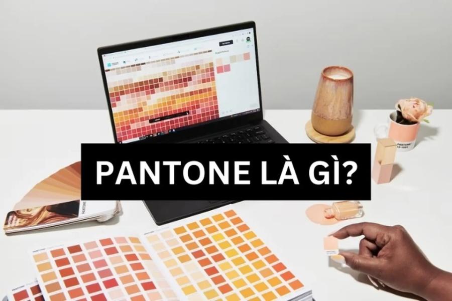
Pantone has become a global language in the world of color, an indispensable standard for designers, manufacturers and anyone working with color. However, to truly understand and effectively utilize this color system, mastering specialized terminology is extremely important. In this article, sadesign will continue to explore this complex and diverse color system with you.
1. Why Do You Need to Understand Pantone Terminology?
Pantone is a standardized color system developed by Pantone Inc. It helps define colors accurately in the design, printing, textile, plastics, and other industries. This system helps ensure that colors are represented consistently on different surfaces and materials.
.jpg)
Before we get into the nitty gritty of terminology, let's clarify why it's important to understand Pantone-related terminology:
Effective communication: In a professional work environment, especially between designers, printers and manufacturers, the correct use of Pantone terminology helps ensure an accurate understanding of the desired color, avoiding costly and time-consuming errors. When stakeholders, from designers, manufacturers to customers, share a common language about color, communication becomes more effective, reducing errors and saving time. The Pantone color system provides a global standard, helping creative ideas be executed accurately and professionally, while building trust and satisfaction from customers.
Ensuring Color Consistency: Pantone is designed to ensure color consistency across a variety of materials and manufacturing processes. Understanding the terminology helps you choose the right Pantone system (e.g. Formula Guide for print, Fashion, Home + Interiors for textiles and furnishings) and the relevant parameters to accurately achieve the desired color.
Improve your professional knowledge: Mastering Pantone terminology shows professionalism and a deep understanding of the color field, helping you to be more confident in your work and communication with colleagues and partners. The Pantone color system not only provides an international standard for communicating about color, but also helps ensure consistency and accuracy in color reproduction on different materials. Mastering Pantone-related terminology not only helps you work more effectively with creative teams and suppliers, but also demonstrates professionalism and a deep understanding of your industry.
Make the most of Pantone tools and resources: Pantone offers a variety of tools and resources to help users select and manage color. Understanding the terminology helps you make the most of these tools. The Pantone Color System not only provides a global standard for communicating about color, but also helps designers and businesses save time, reduce errors, and ensure that colors are represented as intended on a variety of materials. Making the most of the tools and resources Pantone offers, such as color charts, support software, and user guides, will help you create high-quality products that meet market requirements and enhance brand value.
Stay on top of color trends: Pantone regularly releases new color trends. Understanding the terminology involved makes it easy to understand and apply these trends to your work. The Pantone color system not only provides a global standard for communicating about color, but also helps ensure consistency and accuracy when implementing ideas across different materials and platforms. Keeping up with the latest color trends from Pantone also helps designers and businesses create products, campaigns or collections that are relevant to the market, thereby enhancing brand value and attracting customers effectively.
2. Popular Pantone Color Systems and Related Terminology
Pantone offers a variety of color systems, designed to meet the needs of specific industries. Here are some common systems and the basic terminology associated with them:
.jpg)
2.1. Pantone Matching System (PMS) / Pantone Solid Colors
The Pantone color system is a widely used color standard in the printing, design and manufacturing industries, especially the Pantone Matching System (PMS) or Pantone Solid Colors. This is the original and most widely used Pantone color system, especially in the graphic printing industry.
Terms to know:
Pantone Solid Colors: Refers to pre-mixed colors, created by mixing primary colors (Pantone Basic Colors) in certain proportions. Each solid color has a unique code number, for example: Pantone 185 C (magenta).
Pantone Number: A unique code that identifies a specific Pantone color. The code is often followed by a suffix that indicates the type of paper it is printed on (e.g. C - Coated, U - Uncoated, M - Matte).
Pantone C (Coated): Only Pantone colors are printed on coated paper (glossy), giving brighter and bolder colors.
Pantone U (Uncoated): Only Pantone colors are printed on uncoated (matte) paper, which provides softer colors and higher ink absorption.
Pantone M (Matte): Only Pantone colors printed on matte paper, is another option for non-gloss surfaces.
Pantone Basic Colors: The basic colors used to mix all other solid colors in the PMS system.
Formula Guide: Pantone's handbook contains solid color swatches and their mixing formulas. This is an important tool for color selection and comparison.
Color Bridge: The Pantone Handbook displays solid colors along with their approximate representations when converted to CMYK and sRGB. This tool is useful for four-color printing and digital design.
Spot Color: A color printed using a single ink (premixed according to Pantone formulas) instead of using a combination of CMYK colors. Spot colors typically provide better color accuracy and coverage than CMYK printing.
This is an important tool to ensure color consistency and accuracy between the design and production stages. PMS provides a standardized color palette, each color is coded with a specific number, making it easy for designers and manufacturers to exchange and coordinate without encountering color differences due to technical factors or equipment. Using this system not only improves product quality but also demonstrates professionalism and consistency in the workflow.
2.2. Pantone Fashion, Home + Interiors (FHI)
This color system is specifically designed for the fashion, interior and product design industries. It is a color standardization tool that helps designers, manufacturers and brands easily communicate and ensure consistency in the use of color across different materials and products.
.jpg)
Terms to know:
Pantone FHI Colors: Colors in the Fashion, Home + Interiors system, available in paper (TPG/TPG) and fabric (TCX).
TPG (Textile Paper – Green): Paper version of the FHI system, more environmentally friendly than the old version (TPX).
TCX (Textile Cotton eXtended): Color version on cotton material, providing accurate color for the textile industry.
Color Guide: The Pantone FHI Handbook contains paper color guides (TPGs) organized by color family.
Color Specifier + Guide Set: The set includes both a paper color guidebook (TPG) and tear-off paper color cards, convenient for color matching and sharing.
Cotton Swatch Library: Large collection of cotton fabric swatches, providing the most intuitive and accurate view of FHI colors.
Cotton Planner: A fan-shaped book containing small cotton fabric swatches, a portable tool for color reference.
2.3. Pantone Color of the Year
The Pantone Color System is an international standard widely used in design, printing, fashion and many other creative fields. It is not a separate color system but a color chosen annually by the Pantone Color Institute, which has a great influence on design trends and popular culture. The use of this color is not only aesthetic but also shows the connection between art, culture and life.
Terms to know:
Pantone Color Institute: Pantone's color research division, responsible for predicting color trends and announcing the Color of the Year.
Color of the Year: The color chosen by Pantone reflects the general trends and sentiments of society in that year. The announcement of the Color of the Year has a big impact on the creative industries.
3. Basic Color Attribute Terms in Pantone
Basic Pantone color attribute terminology plays an important role in understanding and applying the color system correctly. Pantone is an international standard widely used in design, printing, fashion and many other fields, helping to ensure color consistency across different platforms and materials. To better understand how Pantone defines and describes color, we need to familiarize ourselves with the basic color attribute terminology:
Hue: The most basic property of color, which tells you what color it is (e.g. red, blue, yellow). In the color wheel, hues are arranged in a continuous circle.
Saturation: Also known as chroma, intensity, or brilliance, saturation refers to the purity and richness of a color. A highly saturated color will be vibrant and vivid, while a less saturated color will be duller and duller.
Brightness / Value: This property refers to how light or dark a color is. A color with high brightness will be closer to white, while a color with low brightness will be closer to black.
Tint: A base color (hue) to which white has been added to increase its brightness.
Shade: A base color (hue) to which black has been added to reduce its brightness.
Tone (Neutral Color): A base color (hue) to which gray is added to reduce saturation and create a more neutral color.
4. Terms Related to Using and Referencing Pantone Colors
These are important factors in ensuring color consistency and accuracy in industries such as graphic design, printing, fashion and manufacturing. The Pantone system provides a standardized color language, making it easy for designers and manufacturers to communicate ideas and achieve desired results without experiencing color differences across different materials or devices. When working with Pantone colors, you will often encounter the following terms:
.jpg)
Color Matching: The process of comparing an actual color sample to color samples in the Pantone color chart to find the closest color match.
Color Swatch: A small sample of a specific Pantone color, typically printed on paper or woven onto fabric, used for color reference and comparison.
Color Palette: A collection of colors selected for use in a specific design project. Pantone color palettes help ensure color harmony and consistency.
Color Harmony: The principle of combining colors aesthetically and effectively. Pantone provides tools and resources to help users create harmonious color palettes based on their color systems.
Cross-Referencing: The process of finding equivalent colors between different Pantone color systems (e.g. converting from PMS to FHI colors) or between the Pantone system and other color systems such as CMYK or RGB. The Pantone Color Bridge tool is useful for this.
Digital Color: Represents Pantone colors in a digital environment, typically using RGB, Hex, or Lab values. However, it is important to note that colors displayed on screen may differ from actual printed colors.
5. Terms Related to Pantone Production and Printing Process
Pantone is a standard color system widely used in the manufacturing and printing industry to ensure color consistency and accuracy. In the manufacturing process, terms related to Pantone often include Pantone color codes, Pantone color charts, and the Pantone Matching System (PMS). In the manufacturing and printing process, the following Pantone terms are commonly used:
Pantone Color Codes are unique identifiers for each color, allowing designers, manufacturers, and printers to communicate effectively without color distortion. The Pantone Color Chart provides a rich color spectrum, assisting in selecting the right color for your design needs.
Ink: Ink used in the printing process. Pantone inks are precisely formulated to ensure color consistency.
Printing Process: Different printing methods (e.g., offset, digital, flexo) can affect how Pantone colors appear.
Substrate: The type of material being printed on (e.g. paper, fabric, plastic) can also affect the final color. That's why Pantone offers color versions for different paper types (C, U, M).
Color Management: The process of ensuring that colors are displayed and printed accurately and consistently across devices and materials. Pantone is an important part of an effective color management process.
Proofing: A proof created to check color before mass production. Using Pantone colors in the proof helps ensure the final color is correct.
The PMS system ensures that colors are accurately reproduced on various materials, from paper, fabric to plastic. Applying Pantone standards in the production and printing process not only improves product quality but also creates professionalism and reliability in the eyes of customers.
6. Conclusion
Understanding basic Pantone terminology is the first and most important step to working effectively with this standard color system. From differentiating between the PMS and FHI color systems, mastering color attributes, to understanding usage and production terminology, it all helps you gain confidence in the professional world of color.


