Best Selling Products
Discover the Principle of Contrast – The Soul of Creative Design
Nội dung
- 1. Definition of “Contrast” in design
- 2. Main types of contrast
- 3. Interesting and unique principles in creating contrast
- 3.1. Creativity in color selection
- 3.2. Play with light and shadow
- 3.3. Symmetry and asymmetry
- 4. Practical applications of contrast
- 4.1. Graphic design and advertising
- 4.2. Product and packaging design
Contrast is more than just color contrast, it’s the art of creating emphasis, directing the eye, and creating emotion. Learn about this fascinating principle and how it can elevate any design you create.
Improved user experience: Clear separation between interactive elements such as headlines, content, and call-to-action (CTA) buttons makes it easy for users to access and use digital products.
For these reasons, we become more interested in learning and applying contrast principles creatively and effectively in every design project.
1. Definition of “Contrast” in design
Contrast can actually be understood as a completely opposite difference in nature, level, state, etc. Accordingly, two things are only considered contrasting when they possess completely opposite properties, not simply different. For example, straight will contrast with curved, not wavy or zigzag; bright contrasts with dark, not opaque;…. Similarly, we have smooth contrasting with rough; cold contrasting with hot;…
(1).png)
2. Main types of contrast
To better grasp the richness of contrast, let's explore the basic types of contrast in design:
Color contrast:
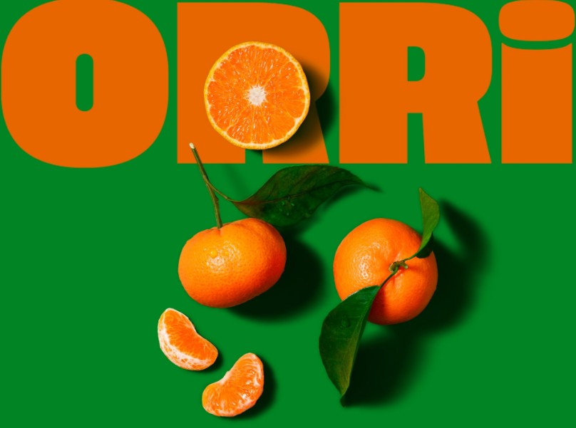
Color is a powerful element in creating emotions. Using contrasting colors such as warm and cool colors not only creates interest but also highlights the message. For example, a dark background and bright text color will help the content appear more clearly.
.png)
Contrast of brightness and light:
Brightness, or “value contrast,” helps create depth and highlight key elements. Light and shadow can be used to create a three-dimensional effect, giving a design life and movement.
.png)
Contrast in size and shape:
Combining elements of different sizes and shapes helps create a visually appealing design. When large elements are placed next to small ones, it is easier for viewers to distinguish important information.
.png)
Contrast of materials and textures:
In product design and digital graphics, the combination of smooth and rough materials not only enriches the surface but also creates a strong tactile feeling, increasing user interaction.
Typography contrast:
Contrasting bold and thin, classic and modern typefaces is a great way to add depth to your copy. Clearly distinguishing between headings, subheadings, and body copy helps readers easily recognize the structure and focus of the information.
.png)
3. Interesting and unique principles in creating contrast
Now that we understand the fundamentals, let's dive into the practical part, where creativity becomes the most important piece of the design puzzle.
3.1. Creativity in color selection
There’s nothing more exciting than seeing color combinations “reinvented” in unconventional ways. Unconventional color schemes, such as combining opposite colors in an unusual way, help create designs that are unique and appealing. Some creative tips for choosing colors include:
Use complementary color palettes wisely:
Instead of using direct opposites, try using complementary tones in new ways. For example, instead of combining blue and orange in the usual way, you can create a new version with slight variations in brightness and saturation.
.png)
Color psychology applications:
Each color evokes a different emotion. Red evokes passion, blue represents peace, while yellow is happy and energetic. Understanding the meaning of each color will help you craft your message subtly.
3.2. Play with light and shadow
Photos with natural light effects or deep shadows always have the power to "attract" the viewer. In digital or print design, the use of "high-key" and "low-key" effects not only creates a contrast in brightness but also conveys the atmosphere of the product.
.png)
Creative techniques involving lighting include:
Create a dark background with bright elements
A dark background with bright accents can help highlight key details, naturally leading the viewer's eye.
Using gradients
Smooth color transitions help create depth in a design. Gradients not only provide a smooth transition between colors, but also create a sense of movement and familiarity with the user.
3.3. Symmetry and asymmetry
Symmetry has long been considered a symbol of balance in design. However, asymmetrical style brings a sense of liveliness and unconventionality. The combination of symmetry and asymmetry is a bold step, making the design unique and modern.
.png)
Advantages of symmetrical design:
Symmetry easily creates a sense of stability, tradition and easily guides the viewer's eye along a clean, straight line. This is ideal for design products that require strict, balanced proportions such as brochures, catalogs or traditional branding projects.
Vitality from asymmetrical design:
Adding a little asymmetry to a design can make it more dynamic and full of surprises. This is often used in modern designs where edginess and creativity are highly valued. The mix of symmetrical and asymmetrical elements can create a unique visual flow that stimulates curiosity and interest in the viewer.
4. Practical applications of contrast
To better understand how contrast is applied in design, let's take a look at some specific cases from different fields.
4.1. Graphic design and advertising
In graphic design and advertising, using contrast is an effective way to attract attention at first sight. For example:
Posters and advertising banners:
A successful poster often uses contrasting colors to make the main message stand out. Imagine a poster with a dark background and bright text – the message is immediately strong and not confused with the secondary information.
.png)
Brochures and flyers:
With a reasonable division between title, image and content, a brochure designed with the principle of contrast will help customers easily access information, thereby increasing the brand's memorability.
These practical examples not only help your advertising products stand out but also contribute to deepening brand value in the hearts of customers.
4.2. Product and packaging design
In the field of product and packaging design, contrast also contributes significantly to highlighting products in the market:
Product packaging:
A package designed with the right amount of contrast will attract consumers at first sight. The combination of color, shape and material helps the product stand out from the crowd of competitors on the shelf.
Product design:
In physical product design, contrast can make a dramatic difference. For example, technology products with dark backs and shiny logo details not only create a brand impression but also enhance the aesthetic and feel of luxury for the user.
Design strategies based on the principle of contrast have been successfully applied by many famous brands, becoming one of the factors that create a distinct mark in a fiercely competitive market.
Through this blog, SaDesign has presented the basic principles, creative techniques and practical applications of contrast in design – from graphic design, web design, to product packaging. These elements not only highlight the product but also create a perfect user experience, contributing to building a unique brand image.
