Best Selling Products

Windows 10 & 11 Pro Key
36 USD

Genuine Cheap Canva Pro
39 USD

Adobe Photoshop Copyright - Full App
120 USD

Capcut Pro 1 Year
39 USD

MidJourney Account
29 USD

Upgrade Duolingo Super
29 USD

Copyright Adobe Lightroom Account
59 USD

Adobe Premiere Pro Account
99 USD

Upgrade genuine Capture One account
120 USD

Upgrade Genuine Office 365
49 USD

Freepik Premium Account
59 USD

ChatGPT Plus Account (GPT-4)
16 USD

Genuine Adobe Illustrator account
99 USD

Plugin Retouch4me
69 USD

Autodesk All App Account Copyright
120 USD
Book Cover Design: The Key to Attracting Readers
Nội dung
- 1.What is book cover design?
- 2. Why is book cover design important?
- 2.1. Impact on purchasing decisions
- 2.2. Communicate information subtly
- 2.3. Building a personal brand for the author
- 3. Elements that make a book cover attractive to readers
- 3.1. Book title – The first element that leaves an impression
- 3.2. Images and illustrations – Telling the story visually
- 3.3. Color – The non-verbal language of emotions
- 3.4. Typography – The look and feel of the content
- 3.5. Cover structure – Reasonable and balanced organization
- 3.6. Printing materials and effects – Added value to the experience
- 4. Some popular cover design styles today
- 5. Common mistakes when designing book covers
- 6. Professional book cover design process
- 2. Elements that make a book cover attractive to readers
- 2.1. Title and typography – first point of view
- 2.2. Color and the ability to create emotions
- 2.3. Illustrations and graphic style
- 2.4. Reasonable layout and visual rhythm
- 2.5. Design style consistent with book genre
- 2.6. Author name and brand identity elements
- 3. Professional book cover design process
- 3.1. Receiving and analyzing content
- 3.2. Identify the target audience
- 3.3. Create a moodboard and develop ideas
- 4. Conclusion
Discover the full scope of book cover design: from definition, role to key elements that make a book cover stand out and attract readers among thousands of books on the market.
Book cover design is not just a cover, but also a visual bridge between the work and the reader. In the context of the increasingly competitive publishing market, an impressive book cover can determine up to 70% of the possibility of being chosen to buy at first contact. The following article will take you deep into the concept of book cover design, the important factors that make an attractive book cover and how designers conquer readers with just one look.
1.What is book cover design?
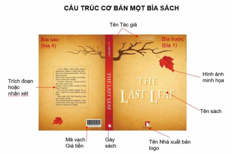
Book cover design is the process of creating and presenting the outer packaging of a book, including the front cover, back cover, and spine. It is the first contact between the reader and the content of the work, and is a powerful visual communication tool that helps convey the genre, emotions, and core message of the book.
.jpg)
Book covers usually include elements such as the book title, author name, illustrations, typography and main colors. Not only does it have an aesthetic function, book cover design also plays a marketing role, enhancing the author or publisher's brand and creating a highlight on bookshelves or e-commerce sites.
In the modern publishing industry, cover design has become a specialized discipline, requiring a seamless combination of art, communication strategy and understanding of consumer behavior.
2. Why is book cover design important?
Book cover design plays an important role because it is the first element that attracts the reader’s attention and creates a first impression of the book’s content. A professionally designed book cover not only helps convey the message of the work but also reflects its style, genre and value. Furthermore, in the increasingly competitive book market, an impressive cover design can help the book stand out on display shelves or online platforms, thereby increasing accessibility and boosting sales. Therefore, investing in book cover design is not only an aesthetic choice but also an effective marketing strategy.
2.1. Impact on purchasing decisions
Within a few seconds of looking at a bookstore or browsing an online bookstore, readers are drawn to the cover. A beautiful, eye-catching design increases the likelihood that they will stop, pick up the book, or click through for more information. This is the first step toward making a purchase.
2.2. Communicate information subtly
A book cover is not just a "dress" but a "visual language" that conveys the genre, setting, or overall feel of the book. A mystery novel will be very different from a children's book in terms of images, fonts, and colors. A good cover design helps the reader immediately understand the main content without having to read a summary.
2.3. Building a personal brand for the author
For authors with many books, unifying the cover design style helps create a personal identity. Readers only need to look at the cover to immediately recognize "this is that person's book", thereby enhancing the reputation and brand value.
3. Elements that make a book cover attractive to readers
An attractive book cover needs to combine many important elements to create a first impression and stimulate curiosity.
3.1. Book title – The first element that leaves an impression
The title of a book is an essential element that must stand out on the cover. The choice of font, size, alignment, and color scheme will determine whether the title is easy to read or not. An attractive and impressive title will pique the reader’s curiosity and make them want to find out more about the content inside.
3.2. Images and illustrations – Telling the story visually
Cover images can be hand-drawn illustrations, photographs, digital graphics or abstracts – depending on the content and style of the book. It is important that the image conveys the right emotional message and connects with the content. Images that have depth, are well-composed and visually striking will create a powerful ripple effect.
3.3. Color – The non-verbal language of emotions
Colors have a strong impact on the reader’s emotions and perceptions. Each genre of book will be suitable for a different color scheme: romance books often use pastel or pink-red tones, horror books tend to use black, gray or blood red, educational books often choose bright and easy-to-read colors. The subtle color coordination helps the book cover stand out while still being harmonious.
3.4. Typography – The look and feel of the content
Typography is just as important as the images. The font should match the mood of the book: modern, classic, fun, or serious. And the way the letters are arranged—the spacing, boldness, italics—also affects readability and retention.
3.5. Cover structure – Reasonable and balanced organization
A beautiful book cover cannot lack a tight layout. The arrangement of elements such as the book title, author name, subtitle, image and publisher logo must be carefully calculated to create a sense of harmony and guide the viewer's eyes in a logical order. Asymmetrical layouts with highlights often create a unique, innovative style.
3.6. Printing materials and effects – Added value to the experience
At the printing stage, the choice of paper stock, matte/gloss lamination, embossing or foiling will add a premium feel to the book cover. These effects are not only visually appealing but also tactile – an often overlooked but important factor in the purchasing decision.
4. Some popular cover design styles today
Currently, in the field of graphic design, there are many popular cover design styles that are widely favored and applied. Specifically, we list them below:
.jpg)
Minimalism
Focus on white space, typography and a few rich details. Great for philosophy books, business books or modern psychology books.
Vintage or retro style
Uses aged effects, muted colors, and vintage imagery. Great for history books, classic novels, or nostalgic short stories.
Hand drawn illustration style
Popular in children's books, short stories, comics or art books. This style creates a sense of intimacy, cuteness and high personalization.
Surrealism
Creates a sense of ambiguity, metaphor, stimulates the imagination. Suitable for fantasy novels, science fiction stories or contemporary art books.
5. Common mistakes when designing book covers
Name some common mistakes when designing book covers, specifically:
Using too many details
The "cramming" of images, words and colors makes the cover confusing and annoying to the viewer. Readers will have difficulty grasping the main information and thus skip the book.
No focus on readability
Fonts that are too fancy, too stylized, or use the same color as the background make the title and author's name difficult to read - a taboo in cover design.
Not suitable for target audience
A children's book with a quiet and serious cover can be misleading. The cover design needs to reflect the target audience so as not to distort the approach.
6. Professional book cover design process
Step 1: Research content and audience
Understand the spirit of the book, and from there build ideas that suit the tastes of the target readers.
Step 2: Concept and sketch development
Sketch out test layouts, choosing fonts, colors, and iconic images.
Step 3: Detailed design and feedback
Finalize the design with final elements, send to author or publisher for review and feedback.
Step 4: Edit and finalize
Based on feedback, make final adjustments before proofing or official publication.
2. Elements that make a book cover attractive to readers
For a book cover to truly impress and attract readers at first sight, the designer needs to harmoniously combine many different elements. Below are the important components that determine the aesthetic quality and effectiveness of conveying the content of a book cover.
2.1. Title and typography – first point of view
The text is the soul of the book cover. The title is often the first detail the reader sees. Therefore, the choice of font, size, thickness, color, and arrangement of the title plays a vital role.
Typography needs to reflect the “mood” of the book:
A horror novel would suit dark, angular serif fonts.
Self-help books should use modern, clear, easy-to-read sans-serif fonts.
Children's books favor playful, whimsical fonts.
In addition, leading, kerning, and margins also contribute to readability and create a harmonious layout. Headings should stand out but not overwhelm other visual elements.
2.2. Color and the ability to create emotions
Each color carries its own emotional message, directly affecting the viewer's psychology. An attractive book cover is not only because of its beautiful color but also because of its suitable color:
Red represents strength, passion, and danger.
Blue conveys calmness, depth, and intelligence.
Yellow evokes feelings of joy and hope.
Black and white are often highly artistic, simple but luxurious.
The color scheme should ensure good contrast between the text and the background, while not being distracting. The main color tones should be carefully selected to highlight the message of the work.
2.3. Illustrations and graphic style
Images are not just decorative, but important “storytelling” elements. The cover illustration should have a connection to the plot, characters, or message of the book.
Three common styles in modern cover design include:
Hand-drawn illustrations: Artistic, expressive, suitable for literature and children's books.
Realistic photography: Accessible, in-depth, widely used for skill books, memoirs, photo books.
Vector Graphics: Modern, minimalist style, versatile for creative, tech or educational book themes.
Images should be high quality, clear, uncluttered, and work well with the overall layout. A strong image can pique curiosity and make the reader want to “turn the page.”
2.4. Reasonable layout and visual rhythm
A book cover is not just a place to present content, but also a “design work” that needs rhythm and emphasis. A good layout helps the reader’s eye move naturally from title → subtitle → author’s name → image → additional information.
Some basic layout principles to keep in mind:
Rule of Thirds: Divide the cover into 9 sections to determine visual emphasis.
Symmetrical or Asymmetrical Balance: Creates a steady or dynamic visual rhythm.
Negative space: Helps to “breathe” and clarify content areas.
Too many details in a design can easily create confusion and lose focus. Strategic simplification is always a wise solution in modern book cover layout.
2.5. Design style consistent with book genre
There is no one-size-fits-all design for all book genres. Each genre has its own “visual language” that creates a distinct identity for readers:
.jpg)
Detective novels : Covers are often dark, with lots of shadows and suggestive images.
Self-development books : Prefer bright colors, clear design, strong typography.
Business Books : Minimalist, professional, emphasis on author name or “USP”.
Academic books/textbooks : Presented seriously, logically, emphasizing information.
Understanding the genre helps designers adjust the tone & mood accurately, avoiding creating a "wrong tone" feeling that makes the book cover lose points at first sight.
2.6. Author name and brand identity elements
For established names, highlighting the author’s name is a must. Readers sometimes don’t care about the content, just seeing the “writer” is enough to buy.
Not only that, for long-standing publishers or book brands, logo elements, seals, or even unique design styles also create familiar recognition, stimulating consumer behavior.
Cover design not only sells book content, but is also a branding tool for the author, the publishing company, and even an entire book line.
3. Professional book cover design process
Behind every impressive book cover is a systematic design process, with strategy and close coordination between related departments. Design is not simply a technical operation, but also a journey to discover the content, spirit and core values of the book. A professional process usually goes through the following steps:
3.1. Receiving and analyzing content
Every design idea must come from a clear understanding of the book's content. The designer needs to:
Read the manuscript (or at least the abstract).
Identify main themes, content highlights, and emotional tones throughout.
Grasp the message the author wants to convey.
Classify book genres to guide appropriate design.
Understanding the content not only helps design in the right direction, but also helps the book cover connect more deeply with the target audience.
3.2. Identify the target audience
Each design is aimed at a specific audience. A book cover for young adults will be very different from an academic book cover for professionals.
Identifying the audience helps answer the questions:
What age range is the reader?
What do they care about?
What visual style are they accustomed to?
What colors and images resonate with this group of people?
Once you have a clear picture of your audience, all your design choices will revolve around “catching their eye.”
3.3. Create a moodboard and develop ideas
Moodboard is a collection of inspirational elements for a book cover, including:
Main color.
Illustration.
Typography style.
Similar designs for reference.
Creating a moodboard not only helps to unify the design direction, but also creates a visual basis for discussion with authors and publishers before implementing the official design.
4. Conclusion
Book cover design is not just a work of art, but also a sophisticated communication and marketing strategy in the publishing world. An attractive book cover can convey the content message in just a few seconds and is a prerequisite to touch the hearts of readers. Whether you are a professional designer or a self-published author, investing seriously in cover design is always the right choice to enhance the value of your book and spread the story to the right readers.


VIP Products


Best Selling Products
Windows 10 & 11 Pro Key
36 USD
Genuine Cheap Canva Pro
39 USD
Adobe Photoshop Copyright - Full App
120 USD
Capcut Pro 1 Year
39 USD
MidJourney Account
29 USD
Upgrade Duolingo Super
29 USD
Copyright Adobe Lightroom Account
59 USD
Adobe Premiere Pro Account
99 USD
Upgrade genuine Capture One account
120 USD
Upgrade Genuine Office 365
49 USD
Freepik Premium Account
59 USD
ChatGPT Plus Account (GPT-4)
16 USD
Genuine Adobe Illustrator account
99 USD
Plugin Retouch4me
69 USD
Autodesk All App Account Copyright
120 USD