Best Selling Products

Adobe Photoshop Copyright - Full App
120 USD

Genuine Adobe Illustrator account
99 USD

ChatGPT Plus Account (GPT-4)
16 USD

Freepik Premium Account
59 USD

Upgrade genuine Capture One account
120 USD

MidJourney Account
29 USD

Plugin Retouch4me
69 USD

Capcut Pro 1 Year
39 USD

Genuine Cheap Canva Pro
39 USD

Upgrade Duolingo Super
29 USD

Upgrade Genuine Office 365
49 USD

Autodesk All App Account Copyright
120 USD

Windows 10 & 11 Pro Key
36 USD

Adobe Premiere Pro Account
99 USD

Copyright Adobe Lightroom Account
59 USD
Color Psychology: The Untold Mystery Behind Every Color
Nội dung
Color psychology is a sub-branch of behavioral psychology that studies the effects of color on human psychology and behavior. Typically, each color evokes certain feelings. For example, red or orange evokes feelings of excitement and vibrancy.
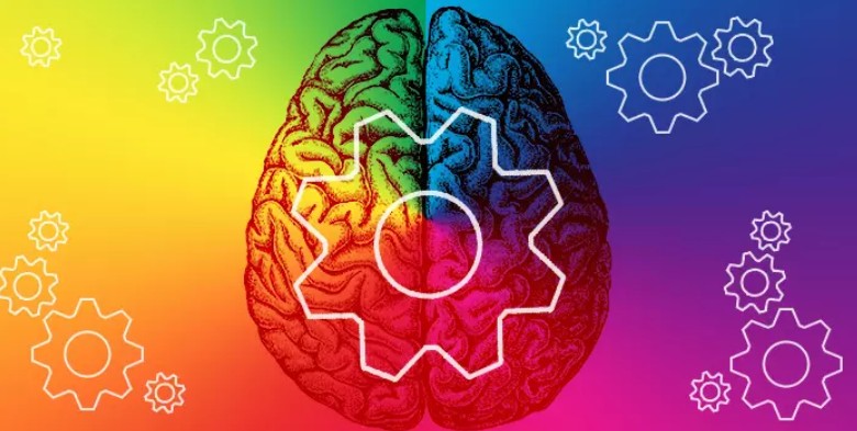
Have you ever suddenly realized that just one color is enough to "awaken" your emotions ? Just a glance at a bright red streak or a radiant yellow patch makes your heart immediately become eager and full of life. On the contrary, when you encounter a gentle blue tone, elegant light purple or mysterious jet black, your soul feels calm, light and full of sophistication. It is this magic that has led to color psychology - the study of how each color affects the mind, thoughts and the way we perceive the world. And from there, designers, marketers or anyone working in the creative field can exploit the hidden power of color to touch the hearts of viewers in the most subtle way.
1. Things to know about color psychology
Color psychology is a sub-branch of behavioral psychology that studies the effects of color on human psychology and behavior. Typically, each color will bring certain feelings. For example, red or orange brings a feeling of excitement and excitement. Blue or sky blue brings a feeling of comfort and relaxation. These feelings can affect our mood and behavior.
Colors have a definite influence on our behavior and perception, and this is something brands take advantage of to attract customers' attention.
.png)
However, the meaning and influence of colors on the human mind will vary depending on preferences and cultures. For example, pure white clothes in Eastern culture signal a funeral, but in Western culture black clothes will show regret for the deceased. In the East, yellow symbolizes power, wealth and the color of kings. Meanwhile, purple in the West is often considered the color of royalty.
In addition to cultural differences, color psychology also shows that the influence of color on human perception depends on each person's personal preferences. For example, people who like the color green will feel happy, excited and enjoy seeing green objects or being in a cool green space. People who dislike the color red will not feel full of energy or excitement, but instead feel frustrated, hot and uncomfortable.
Colors are also used to signal actions. For example, traffic signs on the road will have three prominent colors: yellow, red and green with very clear meanings: red means prohibition, yellow means caution, and green means guidance. When we see the colors of these signs on the road, we will automatically and unconsciously change our behavior to meet the requirements of the sign.
.png)
Some colors are associated with physiological changes in the body such as appetite or discomfort. That is why many fast food and beverage brands such as KFC, McDonald's, Jolibee, CocaCola, Pepsi, Pizza Hut, Domino Pizza, Nescafe, etc. choose red as one of their brand identity colors to attract customers. Red stimulates appetite, the clearest proof of this is that red fruits are very diverse and loved by many people.
The above examples can prove that: color affects our perception and decisions more than we think. Almost all first impressions and quick decisions of people are influenced by color. Therefore, if we understand the meaning of color in different cultures, how color affects human thinking, and the preferences of each subject, we can take advantage of this factor to achieve certain goals.
Color psychology is widely applied in life and all professions, especially in architecture and advertising. Designing the overall color in the house to suit the owner's preferences, but still ensuring color harmony to bring the most comfortable feeling possible is not easy for architects. Designing a brand logo to optimize brand recognition in the eyes of customers is also a challenge.
2. Notes on the application of color psychology
The meaning of colors is not constant, but changes according to the times, personal preferences and cultural characteristics. Therefore, the use of colors cannot be arbitrary because it can cause adverse reactions that affect the original purpose, or damage the brand's impression in the minds of consumers. To successfully apply color psychology to life, we need to understand some important factors.
.png)
First, colors are divided into 3 groups: warm colors, cool colors and neutral colors. The warm color group includes 3 main colors: red, orange, yellow. The warm color group often evokes positive emotions such as youthfulness, dynamism, warmth, enthusiasm, attraction, brightness and energy, but sometimes it is the color of blood and violence. Warm color tones often appear on the logos of food, beverage, health care companies, etc.
The cool color group includes blue, green and purple. These colors evoke feelings of peace, comfort, relaxation, prevent agitation, calm emotions, bring a sense of trust, solidity, nature and prestige. In some cases, this color scheme also creates a feeling of sadness and indifference. Cool colors will appear on the logos of brands related to technology, engineering, finance, natural products, health care, etc.
Neutral colors such as black, white, brown, gray, beige, gray, cream, etc. are colors that serve as backgrounds or are used in logos of brands related to vehicles, technology, finance, fashion, luxury goods, etc. The reason is because these colors, especially black, will evoke a sense of mystery, solemnity, luxury, and class, so they are very popular with the upper class and people in the upper class.
.png)
In 2020, a survey on the influence of color on people was conducted on 4,598 people from more than 30 different countries. The results of the survey showed that the meaning of color has a certain universality. Although different cultures and different meanings of colors are received, people still have certain impressions of the meaning of colors in nature.
Black: 51% associate black with luxury, sophistication or sadness
White: 43% believe that white represents purity and a sense of peace and serenity.
Red: 68% associate red with love, luck and passion
Blue: 35% feel relieved, peaceful, comfortable, creates a sense of professionalism and stability
Green: 39% said green makes them feel trusting, secure and natural
Yellow: 52% associate yellow with feelings of dynamism, joy, and energy
Orange: 44% feel that orange represents health, enthusiasm and energy
Pink: 50% agree that this is the color of romance and love.
Purple: 25% said purple gives a feeling of luxury, nobility and power
From this survey, we can see that the use of color in advertising and marketing aimed at the masses requires careful selection. When looking at the logos of brands from large to small around the world, we can easily see that they all have a certain intention in choosing and combining colors. Each brand has very specific intentions, and they are willing to change according to the development of society and product orientation.
3. Color Psychology in Marketing and Advertising
Color psychology is widely used in marketing and advertising to create an impression and attract customers. Have you ever wondered why brands choose this color, and not that color for their logos? Why do logos of brands in the same field often have certain similarities in color? In fact, businesses use certain colors in marketing and advertising for a number of reasons below.
.png)
Brand Identity: Fast food brands often use red, white and yellow. Technology, web application and software companies often choose blue and white. Health and natural product brands will prefer orange and green. These are the brand identities that companies want to aim for. These colors have been carefully chosen to highlight the industry characteristics and the brand's perspective in business.
Product characteristics: Green always reminds us of nature, freshness, and comfort. Therefore, brands specializing in natural cosmetics, clean food, or agriculture and forestry will choose green as their logo to highlight the nature and characteristics of the product. Blue brings a feeling of solidity, confidence, transparency and stability, so this color is often used in industries, electronics, finance, technology, aviation, etc. The color of the brand reflects the spirit of the product.
Customer perception: Every product launched on the market targets a certain customer group. Therefore, before deciding on the color for the brand, it is necessary to research the market and find out the colors that are preferred by the target audience. Through the survey, the brand can choose the most optimal color, which is suitable for the product characteristics, while creating an impression and attracting potential customers. Customers will pay more attention to products with their favorite colors.
In addition, in the process of choosing colors for brands, product packaging, and website design, we also need to pay attention to many issues including gender, age, cultural characteristics, and consumer purchasing habits. These are important factors that determine the success or failure of advertising and marketing strategies. To clarify this issue, we will analyze some important aspects.
3.1. Gender
According to a Kissmetric study, blue, green, red, black and white are the colors that are loved and trusted by customers. More than 1/3 of female customers, and most of male customers participating in the survey said that they would prioritize choosing brands and products with the above colors. Therefore, blue, green and red will be suitable colors for neutral products, targeting all customers regardless of gender.
.png)
In addition, purple, orange and pink are also popular colors for many women. Women often prefer simple colors with many different shades. They may like black, beige and gray, but are not very interested in earthy or brown tones. We can see that products or websites aimed at women often have purple, pink, green and blue.
Most men do not like purple, in any shade. This is one of the biggest differences compared to women. Men will prefer cool colors that bring a sense of masculinity, maturity, reliability and luxury such as blue, green and black. Therefore, when the product is aimed at men, brands should refer to colors that lean towards blue and black to attract users.
To effectively apply color psychology in advertising and marketing, we must use the right color, to the right person, at the right time, and for the right purpose. If any of these elements are wrong, the product promotion plan and customer interest will decrease sharply. This is a mistake that should not be made in advertising strategy, and we can completely avoid it if applied correctly.
3.2. Age and personality
Besides gender, age is also one of the important factors that determine color preferences and purchasing habits. Different ages will be attracted to different colors. Children and teenagers often like bright colors, high contrast and distinct tones. For example, yellow, orange, red, green, pink, or more uniquely, fluorescent colors.
.jpg)
Young people and adults still like bright colors, but they also prefer more muted and mature colors. Middle-aged and older people tend to prefer soft, pastel colors, or colors like brown and gray. As we get older, we tend to be less interested in flashy or overly dynamic things, and instead prefer soft and neutral colors.
Personality also has a significant impact on our purchasing decisions. Active, hot-tempered people who like to move quickly will prioritize items with hot colors such as red, yellow, orange, etc. Quiet, calm, or mature people will prioritize colors such as white, black, blue, gray, etc. The color a person is attracted to can say a part of their personality.
3.3. Culture
In different countries and cultures, colors will have different meanings. Therefore, brands also need to carefully understand cultural differences in advance, and understand the taboos when entering a foreign market to avoid unnecessary misunderstandings. There are two areas that any advertiser needs to pay attention to to avoid arousing customer anger, which are culture and religion.
.png)
For example, in some cultures, black represents darkness, death, bad luck, evil, mourning, witchcraft and is an unlucky sign. However, in another place, black represents luck, power, mystery and wealth. In advertising or marketing products in these two different cultures, if you do not pay attention to the meaning of colors, you can fail miserably in your marketing campaign.
Hopefully, through this article, you have partly discovered the "magic" of color in influencing emotions, behaviors and purchasing decisions. Each color, from bright to elegant, carries its own message and has the power to shape the brand image and the way consumers perceive the product. Therefore, when building an identity or advertising strategy, businesses need to consider carefully - because just one color choice can make the difference between success and failure. At the same time, as a consumer, you can also identify and take advantage of color effects to make smart purchasing decisions that are in harmony with your emotions and needs.


VIP Products


Best Selling Products
Adobe Photoshop Copyright - Full App
120 USD
Genuine Adobe Illustrator account
99 USD
ChatGPT Plus Account (GPT-4)
16 USD
Freepik Premium Account
59 USD
Upgrade genuine Capture One account
120 USD
MidJourney Account
29 USD
Plugin Retouch4me
69 USD
Capcut Pro 1 Year
39 USD
Genuine Cheap Canva Pro
39 USD
Upgrade Duolingo Super
29 USD
Upgrade Genuine Office 365
49 USD
Autodesk All App Account Copyright
120 USD
Windows 10 & 11 Pro Key
36 USD
Adobe Premiere Pro Account
99 USD
Copyright Adobe Lightroom Account
59 USD