Best Selling Products

ChatGPT Plus Account (GPT-4)
16 USD

Plugin Retouch4me
69 USD

Genuine Adobe Illustrator account
99 USD

Upgrade genuine Capture One account
120 USD

Freepik Premium Account
59 USD

Autodesk All App Account Copyright
120 USD

Adobe Photoshop Copyright - Full App
120 USD

Copyright Adobe Lightroom Account
59 USD

Windows 10 & 11 Pro Key
36 USD

Capcut Pro 1 Year
39 USD

Upgrade Genuine Office 365
49 USD

Genuine Cheap Canva Pro
39 USD

Upgrade Duolingo Super
29 USD

MidJourney Account
29 USD

Adobe Premiere Pro Account
99 USD
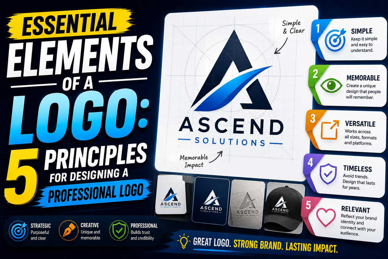
Essential elements of a logo: 5 principles for designing a professional logo.
Nội dung
- 1. Logotype: Logo that uses only text
- 2. Brandmark: Logo/Symbol
- 3. Combination Mark: A combination of letters and symbols.
- 4. Container: A geometric shape that provides structure to the logo.
- 5. Clear Space: White space to protect the logo.
- 6. The applicability of the logo
- 7. Simplicity and memorability
- 8. Conclusion
A beautiful logo comes not only from a creative idea but also from being built on design principles and core elements.
1. Logotype: Logo that uses only text
A logotype (or wordmark) is a type of logo that uses only the brand name in text form, without combining it with symbols or illustrations. This is one of the most popular design styles due to its minimalism, easy recognition, and ability to help customers directly remember the business name.
The core of a logotype lies in its typography. Fonts not only convey information but also express the brand's personality. A sans-serif font conveys a modern, youthful, and minimalist feel, while a serif font creates an impression of elegance, tradition, and reliability. Beyond the typeface, designers also need to pay attention to stroke thickness, character spacing (kerning), overall spacing (tracking), proportion, and color to create a balanced whole.
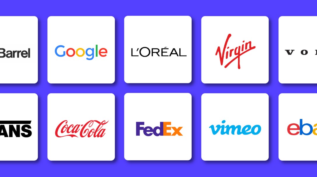
This logotype is particularly suitable for businesses with short, unique names or those wanting to build brand identity based on their name. When used consistently across all platforms, this logo style helps customers remember the brand faster without needing an intermediary symbol.
However, because there are no supporting icons, Logotype demands meticulous attention to detail in its typography. Even a small change in letter spacing or proportions can affect the visual perception and professionalism of the entire logo.
2. Brandmark: Logo/Symbol
A brandmark is a type of logo that uses only a symbol or icon to represent the brand without including the company name. This style is highly symbolic, helping the brand create a strong and easily recognizable impression across multiple platforms.
The biggest advantage of branding is its ability to convey a message visually. A well-designed logo can overcome language barriers, is easy to remember, and displays effectively at all sizes, from app icons and website favicons to packaging and billboards.

However, branding is only truly effective when the brand already has sufficient recognition. For newly established businesses, using only a logo can make it difficult for customers to associate it with the brand name, increasing the time needed to build brand recognition.
When designing a brand mark, prioritize simple, memorable shapes that are recognizable even when scaled down. A less detailed logo will be more versatile when applied to various materials and display environments.
3. Combination Mark: A combination of letters and symbols.
Combination Mark is a type of logo that combines a logotype and a brandmark, including both the brand name and the symbol in the same layout. This is considered the most balanced option and is also the style used by many businesses due to its high flexibility.
This combination helps brands build memorability of both their name and logo simultaneously. In the early stages of development, the text helps customers recognize the brand, while the logo gradually creates a unique impression. Once recognition is strong enough, businesses can completely use the icon alone while still maintaining brand recognition.
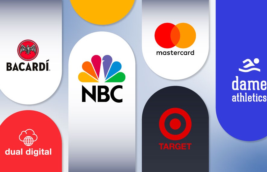
Combination Mark is also very flexible in its application. The full version can appear on websites, packaging, marketing materials, or signage, while the individual symbol can be used as an avatar, favicon, watermark, or application icon.
To be highly effective, designers need to balance the proportions between the text and the logo. The two elements should support each other rather than compete for attention. At the same time, it's crucial to ensure the logo remains clear and easily readable when scaled down or used on various background colors.
4. Container: A geometric shape that provides structure to the logo.
Containers are the shapes or structures that surround or contain logo elements such as circles, squares, rectangles, shields, or custom-designed outlines. While not mandatory in every logo, containers play a crucial role in creating structure and enhancing memorability.
A well-designed container helps to make the elements inside neat, unified, and easily recognizable. At the same time, the shape also contributes to conveying the brand message. For example, a circle evokes a sense of friendliness and connection, a square symbolizes stability, and a shield often represents safety and reliability.

Besides its aesthetic value, containers also help logos adapt better when placed on various platforms and materials. On websites, social media, or product packaging, logos with a clear structure tend to stand out and maintain consistency better.
However, the container shouldn't be too complex or take up too much space. A simple frame will make the logo look modern, easily scalable, and avoid a heavy feel when applied in practice.
5. Clear Space: White space to protect the logo.
Clear space refers to the safe white area surrounding a logo, where no additional text, images, or other graphic elements should be placed. This is a crucial but often overlooked guideline in brand identity design.
White space allows the logo enough room to stand out and creates a sense of spaciousness. If the logo is placed too close to other elements, its recognition will be significantly reduced, and the overall design will appear cramped and unprofessional.

Typically, safe spacing is determined based on the height of a character, the width of the logo, or a unit of measurement specified in the Brand Guidelines. Adhering to these standards ensures consistent logo display across websites, packaging, printed materials, signage, and digital platforms.
In addition to Clear Space, designers should also specify the minimum display size of the logo. A professional logo should not only look good when enlarged but also maintain sharpness, readability, and recognition when scaled down on favicons, business cards, or mobile app interfaces.
6. The applicability of the logo
A successful logo needs to be not only aesthetically pleasing but also practical. The logo will appear on various platforms such as websites, social media, business cards, product packaging, uniforms, billboards, and other communication materials. Therefore, the design must maintain clarity and recognition at both large and small sizes.
In addition, the logo should have multiple versions to suit different purposes, such as full color, black and white, monochrome, or inverted versions. This allows the brand flexibility when using it on light or dark backgrounds, or in printed materials with color limitations.
Beyond visual appeal, a logo should also be designed in vector format so that it can be scaled up or down without losing image quality. When combined with color, proportion, and whitespace guidelines within the brand identity, the logo will be used consistently across all communication channels. This is a crucial element in enhancing professionalism and increasing brand memorability in the eyes of customers.
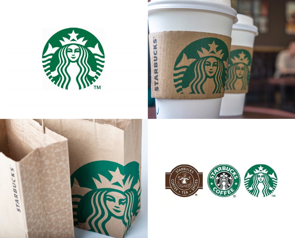
7. Simplicity and memorability
An effective logo doesn't necessarily need an elaborate design or complex details. In fact, famous logos are often built from simple shapes, lines, and colors, yet still make a strong impression. Simplicity helps viewers easily remember the brand after just a few encounters, while also enhancing recognition in various environments.
A simple design also offers advantages in terms of applicability. The logo will be clearly visible even at very small sizes, such as website favicons, app icons, or social media profile pictures, while still maintaining aesthetic appeal when enlarged on billboards or banners. Furthermore, a logo with fewer details is easier to print on various materials such as paper, fabric, metal, or product packaging without losing its essential elements.
During the design process, focus on the elements that truly represent the brand and eliminate unnecessary details. A simple, recognizable, and memorable logo will have lasting value, helping businesses build a professional image and create a lasting impression on customers.
8. Conclusion
For businesses, investing in a well-designed logo provides long-term value, helping the brand stand out in a competitive market and create a professional impression in the eyes of customers. Before starting to design or refresh a logo, understand the function of each element to make the most appropriate choice for the brand's development direction.





















VIP Products








Best Selling Products
ChatGPT Plus Account (GPT-4)
16 USD
Plugin Retouch4me
69 USD
Genuine Adobe Illustrator account
99 USD
Upgrade genuine Capture One account
120 USD
Freepik Premium Account
59 USD
Autodesk All App Account Copyright
120 USD
Adobe Photoshop Copyright - Full App
120 USD
Copyright Adobe Lightroom Account
59 USD
Windows 10 & 11 Pro Key
36 USD
Capcut Pro 1 Year
39 USD
Upgrade Genuine Office 365
49 USD
Genuine Cheap Canva Pro
39 USD
Upgrade Duolingo Super
29 USD
MidJourney Account
29 USD
Adobe Premiere Pro Account
99 USD