Best Selling Products

Plugin Retouch4me
69 USD

Genuine Cheap Canva Pro
39 USD

Genuine Adobe Illustrator account
99 USD

Windows 10 & 11 Pro Key
36 USD

Adobe Photoshop Copyright - Full App
120 USD

Upgrade Duolingo Super
29 USD

Copyright Adobe Lightroom Account
59 USD

ChatGPT Plus Account (GPT-4)
16 USD

Upgrade genuine Capture One account
120 USD

MidJourney Account
29 USD

Freepik Premium Account
59 USD

Adobe Premiere Pro Account
99 USD

Capcut Pro 1 Year
39 USD

Autodesk All App Account Copyright
120 USD

Upgrade Genuine Office 365
49 USD
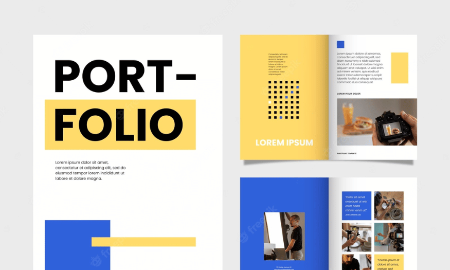
Explore Usuk Album Cover Design: Sophisticated, Minimalist and Emotional
Nội dung
- 1. Album cover – the first point of contact between the listener and the music
- 2. Characteristic elements that make up the identity of US-UK album covers
- 2.1. Symbolism and brand recognition
- 2.2. Artist portrait – from expression to body language
- 2.3. Typography – words also have their own tone
- 3. Core elements in Usuk album cover design
- 3.1. Minimalist and refined color palette: Focus on harmony and emotion
- 3.2. Typography: Choose fonts and arrange them to create emphasis
- 3.3. Images and symbols: Use metaphors or suggestive symbols
- 3.4. Negative Space: The Importance of White Space in Usuk Design
- 3.5. Printing materials and effects: Contribute to visual and tactile experiences
- 4. Detailed analysis of design features commonly found on Usuk album covers
- 4.1. Color
- 4.2. Typography:
- 4.3. Images and icons:
- 4.4. Negative Space
- 4.5. Printing materials and effects:
- 5. Professional Usuk album cover design process
- 5.1. Research and understand the music and message of the album
- 5.2. Brainstorm and sketch Usuk design concepts
- 5.3. Choose the right color palette, typography, images and icons
- 5.4. Layout and arrangement of elements on the album cover
- 6. Conclusion
Explore US-UK album cover design: from visual art, artist branding to iconic design trends.
Album covers in the US-UK music industry have long gone beyond the framework of a simple identification tool. Not only is it a place to express the artist's style, it also acts as a gateway to emotions, helping listeners visualize the melody through visual language. From classic to modern designs, each album cover is a work of symbolic value, reflecting the spirit of music and contemporary popular culture. Let's find out more details with sadesign below.
1. Album cover – the first point of contact between the listener and the music
In the music world, the album cover is the “face” of an entire artistic project. Before the sound is heard, listeners are impressed or curious by the image on the cover. In the US-UK market, where competition between artists and record labels is always fierce, album cover design becomes more important than ever.
.jpg)
A well-designed album cover helps build an artist’s brand image and defines the musical style they want to convey. More than just an illustration, it’s a form of “narrative art” – the art of telling a story through images.
Album covers are not just a visual design, but also play an important role in conveying the message and emotions of the music. This is the first point of contact between the listener and the work, where the first impression is formed. A delicately designed album cover can suggest a story, arouse curiosity and create an emotional bridge between the artist and the audience. Therefore, investing in album cover design is not only aesthetic but also an important strategy in building a brand and spreading the artistic value of music to the public.
2. Characteristic elements that make up the identity of US-UK album covers
The US-UK album cover is not only a part of the music product but also an important element that shows the artist's artistic identity and style. The typical elements that make up the identity of the US-UK album cover include:
2.1. Symbolism and brand recognition
Many famous US-UK album cover designs do not need to include the artist name or album title, viewers can still recognize them thanks to the highly symbolic image. It can be a characteristic pose, a color tone associated with the musical personality, or a small detail with great suggestive value.
For example, a bright red throughout an album cover can suggest intensity and rebellion; soft pastel tones often imply a dreamy or nostalgic feeling. The design then acts as an emotional color code, guiding the listener from the first glance.
2.2. Artist portrait – from expression to body language
A classic element often seen in US-UK album cover design is the artist portrait. However, more than just a photo ID or studio shot, these portraits often contain a story, emotion or are highly artistic.
From the eyes, to the hand gestures, to the camera angles – all contribute to conveying the spirit of the album. In many cases, the artist’s facial expression is the highlight that determines the visual tone of the entire design.
2.3. Typography – words also have their own tone
The typefaces on US-UK album covers are often carefully chosen to match the musical concept. Classic serif fonts are often associated with acoustic, soul, or folk albums with a traditional feel. Meanwhile, sans-serif, broken-stroke, or experimental fonts are often found in modern electronic, hip hop, and pop music.
In addition to aesthetic factors, typography also plays a role in visual navigation, creating rhythm in the layout and emphasizing the content message.
3. Core elements in Usuk album cover design
.jpg)
3.1. Minimalist and refined color palette: Focus on harmony and emotion
The color palette in Usuk design is usually limited to a few basic colors, mainly neutral tones (black, white, gray, beige) or soft pastel tones.
The goal is to create visual harmony, without distractions, and to focus on the emotion the music is trying to convey.
The deliberate use of color, sometimes just a little pop of color on a neutral background, can create a powerful effect.
3.2. Typography: Choose fonts and arrange them to create emphasis
Typography plays an important role in Usuk design. Fonts are often carefully chosen to convey elegance, modernity or classic sophistication.
The type arrangement is simple, clear and well-spaced for readability and aesthetics.
The size and placement of the lettering is also carefully considered to create emphasis without detracting from the overall minimalism of the design.
3.3. Images and symbols: Use metaphors or suggestive symbols
If there are images or symbols, they are usually abstract, minimalist, or suggestive.
Images can be small details, delicately rendered natural elements, or simple shapes.
Icons are often simplified to convey a concise and meaningful message.
3.4. Negative Space: The Importance of White Space in Usuk Design
Negative space, or the empty space around and between design elements, is an integral component of the Usuk style.
White space helps create balance, harmony, highlights key elements and gives the viewer a sense of relaxation and tranquility.
Using negative space effectively is an art that requires sophistication and a high aesthetic sense.
3.5. Printing materials and effects: Contribute to visual and tactile experiences
Paper texture and printing effects can play a big role in enhancing the experience of an Usuk album cover.
Using paper with a smooth, matte or special texture can add sophistication and a high-end feel.
Minimalist printing effects like foil stamping, embossing or selective UV coating can create subtle accents without detracting from the overall minimalism of the design.
4. Detailed analysis of design features commonly found on Usuk album covers
4.1. Color
4.11. Minimalist Color Accents: When and Where to Use Them.
Color accents in Usuk design are often used very sparingly and deliberately. The purpose is to draw attention to a specific element, such as the artist name, album title, or a small icon.
When to use:
When you want to create a gentle contrast and avoid the absolute monotony of a neutral palette.
To visually associate with a particular aspect of the music or message of the album. For example, a touch of blue can evoke peace or a touch of red can represent passion.
To create a subtle branding element for the artist.
Where to use:
Usually in small details like a few letters in the album name, a thin line, or a simple icon.
Maybe a small pop of color in one corner of the album cover for a surprising visual highlight.
Avoid using too many or too many color accents on the album cover, as this can disrupt the minimalism of the Usuk style.
4.2. Typography:
4.2.1. Choose an elegant and modern sans-serif font.
Sans-serif fonts are often favored in Usuk design because of their clean, modern, and easy-to-read look.
Fonts like Helvetica, Arial, Montserrat, Open Sans, Lato are often chosen for their neutrality and ability to convey a message clearly without being distracting.
Elegance is achieved by choosing light, regular, or semibold variations of the font, creating a subtle and unobtrusive feel.
4.2.2. Use classic serif fonts to create elegance and sophistication.
Although sans-serif is more popular, serif fonts can still be used in Usuk design to give a classic, formal, and sophisticated feel.
Serif fonts like Garamond, Times New Roman (used sparingly), or modern serif fonts with thin strokes can create this effect.
When using serifs, care should be taken to choose variants with moderate thickness and reasonable letter spacing to avoid a heavy feeling.
4.2.3. Text arrangement: Position, size, line and letter spacing.
The typographic arrangement in Usuk designs is often very simple and intentional.
Placement: Artist names and album titles are often placed centrally or off to the side in a balanced manner, creating harmony with other elements and negative space.
Size: The font size should be moderate, easy to read but not too large, leaving room for negative space and visual elements (if any). Sometimes the artist name can be larger than the album name or vice versa, depending on the design intent.
Leading and kerning/tracking: Carefully adjusted to create spaciousness, readability, and aesthetic appeal to typography. Wider leading can convey a sense of elegance and sophistication.
4.2.4. Use minimalist calligraphy.
In some cases, stylized typography or minimalist calligraphy can be used to add a unique and personal touch to the Usuk album cover.
However, the use should be very sparing and ensure that the lettering is still legible and fits in with the overall minimalist style. The lines are usually thin and not too complex.
4.3. Images and icons:
.jpg)
4.3.1. Abstract and minimalist images: Evoke emotions and ideas.
Instead of straightforward imagery, Usuk designs often use abstract images, simple color blocks, or subtle textures to evoke emotions and ideas related to music.
Simple geometric shapes, clean lines, or soft lighting effects can be used to create an image that is both unique and in keeping with the minimalist style.
4.3.2. Use natural images (landscapes, natural elements) subtly.
Nature imagery can be used in Usuk design, but is often presented in a very subtle and minimalistic way.
For example, a hazy horizon line, a small detail of a flower, or a simple marble pattern can evoke certain emotions without taking away from the minimalism of the design.
These images are often processed to have pale or neutral colors that blend in with the overall color palette.
4.3.3. Simple and meaningful icons: Convey a concise message.
Simple and meaningful icons can be used to convey the album's message in a concise and visual way.
These icons are often designed with minimal lines, clear and easily recognizable. Their position and size are often carefully considered to create balance with other elements.
4.3.4. Use portrait images (if any): Minimalist and expressive.
When portrait imagery is used in Usuk design, the representation is often very minimalistic and focuses on the artist's expression rather than intricate details.
Portraits can be black and white, toned down, or focused on just one part of the face. The composition is often simple, with plenty of negative space around the subject to make it stand out.
4.4. Negative Space
4.4.1. Create balance and harmony in the design.
Negative space plays an important role in creating visual balance between elements on an album cover. It gives the viewer's eye room to "breathe" and doesn't feel overwhelmed by too many details.
Distributing negative space properly helps create a harmonious and pleasing composition.
4.4.2. Emphasize the key elements of the album cover.
White space around the artist name, album title, or main image/icon helps draw the viewer's attention to the most important elements.
The contrast between content elements and negative space creates a natural focal point.
4.4.3. Create unique and surprising visual effects.
In some creative Usuk designs, negative space can be cleverly used to create hidden images or messages, bringing surprise and interest to the viewer. This is a subtle way to add depth to a minimalist design.
4.5. Printing materials and effects:
Paper material plays an important role in conveying the refined and high-class feel of Usuk style.
The paper has a smooth surface that gives a modern and clean feel.
Matte surface paper provides an elegant look and minimizes light reflection.
Paper with a special texture (e.g. a slight grain) can add subtle tactile and visual depth.
5. Professional Usuk album cover design process
.jpg)
5.1. Research and understand the music and message of the album
The first and most important step is to have a deep understanding of the music (genre, rhythm, tempo) and the message the artist wants to convey through the album.
Listen carefully to the songs, read the lyrics (if available), and talk directly with the artists to get the core spirit of the project.
Research the artist's previous images and art style (if any) to ensure consistency or create a meaningful development.
5.2. Brainstorm and sketch Usuk design concepts
Based on the understanding of music and message, start sketching out design ideas in Usuk style.
Experiment with simple layouts, different neutral and pastel color palettes, elegant fonts, and minimalistic image or icon ideas.
Focus on conveying the core emotions and ideas of the album in the most subtle and effective way.
5.3. Choose the right color palette, typography, images and icons
Color Palette: Choose a minimal and subtle color palette, which can include a few neutrals, a dominant pastel shade, or a pop of color.
Typography: Choose one or two suitable fonts for the artist name and album title, making sure they are legible and aesthetically pleasing. Decide on the size, position and spacing of the letters.
Images/Icons: If you decide to use images or icons, choose abstract, minimalist images or simple icons that are still evocative and meaningful.
5.4. Layout and arrangement of elements on the album cover
Arrange the elements (typography, images/icons, negative space) on the album cover in a balanced and harmonious way.
Experiment with different layouts: symmetrical, asymmetrical, centered, or off to one side.
Focus on creating ample negative space to highlight key elements and give a sense of sophistication.
6. Conclusion
In every stage of music development, the album cover has always been at the forefront as a cultural symbol, shaping the visual aesthetics of each period. When music touches the hearts of listeners, the album cover image will be something that will remain in their minds for a long time. And it is from this intersection of sound and vision that the world of US-UK becomes rich, fascinating and constantly inspires both music lovers and the global creative community.


VIP Products


Best Selling Products
Plugin Retouch4me
69 USD
Genuine Cheap Canva Pro
39 USD
Genuine Adobe Illustrator account
99 USD
Windows 10 & 11 Pro Key
36 USD
Adobe Photoshop Copyright - Full App
120 USD
Upgrade Duolingo Super
29 USD
Copyright Adobe Lightroom Account
59 USD
ChatGPT Plus Account (GPT-4)
16 USD
Upgrade genuine Capture One account
120 USD
MidJourney Account
29 USD
Freepik Premium Account
59 USD
Adobe Premiere Pro Account
99 USD
Capcut Pro 1 Year
39 USD
Autodesk All App Account Copyright
120 USD
Upgrade Genuine Office 365
49 USD