Best Selling Products

Genuine Adobe Illustrator account
99 USD

Adobe Photoshop Copyright - Full App
120 USD

Autodesk All App Account Copyright
120 USD

MidJourney Account
29 USD

Windows 10 & 11 Pro Key
36 USD

Freepik Premium Account
59 USD

Upgrade genuine Capture One account
120 USD

Adobe Premiere Pro Account
99 USD

Genuine Cheap Canva Pro
39 USD

Plugin Retouch4me
69 USD

Upgrade Duolingo Super
29 USD

ChatGPT Plus Account (GPT-4)
16 USD

Upgrade Genuine Office 365
49 USD

Copyright Adobe Lightroom Account
59 USD

Capcut Pro 1 Year
39 USD
Exploring Color: The Element That Makes Design Unique
Nội dung
- 1. What is Color Contrast? Discover Its Meaning and Applications in Design
- 2.why Contrasting Colors Create Unique Designs
- 2.1. Create Strong Contrast
- 2.2. Enhance Emotions and Impressions
- 2.3. Create Unique and Unforgettable Designs
- 2.4. Flexible Application In Design Projects
- 2.5. Ability to Create Focus and Lead the Viewer's Eye
- 3. How to Use Contrast Colors in Graphic Design
- 3.1. Determine the Design Objective
- 3.2. Choose the Right Color for Your Message
- 3.3. Don't Overuse Colors
- 3.4. Combining Suitable Color Tones
- 4. Conclusion
Learn about color, an important element in graphic design, and why it helps create creative, unique, and engaging products. Explore the application and power of color in design.
Color contrast, a term in graphic design, is becoming more and more popular in creative products. Discover the definition of color contrast and why it is an important element in creating unique, impressive designs.
1. What is Color Contrast? Discover Its Meaning and Applications in Design
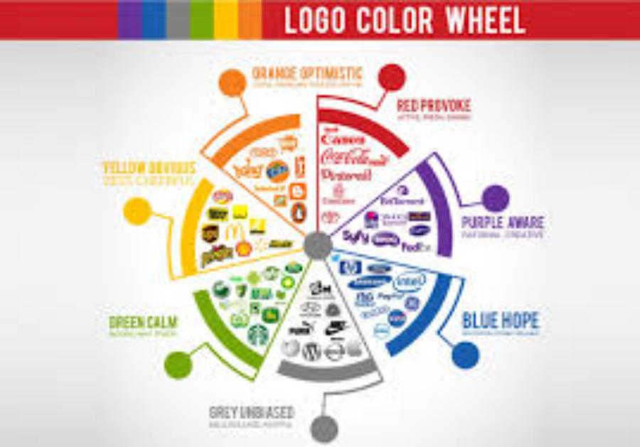
Color is always an indispensable part of any design product, from logos to advertisements, from book covers to websites. However, not all colors are easy to combine and use effectively. In graphic design, contrasting color is a rather special concept that not everyone understands clearly. So what is contrasting color, and why is it so important?
.jpg)
Complementary colors, also known as strong contrasting colors, are colors that are opposite each other on the color wheel. These contrasting colors are often used to create prominence, attract attention and make a strong impression on the viewer. They create high contrast, making design elements easily recognizable and highly aesthetic. Combining contrasting colors in design not only helps to highlight details but also creates liveliness and excitement for the product.
In the field of design, contrasting colors play an important role in creating highlights, directing the viewer’s attention to key elements or conveying a strong message. The use of contrasting colors requires careful consideration to ensure aesthetics and avoid creating a sense of confusion. When applied correctly, contrasting colors not only increase the effectiveness of a design but also contribute to shaping the style and personality of a product or brand.
2.why Contrasting Colors Create Unique Designs
Distinction and distinction are the core elements that make contrasting colors such a powerful tool in graphic design. Here are the main reasons why contrasting colors can create unique designs:
2.1. Create Strong Contrast
One of the most striking features of contrasting colors is their ability to create strong contrast between design elements. When opposing colors appear together, the human eye is immediately drawn to them. This helps important details in the design stand out and become easily recognizable.
.jpg)
For example, when combining red and green, you will feel a clear separation between them, making each color stand out more than ever. This contrast also helps the design come to life, making it impossible for the viewer to take their eyes off the product.
2.2. Enhance Emotions and Impressions
Color is not only an aesthetic element but also has a strong impact on the emotions of the viewer. Contrasting colors, with strong contrasts, can create different emotions depending on how they are used. Colors can make the viewer feel excited, curious, or even tense, strong.
For example, the combination of red and black can create a strong, powerful feeling, while yellow and purple can bring creativity, originality and edginess. Understanding how to use contrasting colors in your designs will help you create works that are both attractive and emotional.
2.3. Create Unique and Unforgettable Designs
Complementary colors are more than just random color combinations. When used correctly, they can make your designs unique and memorable. Professional graphic designers often choose contrasting color combinations to create highly recognizable works that help products stand out in the eyes of consumers.
For example, famous brands like Coca-Cola or McDonald's have cleverly used red and yellow, two contrasting colors, to create logos that are easily recognizable and leave a strong impression in the minds of customers.
2.4. Flexible Application In Design Projects
Mixed colors can be applied flexibly in many different types of designs, from graphic design, advertising, websites to product packaging. In each case, the combination of mixed colors will bring a unique aesthetic effect, suitable for the purpose and message of the project.
.jpg)
When designing a website, for example, using blue as the background and orange for the buttons will make it easier for users to identify important elements on the page, thereby improving the user experience. Contrasting colors not only make the design beautiful, but can also improve the functionality of interface elements.
2.5. Ability to Create Focus and Lead the Viewer's Eye
Color can be used to direct the viewer’s eye to important points in a design. Contrasting colors, with their strong contrast, have the ability to create strong focal points, making it easier for the viewer to focus on the most important elements.
One of the common uses of contrasting colors is in advertising design, where these colors are used to highlight key messages or featured products. This not only helps the ad attract attention, but also improves viewer engagement and engagement.
3. How to Use Contrast Colors in Graphic Design
To use contrasting colors effectively in design, designers need to master some basic principles. Here are some suggestions to help you harness the power of contrasting colors in your design projects:
3.1. Determine the Design Objective
Before you start choosing colors, you need to clearly define the goal of your design. Do you want to create a bold, energetic design, or a soft, subtle design? Each goal will require a different color combination, so you need to consider carefully before deciding on colors to use.
Using contrasting colors in graphic design is not only to create highlights but also plays an important role in conveying messages and attracting the attention of viewers. To apply effectively, you must first clearly define the purpose of the design, from which you can choose the appropriate contrasting color pairs to highlight the main element you want to emphasize. At the same time, you need to consider the overall harmony to avoid causing confusion or losing the professionalism of the product. When used properly, contrasting colors not only help increase aesthetics but also contribute to improving the communication effectiveness of the design.
3.2. Choose the Right Color for Your Message
Not all colors are appropriate for all messages. For example, red can convey strength and assertiveness, while blue can convey calmness and trust. Make sure the contrasting colors you choose are appropriate for the message you want to convey.
.jpg)
In graphic design, using contrasting colors effectively not only helps create highlights but also conveys messages clearly and strongly. To choose the right contrasting color, you need to consider the psychological meaning of the color, the harmony in the overall design and the target audience you want to target. Contrasting colors should be used in moderation, avoiding overuse so as not to cause confusion or reduce the professionalism of the product. At the same time, make sure that the contrasting color is chosen to match the main message, helping to increase recognition and create a deep impression on the viewer.
3.3. Don't Overuse Colors
While contrasting colors can create a strong statement, using too many contrasting colors in a design can be overwhelming and distracting. Choose the elements you want to emphasize and use contrasting colors wisely to achieve the best effect.
Avoid using contrasting colors too much as this can create visual imbalance and detract from the aesthetic of the design. Instead, use contrasting colors strategically and appropriately, ensuring that they support the message and create harmony with the overall layout. A successful design is not only about using bold colors but also about combining them subtly and effectively.
3.4. Combining Suitable Color Tones
To create harmony in your design, you can combine contrasting colors with neutral tones or softer colors. This will help balance the design and create a soft, pleasant look for the viewer.
To be effective, color tones need to be combined harmoniously and strategically, avoiding using too many colors that are confusing or unbalanced. Some important principles include choosing contrasting colors based on the color wheel, utilizing the 60-30-10 rule to distribute colors appropriately, and ensuring that the colors chosen match the mood or message of the project. Additionally, checking contrast and readability are also important factors to ensure that the design is not only beautiful but also effective in communicating with the viewer.
4. Conclusion
Color contrast is a powerful tool in graphic design , helping to create a striking and memorable impression. When used correctly, color contrast can enhance designs, resulting in unique, attractive and creative products. However, using color contrast effectively requires sophistication and a good understanding of color combinations. If you are a designer, mastering the concept and application of color contrast will be a great advantage to help you create impressive and unforgettable designs.


VIP Products


Best Selling Products
Genuine Adobe Illustrator account
99 USD
Adobe Photoshop Copyright - Full App
120 USD
Autodesk All App Account Copyright
120 USD
MidJourney Account
29 USD
Windows 10 & 11 Pro Key
36 USD
Freepik Premium Account
59 USD
Upgrade genuine Capture One account
120 USD
Adobe Premiere Pro Account
99 USD
Genuine Cheap Canva Pro
39 USD
Plugin Retouch4me
69 USD
Upgrade Duolingo Super
29 USD
ChatGPT Plus Account (GPT-4)
16 USD
Upgrade Genuine Office 365
49 USD
Copyright Adobe Lightroom Account
59 USD
Capcut Pro 1 Year
39 USD