Best Selling Products

MidJourney Account
29 USD

Upgrade Duolingo Super
29 USD

Upgrade genuine Capture One account
120 USD

Capcut Pro 1 Year
39 USD

Copyright Adobe Lightroom Account
59 USD

Genuine Adobe Illustrator account
99 USD

Adobe Premiere Pro Account
99 USD

Windows 10 & 11 Pro Key
36 USD

Autodesk All App Account Copyright
120 USD

Upgrade Genuine Office 365
49 USD

Adobe Photoshop Copyright - Full App
120 USD

Genuine Cheap Canva Pro
39 USD

Freepik Premium Account
59 USD

ChatGPT Plus Account (GPT-4)
16 USD

Plugin Retouch4me
69 USD
Exploring Typography: The Art of Lettering and Canva Resources
Nội dung
- 1. What is Typography? Understand correctly to design correctly
- 2. The importance of typography in design
- 2.1. User Experience (UX)
- 2.2. Brand identity
- 2.3. Effectiveness of message transmission
- 3. Main elements in typography
- 4. Elements That Create Beautiful and Effective Typography
- 5. Basic principles when using typography
- 5.1. Avoid using too many fonts
- 5.2. Reasonable contrast coordination
- 5.3. Standard alignment
- 5.4 Prioritize readability
- 6. Revealing the Hidden Treasure of Beautiful Typography on Canva
- 7. Canva and the power of typography in design
- 8. Beautiful typography styles on Canva you may not know
- 8.1. Elegant serif font: Playfair Display
- 8.2. Modern sans-serif font: Montserrat
- 8.3. Font combination: League Spartan + Libre Baskerville
- 8.4. Creative script font: Great Vibes
- 8.5. Outstanding pre-designed typography templates
- 9. Instructions for using typography effectively on Canva
- 10. Common typography mistakes and how to fix them
- 11. Typography and design trends 2025
- 12. Conclusion
Explore the concept of typography, its role in design, and beautiful typography templates on Canva that you may not have known before. Detailed instructions on how to apply typography correctly, making your designs more professional and attractive.
In the world of design, besides color, image and layout, typography plays the role of the soul of visual language. It is not simply choosing a typeface but also the art of arranging letters in an aesthetic, easy-to-read and effective way to convey the message. In this article, sadesign will thoroughly explain the concept of typography, explore the key elements that create beautiful and special typography. Reveal hidden beautiful typography updates on Canva that you may not have discovered.
1. What is Typography? Understand correctly to design correctly
Typography is the art of arranging type in design. It is not just about font selection, but also about letter placement, letter spacing, line spacing, and letter height to create visual balance and effectively convey a message.
.jpg)
In modern design, typography plays a role just as important as imagery. It not only affects readability, but also helps convey the emotion, personality, and core message of a brand. Good typography can make a strong impression, while poor typography can detract from the entire design, no matter how beautiful the imagery.
Distinguishing between typography, calligraphy and lettering:
Typography: Involves using available typefaces (fonts) and arranging them systematically to create text.
Calligraphy: Is the art of writing by hand with a brush or other writing instrument, focusing on the beauty of each stroke and the smoothness of the flow.
Lettering: The process of meticulously drawing letters, often for a specific purpose (logo, headline), focusing on the unique shape and artistry of each letter.
2. The importance of typography in design
Typography is more than just a decorative element in a design. It is a strategic element that influences:
2.1. User Experience (UX)
Good typography ensures that text is easy to read and digest, helping users avoid eye strain and have a better experience interacting with the design. An easy-to-read font and balanced layout help viewers absorb information quickly and easily. On the other hand, a confusing design with incorrect typography can easily cause visual confusion, causing users to abandon the content after just a few seconds.
2.2. Brand identity
Typography can be as powerful a brand reminder as colors or logos. For example, serif fonts evoke a sense of classic, trustworthy, while sans-serif fonts convey a modern, youthful feel. Choosing the right typography can help your brand be more consistent in its communications.
Fonts are an important element of brand identity. Consistent use of one or a few distinctive fonts helps create brand distinction and recognition.
2.3. Effectiveness of message transmission
Messages are more powerful when presented with appropriate typography. The appropriate use of bold, italic, and uppercase helps to emphasize the right points of content.
The choice of font and the way the text is arranged directly affects how the message is conveyed and perceived. The right font can enhance the meaning of the text, while the wrong font can be misleading or detract from the message.
3. Main elements in typography
In order to choose and use typography effectively, it is important to understand the basic structure of a letter and related terminology.
.jpg)
Basic components of a letter:
Baseline: The imaginary line on which the letters stand.
X-height (X-height): The height of lowercase letters (no indents or outdents), usually the height of the x.
Ascender: The part of a letter that extends above the x-height line (e.g. b, d, h).
Descender: The part of a letter that extends below the baseline (e.g. g, j, p).
Cap height: The height of the uppercase letters.
Serif: The small strokes at the ends of the main strokes of some serif fonts.
Stem: The main vertical or slanted stroke of a letter.
Bowl: The rounded part that encloses an enclosed space of a letter (e.g. o, b, d).
Counter (Counter): The space inside the letter shape (e.g. the space inside the letter o).
Important terms in typography:
Kerning (Specific spacing between letter pairs): Adjusting the spacing between specific letter pairs to create a harmonious and readable whole (e.g. WA, To).
Leading (Line Spacing): The vertical space between lines of text.
Tracking: The even spacing between all letters in a paragraph of text.
Hierarchy: Use different typography attributes (size, weight, color, font) to distinguish the importance of text sections and guide the reader's eye.
Alignment: How text is aligned horizontally (left, right, center, justify).
Weight: The level of darkness of the font (eg: light, regular, bold).
Style: Variations of a font (e.g. italic, condensed).
The impact of structural elements on readability and aesthetics: Understanding these elements helps you make informed typography decisions. For example, leading that is too small can cause lines of text to overlap, making it difficult to read; poor kerning can create uneven spaces that are unsightly.
4. Elements That Create Beautiful and Effective Typography
Good typography is not just about choosing an eye-catching font, but also about ensuring it effectively conveys your message and provides a good user experience.
Legibility: This is the most important factor. No matter how beautiful a font is, if it is difficult to read, it will fail. Legibility refers to the individual shapes of the letters and how they are designed to be easily distinguishable.
Readability: Readability is concerned with how letters are arranged in a long piece of text. Factors such as leading, tracking, and line length greatly affect readability.
Hierarchy: Effective typography uses a clear hierarchy to guide the reader’s eye and highlight important information. Headings, subheadings, and main content should have clear differences in size, boldness, and font (if applicable).
Contrast: Contrast applies not only to color but also to size, weight, and typeface. Contrast helps create emphasis and makes typographic elements stand out.
Consistency: Maintaining a consistent typography style across all designs (websites, publications, applications...) helps create professionalism and reinforce brand identity.
Personality: Choose a font that matches your brand’s personality and the message you want to convey. A formal font might work for a luxury brand, while a playful font might work for a children’s brand.
5. Basic principles when using typography
5.1. Avoid using too many fonts
A design should only use 2-3 different fonts to avoid confusion. The title font should stand out and be easily recognizable. The body font should be simple and easy to read.
5.2. Reasonable contrast coordination
Combine sans-serif and serif fonts to create contrast while still maintaining harmony. Use bold fonts for headlines, thin fonts for sub-descriptions.
5.3. Standard alignment
Text should be clearly aligned: left, center, or right – depending on the purpose. Avoid random alignment, which makes the design look unprofessional.
5.4 Prioritize readability
Readability is always more important than aesthetics. Avoid using fancy fonts for main content.
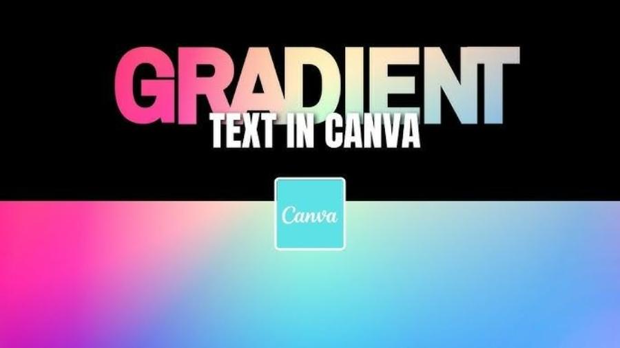
6. Revealing the Hidden Treasure of Beautiful Typography on Canva
Canva is a powerful online design tool with a huge font library. However, besides the popular fonts, Canva also hides many beautiful and unique typographic gems that you may not have discovered.
Introducing the Canva font selection interface: When you select a text box in Canva, the toolbar at the top will display the font options (usually the current font name). Click on it, and a drop-down menu will appear with a list of available fonts. You can scroll to see them all or use the search bar to search by name.
Explore font collections by style: Canva organizes fonts by style, making it easy to find the right font for your project. Popular collections include:
Serif: Fonts with feet, giving a traditional, formal, and trustworthy feel (e.g. Playfair Display, Merriweather, Libre Baskerville).
Sans-Serif: Fonts that are sans-serif, modern, clean, and easy to read (e.g. Montserrat, Open Sans, Lato).
Script: Fonts that mimic handwriting, creating a personal, artistic, and intimate feel (e.g. Lobster, Pacifico, Sacramento).
Display: Unique, stylized fonts, often used for headlines or attention-grabbing elements (e.g. Bebas Neue, Oswald, Anton).
Check out these beautiful and unique fonts that few people know about on Canva: To help you discover hidden gems, here are a few suggestions for beautiful and unique fonts on Canva that you may not have tried:
Abril Fatface: A bold, strong, modern serif font, great for large headlines.
Raleway: An elegant sans-serif font with a variety of weights, suitable for both headlines and body copy.
Poppins: A geometric sans-serif font with multiple variations, giving it a modern and professional feel.
Playfair Display SC: A compact and elegant version of Playfair Display, ideal for subheadings or short text passages.
Dancing Script: A playful and free-spirited script font, suitable for personal designs.
Ovo: A unique serif font with soft curves, creating a warm and friendly feel.
Cabin: A modern and easy-to-read sans-serif font with gently rounded corners.
Amatic SC: A unique handwritten sans-serif font, suitable for headlines or elements that need to stand out.
How to search and filter fonts effectively on Canva:
Using the search bar: If you have a specific style in mind (e.g. vintage, geometric), type that keyword into the font search bar.
Explore suggested fonts: Canva often suggests fonts that work well with the design you're using. Pay attention to these suggestions.
Browse by collection: Use the style filters at the top of the font list to narrow your search.
Experiment and preview: Click each font to preview how it will appear with your text.
7. Canva and the power of typography in design
Canva is a powerful tool for both amateurs and professional designers. Without complicated software, you can create impressive products with just a few drag-and-drop operations on the intuitive interface.
.jpg)
When it comes to typography, Canva offers:
Over 3,000 diverse font styles, from classic to modern, from serious to creative.
Font Pairings are pre-suggested, saving users time in choosing.
Pre-designed typography templates (text templates) suitable for each type of product such as posters, slides, banners, Instagram stories...
8. Beautiful typography styles on Canva you may not know
Below are some very popular fonts and font combinations on Canva that few people exploit properly.
.jpg)
8.1. Elegant serif font: Playfair Display
This is a classic font but extremely suitable for artistic and luxurious designs such as portfolios, book covers, and art posters.
8.2. Modern sans-serif font: Montserrat
Montserrat is modern, clean and easy to read. Suitable for headlines, presentation slides and corporate websites.
8.3. Font combination: League Spartan + Libre Baskerville
League Spartan (sans-serif) combined with Libre Baskerville (serif) creates a beautiful contrast, ideal for brochures or inspirational posts.
8.4. Creative script font: Great Vibes
Handwritten style font, great for wedding invitations, video titles or artistic quotes.
8.5. Outstanding pre-designed typography templates
Canva has many typography layout templates such as:
Bold & Simple Quote – Social Media Friendly.
Minimalist Sale Banner – For marketing.
Retro Title Text – Nostalgic, retro style.
9. Instructions for using typography effectively on Canva
Step 1: Choose the right design
Canva offers layouts that are compatible with poster sizes, social media posts, resumes, and more. Choose a format before adding typography.
Step 2: Choose the main font
Determine your design style (serious, creative, feminine, strong…) to choose a main font for the title.
Step 3: Coordinate fonts
Use a secondary font for descriptive content, and a different font for subheadlines if needed. Avoid using fonts that are too similar or too different.
Step 4: Adjust hierarchy and spacing
Scale up or down to show hierarchy of information. Adjust spacing to ensure a harmonious layout.
Step 5: Brand if needed
If you are designing for a business, use the correct fonts in the brand guidelines to maintain brand identity.
10. Common typography mistakes and how to fix them
a. Abuse of artistic fonts
Fonts like Brush Script or Gothic fonts, if used in the wrong context, can make it difficult for viewers to access information.
Solution: Use these fonts for short titles, avoid using them for long paragraphs.
b. Font Inconsistency
Inconsistency causes visual disengagement.
Solution: Use 1-2 fonts consistently throughout the design.
c. Forget to optimize for other devices
Some fonts look good on computers but are formatted incorrectly when viewed on phones.
Solution: Check preview on sizes before publishing.
11. Typography and design trends 2025
Typography is moving towards a minimalist yet expressive direction. Notable trends include:
Neo Grotesque Revival: The return of classic sans-serif fonts.
Custom Typography: Create your own unique typography.
3D Typography: Typography with depth for more striking designs.
Mixed Styles: Combine multiple fonts in the same layout while still ensuring a clear visual structure.
Canva constantly updates new fonts to keep up with this trend, supporting users to create trendy designs without requiring specialized skills.
12. Conclusion
Although it is a small element in design, typography plays a leading role in the entire visual experience. The sophistication in the selection and arrangement of letters will elevate your design from ordinary to professional, with a strong personal or brand mark. With a powerful toolkit like Canva, mastering typography has never been easier. Start exploring and applying the beautiful, modern fonts that Canva provides, turning each design product into a memorable mark.


VIP Products


Best Selling Products
MidJourney Account
29 USD
Upgrade Duolingo Super
29 USD
Upgrade genuine Capture One account
120 USD
Capcut Pro 1 Year
39 USD
Copyright Adobe Lightroom Account
59 USD
Genuine Adobe Illustrator account
99 USD
Adobe Premiere Pro Account
99 USD
Windows 10 & 11 Pro Key
36 USD
Autodesk All App Account Copyright
120 USD
Upgrade Genuine Office 365
49 USD
Adobe Photoshop Copyright - Full App
120 USD
Genuine Cheap Canva Pro
39 USD
Freepik Premium Account
59 USD
ChatGPT Plus Account (GPT-4)
16 USD
Plugin Retouch4me
69 USD