Best Selling Products

Genuine Cheap Canva Pro
39 USD

Upgrade Genuine Office 365
49 USD

Autodesk All App Account Copyright
120 USD

Windows 10 & 11 Pro Key
36 USD

ChatGPT Plus Account (GPT-4)
16 USD

Adobe Photoshop Copyright - Full App
120 USD

Adobe Premiere Pro Account
99 USD

Genuine Adobe Illustrator account
99 USD

Upgrade Duolingo Super
29 USD

Freepik Premium Account
59 USD

MidJourney Account
29 USD

Copyright Adobe Lightroom Account
59 USD

Upgrade genuine Capture One account
120 USD

Capcut Pro 1 Year
39 USD

Plugin Retouch4me
69 USD
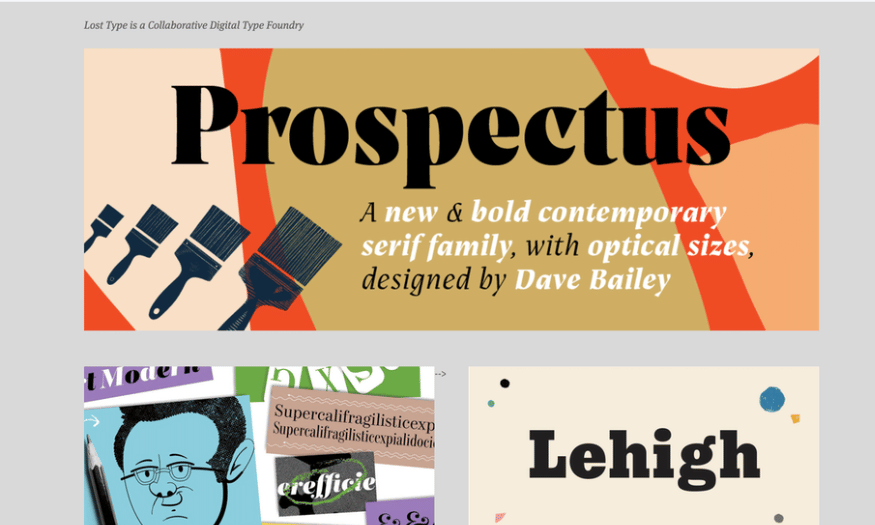
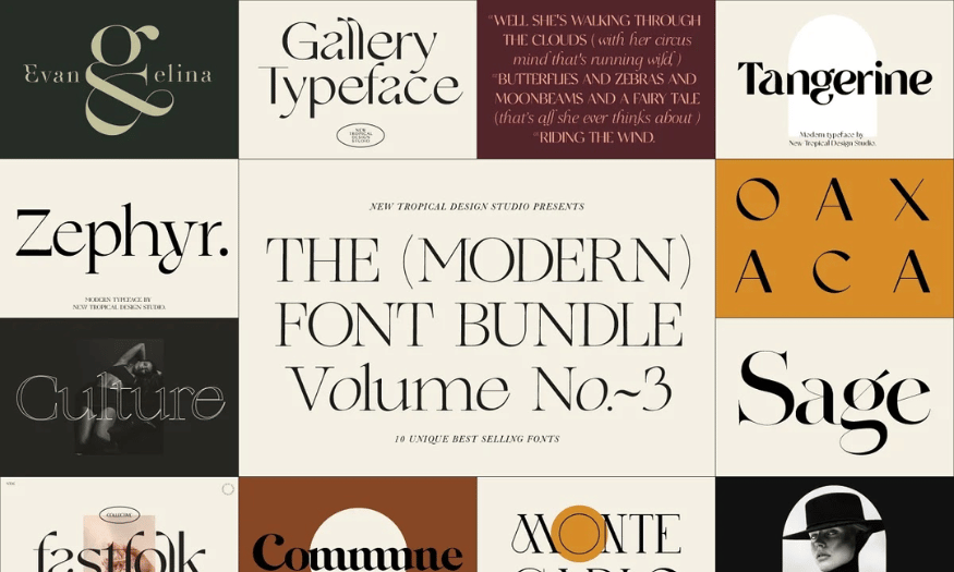
Free Fonts Make Your Designs More Professional
Nội dung
In the field of graphic design, fonts are not only a tool to convey information but also a decisive factor in the beauty and professionalism of the product. A suitable font not only helps to enhance the aesthetic value but also makes the content easier to read and more attractive. This article will introduce you to a set of free fonts, helping you easily choose for design projects, from websites to brochures, from logos to advertisements. With these fonts, you will create impressive and professional designs without having to spend a lot of money. Let's find out with Sadesign now!
In the field of graphic design, fonts are not only a tool to convey information but also a decisive factor in the beauty and professionalism of the product. A suitable font not only helps to enhance the aesthetic value but also makes the content easier to read and more attractive. This article will introduce you to a set of free fonts, helping you easily choose for design projects, from websites to brochures, from logos to advertisements. With these fonts, you will create impressive and professional designs without having to spend a lot of money. Let's find out with Sadesign now!
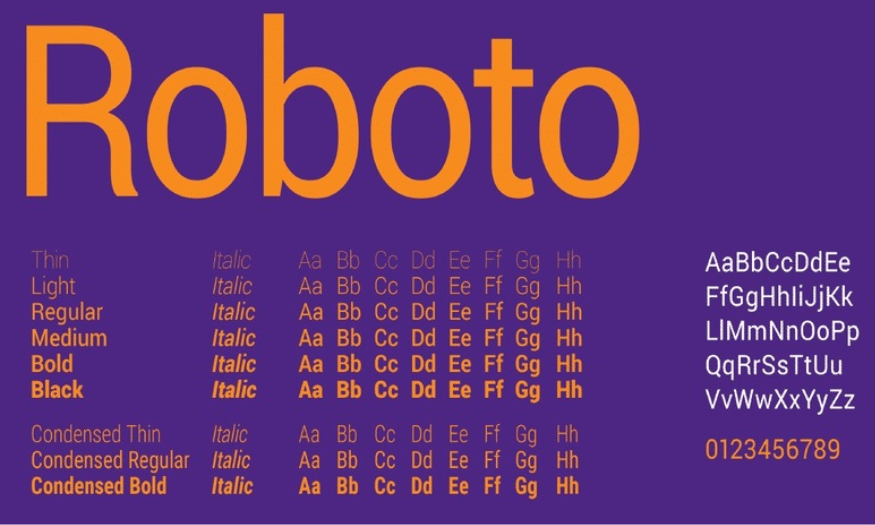
1. Robot
Roboto is one of the most popular modern sans-serif fonts today. Designed by Google, Roboto is not only easy to read but also creates a friendly, approachable feeling. This font is suitable for both headlines and main content, helping users easily access information quickly and effectively.
One of the highlights of Roboto is its ability to adapt to a wide variety of design types. Whether you are working on a website, a mobile app, or a printed document, Roboto can accommodate your needs. With a variety of weights, you can flexibly choose the typeface that best suits each part of your design.
In addition, Roboto's design also shows modernity and sophistication, making your product more professional. Using Roboto not only increases aesthetics but also creates consistency throughout the design, from colors to images. In particular, with the support of Google Fonts, integrating Roboto into projects becomes easier and faster than ever.
2. Open Sans
Open Sans is one of the most popular fonts in the world and is widely used in web design. Designed by Steve Matteson, Open Sans is clean and easy to read, making it an ideal choice for websites and printed materials. This font comes in a variety of styles, giving you the flexibility to choose the right font for any given context.
One of the strengths of Open Sans is its ability to display well on a variety of devices, from desktops to mobile phones. This is important in today's technological age, when users can access information from anywhere. The clarity and readability of Open Sans helps users avoid distractions and focus on the main content.
Additionally, Open Sans is also very popular in the design community due to its modern and approachable look. It is often used for e-commerce websites, personal blogs, and even marketing materials. Due to its versatility and aesthetic appeal, Open Sans has become an indispensable part of many designers' toolkits.
3. Side
Lato is a sans-serif font with soft, modern strokes. Designed by Łukasz Dziedzic, Lato exudes elegance and class, making it an ideal choice for a wide range of projects. With the perfect combination of functionality and aesthetics, Lato can be used for everything from advertising to interface design.
Lato comes in a variety of styles, from thin to bold, allowing you to easily choose the font that best suits your needs. This allows you to create variety in your designs while maintaining consistency. This font is especially suitable for headings, highlights, and body copy, making it easy for readers to grasp information.
A big plus for Lato is its ability to work well in online designs. Even at small font sizes, Lato remains clear and crisp, making it easy for users to read without straining their eyes. This makes Lato a top choice for websites that need to be professional and accessible.
4. Montserrat
Montserrat features a modern and urban style that feels strong and personal. Designed by Julieta Ulanovsky, Montserrat was inspired by the signs and architecture of Buenos Aires. This font is great for large, attention-grabbing headlines, making it a perfect choice for advertising and communications projects.
With its thick lines and unique shape, Montserrat is both powerful and friendly. This allows you to create bold and impactful designs. Montserrat is also versatile, being able to be used for both body copy and headlines, making it easy to create consistency in your designs.
Besides, Montserrat also supports many languages, helping you expand your user base. With its increasing popularity, Montserrat has become one of the favorite fonts in the design community, thanks to its unique beauty and versatility.
5. Raleway
Raleway is a classy sans-serif font with thin lines, designed by Matt McInerney. It is a great choice for design projects that need sophistication and elegance. With a minimalist yet impressive design, Raleway can create outstanding design products without using too many decorative elements.
One of Raleway’s strengths is its versatility. The font offers a wide range of weights, from thin to bold, allowing you to choose the right weight for each piece of your design. This not only helps you create variety, but also creates balance in your overall design.
Raleway is great for headlines and slogans, helping to grab the viewer’s attention. With its modern and elegant look, Raleway is often used in high-end projects, such as brochures, business cards, and websites. Thanks to its ability to create interest without using too many details, Raleway has become one of the favorite fonts in the design world.
6. Poppins
Poppins is a modern sans-serif font with rounded shapes that exudes a playful and dynamic feel. Designed by Indian Type Foundry, Poppins features smooth lines and a great balance between characters, making it a favorite among modern designers. Not only is this font suitable for youthful design projects, but it can also be used in a variety of contexts, from advertising to media products.
One of the strengths of Poppins is its compatibility with a wide range of designs. With a variety of weights, from thin to bold, Poppins allows designers to be flexible in choosing the right typeface for each part of the project. This not only helps create richness in the design but also increases the uniformity of the entire product. Poppins is suitable for large titles, bold letters, as well as main content, helping to attract the attention of the viewer at first sight.
Additionally, Poppins is highly readable, even when used on digital platforms. This makes it an ideal choice for websites and mobile apps where user experience is paramount. With Google Fonts support, Poppins can be easily integrated into any project, saving you time and effort in the design process.
7. Playfair Display
Playfair Display is a classic serif font that exudes elegance and class. Designed by Claus Eggers Sørensen, Playfair Display is inspired by traditional 18th century typefaces, but modernized to fit today’s design needs. This font is often used for titles, subtitles, and projects that require elegance, such as business cards, brochures, or printed materials.
One of the standout features of Playfair Display is the high contrast between thick and thin lines, creating a sense of depth and interest. This not only makes the titles stand out more, but also enhances the overall aesthetic of the design. With its soft curves and subtle details, Playfair Display has a classic yet modern feel, suitable for many different design styles.
Playfair Display is also very versatile when combined with other sans-serif fonts. Using Playfair Display for a headline and pairing it with a sans-serif font for the body copy creates a great balance that makes the entire design more harmonious and professional. With its elegant beauty and versatility in application, Playfair Display is definitely a great choice for those looking for a font with depth and artistry.
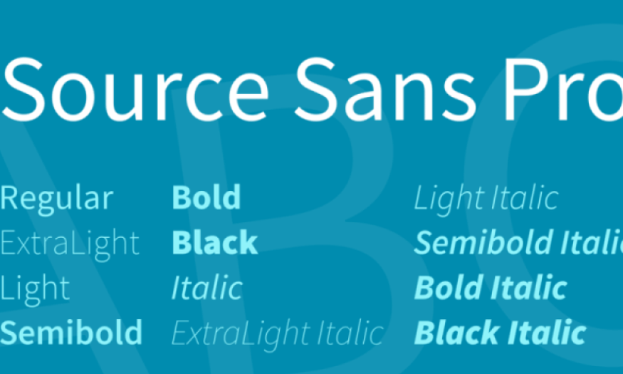
8. Source Sans Pro
Source Sans Pro is a sans-serif typeface designed specifically for user interfaces. Developed by Adobe, Source Sans Pro is clear and easy to read, even on small screens. It has become a popular choice for apps and websites due to its good display and versatility.
One of the strengths of Source Sans Pro is the high contrast between characters, which makes information easier to digest. With simple yet elegant lines, Source Sans Pro makes it easy for readers to follow the content without being distracted. This is important in user interface design, where convenience and user experience are top priorities.
In addition, Source Sans Pro also supports many different languages, which helps to expand the user audience and increase the product's availability. With easy integration into projects through Google Fonts, Source Sans Pro is not only a font but also a useful tool to help you create professional and user-friendly designs.
9. Merriweather
Merriweather is a serif typeface designed for easy reading, especially on small screens. Developed by Eben Sorkin, Merriweather has a traditional yet modern feel, suitable for both long text and headlines. The font is designed with soft curves and high contrast, which enhances readability and makes it comfortable to use.
One of the great things about Merriweather is its versatility. With a variety of typefaces, from thin to bold, you can easily choose the right typeface for each part of your design. This not only creates variety but also helps you maintain consistency across your entire product. Merriweather is often used for blogs, online articles and printed materials where clear communication is important.
Additionally, Merriweather is optimized for both desktop and mobile devices, making it an ideal choice for digital projects. With its elegant design and superior features, Merriweather is sure to please even the most demanding designers.
10. Oswald
Oswald is a bold sans-serif font, ideal for headlines and slogans. Designed by Vernon Adams, Oswald has a modern and energetic look, with clean, crisp lines. This font is great for projects that need to make a strong statement, such as advertisements, banners, and other communication designs.
One of Oswald’s defining characteristics is its ability to grab attention at first glance. With its bold strokes and unique structure, Oswald makes headlines stand out and memorable. This is crucial in creating a strong first impression on the viewer and effectively conveying the message.
Oswald is also very versatile when combined with other fonts. You can use Oswald for large headlines and choose a lighter sans-serif font for the main content, creating balance and harmony in the design. With its modern beauty and outstanding features, Oswald has become a popular choice in the design community, helping you create impressive and professional products.
11. Noto Sans
Noto Sans is a sans-serif font developed by Google, with the goal of creating a multilingual font family that is consistent and easy to read. Noto Sans features a simple, clean design that allows readers to easily access content without distraction. This font is great for websites, mobile apps, and documents that need to be clear and professional.
One of Noto Sans’ strengths is its ability to support multiple languages and characters. This makes Noto Sans an ideal choice for international projects where it is important to convey a message to a wide range of audiences. With a variety of typefaces and weights, Noto Sans allows designers to be creative and choose the right typeface for each context.
12. Chisel
Cinzel is a serif font inspired by classic Roman typefaces, offering an elegant and refined look. Designed by Natanael Gama, Cinzel is perfect for headlines, logos, and projects that require elegance and sophistication. With its clean lines and subtle details, Cinzel creates a strong and impressive feel.
Cinzel is not only beautiful but also highly legible, even at small sizes. This makes it a great choice for printed materials, business cards, and other communication products. With the perfect combination of art and functionality, Cinzel is sure to please even the most demanding designers.
13. Conclusion
Choosing the right font is an important step in the design process, directly affecting the way viewers receive information. The set of 10 free fonts we introduce not only brings high aesthetics but also ensures readability and compatibility with many different types of projects. From the modern, youthful Poppins to the elegant, luxurious Playfair Display, each font has its own beauty and features, helping you easily express your personal style in design.


VIP Products


Best Selling Products
Genuine Cheap Canva Pro
39 USD
Upgrade Genuine Office 365
49 USD
Autodesk All App Account Copyright
120 USD
Windows 10 & 11 Pro Key
36 USD
ChatGPT Plus Account (GPT-4)
16 USD
Adobe Photoshop Copyright - Full App
120 USD
Adobe Premiere Pro Account
99 USD
Genuine Adobe Illustrator account
99 USD
Upgrade Duolingo Super
29 USD
Freepik Premium Account
59 USD
MidJourney Account
29 USD
Copyright Adobe Lightroom Account
59 USD
Upgrade genuine Capture One account
120 USD
Capcut Pro 1 Year
39 USD
Plugin Retouch4me
69 USD