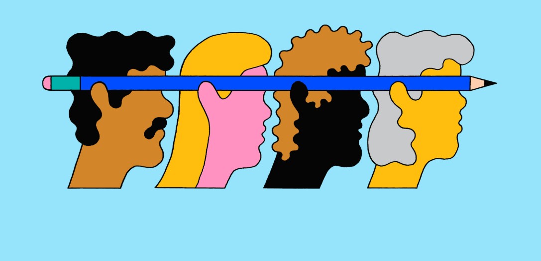
Color is always a lively and vibrant element in every design. Light colors with soft shades such as white, pastel, or neutral colors bring a sense of spaciousness, comfort and modernity. On the contrary, dark colors such as black, dark gray, ... or jewel colors create strength, mystery and sophistication. Choosing between these two colors is not only based on personal preference but also must consider the context, purpose of use and the emotions you want to convey. In this article, we will explore more deeply about light and dark color tones. Hopefully, through this, you will find inspiration to create and apply effectively to your design projects.
1. Concept and Classification of Color Gamut
First, let’s get the basics straight. Light colors are generally understood as shades that give a light, airy, and elegant feel. Typical examples include white, pastels, or diluted neutrals. These colors are often used to create a background for the design, helping other elements stand out.
In contrast, dark colors include deep, bold and powerful shades such as black, dark gray, navy blue or jewel colors (like ruby, emerald, sapphire). These colors have the ability to create strong attraction, while also bringing a sense of mystery, luxury and impression.
Color gamut classification is not only based on brightness, but also involves factors such as saturation and hue. Brightness of a color determines how bright or dark it is, while saturation indicates how “vivid” or “dull” the color appears. Hue, in turn, helps determine the specific depth and tone of each gamut.
These criteria, when combined, will create a diverse, rich and flexible color palette in design. Understanding these factors will help you be more confident when choosing and coordinating colors to suit the project's goals.
2. Color Psychology and Its Impact on User Emotions
2.1. Color Psychology
Colors are not just lines on paper or computer screens, but also powerful tools to convey emotions. Light colors with soft lighting often create a feeling of comfort, spaciousness and comfort. For example, white or pastel tones are often used in quiet spaces, spas or health care brands to bring a sense of purity and cleanliness.
On the contrary, dark colors carry power and mystery. Bold colors like black or navy blue can create a solemn, powerful and luxurious space. This is an ideal choice for high-end brands, technology or breakthrough products that want to affirm their position and uniqueness.
2.2. Applications in Marketing and Design
In fact, each brand has its own color “language”, reflecting the values and messages they want to convey. Health and beauty brands often use light colors to evoke a sense of cleanliness, nature and closeness. Meanwhile, high-end and technology brands often use dark colors to emphasize modernity, uniqueness and luxury.
3. How to mix light and dark colors
3.1. Choose the right light and dark tones
First, you should choose 2 colors to mix neutral and accent colors. Neutral colors include accent colors such as gray, black, dark colors, white, brown. Accent colors do not have fixed colors, they can be your favorite colors. With such choices, you can mix countless colors, besides, you can also mix white and black to harmoniously combine neutral and accent colors.
3.2. Understanding tint and shade
Lightness and darkness are artistic terms in adjusting the lightness and darkness of colors by adding white or black to the base color, thereby creating a variety of colors. When you control the lightness and darkness, it will be easier to choose colors and minimize the design without worrying about the design being confusing. If you apply lightness and darkness well, your color palette will be clear, consistent and harmonious.
4. Color gamut also has positive and negative colors
Positive colors will be the colors produced from a light source.
Eg: blue, sky blue,...
Negative colors are colors that absorb light.
Eg: brown, gray,...
How to use light and dark color gamut
Primary colors: Red - Yellow - Green will mix with other colors to create unique color tones.
Secondary colors: From the 3 primary colors you can use to create secondary colors: Orange - Green - Purple
Tertiary colors: Combine primary and secondary colors to create tertiary colors by combining adjacent colors to create additional colors: Orange-red - Orange-yellow - Blue-yellow - Cyan - Violet - Purple
The three color levels will be directly related and supportive of each other.
5. Steps to mix light and dark colors
To give yourself a modern style, master the following steps to look more individual.
Step 1: Choose the color you want to choose, choose the color tones that suit you and cover your flaws.
Step 2: Choose one color from the colors you have chosen as the characteristic color you want to represent.
Step 3: Choose a color that supports the main color. You can use the color palette to mix colors that match and support each other to increase the brightness and make you stand out more.
Several studies have shown that colors can directly influence customers’ moods and purchasing behavior. Therefore, choosing the right color scheme not only enhances aesthetic value but also creates a competitive advantage in the market.
6. Notes When Combining Light and Dark Colors in Design
6.1. Color Balance Principles
One of the most important principles in design is the 60-30-10 rule. According to it:
60% of the space is the main color,
30% is secondary color,
10% is the accent color.
This method helps create a natural balance, avoiding the feeling of being too “heavy” or “bland”. When applying this principle, you will easily adjust the ratio of colors in the design to achieve optimal aesthetic effect.
6.2. Using Intermediate Colors
Mid-tones play an important role in connecting light and dark tones. Neutral shades like gray, beige, and cream not only create a smooth transition, but also soften the contrast between strong colors. This is the key to avoiding the phenomenon of "clashing" too strongly between design elements.
6.3. Contextual Applications
Space and context of use are also decisive factors in choosing color gamut. For example:
Website and mobile app design: Requires visual appeal, readability, and user friendliness. Light colors are often preferred to create a light feel, while dark accents help guide and highlight content.
Interior design and branding: Here, the subtle combination of light and dark colors can create a cozy yet modern and unique space.
6.4. Support Tools
During the creative process, support tools like Adobe Color or Coolors will help you experiment and create diverse color palettes quickly. These tools not only allow you to choose from thousands of shades but also provide color suggestions based on modern design trends.
6.5. Avoid Common Mistakes
When mixing colors, some common mistakes you should avoid include:
Using too many bright colors without highlights makes the design bland.
Overuse of dark colors without combining with bright colors leads to a gloomy, heavy feeling.
Ignoring the natural and artificial light elements in the space used affects the user's perception.
Above all, colors are the soul of design – they are the means to convey emotions, values and messages of the brand to customers. Understanding and effectively applying light and dark color tones not only helps you create beautiful design products but also affirms your own style, creating a deep impression in the hearts of users.


.png)
.png)
.png)
.png)
.png)
.png)
.png)