Best Selling Products
How to Create a Powerful Text Portrait Poster Cristiano Ronaldo
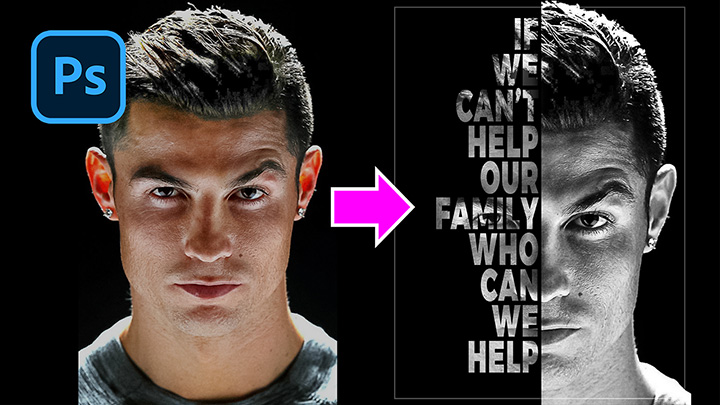
Hi guys, this is SaDesign, today I will show you how to create a typography portrait poster in PTS.
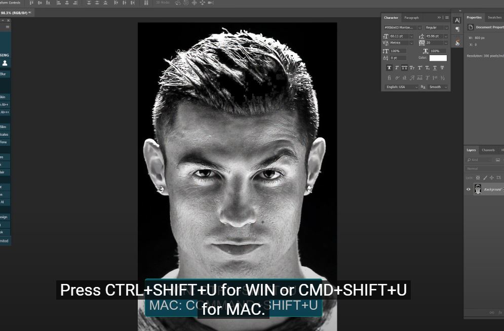
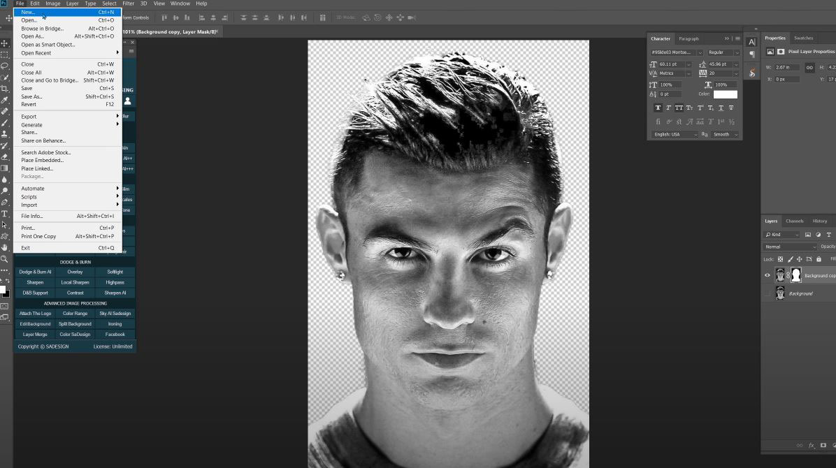
(1). Here, I have a portrait of Ronaldo, first remove all the colors. Press CTRL + SHIFT + U for WIN or CMD + SHIFT + U for MAC. This step is to convert the image to black and white.
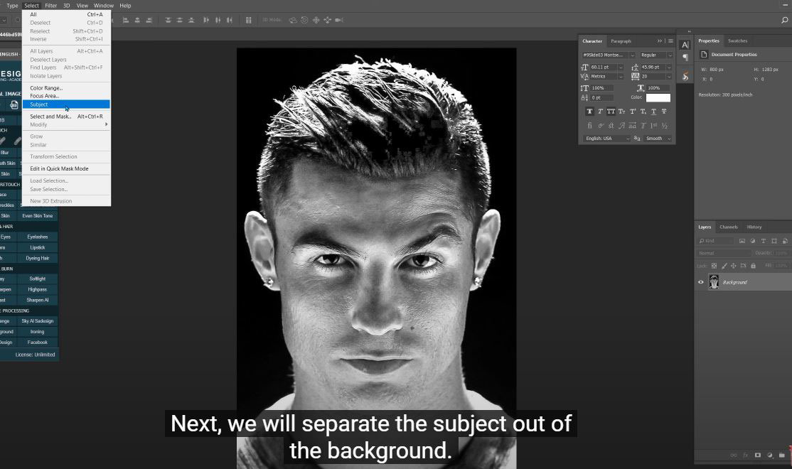
(2). Next, we will separate the subject from the background. To do that, go to Select > Subject, then Select > Select and Mask > select the Refine Edges Brush Tool and paint over the edges of the object to make a precise selection.
(3). Make sure to select "Decontamination" and set the amount to about 45%.
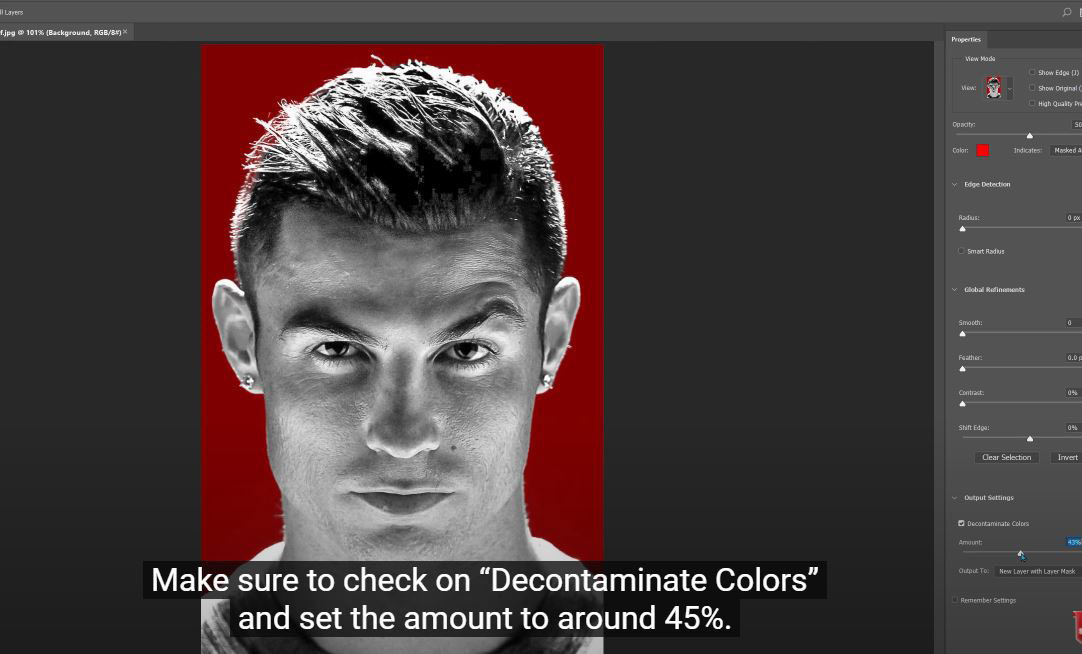
(4). In the output box: select “New layer with layer mask” and OK Now, the object has been cut out of the background.
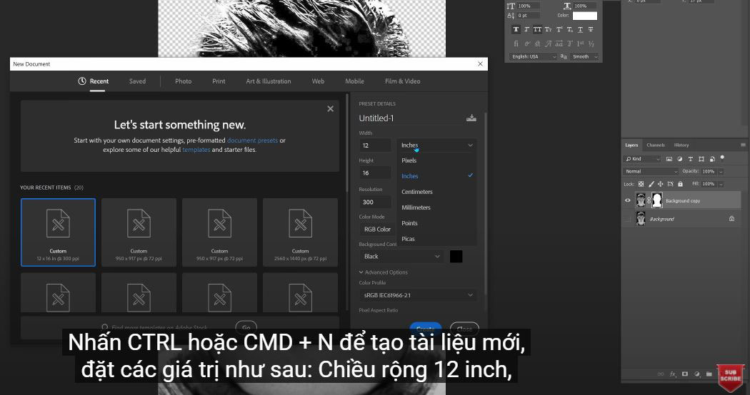
(5). Press CTRL or CMD + N to create a new document, set the values as follows: Width 12 inches, Height 16 inches
(6). In color profile: select sRGB and black in background content. Then create Move back to the original image, use the move tool (shortcut V) and move this layer to the new document we just created
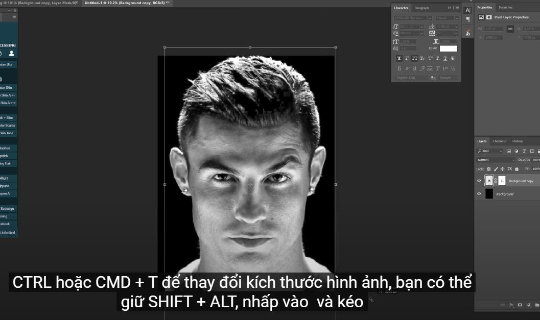
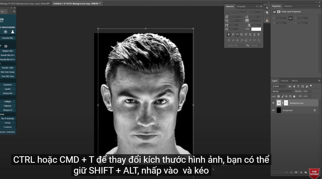
(7). CTRL or CMD + T to resize the image, you can hold SHIFT + ALT, click on the corner and drag out to expand the image from the center. Adjust it to fill the background. Next, CTRL or CMD + R to open the ruler.
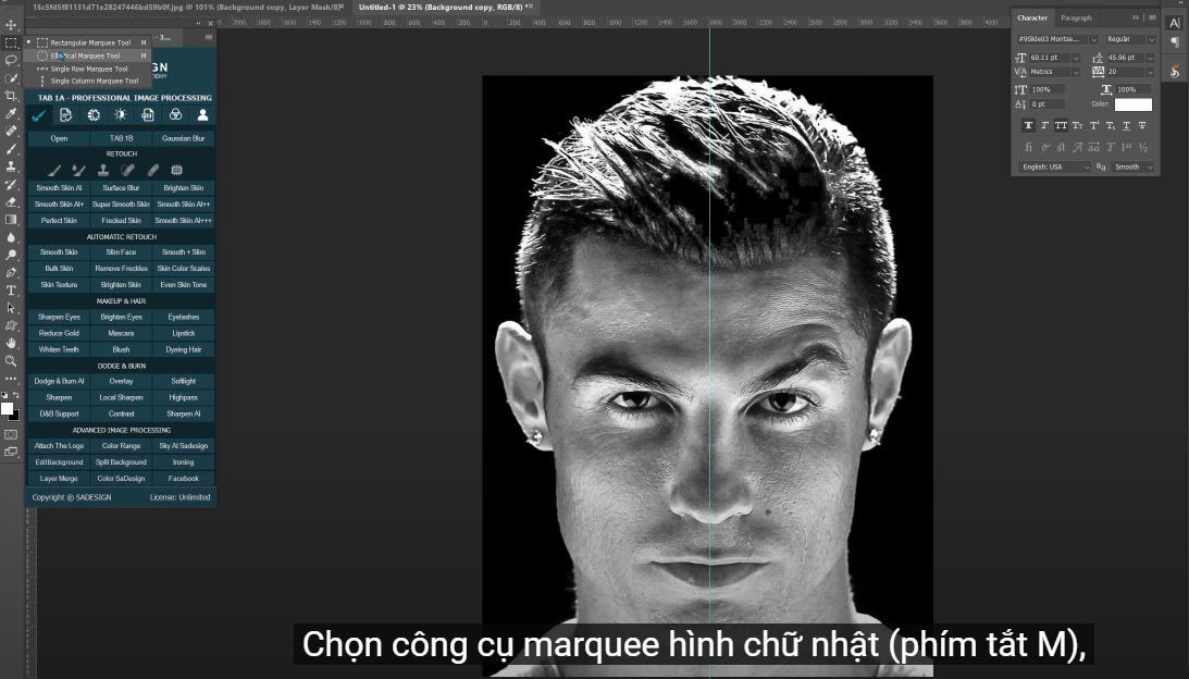
(8). Go to the rule on the left, click and drag the guide to the center of the document. Select the rectangular marquee tool (shortcut M),
(9). Click the page icon in the lower right corner to create a new layer. Click the little arrow here to switch the black color to the front, or you can easily do that with the X keyboard shortcut.
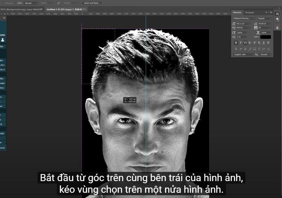
(9). We will draw a rectangle. Starting from the top left corner of the image, drag the selection over half of the image. Make sure it aligns correctly with the center guide.
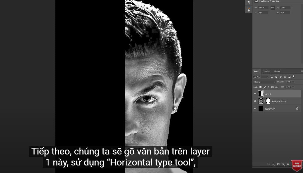
Fill the selection with black by pressing CTRL or CMD + Delete. This is why we changed the foreground color to black.
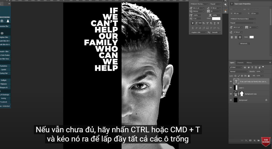
(10).Next we will type text on this layer 1, using the “Horizontal type tool”, choose a font you like or choose Monstserrat Black like I did. Since the text is on the left side of this poster, make sure to select the "Right Align" icon. Click the color box and choose white.
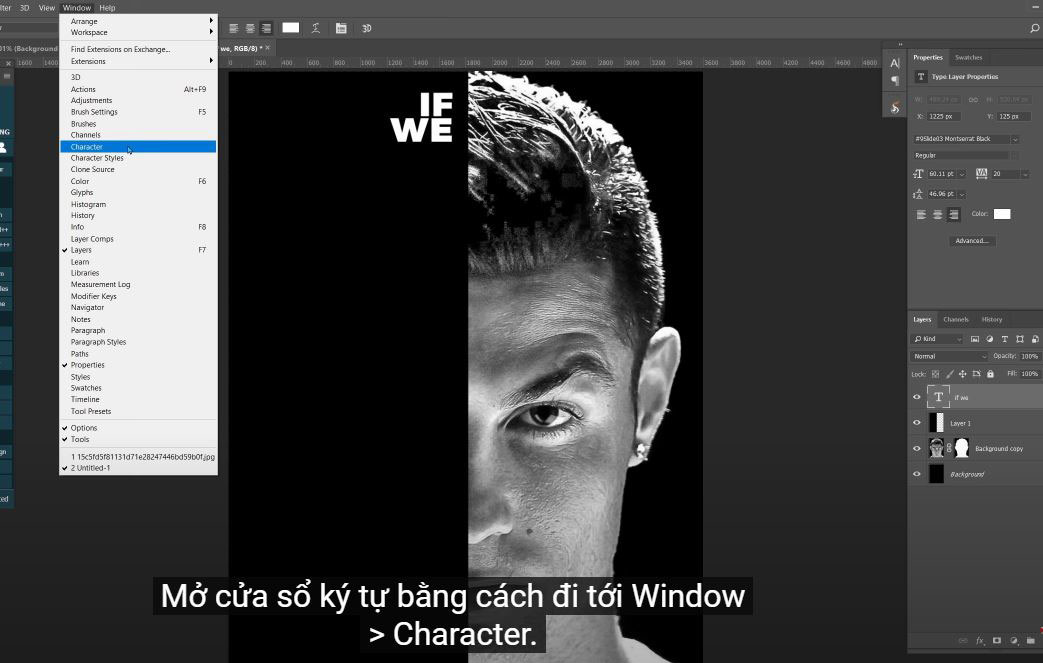
(11). Place your cursor on the top next to the middle line and type the first 2 texts.
Since the spacing between these texts is too close, to add a lot of space to it. Open the character window by going to Window > Character. Just increase the "top" to add more space.
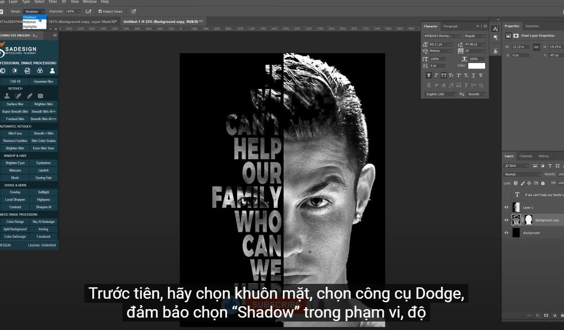
(12). However, the first three documents are not eligible. We have to fix it now. Select the face first, select the Dodge tool, make sure to select “Shadow” in the range, exposure: 100% and select “Protect Tone”
(13).Now just type on the text that you want to lighten.
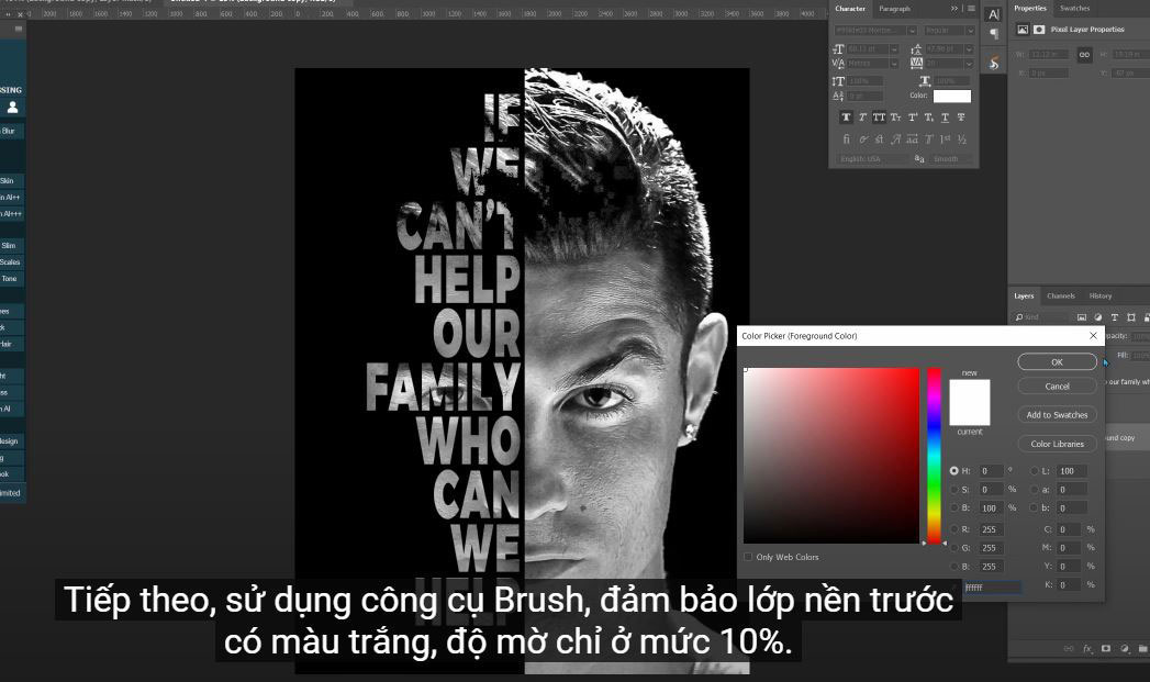
Next, use the Brush tool, make sure the foreground layer is white, the opacity is only 10%
Paint to remove some hair on the text and this time, we can read the text more easily.
Create another new layer above layer 1, press CTRL or CMD + DELETE to fill new background color for this new layer
Reduce the fill of this layer 2 to 0%
Click the fx icon and select Blending Options,
Turn on “Inner Light” and swipe to outline this poster.
Add a bit of contrast to the image with a curve adjustment layer. Increase highlights and reduce shadows.
Do it! Enjoy this new technique for creating portrait posters.
If you like this tutorial, please click like, subscribe and notify to update the latest videos daily. Thank you and goodbye!
REGISTER FOR FREE PHOTOSHOP LEARNING
============================
The most powerful Retouch tool processor
DOWNLOAD:
✅ SADESIGN PANEL ENGLISH: https://sadesign.ai/retouching/
✅ SADESIGN PANEL VIETNAM: https://www.retouching.vn/

