Best Selling Products
How to effectively decentralize information in graphic design
Nội dung
- 1. What is information hierarchy in graphic design?
- 2. Why is it necessary to classify information when designing graphics?
- 3. How to effectively hierarchize information in graphic design?
- 3.1. Identify information
- 3.2. Choose the right color and contrast
- 3.3. Layout and white space
- 3.4. Information is displayed in logical order
- 3.5. Create emphasis when classifying information in graphic design
- 3.6. Adjust text size when classifying information
- 3.7. Choose the appropriate font when classifying information
- Conclude
Every design needs to have a clear division between levels of information, from the most important elements to the minor details, helping to create a coherent and easy-to-follow information flow. So how to effectively decentralize information in graphic design?
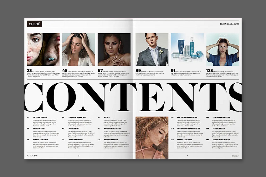
In graphic design, information hierarchy is an important factor that helps viewers easily access and understand the content that the author wants to convey. How to effectively classify information in graphic design is not only a challenge but also an art, requiring the perfect combination of images, colors, fonts and other elements. Each design needs to have a clear division between levels of information, from the most important elements to the minor details, helping to create a coherent and easy-to-follow flow of information. So how to effectively classify information in graphic design?
1. What is information hierarchy in graphic design?
Information hierarchy in graphic design is the process of organizing and arranging visual and textual elements in order of priority, directing the viewer to the most important information first. It is a design technique that helps create clarity and understanding, while also making the message more effective. Information hierarchy is often expressed through the size, color, weight of text, or the position of elements in a layout.
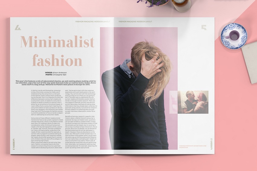
For example, the title will be larger and more prominent to attract attention first, while the details will be arranged smaller and less prominent. This way, the viewer can easily identify and understand the importance of each piece of information without feeling cluttered or uncomfortable. Information hierarchy not only helps optimize the user experience, but also makes the design look professional and easily conveys the purpose of the work.
2. Why is it necessary to classify information when designing graphics?
Information hierarchy in graphic design is extremely important to optimize the user experience and ensure that the message is conveyed clearly and effectively. When designing graphics, designers are faced with arranging many elements such as images, text, colors, and layouts. Without a clear hierarchy, important information can be confused or lost, making it difficult for viewers to receive the message easily. Information hierarchy helps create a natural flow that viewers can easily follow, from information that needs immediate attention (like headlines or calls to action) to additional details (like contact information or product descriptions).
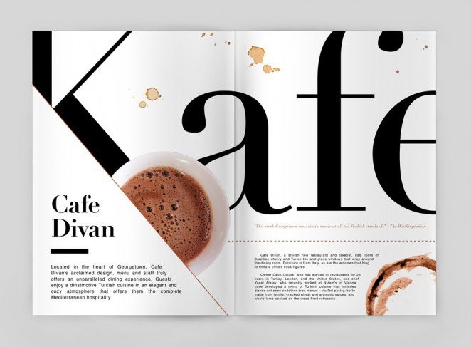
In addition, information hierarchy also helps to increase the aesthetics of the design. A clear layout with well-distributed elements creates a sense of balance and is easy on the eyes. This not only attracts viewers but also makes it easy for them to find the information they need. In short, information hierarchy in graphic design is not only a technique that improves understanding but also contributes to the professionalism and efficiency of design projects.
3. How to effectively hierarchize information in graphic design?
In graphic design , information hierarchy plays an important role in helping viewers easily access and understand the message that the designer wants to convey. Information hierarchy not only makes the design clear and coherent but also helps increase the aesthetics and effectiveness of the design product. So how to effectively classify information?
3.1. Identify information
First, it is essential to identify the most important information. Before you begin designing, you need to identify the most important elements that you want the viewer to notice immediately. These could be the headline, slogan, or key message. These elements should be highlighted in the design by methods such as increasing the text size, using bold colors, or placing them in a prominent position. Text size is an effective tool for information hierarchy, with headlines being large and prominent, while additional details can be made smaller so as not to distract from the main elements.
3.2. Choose the right color and contrast
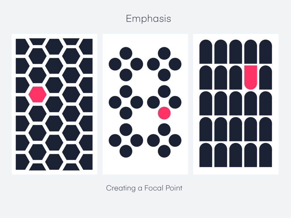
Using color and contrast is an important element in creating hierarchy. Color has the ability to draw attention and highlight elements in a design. Important elements can be highlighted with bold, bold colors, while secondary information can use softer colors to draw less attention. This not only helps create a clear distinction between levels of information, but also contributes to the aesthetics of the design.
3.3. Layout and white space
In addition, layout and white space are also indispensable factors in effective information hierarchy. A clear layout with well-distributed elements will create a natural flow that viewers can easily follow. White space around important elements helps to highlight them and avoid a feeling of clutter. Furthermore, secondary elements can be grouped together to reduce distraction, helping viewers focus on the main information.
3.4. Information is displayed in logical order
Finally, using a logical order of display is also an important part of information hierarchy. When designing, you need to think about how the viewer will approach the information. The most important information usually appears first, followed by additional details, and finally secondary elements. Using headings, subheadings, and paragraphs systematically makes it easy for the viewer to distinguish and grasp the information in a logical order.
3.5. Create emphasis when classifying information in graphic design
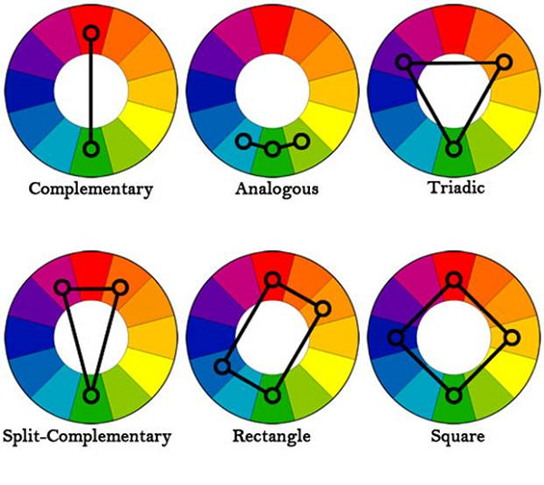
Creating emphasis when it comes to information hierarchy in graphic design is an important technique for drawing the viewer’s attention to important elements in a layout. Emphasis is often achieved through the use of salient elements such as color, size, and weight of text or images. One of the most effective ways to create emphasis is to use contrasting colors. Elements that need attention can be highlighted with bright or bold colors, while less important details can be highlighted with lighter or neutral colors so as not to take attention away from the main points.
In addition to color, text size and weight are also ways to create emphasis. Important headlines or messages are often presented in larger or bolder font, making them easier to grab the viewer’s attention first. Using white space also helps to highlight elements, as it creates separation and helps the viewer focus on the essential information without distraction.
Creating emphasis is an important part of information hierarchy, helping viewers easily recognize and receive messages quickly and accurately. When done correctly, emphasis not only makes a design more attractive, but also helps information to be conveyed more effectively.
3.6. Adjust text size when classifying information
.jpg)
Adjusting the size of text is an important method of creating hierarchy in graphic design. Changing the size of text helps to determine the importance of each piece of information, creating a clear order for the viewer. Larger text is often used to highlight important elements, such as headlines, taglines, or key messages. These elements need to attract attention first, so using a large size helps them become focal points in the design.
Conversely, additional information or less important details will be presented in smaller text sizes, so that they do not distract attention from the main elements. This not only helps to divide information reasonably but also creates balance in the layout. In addition, using different text sizes also helps to create a clear distinction between levels of information, from main information to secondary details, thereby making it easier for viewers to receive and understand the message. The technique of adjusting text size when classifying information also makes the design more professional and easier to read, while improving the effectiveness of information communication.
3.7. Choose the appropriate font when classifying information
.jpg)
Choosing the right font when assigning information is an important factor in improving the effectiveness of message transmission in graphic design. Each font type brings a different feeling and purpose, so choosing the right font for the level of importance of the information is essential. For important information such as titles or slogans, you should use bold and easy-to-read fonts, which can be serif or sans-serif fonts with large sizes to attract immediate attention. These fonts help create prominence and express strength and clarity.
On the other hand, for details or secondary elements, a thin or light font will help to not take away attention from the main elements. Sans-serif fonts are often preferred in modern designs because of their readability and clarity, while serif fonts are suitable for traditional or formal designs. By choosing the right font, you not only create a clear hierarchy but also contribute to the aesthetics and effectiveness of the design.
Conclude
In short, information hierarchy in graphic design is not an impromptu process but requires a clear calculation and strategy. By identifying important information, using appropriate colors and sizes, optimizing layout and white space, and applying a reasonable display order, you can create a design that is not only beautiful but also easy to understand and effective in conveying the message. Information hierarchy is the key to making graphic design clear, attractive and bringing value to the viewer.


