Best Selling Products

Adobe Photoshop Copyright - Full App
120 USD

Copyright Adobe Lightroom Account
59 USD

Freepik Premium Account
59 USD

Genuine Adobe Illustrator account
99 USD

Genuine Cheap Canva Pro
39 USD

Upgrade Genuine Office 365
49 USD

Capcut Pro 1 Year
39 USD

Adobe Premiere Pro Account
99 USD

Windows 10 & 11 Pro Key
36 USD

ChatGPT Plus Account (GPT-4)
16 USD

MidJourney Account
29 USD

Upgrade genuine Capture One account
120 USD

Plugin Retouch4me
69 USD

Autodesk All App Account Copyright
120 USD

Upgrade Duolingo Super
29 USD
Layout Rules In Design Every Designer Should Know
Nội dung
- 1. Five standard formulas of composition
- 2. Classical composition principles (Golden ratio)
- 3. Basic elements in photo composition
- 4. Find the rhythm or pattern of the setting
- 4.1 Show object size or distance
- 4.2 Create attraction for the highlight of the photo
- 5. MONDRIAN style layout
- 6. Large window layout
- 7. Multi-panel layout
- 8. Frame layout
- 9. Large typography layout
- 10. Inspiration from the alphabet
- 11. Silhouette composition
- 12. Vivid Layout
- 13. Picture Puzzle Layout
You might think that layout rules will stifle creativity, but they’re actually like baby walkers: they help you get started, but then you can break free and create your own unique layouts. So think of the principles of balance, grids, and white space as tools to help you stay organized, not as limitations.
To have an impressive design, besides aesthetic eyes and personal taste, mastering the rules of composition will help you be more confident when arranging elements, choosing colors and building highlights. In the design world, like photography or painting, a good composition not only creates harmony but also leads the viewer to understand the message you want to convey.
You might think that composition rules will stifle creativity, but they are actually like a baby walker: they help you stay grounded, but then you can break free and create unique layouts that are uniquely yours. So, consider the principles of balance, grids, and white space as tools to help you design without clutter, rather than as limitations. Let’s explore how to apply basic and advanced rules to create layouts that are both beautiful and effective in communicating your ideas!
1. Five standard formulas of composition
Never place the subject in the center of the photo.
All pictures have one and only one strong point.
The S-curve is one of the most popular compositional techniques.
Always lead the viewer's gaze into the picture.
The horizon never cuts across the middle but is always located in the upper or lower third of the picture.
.png)
Just like the issue of correct lighting, sharpness, detail… those are also the first things you learn – but in reality, a photo with all of the above is not necessarily beautiful, and a beautiful photo does not necessarily need to follow the above principles. Learning, understanding and applying, knowing the composition, taking photos according to the rules of composition is difficult – taking photos that break the composition and still look beautiful is even more difficult.
2. Classical composition principles (Golden ratio)
Horizon at 1/3 or 2/3 of the photo height.
Each frame has only one strength.
This focal point should never be placed in the center of the image, but should be positioned 1/3 wide x 1/3 high.
Direct the viewer's eyes from outside to inside the photo.
Take advantage of S-curves if present in the context.
3. Basic elements in photo composition
If in painting, the artist gradually puts brush strokes into the white canvas to create its content and composition, in photography, people do the opposite. In photo composition, there are 6 standards for you to rely on, but to make the photos soulful, attractive and avoid boredom, it is necessary to apply them flexibly.
.png)
Both painting and photography are visual arts and are governed by the basic principles of perceiving reality through light. But if painting is a synthetic art, photography is an analytical technique. When painting, the artist gradually introduces brush strokes onto the white canvas to create its content and composition. But in photography, people do the opposite…
With the real context already having content and composition, the photographer must change the perspective, use wide or telephoto lenses, rotate the frame to select the elements that build the photo. However, whether adding or removing blocks in the frame, both painting and photography aim at the most effective arrangement to express the content of the works. In the final result, to some extent, both paintings and photographs are judged by a standard of composition.
When evaluating a photograph, one looks at the basic elements of content, color, mood, and optical effect. If the composition is emphasized while other elements are blurred, it may be the subject of the photograph itself.
Most of these basic elements that convey visual information, such as point and line, shape, color, texture, and contrast, are involved in photographic composition. Photographers use these principles to develop their skills in arranging objects in a frame.
4. Find the rhythm or pattern of the setting
It is the technique of deriving logic about the position and arrangement of objects in the frame, choosing the best camera angle to reflect the details and patterns on the objects. This technique is widely applied to architectural, traffic, production line photos, etc. The discovery of the logic of arrangement in a large context depends a lot on the photographer's ability to observe and sequence. However, abusing rhythm, lacking thought and analysis will lead to boring stereotyped photos. The effective application of this composition must go hand in hand with lighting effects, shading and unusual camera angles.
.png)
For example, a row of round columns that are neat and bright in the midday sun will not be as beautiful as a photo of them standing in low, oblique light slightly off-center from the lens. Thanks to the horizontal sunlight, the column shadows will be long, creating another row of columns lying on the ground, their bodies will be "rounded" because of the effect of light and dark transition. If you place the camera very low at the foot of the column with a wide-angle lens, their heads will touch each other and shoot up into the sky, very interesting. Many times, rhythms appear with optical effects and only affect the lens at a certain angle, the problem is to explore and be creative.
4.1 Show object size or distance
This technique helps the viewer visualize the size of the object in the frame. Using a good comparison of size differences can highlight the size of the object in the photo. For example, if you want to illustrate the size of an elephant, you should put a starling as small as a grain of rice on its back. Conversely, when taking a macro photo of a small flower, people emphasize the magnification of the photo with a yellow ant as large as a queen bee. The object used as a comparison model should be a familiar image, easy to visualize the size such as a person, a car, a matchstick, a pen, etc.
The effectiveness of the comparison technique can be easily seen when watching classic animated films about giants and dwarfs. When the photographer is faced with a grand setting or an object that is too large, he is easily overwhelmed and forgets that he needs a comparison object. As a result, the image will retain the emotions he experienced, everything will just look like a scene on a table or a child's toy.
4.2 Create attraction for the highlight of the photo
The focal point or highlight of the photo is expressed by the technique of creating contrast, or leading lines. According to the principle of vision, the most contrasting point in the frame will attract the eye, the dark area will be heavier and more eye-catching than the light white area. On the other hand, the viewer's eyes will also move in the direction of the light rays in the frame, that is, from the lightest to the darkest place. Curves and diagonal lines ending at the highlight will lead the viewer's eyes there. However, they can also cause distraction and confusion if they only deviate from the main subject.
.png)
In classical composition, the strong point of the photo is usually located at the intersection of the vertical 1/3 line and the horizontal 1/3 line of the photo (near the 4 corners of the frame). This arrangement is especially suitable for 35mm film size. Modern photography is not dependent on classical formulas. In fact, innovative photographers deliberately place the subject in awkward positions, which attracts attention and makes the photo impressive. In fact, these photographers must understand the Golden Ratio very well to be able to do the opposite and create interesting effects. The highest value that modern photography aims for is not entirely beauty, but emotion and impression.
Characteristics of balance and mood: The balance in a photo will determine its static or dynamic state. If the technique of using the horizontal horizon in the middle of the photo creates a feeling of stillness, then tilting it, raising it up or lowering it will give a dynamic effect. A photo with more sky and less land will create a feeling of lightness and nobility. But when this ratio is reversed, the effects will be the opposite. The viewer's eyes have the characteristic of being attracted in the direction of the subject's movement.
Therefore, in classical composition, the movements must be directed into the photo. But modern photographers do not want the viewer to see everything immediately, they require observation and reflection on the message of the photo, so they may not follow this rule. If creativity is limitless, then limiting advertising formats is unjustified.
5. MONDRIAN style layout
This is one of the most popular formats, utilizing thick or thin black lines and solid colored blocks to divide the drawing into horizontal and vertical rectangles and squares. Named after the Dutch artist Piet Mondrian, this drawing style is especially popular among newspaper layout artists. Based on the subtle coordination of blocks and colors, Mondrian remains one of the ideal composition principles today.
.png)
As the name suggests, the highlight of these layout formats is text. There are two reasons why advertisers choose this layout: First, the ideas that need to be expressed are too complex, important or unique to be expressed in images.
Second, most ads are presented in a “window” style or are too image-heavy. In that case, a quiet text-heavy ad may seem heavy but it stands out.
Because text-heavy advertising is inherently more serious than other types, its elements are often presented symmetrically. For example, headlines are centered in Roman type, copy begins with a larger letter, and is divided into two or more columns.
6. Large window layout
This layout is particularly suitable for magazines because of the emphasis on images. The advantage of the “large window” layout is that the images and the text do not overlap. There is no “art for art’s sake” problem here, just a large space for the images and a careful selection of the text so that it can be presented sufficiently in the small space left.
.png)
Designers often present images close to the margins and eliminate unnecessary elements to create a strong impression on the viewer. Below the image is a centered title bar, and the copy can be presented in two or three columns. To create a relationship between the image and the copy, designers can print the title on the image or leave the title in white on a dark background, or they can spread the copy within the image.
7. Multi-panel layout
Typically, designers use panels of the same size and use effective pausing to guide the reader through the ad copy. Create a difference in scale by making the ad copy blocks larger than the boxes that frame the headline, caption, and signature. These panels can be used to tell a story, or simply to represent a product type, like a checkerboard.
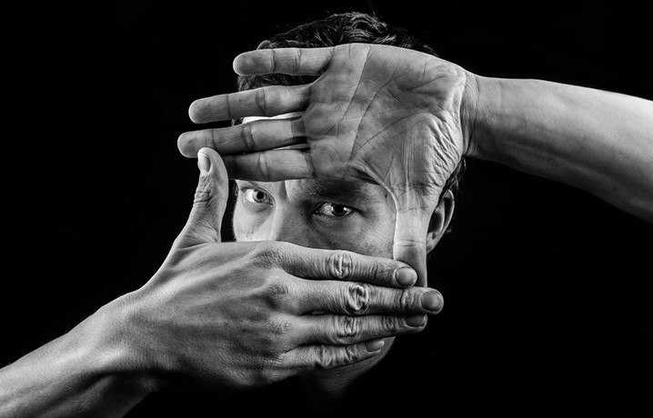
8. Frame layout
Frame layouts are more commonly used in newspapers than in magazines, to help separate an advertisement from the crowd of other advertisements. In this format, designers often frame the image in a separate frame, leaving the remaining space for the headline and copy.
Another variation is to dedicate the entire allowed area to the image, with the text usually printed in black on a light-colored image or in white on a dark-colored image.
9. Large typography layout
Using typography in advertising design is an art. Large type layouts create impact by combining typefaces perfectly, filling a page and creating impact with just a few strokes of the typeface. We usually associate large typeface advertising with slow-moving retail products, but elegant, carefully designed typefaces, perhaps with a black tint when used at large sizes, can attract image-conscious customers. Typefaces can run close together, without line spacing, or overlap partially, or can be patched together to enhance the spirit of the ad.
(1).png)
10. Inspiration from the alphabet
The beauty of letters created by designers centuries ago has provided new inspiration for advertising designers. The basic shapes of letters, both uppercase and lowercase, can be used as basic templates for arranging the elements of an advertisement.
11. Silhouette composition
Silhouette composition is created from the unique shapes of the advertising design. The more irregular the silhouette, the better. We can consider the ancient art of paper portrait cutting to see the superiority of irregular silhouettes over formal silhouettes. The artist always used scissors to cut in profile, not in front. If it were not difficult for anyone to recognize the portrait, the portraits would look the same, because the lines of the front face do not attract the viewer as much as the lines of the face drawn in profile. Silhouette composition is the way to present in profile.
12. Vivid Layout
A dynamic layout is one that doesn’t follow any established order. With its upside-down shapes, oversized typefaces, sunbursts, tilts, and subtle tricks, this layout may not win any design awards, but it definitely sells, at least to a certain type of product and a certain audience. It makes the viewer stop and think, and in the process of understanding the unusualness, the viewer will remember the ad longer.
.png)
The secret to the success of a dynamic layout lies in the designer’s adherence to basic design principles. The elements of a design are arranged in units, and these units are arranged into a unified pattern. When there are multiple elements of the same size, designers can achieve a pleasing proportion by combining some of the parts to form a larger unit, which creates contrast with other units in the same advertisement, which is most effective when designing a brand for businesses.
13. Picture Puzzle Layout
A picture puzzle is a puzzle in which a word or phrase is represented by a picture rather than written. Advertisers will not present their ads in a puzzle format because clarity is important, but they may exaggerate the copy by inserting a series of illustrations. These may be the same size for a staccato effect, or they may be different sizes to add variety to the copy. In some cases, the “copy” is nothing more than a series of pictures.
Before you start designing, it’s helpful to consider each of the basic formats. Choose a layout, and as you sketch, new variations may come to mind. When you combine those variations into a unified layout, you’ll find that this careful exploration pays off beyond your expectations.


VIP Products


Best Selling Products
Adobe Photoshop Copyright - Full App
120 USD
Copyright Adobe Lightroom Account
59 USD
Freepik Premium Account
59 USD
Genuine Adobe Illustrator account
99 USD
Genuine Cheap Canva Pro
39 USD
Upgrade Genuine Office 365
49 USD
Capcut Pro 1 Year
39 USD
Adobe Premiere Pro Account
99 USD
Windows 10 & 11 Pro Key
36 USD
ChatGPT Plus Account (GPT-4)
16 USD
MidJourney Account
29 USD
Upgrade genuine Capture One account
120 USD
Plugin Retouch4me
69 USD
Autodesk All App Account Copyright
120 USD
Upgrade Duolingo Super
29 USD