Best Selling Products

ChatGPT Plus Account (GPT-4)
16 USD

Copyright Adobe Lightroom Account
59 USD

Freepik Premium Account
59 USD

Upgrade genuine Capture One account
120 USD

Plugin Retouch4me
69 USD

Autodesk All App Account Copyright
120 USD

Adobe Photoshop Copyright - Full App
120 USD

MidJourney Account
29 USD

Windows 10 & 11 Pro Key
36 USD

Capcut Pro 1 Year
39 USD

Genuine Cheap Canva Pro
39 USD

Genuine Adobe Illustrator account
99 USD

Upgrade Genuine Office 365
49 USD

Adobe Premiere Pro Account
99 USD

Upgrade Duolingo Super
29 USD
Logo and color – The powerful duo that shapes brand emotions
Nội dung
- 1. Meaning of logo
- 1.1 What is a logo and its main role?
- 1.2 Basic elements of a logo
- 1.3 Principles of effective logo design
- 1.4 Color psychology in logos
- 2. How to apply color in brand identity
- 2.1. Red – The color of passion, energy and enthusiasm
- 2.2. Orange – The color of freshness, adventure and creativity
- 2.3. Yellow – The color of joy, happiness and positivity
- 2.4. Green – The color of nature, prestige and wealth
- 2.5. Blue – The color of safety, trust, responsibility
- 2.6. Purple – The color of mystery, loyalty and nobility
- 2.7. Brown – The color of purity, authenticity and simplicity
- 2.8. Black – The color of sophistication, elegance and luxury
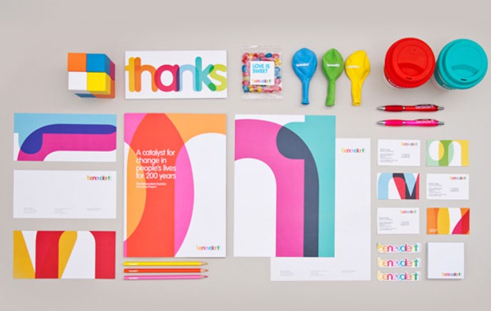
It’s no coincidence that Coca-Cola chose red, or Facebook chose blue. Logos and colors are a powerful combination that helps cement a brand’s image in the minds of consumers. Discover why this combination is so important – and how you can choose the right one for your business.
In an increasingly competitive business world, building a strong brand identity not only helps businesses stand out, but also creates a deep impression in the minds of customers. In particular, the two most important factors are logo and color . Logo is the representative "face", quickly recalling the brand name; while color plays the role of "tone" conveying emotions and personality. In this article, we will learn with SaDesign about the core meaning of logos and how to build and apply color in the entire brand identity system. Let's find out!
1. Meaning of logo
1.1 What is a logo and its main role?
A logo (short for logotype) is a visual mark – a word, a symbol, or a combination of both – used to identify and distinguish a brand. Essentially, a logo serves three functions:
Recognition: Helps customers immediately recognize the brand among a sea of products/services.
Recall: A good logo will “stay” in the user’s mind, creating familiarity when they see it again.
Convey: Through shapes, colors, fonts, logos convey messages, core values, and personality of the business.
Have you ever wondered why with just a bitten “apple” image, the whole world immediately thinks of Apple? That is the power of effective logo design.
![]()
1.2 Basic elements of a logo
A logo usually consists of three elements:
Symbol/Icon
Can be abstract or literal.
For example, Nike chose the “check” (swoosh) symbol to evoke movement; WWF used a friendly, memorable panda image.
Logotype/Wordmark
The lettering represents the brand name, with different typefaces: serif, sans-serif, script, etc.
For example, Coca‑Cola features a curvy Celtic script, which creates a nostalgic, friendly feel.
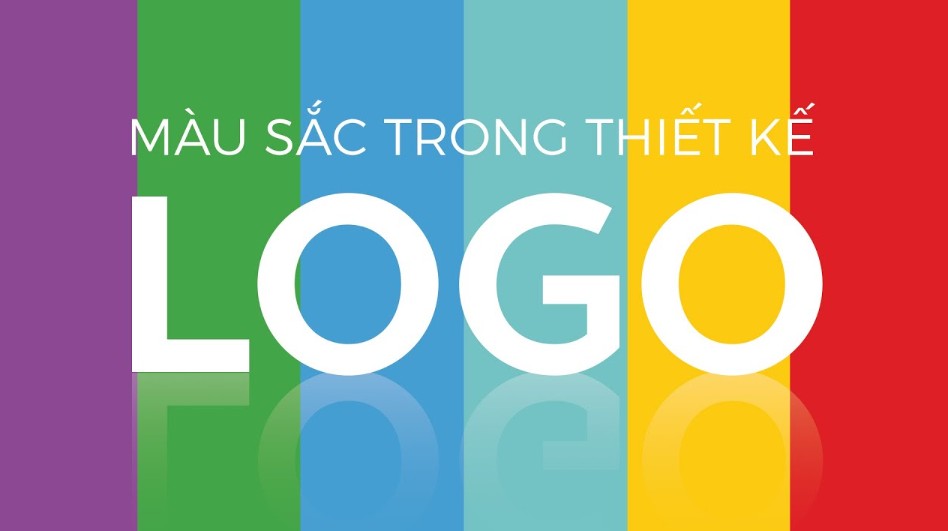
Color
Each color has its own psychological meaning, helping to reinforce recognition and convey emotions.
For example: Pepsi uses blue - red - white, suggesting dynamism and joy.
![]()
1.3 Principles of effective logo design
To get the most out of your logo, follow these principles:
Simplicity
Limit unnecessary details.
Simplicity makes the logo memorable, quickly recognizable and flexible when printed/displayed.
Scalability
The logo retains its clarity at sizes from very small (favicon, stamp) to very large (banner, billboard).
Design in vector format (AI, SVG) to avoid broken lines.
Consistency
The logo must be consistent with the brand positioning and consistent with other elements in the identity (typeface, color, image).
Avoid using too many different versions, which can dilute your brand.
![]()
1.4 Color psychology in logos
Each color carries different emotions and meanings. Choosing a color for a logo is not just about beauty, but also about the right message:
Colors have a huge impact on human emotions. According to compiled reports, colors help brands increase their recognition by up to 85%. Therefore, when designing a brand identity for a business, you cannot use colors based on emotions, but also have to understand the meaning and explain it convincingly. From here, they make it easier for customers to remember and be loved.
2. How to apply color in brand identity
Once you have a logo, it's time to build a color palette and apply it to all publications to ensure a consistent, professional identity.
Identify your personality & core values
“Dynamic, youthful” brands are suitable for bright colors (yellow, orange).
“Professional, trustworthy” brands prioritize blue and teal.
Choose a maximum of 2–3 main colors
Too many colors can be confusing and dilute the brand.
Keep your palette neat and easy to remember .
.png)
2.1. Red – The color of passion, energy and enthusiasm
Red has a wide range of meanings depending on the context. Red often carries strong emotions, the color of passion and enthusiasm. Red also represents seduction, adventure, violence and danger.
Depending on the field and industry, it will show the unique characteristics that the brand wants to convey.
In the culinary field, the color red in brand identity causes strong stimulation to the pituitary gland of the viewer. They cause a feeling of hunger. Famous brands that use red are: Coca Cola, KFC, Mcdonald, Budweiser...
In the field of technology and engineering, red evokes passion, enthusiasm, and speed. Car companies that use red in their identity are: Toyota, Mitsubishi,…
Some other brands consider red to symbolize victory, luck and fortune, respectively: SCG (royalty, royalty), JVC (victory),...
![]()
Popular industries: Food, automobiles, agriculture, technology, etc.
Unpopular industries: Aviation, finance, clothing,…
2.2. Orange – The color of freshness, adventure and creativity
Orange or orange-yellow represents warmth and passion. Orange also means attraction and deliciousness in the food industry. Besides, orange also attracts the attention of users, but not as harsh as red. It represents vitality and full of energy.
Orange is more suitable for products and services for young, dynamic people and luxury industries.
Popular industries: Technology, health, luxury jewelry industry.
Unpopular industries: Finance, energy, automotive, aerospace.
![]()
2.3. Yellow – The color of joy, happiness and positivity
Yellow represents the sun. It represents joy, optimism, lightness, positivity and warmth. In different shades, they will have completely different meanings.
According to statistics, more than 13% of top brands in the world today use yellow as the color in their brand identity.
Popular industries: Energy, food, household appliances, technology.
Unpopular industries: Finance, clothing, automobiles.
![]()
2.4. Green – The color of nature, prestige and wealth
Green is the color of nature, the color of chlorophyll. Green has many different meanings and also depends on the shade. However, the overall meaning is still towards health, peace, freshness.
If it is light blue, it represents joy and coolness. If it is dark blue, it represents wealth and prestige. In addition, blue also represents modesty and wisdom. Therefore, many brands use this color as the color in their brand identity. Major brands typically use green such as: Heineken, Starbuck, John Deere, ...
Popular industries: Energy, finance, food, household appliances.
Unpopular industries: Automotive, aviation.
![]()
2.5. Blue – The color of safety, trust, responsibility
According to 2012 statistics from Interbrands.com, in the top 100 global brands, while 19 brands use red in their logos and identities, 28 use blue.
Red attracts strong attention from users. If they are suitable for retail and distribution of goods, blue is the personality used by large corporations. In terms of visual meaning, blue brings a sense of peace, safety, creating solidity, stability, and transparency.
Besides, this color also represents the meaning of great aspirations. Large corporations use blue as the color in their brand identity: Samsung, Facebook, Intel, ...
In addition, another very interesting “war” between blue and red is always taking place. According to the design principles and visual impression, large companies and corporations that come after all use contrasting colors to make a strong impression on customers. Companies that use blue as the color in their brand identity to compete with red typically include: Pepsi (Coca Cola), Samsung (LG), Panasonic (Toshiba),…
Popular industries: Aerospace, finance, energy, technology, healthcare, agriculture.
Unpopular industry: Culinary.
![]()
2.6. Purple – The color of mystery, loyalty and nobility
Purple represents loyalty and nobility. It has a low stimulation potential. It also represents sacredness and mystery, making the brand more attractive. In addition, purple also represents loyalty and truth.
Dark purple is often associated with luxury and nobility. Light purple represents sentimentality and nostalgia.
Popular industries: Finance, healthcare technology.
Unpopular industries: Energy, industry.
![]()
2.7. Brown – The color of purity, authenticity and simplicity
Brown represents durability and purity. Therefore, many organic food companies and beauty brands have used brown as a color in their brand identity.
Popular industries: Clothing, agriculture, automobiles.
Unpopular industries: Finance, aviation, technology.
![]()
2.8. Black – The color of sophistication, elegance and luxury
Black is a color that symbolizes formality and formality. It also represents elegance, luxury, and mystery. It is also known as an ominous color.
When designing a logo or brand identity, avoid using monochrome colors. You should combine black with contrasting colors (white, yellow) to highlight the message the brand wants to convey.
According to research, up to 28% of businesses use black in their brand identity.
Popular industries: Technology, automobiles, apparel, clothing.
Unpopular industries: Energy, finance, aviation, healthcare, food.
![]()
Hopefully, through this article, you will equip yourself with some notes about the profession, to develop more in your design work. Wish you success in implementing an attractive identity, deeply in the minds of customers and helping your brand shine in the crowd!


VIP Products


Best Selling Products
ChatGPT Plus Account (GPT-4)
16 USD
Copyright Adobe Lightroom Account
59 USD
Freepik Premium Account
59 USD
Upgrade genuine Capture One account
120 USD
Plugin Retouch4me
69 USD
Autodesk All App Account Copyright
120 USD
Adobe Photoshop Copyright - Full App
120 USD
MidJourney Account
29 USD
Windows 10 & 11 Pro Key
36 USD
Capcut Pro 1 Year
39 USD
Genuine Cheap Canva Pro
39 USD
Genuine Adobe Illustrator account
99 USD
Upgrade Genuine Office 365
49 USD
Adobe Premiere Pro Account
99 USD
Upgrade Duolingo Super
29 USD