Best Selling Products

Upgrade Duolingo Super
29 USD

Plugin Retouch4me
69 USD

Upgrade Genuine Office 365
49 USD

Upgrade genuine Capture One account
120 USD

Capcut Pro 1 Year
39 USD

Adobe Photoshop Copyright - Full App
120 USD

Genuine Adobe Illustrator account
99 USD

Adobe Premiere Pro Account
99 USD

Windows 10 & 11 Pro Key
36 USD

Autodesk All App Account Copyright
120 USD

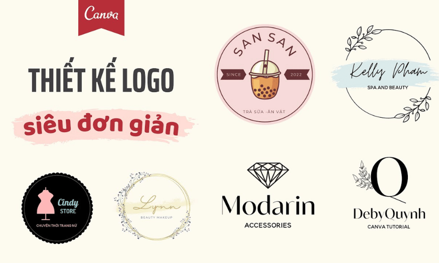
Genuine Cheap Canva Pro
39 USD

Copyright Adobe Lightroom Account
59 USD

MidJourney Account
29 USD

ChatGPT Plus Account (GPT-4)
16 USD

Freepik Premium Account
59 USD
Mistakes to Avoid When Designing a Logo and Solutions
Nội dung
Logo design is an important part of branding, directly affecting the first impression that customers have of the business. A beautiful logo not only needs to be eye-catching but also needs to convey the right message and core values of the brand. However, in the design process, many designers often make common mistakes that lead to the logo not achieving the desired effect. In this article, Sadesign will explore with you the mistakes to avoid when designing a logo and provide effective solutions to optimize the design, helping your brand stand out more in the minds of customers.
Logo design is an important part of branding, directly affecting the first impression that customers have of the business. A beautiful logo not only needs to be eye-catching but also needs to convey the right message and core values of the brand. However, in the design process, many designers often make common mistakes that lead to the logo not achieving the desired effect. In this article, Sadesign will explore with you the mistakes to avoid when designing a logo and provide effective solutions to optimize the design, helping your brand stand out more in the minds of customers.
1. Outdated logo
One of the most common problems with logo design is outdatedness. Many brands keep their logos looking dated, making them look like they were created decades ago. These logos often use techniques, images, and effects that have become outdated, such as 3D gradients, clip art, and vintage fonts. Not only do these elements make the logo look unattractive, but they can also make the brand lose its relevance in the current market.
When we look at logos from the 1980s and 1990s, we can see a clear difference from current design trends. This era saw an explosion of graphic effects, but today, many of them are no longer relevant. Going retro is not always a good idea; sometimes it just makes the brand look outdated and unappealing to new customers.
Solution
To overcome this problem, the best solution is to redesign the logo to match the modern style, specifically the retro trend. This does not mean that you have to completely abandon the classic elements, but instead innovate them in a more modern way. A useful suggestion is to refer to the classic logo styles that are hand-drawn with a logical and elegant layout.
For brands with outdated logos, a redesign is essential. Consider the elements of color, shape, and font. Instead of using complex effects, focus on simplicity and elegance. A simple yet memorable logo is easier to recognize and remember.
The Spruce brand is a great example of a classic logo that has been elegantly designed. The logo combines modern and classic elements, creating a harmonious blend of tradition and modernity. The use of neutral colors and simple shapes makes the logo easy to see and remember.
![]()
2. Logo is too detailed
Another problem that many brands often face is the over-detailedness of their logo designs. While detailed logos can be beautiful and artistic, in many cases they are not very practical. When a logo appears on a large billboard, mural, or outdoor advertisement, the detail can be a plus. However, when the logo needs to appear on smaller surfaces, such as smartphone screens, business cards, or small products, the detail can become a big problem.
The main problem with overly detailed logos is that they can be difficult to see and read in limited space. When a logo is scaled down, small details can be lost or become difficult to distinguish, resulting in the brand not being able to represent its true essence. Customers may have difficulty recognizing or remembering the brand, which directly affects brand awareness.
Solution
One possible solution to this problem is to design variant versions of your logo for smaller sizes. Minimizing unnecessary details will make your logo more recognizable in all conditions. For example, the Bluffton Inn brand cleverly uses classic architecture in their logo, but when it comes to printing on small surfaces, they create simpler, round versions that still maintain the beauty and aesthetic.
Additionally, you should also consider using a symbol or icon in place of the main logo where necessary. This not only makes the logo easier to recognize, but also creates flexibility in use, from websites to promotional products. This will not only help your brand stand out in the minds of customers but also create a more professional and modern image.
![]()
3. Irrelevant images
One of the most common mistakes in logo design is using an image that is not relevant to the brand. This often happens when designers choose symbols that are beautiful but do not accurately reflect the nature of the business. For example, a logo that includes a flame can be confusing, causing viewers to think of an oil company or tobacco products, when in fact it is a logo for a sushi restaurant.
Choosing the right image is important, as your logo is more than just a symbol; it represents your brand. A successful logo needs to convey a clear message about the industry, product or service your business offers. If your logo doesn’t reflect the essence of your brand, it can leave customers feeling confused and disconnected from your business.
Solution
To overcome this problem, it is necessary to find images that are associated with your company, which can accurately reflect the company name, the industry or the products that the business is doing business in. Creativity in logo design lies not only in choosing beautiful images but also in choosing symbols that have deep meanings, creating connections with customers.
For example, the logo of Eaglehead Woodcraft, a company that specializes in manufacturing wooden furniture, uses the image of a tree. This image is not only easily recognizable but also directly related to their industry. This logo not only stimulates the viewer’s thinking but also creates closeness and familiarity. By using symbolic images such as trees, the logo not only represents the nature of the business but also creates a sense of friendliness and closeness to customers.
To find the right image for your logo, consider factors like your brand’s core values, mission, and the vision you want to convey. Get input from industry insiders and experiment with different designs to find the image that best represents your brand. This will not only help to highlight your brand identity, but also increase your ability to recognize and connect with your customers.
![]()
4. Logo is too vague
Another mistake many brands make is designing a logo that is too vague. While a logo may look beautiful and appealing, if it doesn’t convey anything about your brand, it’s still a poor design. One of the main purposes of a logo is to help viewers identify who you are and what you do at first glance. If your logo fails to do this, it won’t serve its purpose.
Some logos do not provide clear information and the company name may be obscured or difficult to read. Images in logos sometimes appear to be randomly chosen, with no connection to the business or its products. This can lead to customers not understanding the brand and may refuse to learn more.
Solution
To overcome this, you need to add additional descriptions to your logo. This doesn’t mean you have to add a lot of details or text to your logo, but just add the necessary elements to clearly explain what you offer to your customers. A short slogan or logo image can help clarify the message your logo is trying to convey.
For example, the Phoenix lingerie logo is minimalistic with the brand name and a blue wing symbol. While the logo is sleek and modern, without a clear description, viewers might mistake the wing symbol for an architectural firm or even a musical instrument. To avoid this, you can add a slogan or a brief description below the logo to clarify what your brand does.
Additionally, using legible fonts and appropriate colors is also an important factor in making the logo clearer. Make sure that all the elements in the logo support each other, creating a unified and understandable whole. When customers can recognize your brand in just a second, their ability to remember and connect with the brand will increase significantly.
![]()
5. Conflicting topics
Logos have a powerful impact on how customers remember your brand. However, one of the biggest problems with logo design is using images that don’t align with your brand’s core values and messaging. When images don’t “fit” your brand, it can create confusion and prevent customers from effectively connecting with your brand. A classic example is a logo featuring a monkey smoking a cigarette, which may seem playful and cartoonish, but is inappropriate for a brand that targets business people and mature customers.
Choosing a logo image requires careful consideration. If the image does not convey the right message, it can lead to misunderstandings and damage the brand’s reputation. Inappropriate images can make customers feel that the brand is unprofessional or untrustworthy, which can affect their purchasing decisions.
Solution
To address this issue, both the imagery and the artistic style of your logo need to align with your branding goals. It’s important to understand your target audience and what they’re looking for. Using widely recognized symbols and images can help ensure that your brand is not only recognizable, but also understandable.
For example, the Adventures logo is clearly designed for nature lovers. The logo features a red sun, representing both sunrise and sunset. The logo also represents outdoor activities such as swimming, boating, and wildlife watching, using additional symbols such as arrows, oars, and compasses. These images not only support the brand message, but also create an emotional connection with customers.
When designing a logo, consider using colors, shapes, and styles that are appropriate to the industry you operate in. This will help your logo not only look good, but also have a deep meaning and be easily remembered in the minds of customers.
![]()
6. General logo
Another common problem in logo design is the use of generic logos that lack originality and creativity. These logos often follow the same trends and styles, resulting in a lack of strong impression on viewers. This can even cause confusion with other brands in the same field.
A classic example is the overused “V-man” symbol, which represents an ambiguous human figure that can stand for “everyone” or “every woman.” This is often seen in beauty care, dentist, or real estate logos, where symbols such as teeth or houses have become so familiar that they no longer make an impact.
Solution
While generic logos aren’t always bad, they can detract from brand recognition. Sometimes, design ideas come from keeping up with general market trends without looking for something that stands out and is unique. This results in a brand that doesn’t have its own identity and can get lost in the crowd.
To create a unique logo, it is important to look for unique elements. For example, the Headstash brand cleverly uses a mountain image and a classic typography style, but they add other elements to differentiate themselves. The creative layout and illustration style of the mountain, combined with unique typography, gives this logo a distinct and appealing look.
When designing a logo, ask yourself, “What makes my logo different from other brands?” Experiment with different images, colors, and fonts to find the style that best suits your brand. Creating a unique logo not only helps your brand stand out, but it also creates a strong connection with your customers.
In short, it is important to avoid common logo design mistakes such as using inappropriate images or generic logos. By paying attention to every detail in your design, you can create a logo that is not only beautiful but also meaningful, helping your brand to make a lasting impression on your customers.
![]()
7. Confusing logo
One of the biggest problems with logo design is the use of imagery that can be confusing to the viewer. While a logo may be aesthetically pleasing, if the imagery does not clearly communicate the brand message, it will not be effective. Such logos not only confuse the viewer, but can also cause them to forget your brand.
A good example is the On The Heavy Side logo. The most prominent image in the logo is a camping gear, but the man is holding a golf club and a tennis racket. This makes it difficult for viewers to identify the brand’s true business. The slogan “Don’t let your size stop you” also makes it even more difficult for viewers to understand the message the brand wants to convey. This inconsistency can make customers feel that the brand is unprofessional and untrustworthy.
Solution
To overcome this problem, you can apply various strategies mentioned earlier, such as adding a familiar icon or changing the slogan to clarify the message. Adding recognizable elements will make the logo clearer and easier for customers to understand.
A good example of a highly communicative logo is the Tactical Wealth Management logo. This logo combines images and text, making it easy for viewers to understand the brand’s goals and mission. The image in the logo is not only attractive, but also closely related to the business’s field of operation, creating a strong connection between the image and the message.
When designing your logo, make sure that all the elements work together to convey a clear message. If you decide to use abstract images or artistic symbols, make sure they still help viewers understand the essence of your brand. This not only enhances recognition, but also creates a better experience for your customers.
![]()
8. Conclusion
Mistakes in logo design can seriously affect your brand image and customer recognition. By understanding common mistakes and applying appropriate solutions, you can create a logo that is not only beautiful but also brings long-term value to your brand. Sadesign offers many logo design software, notably Canva. With this tool, you can create unique publications. Investing in a logo design platform will bring great benefits to the sustainable development of your business in the future.


VIP Products


Best Selling Products
Upgrade Duolingo Super
29 USD
Plugin Retouch4me
69 USD
Upgrade Genuine Office 365
49 USD
Upgrade genuine Capture One account
120 USD
Capcut Pro 1 Year
39 USD
Adobe Photoshop Copyright - Full App
120 USD
Genuine Adobe Illustrator account
99 USD
Adobe Premiere Pro Account
99 USD
Windows 10 & 11 Pro Key
36 USD
Autodesk All App Account Copyright
120 USD
Genuine Cheap Canva Pro
39 USD
Copyright Adobe Lightroom Account
59 USD
MidJourney Account
29 USD
ChatGPT Plus Account (GPT-4)
16 USD
Freepik Premium Account
59 USD