Best Selling Products

Adobe Premiere Pro Account
99 USD

Freepik Premium Account
59 USD

Adobe Photoshop Copyright - Full App
120 USD

Windows 10 & 11 Pro Key
36 USD

MidJourney Account
29 USD

Upgrade Duolingo Super
29 USD

Capcut Pro 1 Year
39 USD

Genuine Cheap Canva Pro
39 USD

Upgrade Genuine Office 365
49 USD

Autodesk All App Account Copyright
120 USD

ChatGPT Plus Account (GPT-4)
16 USD

Plugin Retouch4me
69 USD

Copyright Adobe Lightroom Account
59 USD

Upgrade genuine Capture One account
120 USD

Genuine Adobe Illustrator account
99 USD
22 Professional Graphic Design Tips (Part 2)
Nội dung
In part 2 of "22 Professional Graphic Design Tips", we will continue to explore tips and techniques to improve your design skills. These tips will not only help you create eye-catching products but also help you develop your personal style and improve your workflow. Let's learn more with Sadesign and apply this knowledge to your design projects!

In part 2 of "22 Professional Graphic Design Tips", we will continue to explore tips and techniques to improve your design skills. These tips will not only help you create eye-catching products but also help you develop your personal style and improve your workflow. Let's learn more with Sadesign and apply this knowledge to your design projects!
12. Align rows
In graphic design, alignment is one of the most important elements that helps create harmony and professionalism for the product. When elements are properly aligned, they not only help the viewer's eye move easily through the design, but also create a sense of stability and comfort. A poorly aligned design can make the viewer feel confused and unable to focus on the main content.
To make alignment effective, you should define a reference point for the elements in your design. This can be a grid or guidelines that you create. Using these lines will not only help you keep the elements in your design organized, but also add depth to your work. These lines can be simple straight lines or more complex shapes, depending on the style you want to convey.
Finally, combining alignment with other design elements such as color and shape will create a more complete and appealing product. Remember, correct alignment not only enhances aesthetics but also helps to convey the message more clearly. A well-aligned design is the first step to attracting attention and keeping viewers.
.png)
13. Use color palette
Using a color palette in graphic design is an essential element to create consistency and appeal. Color consistency not only makes the design easy to look at, but also creates a sense of professionalism for the product. When you use a suitable color palette, the viewer will feel comfortable and easily receive the message you want to convey.
A good idea is to choose a dominant color palette and use it throughout the entire design. This not only creates a connection between the elements but also highlights important points. You can use online tools to find color palettes that match the theme and emotion you want to express, creating interesting and unique products.
Finally, remember that colors can influence the mood and emotions of your viewers. Choosing colors carefully will help you not only attract attention but also create a lasting impression in the viewer’s mind. When you apply your color palette properly, your design will be more impressive and memorable.
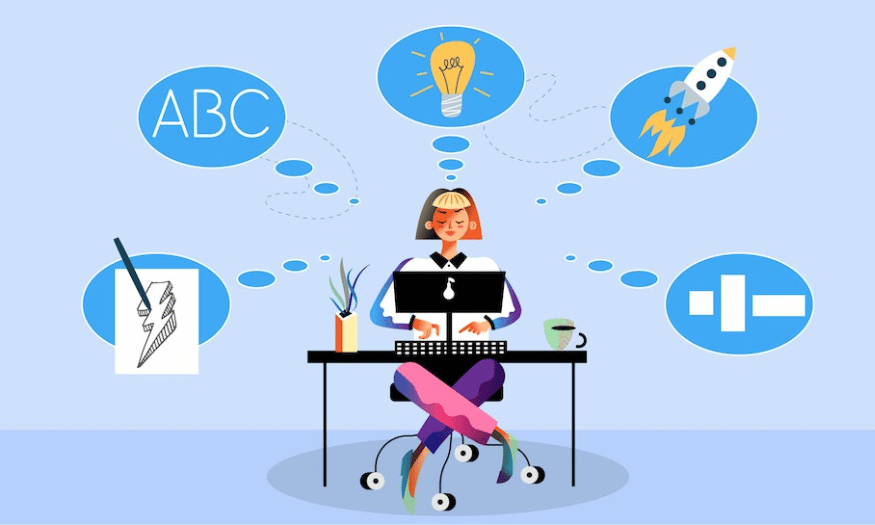
14. Create a visual hierarchy
Visual hierarchy in graphic design is the way you arrange elements in order of priority, making it easy for viewers to understand and absorb information. This is especially important in the digital world, where users spend an average of only 8 seconds scanning a design. Therefore, creating a clear hierarchy will help you grab attention at first glance.
To create effective hierarchy, you should use size, color, and position to delineate important sections. Prominent elements will guide the viewer’s eye to the main points you want to emphasize. For example, headlines can be highlighted with a larger size and contrasting color, while secondary content can be placed lower and in a smaller size.
Finally, test and refine your hierarchy by gathering feedback from your audience. This will help you identify strengths and weaknesses in your design, allowing you to improve and refine your product. An effective visual hierarchy not only makes information easy for your audience to access, but also creates an engaging and engaging experience.
.png)
15. Adjust images and backgrounds to make text stand out
In graphic design, adjusting images and backgrounds to highlight text is an important technique to make your message clear and easy to understand. When you place text on an image background, careful consideration must be given to contrast and harmony between the elements. An image that is too complex can make the text difficult to read, while a background that is too simple may not create enough interest for the viewer.
To achieve this balance, a good strategy is to blur the image background. Blurring not only makes the text stand out, but also creates a sense of depth in the design. You can adjust the blur of the image so that it remains artistic but does not take away from the main content. Additionally, using soft color overlays can also help create the necessary contrast without losing the beauty of the image.
Finally, remember that the color of your text also plays an important role in attracting attention. Using a color that contrasts with the background will help your text stand out. Especially if you are working with a colorful image, choosing a simple, elegant text color will help your audience easily access your message without being distracted.
16. Who is this design aimed at?
When embarking on a design project, identifying your target audience is an essential step. Each audience has its own unique demographics, psychographics, and needs. Factors such as age, gender, interests, and spending habits all influence how they perceive your design message. Therefore, thorough research on your audience will help you create more relevant and appealing products.
One effective way to learn about your audience is to create personas – representations of your ideal customers. These personas will help you get a clearer picture of your customers’ needs and wants. Once you have a persona in place, you can tweak your design to ensure it matches the interests and habits of the audience you want to reach.
Finally, always keep in mind that design is not just about creating a beautiful product, but also about communicating the right message to the right people. If you know who your customers are, it will be easier for you to choose the style, color and form of presentation. A successful design not only attracts attention but also creates a strong connection with the target audience.
.png)
17. Simplify
Many people may think that minimalist design is boring and lifeless. However, that is not true at all. Simple design does not mean lacking in creativity; on the contrary, simplicity is often surprisingly effective and helps to highlight important elements. When you remove unnecessary details, you create space for core messages to shine, making them easier for viewers to absorb and remember.
One way to make a minimalist design more appealing is to incorporate bold colors. A simple yet bright color palette can create an interesting focal point, making the design come alive and appealing. Experiment with different color schemes and see how they interact with each other to find the perfect balance between simple and bold.
Additionally, font selection is an important element of minimalist design. A unique yet legible font can make your design more impressive without adding too much detail. Simplification doesn’t mean you have to sacrifice creativity; on the contrary, it can be a way to enhance the appeal of your design, making it more memorable and accessible to your audience.
18. Emotional highlights
The “emotional” element of graphic design is not just about creating something beautiful, but also about connecting with your audience on a deeper level. When you ask yourself, “What are the emotional touchpoints that I want my audience to notice?”, you open up a creative space for yourself. Identifying the emotions you want to convey will help you make better design decisions, from choosing colors to images and typography.
Once you have determined the “feeling” you want to convey, you can choose the right dominant color tone. Colors have the ability to stimulate strong emotions; for example, red can create a feeling of passion and energy, while green can bring about a sense of peace and freshness. Additionally, using visual effects such as blur or drop shadow can also help to highlight the emotion you want to convey, creating an atmosphere that matches the message of the design.
Ultimately, incorporating emotion into your design will not only help you grab attention, but it will also create a lasting connection with your audience. When your audience feels the emotion in your design, they will be more likely to remember and engage with your brand. Creating from emotion will result in products that are not only beautiful but also meaningful, contributing to creating memorable experiences for your audience.
.png)
19. Use family fonts
Using fonts in the same family is a great way to spice up your text without having to search for too many different typefaces. Using variations within a font family allows you to create variety while still maintaining consistency in your design. For example, if you’re using Helvetica, you can mix in variants like Helvetica Bold, Italic, or Light to make your text more dynamic.
The benefits of using fonts in the same family are not only aesthetic, but also readability. Fonts in the same family often have similar design characteristics, making it easier for viewers to recognize and absorb information. This is important, especially when you want to ensure that your audience can easily read and understand the content you are trying to convey.
Finally, your font choice should reflect your brand’s style and personality. An elegant font can create a sense of luxury, while a playful font can convey a youthful and dynamic feel. Using variations within a font family can help you achieve this in a subtle way, while also creating a harmonious and attractive layout for your design.
20. Research trends
Before you start designing for a client, it is essential to research industry trends. The design world is constantly changing and evolving, with new trends emerging all the time. By observing and understanding what is happening, you can capture creative ideas and apply them to your products. This will not only help you create modern designs but also demonstrate a deep understanding of the industry.
Researching competing brands is also an important part of this process. You need to know what strategies they are using, what colors they use, and how they connect with their customers. This will help you understand the market better and create better products that stand out from the crowd. Furthermore, analyzing design trends will give you an overview of what your customers want and need, which will help you adjust your designs accordingly.
Finally, always keep learning and creating. The world of design is a never-ending journey, and keeping up with new trends will help you become not only a good designer but also a leader in your field. Use your knowledge and skills to create products that are not only beautiful but also bring value to your viewers.
.png)
21. Bold
To stand out from the crowd and be a unique designer, boldness is key. Design is not just about arranging images and text, but also about expressing your own personality and style. Sometimes, making a difference starts with simple questions: "What can I do to stand out more?", "How can I make my message unique?" These questions will lead you to creative ideas you might not have thought of.
One effective way to make a bold statement is to use contrasting colors. Strong colors can add interest and drama to a design. Don’t be afraid to experiment with bold color combinations that will help you grab attention at first glance. Think of using color not only as decoration but also to emphasize the core message of your product. Contrast not only creates attention but also helps design elements become more recognizable.
In addition to color, typography is a powerful tool for making a difference. Choosing a unique and creative font can transform an ordinary message into a work of art. Experiment with the size, style, and placement of your letters to create interesting accents. Don’t be afraid to show your personality through the smallest details; being bold in your design is how you assert yourself and make a lasting impression on your audience.
22. Conclusion
With 22 professional graphic design tips introduced, hopefully you have more ideas and inspiration to improve your skills. Design is not only an art but also a continuous learning process. Apply these tips, experiment and constantly create to become an excellent designer. Wish you success on your creative path!


VIP Products


Best Selling Products
Adobe Premiere Pro Account
99 USD
Freepik Premium Account
59 USD
Adobe Photoshop Copyright - Full App
120 USD
Windows 10 & 11 Pro Key
36 USD
MidJourney Account
29 USD
Upgrade Duolingo Super
29 USD
Capcut Pro 1 Year
39 USD
Genuine Cheap Canva Pro
39 USD
Upgrade Genuine Office 365
49 USD
Autodesk All App Account Copyright
120 USD
ChatGPT Plus Account (GPT-4)
16 USD
Plugin Retouch4me
69 USD
Copyright Adobe Lightroom Account
59 USD
Upgrade genuine Capture One account
120 USD
Genuine Adobe Illustrator account
99 USD