Best Selling Products

ChatGPT Plus Account (GPT-4)
16 USD

Genuine Adobe Illustrator account
99 USD

Freepik Premium Account
59 USD

Upgrade genuine Capture One account
120 USD

Adobe Photoshop Copyright - Full App
120 USD

MidJourney Account
29 USD

Capcut Pro 1 Year
39 USD

Upgrade Genuine Office 365
49 USD

Adobe Premiere Pro Account
99 USD

Genuine Cheap Canva Pro
39 USD

Windows 10 & 11 Pro Key
36 USD

Plugin Retouch4me
69 USD

Autodesk All App Account Copyright
120 USD

Upgrade Duolingo Super
29 USD

Copyright Adobe Lightroom Account
59 USD
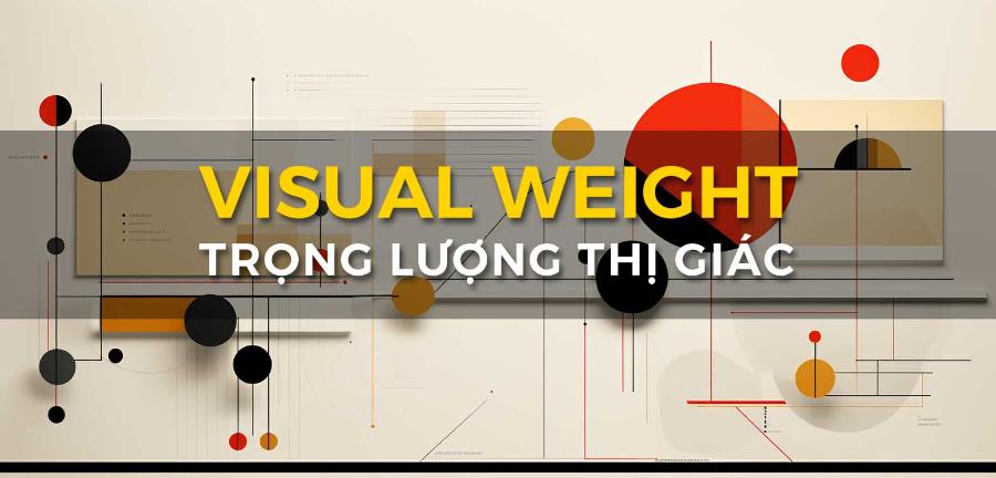
22 Professional Graphic Design Tips (Part 1)
Nội dung
- 1. Limit the number of fonts
- 2. Adjust the text size to fit the design
- 3. Use contrasting fonts
- 4. Don't be afraid of big sizes
- 5. Pay attention to character spacing
- 6. Use contrasting colors
- 7. Use white space
- 8. Consistency in design
- 9. Use flat design
- 10. Create a logical text structure
- 11. Use icons
- 12. Conclusion
In the ever-evolving world of graphic design, mastering professional tips and techniques is essential to creating impressive and engaging work. Whether you are a new or experienced designer, it is essential to update and improve your skills. In this article, Sadesign will explore with you 11 of the top 22 graphic design tips to help you improve the quality of your work and create unique, creative designs.
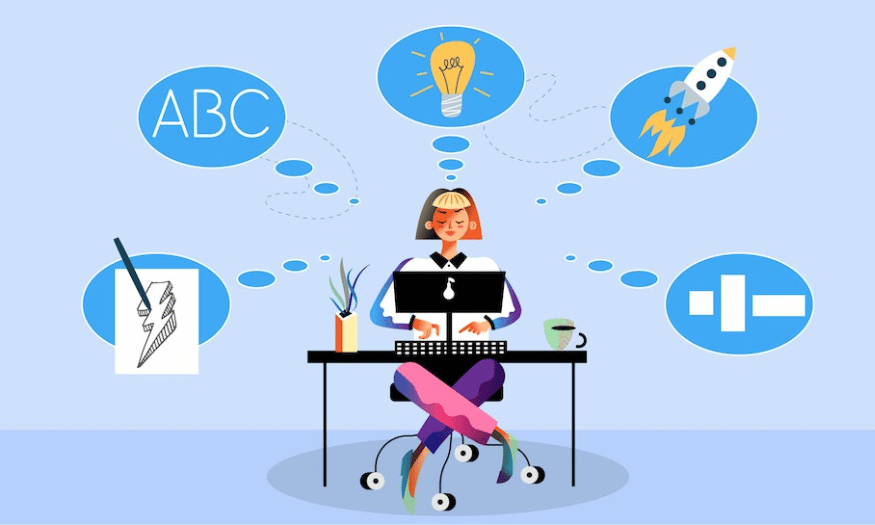
In the ever-evolving world of graphic design, mastering professional tips and techniques is essential to creating impressive and engaging work. Whether you are a new or experienced designer, it is essential to update and improve your skills. In this article, Sadesign will explore with you 11 of the top 22 graphic design tips to help you improve the quality of your work and create unique, creative designs.
1. Limit the number of fonts
One of the most common pieces of advice from professional designers is to limit the number of fonts in a design. Using too many fonts can make a design look confusing and difficult to understand. When a viewer encounters a design, they need to be able to clearly and easily identify the message. If there are too many fonts, the message can become lost in the chaos.
To create a harmonious and consistent design, limit the number of fonts to three. This not only helps keep the design clean, but also creates consistency in style. You can choose one font for the title, one for the body text, and one for secondary elements such as captions or notes. This combination allows you to create contrast while maintaining an overall aesthetic.
Also, keep in mind the compatibility between fonts. The fonts you choose should have a cohesive style and tone. This will help the design process go more smoothly and create a professional final product.
2. Adjust the text size to fit the design
When designing, text size is more than just choosing a font size. You can adjust line height and letter spacing to create more unique effects. Instead of just leaving text at an angle, experiment with text placement to create more visual interest.
One interesting technique is to decrease the line height and increase the font size exponentially. This not only creates attention, but can also make the text stand out more in the design. By using opacity, you can make the text part of the overall layout without obscuring other important elements, such as backgrounds or images.
Adjusting text size can also help you emphasize key messages. Think about what you want your audience to notice most and adjust the text size to match your design goals.
.png)
3. Use contrasting fonts
When designing graphics, one of the most effective ways to grab the viewer’s attention is to use contrasting fonts. Creating contrast between fonts not only highlights the message, but also adds emotion to the design. For example, you can combine a bold san serif font with a thin, romantic font. This “big vs. small” contrast will easily draw the eye and highlight the content.
Contrast isn’t just limited to size, it can also include style and color. When you use a bold font for your headlines and a light font for your body copy, you create a clear division between different parts of your design. This not only makes it easier for viewers to follow, but it also enhances brand recognition.
Also, be mindful of the context in which you use fonts. Contrasting fonts can have different feelings depending on the context. Experiment and find the combination that works best for the message you want to convey.
4. Don't be afraid of big sizes
When choosing elements for your design, remember that larger objects attract more attention than smaller ones. An effective design will usually have one or more prominent elements that catch the eye at first glance. If you have an important message or a key image, make sure it is displayed in large size. This not only makes it easy to identify, but also creates a strong impression.
If your design has a lot of elements, make sure that the main object is larger than the secondary elements. The viewer’s eye is automatically drawn to what is larger and more obvious. This way, you can direct the viewer’s attention to the most important parts of the design. Think carefully about the proportions and placement of elements when you design.
Don’t be afraid to go large; on the contrary, it can make your product unique and stand out. The flexibility in adjusting the size will help you create impressive designs and easily convey your message.
.png)
5. Pay attention to character spacing
Letter spacing and typography are important elements that can make or break a design. Some fonts have incorrect default spacing and can be difficult to read. Pay attention to how the spacing between characters affects the readability and overall aesthetic of your design.
You can adjust the spacing between letters using the tools in your graphics software. This will help create a more streamlined and accessible product. Increase or decrease the spacing depending on the situation and design intent. Too much spacing can make the text difficult to read, while too little spacing can create a disjointed feel.
Experiment with different levels until you find a harmony between the characters. This not only improves the aesthetics but also creates a better experience for the viewer. Good design is not only beautiful but also understandable and accessible.
6. Use contrasting colors
Contrasting colors often create a powerful visual effect. It is human nature to be interested in things that are unusual, which is why you should use contrasting colors in your graphic design. This not only creates eye-catching effects but also helps to highlight important elements in your design.
Using contrasting colors can help you emphasize the message you want to convey. For example, using a light color on a dark background will make text or images stand out more, making them easier to see. Think carefully about how contrasting colors affect the mood and emotions of your audience.
Additionally, color can also be used to separate different sections of a design. A harmonious yet contrasting color palette will help create a striking overall look. Be sure to experiment with different shades and tones to find the best combination for your design.
.png)
7. Use white space
Sometimes, you don’t need to add tons of colors, fancy elements, or fonts to get your message across. Simplicity can be the key to creating an effective design. White space not only helps to highlight elements in your design, but it also creates a sense of comfort for the viewer. When you use white space wisely, you allow the viewer’s eyes to “breathe,” making it easier for them to absorb information.
A suggestion used by many experts is to use white tones that are elegant, simple and beautiful. White is not only easy to combine with other colors but also creates a clean and modern feeling. When combined with white space, white will make the overall design more sophisticated and easier to see, helping viewers focus on the main message you want to convey.
Whitespace can also be used to create hierarchy in a design. By using whitespace around important elements, you can make them stand out from the rest. This not only adds to the aesthetic appeal, but also makes the message you’re trying to convey clearer, making it easier for viewers to recognize and remember.
8. Consistency in design
Consistency is an important factor in tying together all the different elements in a design. A consistent design not only creates harmony but also helps viewers easily recognize your brand and the message you want to convey. To achieve this consistency, you should be consistent in color, font, size, and spacing between elements.
Maintaining consistency in design not only helps create a professional image, but also helps build trust with customers. When consumers see a brand with a consistent design, they are more likely to recognize and remember that brand. This is especially important in marketing campaigns, where the message needs to be strong and clear.
Additionally, consistency in design also helps create a smoother user experience. When design elements are kept consistent, viewers can easily navigate and interact with different parts of the design without feeling overwhelmed. This not only improves the user experience but also contributes to the overall success of the design.
.png)
9. Use flat design
Contrary to popular belief, you don’t have to spend a lot of time creating a design that uses complex 3D elements. Flat design has remained a popular and favorite choice over the years. With flat design, you focus on using simple shapes, bright colors, and clear layouts, which help create a product that is easy to see and understand.
One of the biggest benefits of flat design is its simplicity and efficiency. Flat design eliminates clutter and unnecessary elements, allowing the focus to be on the main message. This not only makes it easier for viewers to absorb information, but also creates a modern and elegant feel.
Furthermore, flat design is also very flexible in terms of application across different platforms, from web to mobile. With the increase in mobile usage, flat design allows designers to create user interfaces that are friendly and easy to use on any screen size. This not only enhances the user experience but also helps your brand stand out from the crowd.
10. Create a logical text structure
Whenever you add text to your design, make sure to align it with other elements to make the overall design look good. Proper text structure not only creates aesthetic appeal, but also makes it easier for viewers to access and understand the content you are trying to convey. Aligning text to the layout will help create a natural flow for the viewer’s eyes, making it easier for them to follow the information.
An important factor when designing text is paragraph length. Try to keep it short and concise. Keep the number of characters to a minimum, as the viewer’s attention span can be very short, typically as short as eight seconds. During that short time, if the text is too long or confusing, the viewer may easily miss your message. Choose precise and concise words to convey your ideas most effectively.
Finally, pay attention to the font and font size. Choosing the right font and font size not only enhances the aesthetics but also makes the text easier to read. A perfect combination of text structure and other design elements will create a finished product that attracts viewers and conveys the message clearly.
.png)
11. Use icons
Using icons can be an effective way to grab the attention of your audience. Icons don’t have to be like popular logos like Twitter or Instagram. Instead, you can get creative with other types of icons based on your personal taste. Using icons wisely can help create unique visuals, from combining letters in black and white tones to adding some 3D elements.
Icons can be used to illustrate ideas, highlight important elements in a design, or simply create an interesting focal point. They can convey a message more quickly and easily than text. Furthermore, icons can also help viewers easily recall and recognize your brand.
Using icons not only adds aesthetic value, but also enhances the experience your audience has when interacting with your design. A well-designed icon can create a sense of friendliness and familiarity, which can make your audience more interested in the content you provide. Make sure that you choose and design icons that are consistent with your brand’s message and style.
12. Conclusion
Hopefully these first design tips will help you on your creative journey. Remember, design is not just an art, but also a process of continuous learning and growth. Don’t miss the next part, where we will continue to explore 11 more professional graphic design tips to help you perfect your skills and create even more impressive works!


VIP Products


Best Selling Products
ChatGPT Plus Account (GPT-4)
16 USD
Genuine Adobe Illustrator account
99 USD
Freepik Premium Account
59 USD
Upgrade genuine Capture One account
120 USD
Adobe Photoshop Copyright - Full App
120 USD
MidJourney Account
29 USD
Capcut Pro 1 Year
39 USD
Upgrade Genuine Office 365
49 USD
Adobe Premiere Pro Account
99 USD
Genuine Cheap Canva Pro
39 USD
Windows 10 & 11 Pro Key
36 USD
Plugin Retouch4me
69 USD
Autodesk All App Account Copyright
120 USD
Upgrade Duolingo Super
29 USD
Copyright Adobe Lightroom Account
59 USD