Best Selling Products

Genuine Adobe Illustrator account
99 USD

Adobe Premiere Pro Account
99 USD

Genuine Cheap Canva Pro
39 USD

Freepik Premium Account
59 USD

Upgrade Genuine Office 365
49 USD

Windows 10 & 11 Pro Key
36 USD

Autodesk All App Account Copyright
120 USD

Upgrade genuine Capture One account
120 USD

Copyright Adobe Lightroom Account
59 USD

Adobe Photoshop Copyright - Full App
120 USD

Upgrade Duolingo Super
29 USD

ChatGPT Plus Account (GPT-4)
16 USD

Plugin Retouch4me
69 USD

Capcut Pro 1 Year
39 USD

MidJourney Account
29 USD
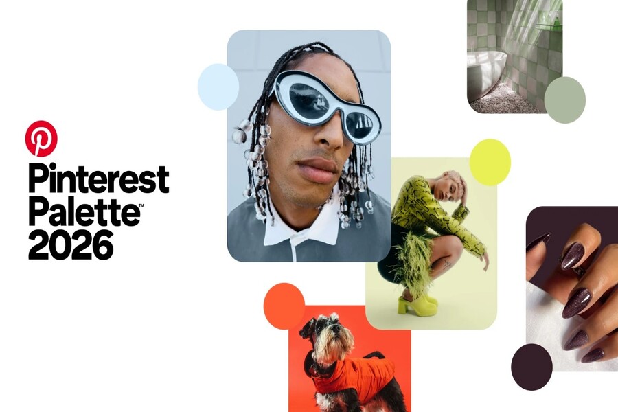
Pinterest predicts that color palettes will dominate in 2026.
Nội dung
The 2026 color palette is not just a trend, but also reflects the emotional shift of the era. From rational cool tones to energetic warm hues, each color tells its own story. Let's explore how these shades are shaping design, fashion, and global branding.
Pinterest predicts that color palettes will dominate in 2026.
The 2026 color palette is not just a trend, but also reflects the emotional shift of the era. From rational cool tones to energetic warm hues, each color tells its own story. Let's explore how these shades are shaping design, fashion, and global branding.
In 2026, Pinterest unveiled a trend-setting color palette featuring five dominant shades that embody a strong, emotional, and highly personal spirit. Beyond aesthetics, this palette reflects a profound shift in how people connect with the world, with themselves, and with the visual experiences around them.
From Cool Blue, embodying intellectual tranquility; Jade, suggesting balance; Plum Noir, representing inner strength; Wasabi, signifying unconventionality; to Persimmon, brimming with social energy, these five shades are not just trends but also embody the emotional states of the era. For designers, marketers, brand builders, or anyone interested in visual language, understanding the spirit of the 2026 color palette means grasping the aesthetic pulse of the year. This article will delve into each shade, deciphering its meaning, inspiration, color psychology, and its potential applications in design, fashion, branding, living spaces, and modern visual culture.
1. Overview
Unlike the safe color palettes that dominated the past, the 2026 palette makes a clear statement: the world is moving away from neutrality and silence into an era of emotion, personality, and direct self-expression. This is no longer the time for "safe colors that everyone likes," but the time for shades that have their own stance, attitude, and story.
Based on data from over 600 million users and billions of searches, saves, and interactions, Pinterest has identified five shades representing the spirit of 2026: Cool Blue, Jade, Plum Noir, Wasabi, and Persimmon. These colors didn't appear randomly but reflect deep-seated societal needs: the need for calm, balance, self-expression, standing out, and connection.
The core of this year's color palette lies in the concept of "emotional utility": the emotional value of color. In a world saturated with information, algorithms, and pressure, people no longer choose colors simply for their beauty, but because those colors evoke a certain feeling in them. Color has become a tool for regulating emotions, shaping experiences, and conveying personal identity. This is what makes the 2026 color palette more expressive, individualistic, and profound than in previous years.
.jpg)
2. Cool Blue: Focus in a chaotic world
Cool Blue is a cool shade of blue that evokes feelings of icy coldness, alertness, and distance. It's not the warm blue of nature, but rather the blue of the digital space, of stillness, of a breather amidst the noisy world. In a context where people are constantly surrounded by information, Cool Blue represents the need to slow down, think clearly, and focus.
Color psychology suggests that cool blue tones help reduce visual stress and create a sense of control. Cool blue is therefore often found in technological, creative, and intellectual designs. When applied to digital interfaces, this shade of blue helps create a clean, logical, and trustworthy experience. In branding, cool blue conveys a sense of professionalism, transparency, and stability.
.jpg)
In fashion, Cool Blue is frequently used on smooth fabrics like cotton satin, thin wool, or cool silk, creating an elegant yet understated look. In interior design, this color often appears in minimalist spaces, helping to create a sense of spaciousness, airiness, and mental balance. Cool Blue isn't a flashy color, but it has a lasting impact because it taps into a deep-seated need: the need for calm amidst a chaotic world.
3. Jade: A balance between nature and luxury
Jade is a shade of emerald green that evokes a sense of balance between nature and sophistication. It's a color reminiscent of gemstones, young leaves, and the movement of life, yet it retains depth and maturity. Jade reflects the healing needs of modern society, where people seek emotional stability while still desiring aesthetic beauty.
.jpg)
Unlike vibrant shades of green, Jade has a more subdued, luxurious, and profound quality. It is often used in high-end interior design, spas, wellness branding, and products embodying a slow-paced lifestyle. Jade evokes a sense of relaxation and security without being boring, thanks to its balanced saturation and subtle hue.
In fashion, jade often appears on materials such as silk, velvet, or knitted wool, creating an elegant and mature look. In graphic design, jade conveys a high-end yet approachable feel, perfectly suited for brands seeking a balanced image between nature and modernity. Jade is not flashy, but always evokes a sense of stability and durability.
4. Plum Noir: Power, depth, and captivating darkness.
Plum Noir is a deep purple mixed with burgundy and velvety brown, evoking a sense of power, mystery, and inner strength. It's a color of emotional depth, complexity, and personalities that refuse to blend in. Pinterest calls this shade "villain energy": the energy of those who dare to be different, dare to express themselves, and aren't afraid to step outside their comfort zone.
.jpg)
In color psychology, deep shades of purple are often associated with intuition, intelligence, and power. Plum Noir therefore evokes a sense of luxury but also mystery. In fashion design, this shade often appears on velvet, suede, or fur, creating a strong and captivating look. In branding, Plum Noir helps build a brand image that is deep, distinctive, and memorable.
In interior design, Plum Noir is used to create accents, making spaces feel warm, deep, and emotional. This color isn't for everyone, but it's incredibly powerful when used correctly. Plum Noir represents a generation that no longer seeks perfection, but embraces complexity and the beauty of inner depth.
5. Wasabi: Rebellion, boldness, and breaking the mold.
Wasabi is the most visually powerful electric chartreuse color in the 2026 color palette. It's the color of experimentation, of positive rebellion, and of a spirit of breaking the mold. In a landscape where aesthetics are becoming overly smooth and uniform due to technology, Wasabi emerges as a statement that people still want to stand out and be different.
.jpg)
Wasabi isn't an easy color to use, but when applied correctly, it creates a powerful visual impact. In graphic design, wasabi is often used as an accent color, drawing attention and creating a modern feel. In fashion, this color appears in streetwear, avant-garde, and experimental designs.
In branding, Wasabi embodies boldness and innovation, perfectly suited to young, tech-savvy, or creative brands. It's the color of those who don't want to follow the beaten path, of individuals seeking to make their own mark. Wasabi doesn't offer safety, but rather energy and distinctiveness.
6. Persimmon: A symbol of pure, innocent joy.
Persimmon is the most socially energetic shade of orange-red in this year's color palette. It's the color of joy, warmth, and a yearning for connection. After years of global upheaval, Persimmon reflects the need to live fully, to be happy, and to feel present in relationships.
.jpg)
In color psychology, red-orange stimulates energy, enthusiasm, and positive emotions. Persimmon therefore often appears in designs that are communal, festive, and experiential. In fashion, this color creates a vibrant, lively, and energetic look. In branding, Persimmon helps create a friendly, approachable, and emotionally resonant feeling.
In living spaces, Persimmon is often used as an accent color, making the space warmer and more vibrant. It's a color of life, connection, and authentic experiences. Persimmon is not just a color, but an emotional state of a world yearning to live more and be happier.
The 2026 color trends clearly show one thing: color is no longer just for decoration, but has become a tool for expressing identity, emotions, and experiences. For designers, understanding this color palette means understanding how people perceive the world. And when emotions are understood, design is no longer just an image, but becomes a vibrant, profound, and impactful language.


VIP Products


Best Selling Products
Genuine Adobe Illustrator account
99 USD
Adobe Premiere Pro Account
99 USD
Genuine Cheap Canva Pro
39 USD
Freepik Premium Account
59 USD
Upgrade Genuine Office 365
49 USD
Windows 10 & 11 Pro Key
36 USD
Autodesk All App Account Copyright
120 USD
Upgrade genuine Capture One account
120 USD
Copyright Adobe Lightroom Account
59 USD
Adobe Photoshop Copyright - Full App
120 USD
Upgrade Duolingo Super
29 USD
ChatGPT Plus Account (GPT-4)
16 USD
Plugin Retouch4me
69 USD
Capcut Pro 1 Year
39 USD
MidJourney Account
29 USD