Best Selling Products
SADESIGN Reveals Principles of Choosing and Using Fonts for Newbies
Nội dung
- 1. The Importance of Fonts in Design
- 1.1. Creating style and brand identity
- 1.2. Enhance readability and message transmission
- 1.3. Create emotional connection
- 1.4. Improve aesthetics and harmony in design
- 1.5. Demonstrate professionalism and meticulousness
- 2. Principles of Choosing and Using Fonts in Design
- 2.1. Understand the purpose and target audience
- 2.2. Choose an easy-to-read font
- 2.3. Avoid using too many fonts
- 2.4. Choose the right size and spacing
- 2.5. Use colors wisely
- 2.6. Choose a font that matches your design style
- 3. SADESIGN Provides Creative Fonts
- 3.1. Creative fonts – An indispensable tool in design
- 3.2. SADESIGN – Source of quality creative fonts
- 3.3. Creative fonts – The key to success in design
- Conclude
Choosing and using fonts appropriately will help your design products become professional, easy to read and attract viewers. However, not everyone knows how to choose and use fonts properly. Below are the basic principles for you to choose and use fonts effectively.
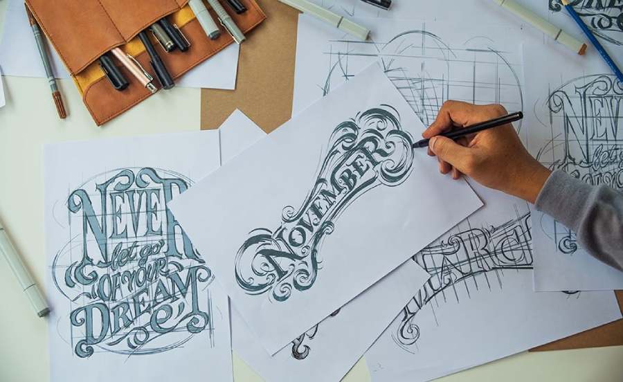
In graphic design, fonts are not only a tool to convey information but also an important factor to express style, personality and create a first impression on the viewer. Choosing and using fonts appropriately will help your design products become professional, easy to read and attract viewers. However, not everyone knows how to choose and use fonts properly. Below are the basic principles for you to choose and use fonts effectively.
1. The Importance of Fonts in Design
Fonts are not only a tool for conveying information, but also an essential element in creating and expressing the style of a design. In a world filled with images and messages, choosing the right typeface can make or break a design project. Fonts, whether simple or complex, have the ability to have a powerful impact on the emotions, perceptions and impressions of the viewer.
1.1. Creating style and brand identity
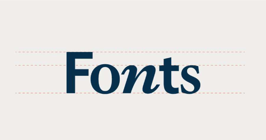
Fonts are one of the most important elements in defining a design style and creating brand recognition. For example, a technology company might use modern, sharp fonts to express innovation and creativity, while a luxury brand might choose a subtle serif font to create a classic, luxurious look. Fonts help to cement the brand image and values in the minds of customers.
1.2. Enhance readability and message transmission
Choosing the right font can improve readability and convey your message clearly and coherently. Easy-to-read fonts like Arial and Helvetica are often used in informational materials, while script or handwritten fonts can add interest and emotion to creative designs. If the font is inappropriate or difficult to read, viewers will easily miss the message you are trying to convey.
1.3. Create emotional connection
Each typeface has its own emotional tone. Strong fonts can convey a sense of power and assertiveness, while soft, flowing fonts can convey a sense of ease and comfort. This allows designers to tailor the emotions they want to convey through their work, creating a strong connection with their audience.
1.4. Improve aesthetics and harmony in design
Fonts are also an important part of creating harmony for the overall design. The combination of fonts, colors, images and layouts creates a unified whole that is not only attractive but also easy to impress. A harmonious design will easily attract the attention of viewers and highlight the message you want to convey.
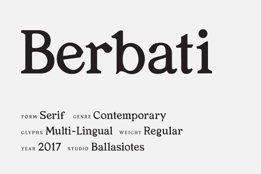
1.5. Demonstrate professionalism and meticulousness
The selection and use of appropriate fonts shows the professionalism and meticulousness of the designer. Careful consideration in choosing fonts for different content sections (headings, main content, captions) shows a deep understanding of the art and technique of design.
2. Principles of Choosing and Using Fonts in Design
2.1. Understand the purpose and target audience
Before you start choosing a typeface, you need to clearly define your purpose and your target audience. The typeface for an advertising poster will be different from the typeface for a financial report or a website. For example, for an advertisement, you might choose a bold, impressive, and emotional font; while for a serious report, the font should be simple, easy to read, and professional. At the same time, you should also consider your audience: if it is a young audience, you might use a modern, creative font; while for a mature audience, a traditional, easy-to-read font is more suitable.
2.2. Choose an easy-to-read font
One of the most important principles when choosing a typeface is to ensure readability. No matter how beautifully designed a typeface is, if it is not easily readable, it will not be able to convey the message effectively. Therefore, when designing text for websites, brochures or printed documents, you need to choose fonts that are clear, not too confusing and easy to read even at small sizes. Sans-serif fonts (such as Arial, Helvetica) are often preferred for modern designs, while serif fonts (such as Times New Roman, Garamond) are suitable for printed and traditional documents.
2.3. Avoid using too many fonts
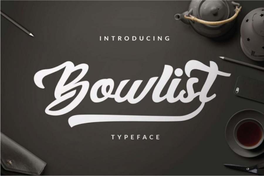
Using too many typefaces in a design is a common mistake. It can make your design look cluttered and disjointed. A general rule of thumb is to stick to two to three typefaces in a design. One for the title, one for the main body of the text, and if necessary, one for secondary elements (such as captions, notes). Keeping your typefaces consistent will create harmony and accessibility for your audience.
2.4. Choose the right size and spacing
The size of the font and the spacing between letters (leading) are important factors in enhancing readability. For main text, the font size should be large enough to be easy to read but not too big to cause a feeling of glare. For headings, you can choose a larger size to attract attention. The spacing between letters (kerning) and lines of text (leading) also need to be reasonable, not too tight or too wide, this helps readers easily access information.
2.5. Use colors wisely
Font color also plays an important role in conveying the message and creating prominence. The color of the text should contrast well with the background to be easy to read. For example, black text on a white background is the most basic and effective combination. Avoid using colors that are too bright or too dark if you do not ensure enough contrast. Color can also help express emotions: red shows dynamism, green brings a sense of peace, while yellow can convey optimism and freshness.
2.6. Choose a font that matches your design style
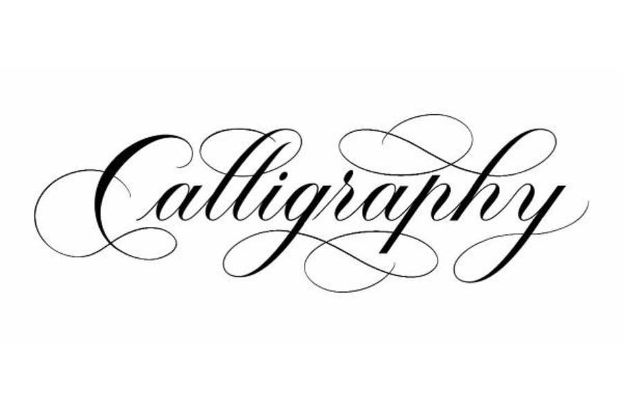
Each typeface has its own personality, which sets the tone for the entire project. Script, brush, or hand-drawn fonts are suitable for artistic, creative, or cute designs. Sans-serif fonts are modern and clean, suitable for minimalist designs. Serif fonts are classic and formal, ideal for printed materials or projects that require a serious look. Choosing the right font for the purpose will help your design look more professional and approachable.
3. SADESIGN Provides Creative Fonts
In the world of graphic design, fonts are not only a tool to convey information but also an important factor in creating style, impression and difference for the product. Especially for those who do design, choosing and using the right font is an indispensable skill. Understanding this importance, SA DESIGN has been providing a collection of creative fonts, helping designers have more rich and professional options for their projects.
3.1. Creative fonts – An indispensable tool in design
Fonts not only enhance the beauty of design projects, but also express the personality, style of the designer and the brand they are working for. A unique font can make a design stand out, be memorable and easily make a strong impression on the viewer. However, finding creative fonts that are both beautiful and suitable for each project is a challenge for many people.
3.2. SADESIGN – Source of quality creative fonts
SADESIGN understands that each design project has its own requirements and characteristics. Therefore, the company not only provides popular fonts but also offers unique and creative options to help users express their ideas in the clearest and most impressive way. Whether you are designing logos, advertising posters, websites or communication materials, SADESIGN has fonts suitable for each purpose.
3.3. Creative fonts – The key to success in design
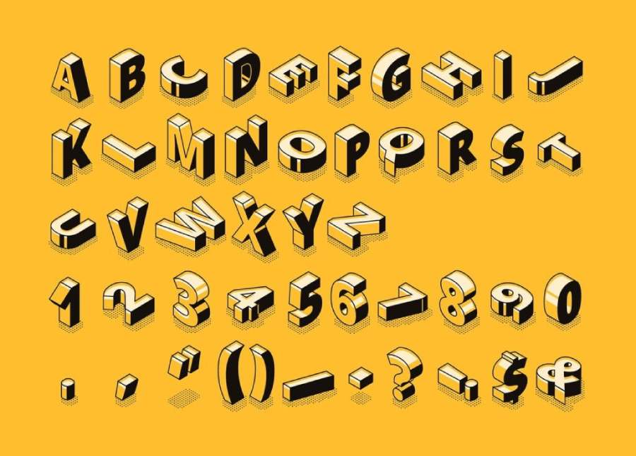
Creativity in design is not only about using colors, images or layouts but also about choosing the right typeface. Fonts can convey emotions, messages and shape the design style. By using creative fonts from SADESIGN, designers can easily turn their ideas into reality in an impressive and professional way.
With creative, diverse and high-quality fonts, SADESIGN provides designers with powerful tools to enhance the value of their products. Whether it is a simple or complex design, choosing the right font will be the deciding factor for the success of the project. With SADESIGN, you will always have the best fonts in hand to create unique and impressive designs.
Conclude
In short, choosing and using typefaces in design is not only a technical job but also an art of creating impressions and connecting with viewers. A suitable typeface will enhance the value of the product, making the message clear and accessible. Following the principles such as understanding the audience, ensuring readability, choosing the right style and not overusing fonts will help your design become more professional and effective. Therefore, always pay attention to every little detail when using typefaces, because these factors will contribute to making the difference and success for your design projects.

