Best Selling Products
Golden Rules of Color Combinations in Design That You Should Know
Nội dung
- 1. From Basic to Advanced: The Ultimate Color Scheme Guide for Designers
- 1.1. Understand the principles of color
- 1.2. Basic color matching rules
- 1.3. Using color to convey emotion
- 1.4. Apply advanced color matching techniques
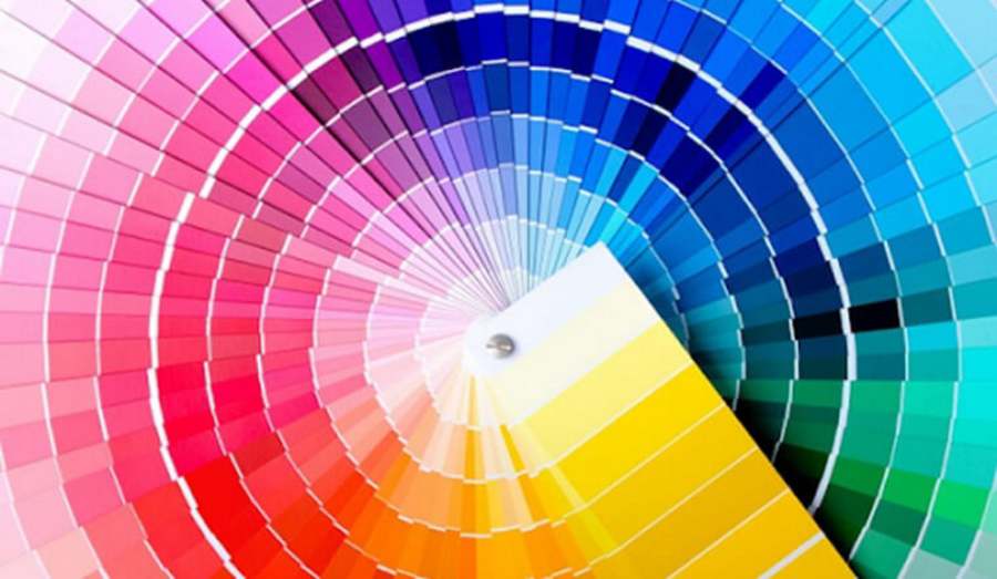
- 1.5. Tools and resources to support color matching
- 2. Unique Color Combination Secrets: Creating the Perfect Accent in Design
- 2.1. Understand the meaning of colors
- 2.2. Basic but effective color matching rules
- 2.3. Create uniqueness with advanced techniques
- 2.4. Inspired by nature and life
- 2.5. Using color matching tools
- 2.6. Be creative but still need to be moderate
- Creativity is important, but moderation is key to keeping a design from becoming too complicated. A unique color palette doesn’t necessarily mean using too many colors. Instead, you can use 2-3 main colors combined with different shades to create depth and sophistication.
- Conclude
Choosing and combining colors is not simple, because even a small deviation can lose meaning or confuse the viewer. Therefore, mastering the golden principles of color coordination is indispensable for any designer.
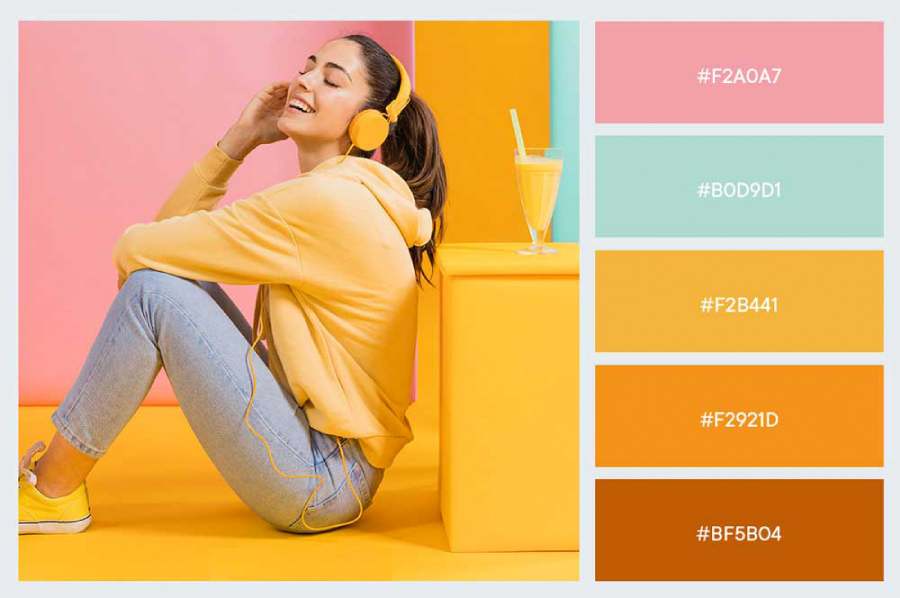
In the world of design, color is not only a decorative element but also a powerful language to convey emotions, messages and create visual appeal. A successful design work cannot lack a subtle, harmonious and impressive color scheme. However, choosing and combining colors is not simple, because even a small deviation can lose meaning or confuse the viewer. Therefore, mastering the golden principles of color scheme is indispensable for any designer, helping them not only create aesthetic works but also touch the deep emotions of the audience.
1. From Basic to Advanced: The Ultimate Color Scheme Guide for Designers
Color is the soul of design, a powerful element that creates emotions, attracts attention and effectively conveys messages. For designers, mastering the art of color coordination is not only a necessary skill but also the key to creating top-notch works. From the basics to advanced color coordination techniques, this article will provide you with a clear roadmap to mastering the color palette in design.
1.1. Understand the principles of color
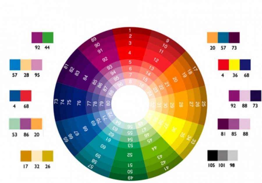
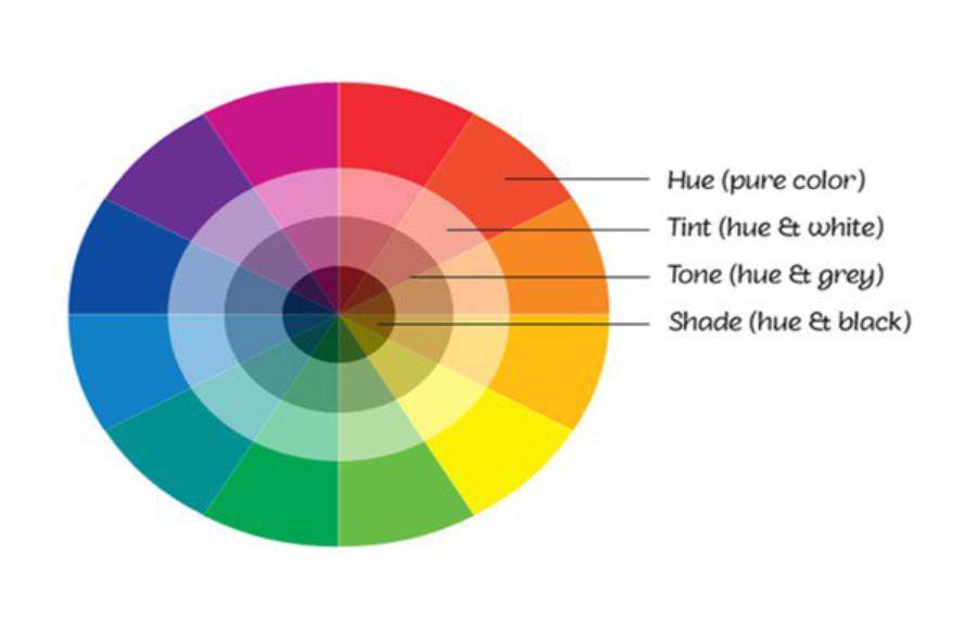
To effectively coordinate colors, the first thing every designer needs to understand is the color wheel. Developed by Isaac Newton, the color wheel is a basic tool to help you understand how colors interact with each other.
- Primary Colors: Red, blue, yellow. These are the three original colors that cannot be created from other colors.
- Secondary Colors: Orange, green, purple – created by mixing primary colors.
- Tertiary Colors: Created by mixing primary and secondary colors.
Understanding the relationships between colors helps you easily apply color matching rules such as contrast, complementarity, or harmony in design.
1.2. Basic color matching rules
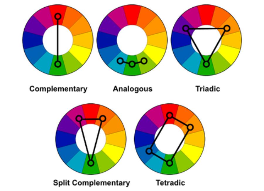
1.2.1. Complementary Colors:
Use two colors that are opposite each other on the color wheel, such as red and green. This style creates a strong pop, ideal for attracting attention, but needs to be used carefully to avoid feeling too bright.
1.2.2. Analogous Colors:
Choose three colors that are adjacent to each other on the color wheel, such as green, blue, and cyan. This method creates harmony and sophistication, and is often used in designs with a soft style.
1.2.3. Triadic Colors:
Use three colors that are evenly spaced on the color wheel, such as red, yellow, and blue. This style creates balance, creating a sense of liveliness and dynamism.
1.3. Using color to convey emotion
Each color carries a different meaning and evokes different emotions. A good designer knows how to use color to create the desired psychological effect:
- Red: Represents energy, passion, and excitement.
- Blue: Brings a sense of peace, trust and professionalism.
- Yellow: Represents joy, creativity and optimism.
- Green: Evokes freshness, balance and nature.
- Purple: Symbol of mystery, creativity and luxury.
When choosing colors, consider the message you want to convey and your target audience to choose the most appropriate color palette.
1.4. Apply advanced color matching techniques
Once you've mastered the basics, you can level up your skills by experimenting with more advanced color matching techniques:
- Gradient: A technique that uses a smooth transition between two or more colors. Gradients are often used to add depth and sophistication to a design, and are especially popular in modern designs.
- Multicolor: Instead of limiting yourself to 2-3 colors, you can combine many different colors. However, use them in a balanced way and choose neutral tones as the background to avoid confusion.
- High Contrast: Uses contrasting light and dark colors to create a strong focal point. This style is often used in web design, posters, or branding to increase recognition.
1.5. Tools and resources to support color matching
Modern technology has brought many effective color matching tools. Some popular tools you should refer to:
- Adobe Color: Helps you create and store consistent color palettes.
- Coolors: An online platform that makes it easy to explore and customize color palettes.
- Material Design Color Tool: Especially useful for UI/UX designers with color palettes optimized for user interfaces.
Color mixing is an art that requires patience, sophistication, and endless creativity. From understanding the basic principles to applying advanced techniques, every designer can develop this skill to create attractive and professional works. Always experiment, learn, and constantly improve your knowledge of color, because this is the factor that helps you shine in the colorful world of design.
2. Unique Color Combination Secrets: Creating the Perfect Accent in Design
Color is one of the most important elements in design, playing a decisive role in attracting attention, conveying messages and evoking emotions in viewers. A well-coordinated color palette not only highlights the work but also creates a deep impression on the audience. However, how to combine colors in a unique and effective way? The secret lies in combining art, science and personal creativity.
2.1. Understand the meaning of colors
Every color has its own story and meaning. Understanding the language of colors will help you use them more intelligently:
- Red: Symbolizes energy, strength and passion. Suitable for creating accents or conveying strong messages.
- Blue: Evokes feelings of peace, trust, and professionalism. Often used in branding and user interface design.
- Yellow: Shines with optimism, creativity and joy. Ideal for dynamic designs.
- Black: Luxurious, powerful and minimalist. Often used to create sophistication and modernity.
The trick is to understand the target audience and the context of the design to choose the right color palette that is both aesthetically pleasing and ensures the right message is conveyed.
2.2. Basic but effective color matching rules
Complementary Colors: Two colors opposite each other on the color wheel, such as blue and orange, create a strong and eye-catching effect. However, use one color as the dominant color and the other as an accent color to avoid a confusing look.
- Monochromatic color scheme: Using different shades of the same color creates harmony and softness. This style is very suitable for minimalist and modern designs.
- Triadic Colors: Combine three colors that are evenly spaced on the color wheel, such as red, yellow, and blue. This method creates a balanced and refreshing look, ideal for dynamic designs.
- Analogous Colors: Three colors that are adjacent to each other, such as green, cyan, and blue, create a natural harmony. This type of color scheme is often used in designs that are soft and intimate.
2.3. Create uniqueness with advanced techniques
Gradient: Gradients are a technique that uses the transition from one color to another to add depth and sophistication to a design. For example, a gradient from orange to pink can create a warm and sweet feeling.
Split Complementary: Instead of using direct complementary colors, you choose two colors that are next to the primary complementary color on the color wheel. This method maintains contrast without being too harsh, creating uniqueness and balance.
Multicolor: This is a bold technique of combining multiple colors in the same design. The key to success is to use neutral colors as the base and let the bold colors create the accents.
2.4. Inspired by nature and life
The most impressive color combinations are often not theoretical, but inspired by nature and everyday life. Look at a beautiful sunset, a colorful field of flowers, or even the way colors are combined in fashion. These sources of inspiration will not only bring you new ideas but also help you create designs that are more intimate and have more depth.
2.5. Using color matching tools
Nowadays, there are many online tools to help you choose and test color palettes:
- Adobe Color: Provides suggested color palettes based on basic color matching rules.
- Coolors: Great tool to generate random or custom color palettes to your liking.
- Material Design Palette: Supports choosing colors suitable for UI/UX designs.
2.6. Be creative but still need to be moderate
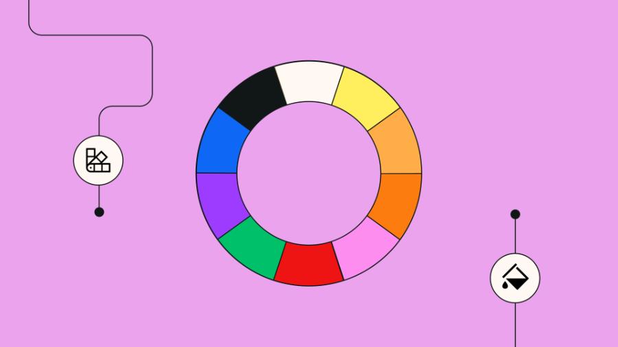
Creativity is important, but moderation is key to keeping a design from becoming too complicated. A unique color palette doesn’t necessarily mean using too many colors. Instead, you can use 2-3 main colors combined with different shades to create depth and sophistication.
Conclude
Color matching is not only a skill but also an art that requires understanding, sophistication and constant creativity. With secrets from basic to advanced, designers can confidently create unique color palettes, contributing to highlighting their work. Always experiment, find new inspiration and let colors tell your own story in each design. Don't forget to apply the golden rules when matching colors in design that SADESIGN has revealed.


