Best Selling Products
Slab-Serif: Definition and 12 Outstanding Fonts in Graphic Design
Nội dung
- 1. Introduction What is Slab?
- 2. Reasons why Slab-Serif fonts are popular in design
- 3. Summary of 12 Most Popular Slab-Serif Fonts
- 3.1. Rockwell
- 3.2. Roboto Slab
- 3.3. Poor 27px
- 3.4. Merriweather
- 3.5. Value
- 3.6. Bitter
- 3.7. Clarendon
- 3.8. PT Slab
- 3.9. Lora
- 3.10. Nine
- 3.11. Better
- 3.12. Ubuntu
- 4. Conclusion
Learn about what slab-serif is and discover 12 beautiful, outstanding slab-serif fonts, commonly used in graphic design, printing, web design. Update these fonts now to refresh your projects.
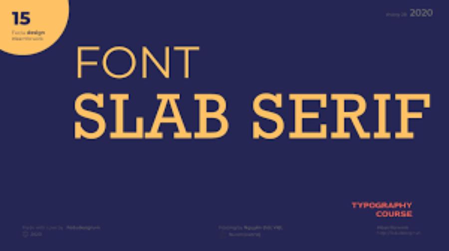
Slab-serif is one of the special font styles, favored by many graphic designers thanks to its strength, clarity and readability. Slab-serif fonts not only bring strength and classicism but also help increase the aesthetics and professionalism of printed publications, websites, and advertisements. In this article, let's learn about slab and explore 12 outstanding slab-serif fonts that are most popular today.
1. Introduction What is Slab?
Slab-serif is a typeface in the serif family, characterized by large, thick, and bold serifs. This creates a strong and recognizable effect. Unlike traditional serif fonts with thin strokes, slab-serif serifs are square and have a uniform thickness, giving them a more solid and powerful feel.
.jpg)
Slab-serif fonts were created in the early 19th century during the industrial era, when manufacturers needed typefaces that could be easily read from a distance or on advertising signs and posters. Therefore, this type of font is very suitable for projects that require prominence and readability.
Slab-serifs can be divided into two main categories: bold slab serifs and soft slab serifs . Strong slab serif fonts tend to have a heavy weight, while soft slab serifs have a softer, more flexible design. This makes slab a great choice for both modern and classic designs.
2. Reasons why Slab-Serif fonts are popular in design
Slab-serif fonts have many outstanding advantages, making them a popular choice in modern graphic design:
Easy to read and easy to recognize : With thick and square serifs, these fonts make text clearer and easier to recognize from a distance.
Strong, bold : Because of their solid and thick structure, slab-serif fonts often create a strong, dynamic, and powerful feeling.
Versatility in design : Slab-serif can be used in many different types of designs, from logos, headlines, signs to websites, print publications.
Classic and modern styles : Although originating from the classical period, slab-serifs still fit well into modern designs thanks to their versatility.
Enhance aesthetics : With the contrast between thick and thin lines, slab-serif helps designs become impressive and eye-catching.
3. Summary of 12 Most Popular Slab-Serif Fonts
Check out the 12 most popular Slab-Serif fonts today, including:
3.1. Rockwell
Rockwell is one of the most famous slab-serif fonts, favored by many designers for decades. With its square, strong, and relatively simple lines, Rockwell is often used in advertisements, logos, headlines, and printed publications.
This font stands out as a strong, clear, and recognizable representative. Designed with strong lines and uniform thickness, Rockwell is not only suitable for headlines but also makes an impressive highlight in advertising publications, branding designs, or even creative projects.
3.2. Roboto Slab
Roboto Slab is one of the most popular Slab-Serif fonts today, featuring a modern design and high flexibility. Roboto Slab is characterized by a harmonious combination of strong, angular lines typical of the Slab-Serif family and a soft, easy-to-read feel in many different sizes.
.jpg)
This font is often used in professional designs, from print publications to digital interfaces, thanks to its ability to create a sense of trust and elegance while still maintaining a friendly feel. With a variety of weight variations, Roboto Slab offers flexibility in application for titles, main content or illustration details, meeting the creative needs of designers.
3.3. Poor 27px
Slabo 27px is a slab-serif font developed specifically for web applications, especially for large-sized headlines. Optimized for web display, Slabo 27px provides clarity and readability even on small screens.
With outstanding features of clarity, readability and high aesthetics, Slabo 27px brings a great visual experience to users. The font size is optimized at 27px, making this font suitable for many types of content, from headlines to main text.
In addition, Slabo 27px is also highly appreciated for its ability to display well on screens with different resolutions, ensuring consistent and professional quality. This is the ideal choice for projects that require a balance between modern and traditional styles.
3.4. Merriweather
Merriweather is a slab-serif font with great legibility, ideal for long articles and online text. It is designed to create a pleasant reading experience, even for long reading sessions.
.jpg)
Merriweather is characterized by its thick strokes, which give it a strong and trustworthy feel, while the gentle curves of its serifs and serifs create a soft and easy-to-read feel. Not only is this font suitable for long texts such as articles or books, but it is also ideal for user interface design, thanks to its ability to display clearly on both digital and print screens. With its balance of tradition and modernity, Merriweather has become a top choice in many design fields, from editorial content to branding.
3.5. Value
Arvo is a slab-serif font with a strong and unique look. Suitable for both print and web design, Arvo helps to make important headlines and content stand out.
Arvo is characterized by its bold, clear strokes that are strong and easy to read. With its balanced design and high usability, this font is suitable for many purposes, from graphic design, printing to web interfaces.
In particular, Arvo shows professionalism and sophistication, helping to enhance the aesthetic value of design products. The flexibility in using dark and light variations is also an important factor that makes Arvo the top choice of designers and businesses.
3.6. Bitter
Bitter is a legible slab-serif font developed for digital platforms. With its strong, sharp lines, Bitter is ideal for websites that need clarity and professionalism.
The Slab-Serif Bitter font is highly regarded for its harmonious combination of aesthetics and practicality. With clean, easy-to-read lines and moderate contrast, Bitter is an ideal choice for both print and digital content.
In particular, this font brings a modern feel but still maintains elegance, suitable for many types of designs, from blog posts, e-books to website interfaces. The balance in every detail of Bitter not only helps improve the user experience but also shows professionalism and sophistication in conveying messages.
3.7. Clarendon
Clarendon is a classic slab-serif font with a bold, solid, and recognizable design. With its large, bold serifs, Clarendon conveys a sense of authority and formality.
Clarendon is characterized by its bold, strong strokes, with square and clear serifs, creating a solid and easy-to-read feel. This font is often used in designs that require prominence such as headlines, signs or advertising materials, thanks to its ability to attract attention while maintaining formality. In addition, Clarendon also brings a classic and modern feel, suitable for many different design fields, from traditional printing to digital products.
3.8. PT Slab
PT Slab is a traditional slab-serif font with thick, high-contrast serifs. It is suitable for print and graphic design applications that need to stand out.
Outstanding features :
Suitable for titles and highlights.
Widely used in advertising design.
3.9. Lora
Lora is a soft, elegant slab-serif font designed for optimal reading. With its combination of softness and strength, Lora is perfect for online articles and blogs.
Outstanding features :
Suitable for long texts and websites.
Highly readable and suitable for multiple devices.
3.10. Nine
Tisa is a slab-serif font designed for readability and aesthetics. With gentle curves but no lack of solidity, Tisa is a great choice for websites, print materials and interface design.
Outstanding features :
Suitable for long documents and printing.
Flexibility in many design applications.
3.11. Better
Aleo is a slab-serif font that strikes the perfect balance between strength and softness. With clean serifs, Aleo is suitable for modern designs, including web, logos, and headlines.
.jpg)
Outstanding features :
Creates a luxurious yet approachable feel.
Suitable for branded products.
3.12. Ubuntu
Ubuntu is a slab-serif font with a modern, youthful, and easy-to-read design. Developed as part of an open source project, Ubuntu is highly versatile and easy to use in a variety of designs.
Outstanding features :
Modern style, easy to use in web and applications.
Simple, accessible design.
Beautiful Font Warehouse
4. Conclusion
Slab-serif fonts are a great choice for designers who want to bring strength, readability and prominence to their design projects. With thick and square serif features, slab-serif is suitable for blogging pages. Visit Sadesign's beautiful font warehouse to experience extremely beautiful fonts.

