Best Selling Products

Capcut Pro 1 Year
39 USD

MidJourney Account
29 USD

Upgrade Genuine Office 365
49 USD

Genuine Adobe Illustrator account
99 USD

Windows 10 & 11 Pro Key
36 USD

Freepik Premium Account
59 USD

ChatGPT Plus Account (GPT-4)
16 USD

Upgrade Duolingo Super
29 USD

Upgrade genuine Capture One account
120 USD

Autodesk All App Account Copyright
120 USD

Genuine Cheap Canva Pro
39 USD

Copyright Adobe Lightroom Account
59 USD

Plugin Retouch4me
69 USD

Adobe Premiere Pro Account
99 USD

Adobe Photoshop Copyright - Full App
120 USD
The Art of Combining Fonts to Create Your Own Impression
Nội dung
- 1. The Role of Fonts in Design
- 1.1. Message Conveying
- 1.2. Aesthetics and Readability
- 1.3. Font Classification and Advantages and Disadvantages
- 2. The most effective ways to combine fonts
- 2.1. Combining sans serif and serif fonts
- 2.2. Create contrast between text sections
- 2.3. Combining complementary fonts
- 2.4. Combine fonts of the same family
- 2.5. Limit the number of fonts used in the design
- 2.6. Avoid using fonts that are too similar
You will discover the subtle secrets of choosing and combining fonts, helping to create a unique and personal design style. This is the handbook for designers who want to break the traditional limits, create impressive works and leave a deep impression on customers.
In today’s design world, every little detail can make a big difference. One of the most important yet often overlooked elements is typography . The subtle lines, letter arrangements, and harmony between fonts not only add beauty to a design, but also convey a brand’s message clearly and deeply.
Years of experience in the design profession have taught me that the success of a project comes not only from ideas or colors but also from the selection and combination of fonts. Therefore, today, SaDesign would like to send you tips on effective font combinations , helping you confidently create designs that are not only beautiful but also highly professional. In this article, we will explore the role of fonts in design , as well as practical tips to help you apply them to real design projects. Let's explore!
1. The Role of Fonts in Design
1.1. Message Conveying
Fonts are more than just characters printed on paper or screen; they are a tool to convey a message, reflecting the style and values of a brand. A carefully chosen font will:
Every brand has its own “language.” For example, a modern technology company might choose a sans-serif font with clean lines, while a luxury fashion brand might choose a font with soft, delicate curves.
.png)
Fonts convey a feeling, from youthful and dynamic to quiet and classic. This choice can help viewers feel the message that the design wants to convey.
1.2. Aesthetics and Readability
There is no denying that fonts contribute to the overall beauty of a design. A design is only truly perfect when the visual elements are balanced and harmonious:
Fonts not only help separate content but also create a clean, easy-to-read design space. A harmonious combination of fonts will help the content become lively, not "heavy" or confusing.
A good design must ensure that information is communicated clearly. Therefore, the readability of the font plays a very important role. No matter how beautiful a font is, if it is difficult to read, it will not be really effective.
.png)
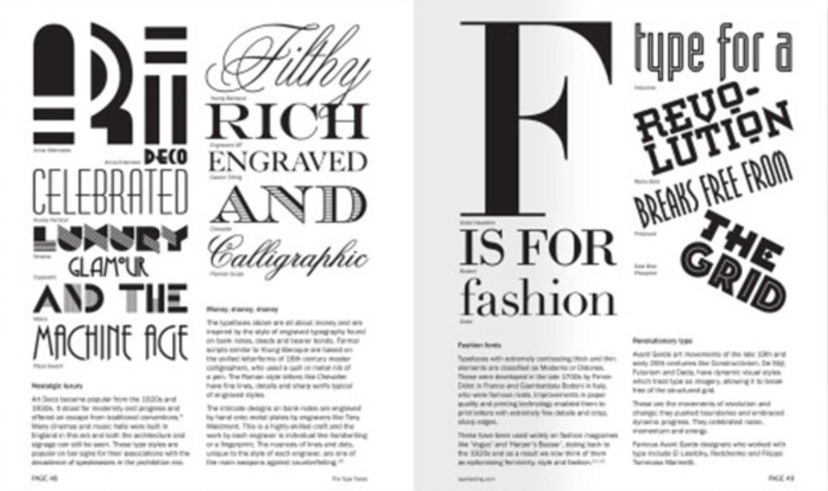
1.3. Font Classification and Advantages and Disadvantages
To be able to combine fonts effectively, you first need to understand the main types of fonts:
Serif: With the “dots” at the ends of letters, serifs often give a traditional, elegant feel and are easy to read in long texts. However, for modern designs, serifs can sometimes be too youthful.
Sans-serif: Simple, clean, and modern, sans-serif is ideal for modern, technological designs. Its simplicity helps create legibility and sophistication.
Script: Artistic, scripts add flair and personality. However, they can be difficult to read if used too much or in the wrong context.
Display: Often used for headlines or highlights, displays have a unique and striking style. However, care must be taken to avoid confusing the viewer.
.png)
Understanding the advantages and disadvantages of each type of font will help you more easily choose and coordinate to suit your design purposes.
2. The most effective ways to combine fonts
Instead of spending hours or days just combining all available fonts, do you want to know a smarter way to choose the perfect font combos? Let's find out the most effective font combination tips for your design with SaSesign!
2.1. Combining sans serif and serif fonts
The first font combination, and also the most classic combination, is the pair of sans serif and serif fonts. These two fonts often work extremely well together, especially when there is a contrast in font sizes. Therefore, if you are in a hurry and need to quickly choose 2 fonts for your design? Combine 1 sans serif font and 1 serif font.
.png)
To talk more about how to use the pair of serif and sans serif fonts, we will discuss the question "Is serif or sans serif easier to read?". Usually, for long texts, serif fonts are preferred because they help us increase reading speed. You can clearly see this preference when reading printed texts such as books, newspapers, magazines, etc. On the contrary, for texts displayed on websites, electronic applications, etc., sans serif fonts gain the advantage because the simplicity of the characters will help display better quality on different types of screens.
2.2. Create contrast between text sections
If you ask me, “Why do serif and sans serif fonts go so well together?”, I would say it’s because they create visual contrast. In fact, there are many ways you can create contrast between text in your design, such as choosing a typeface, adjusting the size, thickness/thinness, etc.
.png)
In the image above, you can see a harmonious combination of a bold, solid font and a tall, slender font. Although they seem so different, the complete contrast of these two fonts gives the overall design a perfect balance.
2.3. Combining complementary fonts
How are fonts like people? They all have certain characteristics such as formality, informality, playfulness, elegance, etc. When designing any publication, you will need to make sure that the fonts you choose are appropriate for the message of the publication. For example, a script or calligraphy font would be perfect for a wedding invitation, but definitely not suitable for a business newspaper.
“Opposites attract.” This law applies not only to physics applications and real-life situations, but also to fonts. You’ll find that fonts with two opposite poles make a perfect pair when placed next to each other. These fonts are called complementary fonts.
.png)
So how do you use complementary fonts? If you’ve chosen a bold font (like the one below), pair it with a more neutral, minimalist font. This will help balance out your design.
.png)
At first, you may find pairing complementary fonts to be a guessing game, as the choice of fonts is entirely based on your own intuition. However, that’s not a big deal. Just pay attention to how fonts pair together on common websites, street signs, or packaging of everyday products, and you’ll gradually form your own font pairing mindset.
2.4. Combine fonts of the same family
Using fonts from the same family is always the safest choice for your designs, as they are designed to work together. When combining fonts, use families that have a wide range of font options (including weight, style, case) to ensure that you have all the fonts you need. You will also want to create contrast between sections of text that use different fonts.
The advantage of limiting your fonts to the same family is that you can focus on consistency in your design. Choosing the right font pairs can be time-consuming. Instead, if you already have a specific font family in mind, you can both shorten the font selection process and create a more complete design.
.png)
2.5. Limit the number of fonts used in the design
If you don’t want to confine yourself to the safety of combining fonts from the same family, you can definitely expand your options. However, you definitely need to set a limit on the number of fonts you use.
You may have heard a lot of advice about choosing fonts for your design, that you should only use 2 to 3 fonts. This is a common rule that has been applied to many publications in reality.
.png)
2.6. Avoid using fonts that are too similar
The problem with fonts that are too similar is that they don’t create the contrast needed to create hierarchy in a design. Any differences between these fonts will look more like a typographical error than a well-chosen font.
Here’s a simple way to check if two fonts are more similar than they should be: Place them side by side on your screen, sit back, and squint. If you can’t see any difference between the two lines of text, that’s a sign of a failed font combination. You’ll need to increase the contrast in your text.
Through this blog, we have gone through the journey of discovering the power of fonts and some common font combination tips in design, a small element but has a big impact on the image and message of the brand. Thank you for following this blog. Hopefully the above sharing will help you have more new ideas and improve your design skills.


VIP Products


Best Selling Products
Capcut Pro 1 Year
39 USD
MidJourney Account
29 USD
Upgrade Genuine Office 365
49 USD
Genuine Adobe Illustrator account
99 USD
Windows 10 & 11 Pro Key
36 USD
Freepik Premium Account
59 USD
ChatGPT Plus Account (GPT-4)
16 USD
Upgrade Duolingo Super
29 USD
Upgrade genuine Capture One account
120 USD
Autodesk All App Account Copyright
120 USD
Genuine Cheap Canva Pro
39 USD
Copyright Adobe Lightroom Account
59 USD
Plugin Retouch4me
69 USD
Adobe Premiere Pro Account
99 USD
Adobe Photoshop Copyright - Full App
120 USD