Best Selling Products

Plugin Retouch4me
69 USD

Windows 10 & 11 Pro Key
36 USD

MidJourney Account
29 USD

Adobe Photoshop Copyright - Full App
120 USD

Upgrade Genuine Office 365
49 USD

Freepik Premium Account
59 USD

Capcut Pro 1 Year
39 USD

Upgrade Duolingo Super
29 USD

Upgrade genuine Capture One account
120 USD

Copyright Adobe Lightroom Account
59 USD

Adobe Premiere Pro Account
99 USD

Autodesk All App Account Copyright
120 USD

ChatGPT Plus Account (GPT-4)
16 USD

Genuine Adobe Illustrator account
99 USD

Genuine Cheap Canva Pro
39 USD
The Importance of Color Psychology in Professional Design
Nội dung
- 1. What is color psychology and why is it important?
- 1.1 The concept of color psychology in design
- 1.2 The influence of color on emotions and behavior
- 2. Emotional map of basic color groups
- 2.1 Red: energy, action and warning
- 2.2 Blue: reliable, safe and stable
- 2.3 Yellow: positive, prominent and intellectually stimulating
- 2.4 Green: natural, regenerating and balanced
- 2.5 Black and white: simplicity, power and contrast
- 3. Color psychology in each specific design field
- 3.1 Brand design: colors shape corporate identity
- 3.2 UI/UX design: color affects user experience
- 3.3 Advertising design: stimulating action and memorability
- 3.4 Print and packaging design: storytelling with color
- 4. Principles of applying color psychology in professional design
- 4.1 Understand your target audience
- 4.2 Use a consistent color palette
- 4.3 Optimize contrast and readability
- 4.4 Controlling saturation and brightness levels
- 5. Modern color trends and the role of visual psychology
- 5.1 Colors according to market trends
- 5.2 Minimalist design: few colors, many layers of meaning
- 6. Applying color psychology in each specific design field
- 6.1. Branding
- 6.2. UI/UX Design
- 6.3. Advertising and media design
- 6.4. Product packaging design
- 7. Common mistakes when applying color psychology
- 7.1. Abuse of color
- 7.2. Lack of color consistency in the design system
- 7.3. Lack of understanding of the socio-cultural market
- 8. Conclusion
Color psychology plays an important role in professional design, influencing user emotions and behavior, creating brand connections and enhancing message transmission effectiveness.
Color in design is not only a decorative element or creates visual harmony, but also plays a role as a powerful emotional language. Proper application of color psychology helps designers convey messages, enhance visual communication effectiveness and create products with depth. In a professional design environment, mastering and fully exploiting color psychology is the key to shaping impressions, positioning brands and promoting user behavior. Let's find out with sadesign.vn in the article below.
1. What is color psychology and why is it important?
1.1 The concept of color psychology in design
Color psychology is the study of how people perceive and react to color on an emotional and behavioral level. In design, this element is not simply an aesthetic but also a subconscious communication tool, helping viewers receive messages quickly and effectively.
Each color carries its own symbolic value, has the ability to evoke emotions, form associations and influence consumer decisions. Therefore, understanding color psychology is a prerequisite for building designs with clear directions, consistent with communication goals.
(1).jpg)
1.2 The influence of color on emotions and behavior
Colors are not only perceived visually, but also activate the nervous system, leading to unconscious responses such as increased heart rate, changes in mood, and even shaping the perception of time and space. For example, red tones often evoke feelings of urgency or passion, while blue conveys trust and calmness.
From a professional design perspective, choosing the right color can directly impact brand awareness, memorability, and customer purchasing decisions. Therefore, color psychology is no longer a personal choice but a creative strategy with a clear scientific basis.
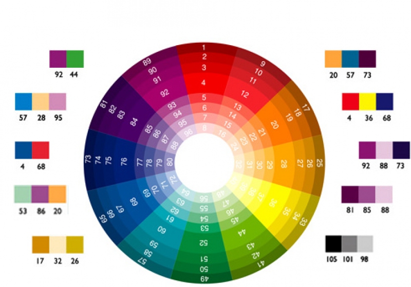
2. Emotional map of basic color groups
2.1 Red: energy, action and warning
Red is one of the most powerful colors in visual psychology. It is often associated with energy, power, passion, and even danger. In design, red is used to attract attention or evoke a quick response from the viewer.
In discount campaigns, red creates a sense of urgency, while in brand logos it conveys a strong, assertive and individualistic image.
2.2 Blue: reliable, safe and stable
Blue conveys a sense of calm, trust, and depth. Commonly used in financial, technology, or medical brands, this color scheme builds trust and professionalism.
In addition, blue also helps reduce stress and creates a cool feeling, suitable for designs that focus on user experience or educational, directional communications.
2.3 Yellow: positive, prominent and intellectually stimulating
Yellow is associated with optimism, joy and creativity. It is often used to create accents or convey a cheerful, energetic message.
However, if yellow is overused at high intensity, the design can cause eye strain or create a feeling of being too "noisy". Therefore, professional designers often combine yellow with neutral tones to balance the vision.
2.4 Green: natural, regenerating and balanced
Green represents growth, freshness and balance. This color scheme is often used in eco-friendly brands or health care products.
In addition to its ability to connect with nature, green also carries a message of healing and sustainability, helping viewers feel comfortable, secure and easily accessible.
2.5 Black and white: simplicity, power and contrast
Black and white are two neutral colors that have a strong influence in professional design. Black brings a sense of power, luxury and mystery, often used in high fashion or minimalist design.
In contrast, white represents purity, transparency and openness. When combined with black, they create a high visual contrast, giving a modern and professional feel.
3. Color psychology in each specific design field
3.1 Brand design: colors shape corporate identity
Color is one of the first elements that helps customers identify a brand. From the main color to the secondary color system, everything contributes to creating a consistent image and specific emotions for that brand.
For example, a technology brand might favor blue tones to convey reliability and modernity, while an organic food brand might choose greens and earthy browns to evoke naturalness and sustainability.
.jpg)
3.2 UI/UX design: color affects user experience
In user interfaces, color plays a role in navigation, creating a hierarchy of information, and suggesting actions. An orange or red CTA button will attract more emphasis and clickability than a light gray or blue.
Additionally, inappropriate use of color can be confusing, disrupting the user experience. Professional UI/UX design always focuses on balancing aesthetics and color psychology to optimize interaction behavior.
3.3 Advertising design: stimulating action and memorability
In advertising, choosing the right color helps increase recognition and attract attention within the first few seconds. Color is used as a “soft weapon” to evoke emotions, direct attention and promote purchasing decisions.
An advertisement using warm colors (red, orange, yellow) is often more effective in creating an explosive effect than cool or neutral colors.
3.4 Print and packaging design: storytelling with color
In product printing and packaging, color plays an important role in storytelling, defining the target audience, and increasing shelf visibility. A packaging design with eye-catching colors that convey the right brand message will easily attract consumers' attention compared to designs that lack color depth.
4. Principles of applying color psychology in professional design
4.1 Understand your target audience
Each target group has a different sensitivity to color. Young people often prefer bright, outstanding and dynamic colors, while adults prefer calm, polite and pleasant tones. Understanding the tastes and color culture of each customer group will help designers build a more accurate color palette.
.jpg)
4.2 Use a consistent color palette
A consistent color system helps brands maintain a stable visual identity. This is especially important in designs related to product ecosystems, websites, advertising publications or brand identity systems.
4.3 Optimize contrast and readability
While color psychology has the power to convey emotion, failing to ensure contrast between the background and the content can reduce readability. Checking the contrast between text and background colors is always an important step in the process of perfecting a professional design.
4.4 Controlling saturation and brightness levels
Differences in saturation or brightness can completely change the perception of a color. Depending on the context, designs can use pastel, dark, or gray variations to balance the mood and support the composition.
5. Modern color trends and the role of visual psychology
5.1 Colors according to market trends
Every year, trending color palettes are announced to guide the design of the times. However, the application of these palettes needs to be closely linked to the psychology of the target users to avoid "color fashion" but lacking brand identity.
5.2 Minimalist design: few colors, many layers of meaning
In modern designs, the trend of color minimalism is on the rise. Instead of using many contrasting colors, professional designers choose fewer colors but carefully calculate the meaning and coordination, to achieve the highest visual effect!
Below is the next part of the article: "The Importance of Color Psychology in Professional Design" - continuing the in-depth, SEO-standard content, ensuring to maintain the requirements of length, structure and professional writing style:
6. Applying color psychology in each specific design field
6.1. Branding
In brand design, color is a core element that helps convey the emotions, vision and core values of the business. The choice of color not only helps the brand to be easily recognized but also creates a distinct identity, leaving a strong impression in the minds of customers.
For example, financial brands often choose blue to convey trust and professionalism. On the other hand, creative brands such as those in the media or technology sectors prefer orange, purple or fuchsia to stimulate imagination and innovation.
Color psychology also supports the construction of brand guidelines, from logos, product packaging to identity systems such as websites, marketing publications... Consistency in color usage helps customers easily associate and remember the brand.
6.2. UI/UX Design
In a digital environment where user experience is at the center, color plays a vital role in driving behavior and emotion. UI/UX experts use color psychology to create intuitive user journeys, drive action, and retain users longer.
For example, call-to-action (CTA) buttons often use bold colors like red, orange, or green to stimulate interaction. Meanwhile, the background prioritizes soft colors like white, light gray, or pastel blue to create a pleasant space and avoid visual distraction.
Additionally, color also affects the sense of speed and continuity when users navigate an application or website. Cool colors like blue help create a sense of speed and efficiency, while warm colors create a sense of intimacy but can make users feel slow if used incorrectly.
.jpg)
6.3. Advertising and media design
In advertising design, the job of color is to attract attention in the shortest amount of time. Smart color combinations make messages easier to understand, easier to remember, and motivate consumers to take action.
Effective advertising campaigns often use contrasting colors to create strong contrasts, thereby highlighting the main content. Warm colors such as red or yellow are often used for promotions to stimulate immediate consumer behavior. Meanwhile, high-end advertising prefers neutral colors such as black, white or gold to convey luxury and sophistication.
Color psychology also helps in better brand communication on social platforms. Choosing the right color palette for each target audience not only increases engagement but also enhances the emotional quotient that users associate with the brand.
6.4. Product packaging design
Packaging is the “silent salesperson”, so the color on the packaging can determine up to 70% of product selection behavior at the point of sale. The psychology of color in packaging design is not only for beauty but also must be consistent with the brand message, product features and customer emotions.
Products for children often use bright, eye-catching colors such as orange, green, yellow... to stimulate vision and create a sense of joy. Meanwhile, cosmetics or organic products tend to use pastel, white, nude or natural green tones to express gentleness, purity and safety.
Thorough research on consumer behavior, combined with knowledge of color psychology, will help packaging not only stand out on shelves but also hit the right "emotional" points of target customers.
7. Common mistakes when applying color psychology
7.1. Abuse of color
One of the biggest mistakes is to overuse color to attract attention, making the design confusing, inconsistent, and losing the main communication goal. Each color should have a specific role and a clear hierarchy in the layout.
Professional design does not follow the color trend of the moment, but needs to prioritize strategic goals: who is the user, what message needs to be conveyed, what environment the color is used in. Using too many contrasting colors without logic can easily create an uncomfortable, offensive feeling.
7.2. Lack of color consistency in the design system
Inconsistency in the use of color across communication platforms – from logos, websites, social media to printed brochures – makes a brand lose its identity and professionalism. Color principles in the identity system need to be strictly maintained to ensure long-term recognition.
The solution is to create specific color guidelines, from primary colors, secondary colors, accent colors to background usage, gradients, and exceptions. Having a unified “color language” helps the entire design team – whether internal or external – follow a clear standard.
7.3. Lack of understanding of the socio-cultural market
A color may have a positive connotation in one country but a negative connotation in another. Failure to consider the socio-cultural context of your target audience can result in a design that is either not well received or loses its initial appeal.
For example, white represents purity in the West but is associated with mourning in many Asian countries. Or red can symbolize good luck in some cultures but can represent danger and hostility in others.
Therefore, designers need to proactively survey the audience, market and usage context before making a final color decision.
8. Conclusion
Color psychology is not just a supplementary knowledge, but a pillar in professional design thinking. Mastering the rules of color emotions helps designers not only create products that are beautiful in form but also touch users' emotions, build deep brand connections and improve communication effectiveness.


VIP Products


Best Selling Products
Plugin Retouch4me
69 USD
Windows 10 & 11 Pro Key
36 USD
MidJourney Account
29 USD
Adobe Photoshop Copyright - Full App
120 USD
Upgrade Genuine Office 365
49 USD
Freepik Premium Account
59 USD
Capcut Pro 1 Year
39 USD
Upgrade Duolingo Super
29 USD
Upgrade genuine Capture One account
120 USD
Copyright Adobe Lightroom Account
59 USD
Adobe Premiere Pro Account
99 USD
Autodesk All App Account Copyright
120 USD
ChatGPT Plus Account (GPT-4)
16 USD
Genuine Adobe Illustrator account
99 USD
Genuine Cheap Canva Pro
39 USD