Best Selling Products

Adobe Premiere Pro Account
99 USD

MidJourney Account
29 USD

ChatGPT Plus Account (GPT-4)
16 USD

Capcut Pro 1 Year
39 USD

Upgrade genuine Capture One account
120 USD

Genuine Adobe Illustrator account
99 USD

Windows 10 & 11 Pro Key
36 USD

Plugin Retouch4me
69 USD

Copyright Adobe Lightroom Account
59 USD

Adobe Photoshop Copyright - Full App
120 USD

Freepik Premium Account
59 USD

Autodesk All App Account Copyright
120 USD

Upgrade Duolingo Super
29 USD

Genuine Cheap Canva Pro
39 USD

Upgrade Genuine Office 365
49 USD
The influence of color on human mood and emotions
Nội dung
- 1. Color and psychology: The connection that cannot be ignored
- 2. Red - Power and passion
- 3. Blue - Peace and stability
- 4. Yellow - Hope and joy
- 5. Blue - Calmness and seriousness
- 6. Purple - Creativity and mystery
- 7. Orange - Energy and enthusiasm
- 8. White - Purity and simplicity
- 9. Black - Power and luxury
- 10.Color and emotional changes
- 11. Conclusion
Color is not just an aesthetic element, but also has a powerful impact on our emotions and behavior. Discover how each color can affect human mood and emotions in this article.

Colors are not just aesthetic elements in everyday life, but also have a profound influence on human emotions, moods and behaviors. Scientific studies have shown that colors can have a powerful impact on how we feel, think and act in different situations. From the warmth of red to the tranquility of blue, each color carries a unique message and has the ability to stimulate different emotional responses. Let's learn about the role of colors in regulating human emotions with sadesign .
1. Color and psychology: The connection that cannot be ignored
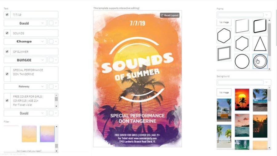
It has been scientifically proven that colors can have a powerful effect on the brain, even when we are not consciously aware of it. According to many studies, each color can stimulate different parts of the brain, thereby causing different feelings such as relaxation, excitement, anxiety or even stress. This feeling can change depending on the context of use and each person's personal perception.
.jpg)
Color is not only an aesthetic factor but also has a profound impact on human psychology and emotions. Many studies have shown that each color has different psychological effects, directly affecting our mental state, behavior and even decisions. For example, green is often associated with freshness, balance and relaxation, while red stimulates energy, passion and a sense of urgency. Understanding the relationship between color and psychology not only helps individuals optimize their living and working environments, but also supports businesses in building brands and attracting customers more effectively. This is a field worth studying and applying in many aspects of modern life.
2. Red - Power and passion
Red is often associated with strength, passion, and energy. It is a color that can stimulate feelings of excitement, increase heart rate, and alertness. In many cultures, red is considered the color of luck, health, and love. However, red can also bring about feelings of stress or anger if it appears in excess, especially in work spaces or places that require calmness.
This is also a color often used to convey messages of determination, enthusiasm and fighting spirit. In the fields of design, advertising or branding, red is often chosen to attract attention and create a deep impression, while at the same time arousing a sense of confidence and prominence in the eyes of the viewer.
3. Blue - Peace and stability
Blue, especially shades of blue and green, often evoke feelings of relaxation, peace, and stability. It is a color that helps reduce stress, calm the mind, and improve concentration. Blue brings a sense of freedom, freshness, and open space, while green is said to restore energy and create balance. For this reason, blue is often used in spaces such as bedrooms, offices, and in health advertising campaigns.
.jpg)
In the field of design, green is often used to create a comfortable, pleasant space, while expressing trust and professionalism. In addition, green is also associated with nature, symbolizing sustainable development and harmony with the environment. Therefore, the reasonable application of green not only creates aesthetic value but also contributes to improving the quality of life.
4. Yellow - Hope and joy
Yellow is a symbol of joy, optimism and hope. It is a color that easily attracts attention and brightens up a space. Yellow is often associated with sunlight, a feeling of warmth and freshness, stimulating creativity and motivation. However, too much yellow can make a space too bright and cause anxiety, so it should be used in moderation.
In design and communications, yellow is often used to attract attention and convey a positive message, while evoking feelings of energy and renewal. However, the use of yellow needs to be carefully considered to ensure it does not cause a feeling of glare or create a visual overload effect.
5. Blue - Calmness and seriousness
Blue, especially dark shades, is often used to convey a sense of trustworthiness, professionalism, and seriousness. It is a popular color in office designs or work environments because it promotes confidence and communication. Additionally, blue can help reduce anxiety and increase concentration. However, if too much blue is used in a small space, it can create a cold and lifeless feeling.
In design and art, this color is often used to create a sense of calm, focus, and professionalism. It also evokes confidence and responsibility, making it a popular choice in fields such as finance, technology, and education. With its ability to convey a powerful yet subtle message, blue plays an important role in building a brand image and making a lasting impression.
6. Purple - Creativity and mystery
Purple is a combination of red and blue, bringing a sense of mystery, creativity and nobility. It is a color often seen in artistic spaces, or in products and services related to luxury. Purple can stimulate the imagination and creativity, but if used too much, it can bring a feeling of gloom or loneliness.
In art, design and creative fields, purple is often used to convey a message of distinction and uniqueness, while creating an inspiring and thought-provoking space.
7. Orange - Energy and enthusiasm
Orange is a mixture of red and yellow, giving a feeling of strong energy, enthusiasm and passion. Orange can increase enthusiasm and create a happy, pleasant atmosphere, so it is often used in entertainment spaces or activities that require creativity and innovation. However, if orange is overused, it can increase feelings of anxiety or stress.
.jpg)
Using orange in design, communications or workspaces not only helps stimulate creative thinking but also encourages interaction and collective energy, contributing to improved performance and team spirit.
8. White - Purity and simplicity
White, a symbol of purity and simplicity, always brings a sense of elegance and grace in every field. From interior design, fashion to art, white is used as a perfect background to highlight other elements. Not only representing cleanliness and minimalism, this color also evokes balance and harmony, creating a spacious and pleasant space. Therefore, white is not only an aesthetic choice but also a message of professionalism and sophistication.
9. Black - Power and luxury
Black is a symbol of power, mystery and luxury. It is a popular color in high-end designs and fashion. Black can create a strong and powerful feeling, however, if used too much in a living space, it can cause a gloomy or lonely feeling.
In many fields, from fashion, interior design to branding, black always brings a sense of strength, mystery and sophistication. This is a color that not only shows class but also creates a special attraction, suitable for those who want to affirm their style and position.
10.Color and emotional changes
Many studies have shown that using color can help regulate our emotions. For example, in work environments, using the right color can help increase work efficiency and reduce stress. Some studies show that blue and green can help improve concentration and productivity. Meanwhile, red helps stimulate dynamism and creativity.
.jpg)
Major brands around the world have also taken advantage of the power of color to influence customer emotions and behavior. For example, the red color in the Coca-Cola logo or the yellow color in the McDonald's logo are effective strategies to attract attention and create a sense of joy and optimism for consumers.
11. Conclusion
Thus, color is not simply an aesthetic factor but also has a profound influence on human emotions and behavior. Each color has a distinct meaning and can create a strong impact on our mood. Understanding the impact of color can help us use it more effectively in our daily lives, from decorating our living space to choosing clothes or designing advertisements. Take advantage of the power of color to create positive emotions and improve the quality of your life.


VIP Products


Best Selling Products
Adobe Premiere Pro Account
99 USD
MidJourney Account
29 USD
ChatGPT Plus Account (GPT-4)
16 USD
Capcut Pro 1 Year
39 USD
Upgrade genuine Capture One account
120 USD
Genuine Adobe Illustrator account
99 USD
Windows 10 & 11 Pro Key
36 USD
Plugin Retouch4me
69 USD
Copyright Adobe Lightroom Account
59 USD
Adobe Photoshop Copyright - Full App
120 USD
Freepik Premium Account
59 USD
Autodesk All App Account Copyright
120 USD
Upgrade Duolingo Super
29 USD
Genuine Cheap Canva Pro
39 USD
Upgrade Genuine Office 365
49 USD