Best Selling Products

Freepik Premium Account
59 USD

Copyright Adobe Lightroom Account
59 USD

ChatGPT Plus Account (GPT-4)
16 USD

MidJourney Account
29 USD

Adobe Premiere Pro Account
99 USD

Windows 10 & 11 Pro Key
36 USD

Genuine Adobe Illustrator account
99 USD

Genuine Cheap Canva Pro
39 USD

Plugin Retouch4me
69 USD

Upgrade Genuine Office 365
49 USD

Capcut Pro 1 Year
39 USD

Upgrade genuine Capture One account
120 USD

Autodesk All App Account Copyright
120 USD

Upgrade Duolingo Super
29 USD

Adobe Photoshop Copyright - Full App
120 USD
The Meaning of Color in Design: Creating Power from Color
Nội dung
- 1. Color in design: An important element that cannot be ignored
- 2. Why is color important in design?
- 3. The meaning of colors in design
- 3.1 Red: Strength and dynamism
- 3.2 Blue: Peace and trust
- 3.3 Green: Freshness and growth
- 3.4 Yellow: Optimism and creativity
- 3.5 Orange: Warmth and friendliness
- 3.6 Purple: Luxury and mystery
- 3.7 Black: Strength and sophistication
- 3.8 White: Purity and simplicity
- 4. How to use color effectively in design
- 5. Conclusion
Explore the meaning of color in design. Learn how each color evokes emotions and affects viewers, helping you create impressive and effective designs.
The Meaning of Color in Design: Creating Power from Color
Color is not just a decorative element in design, but also plays an important role in conveying messages, creating emotions and connecting with viewers. Understanding and applying color appropriately in design can enhance aesthetics, strengthen brand identity and improve communication effectiveness. Let's explore with sadesign the meaning of color in design and how it affects user perception.
1. Color in design: An important element that cannot be ignored
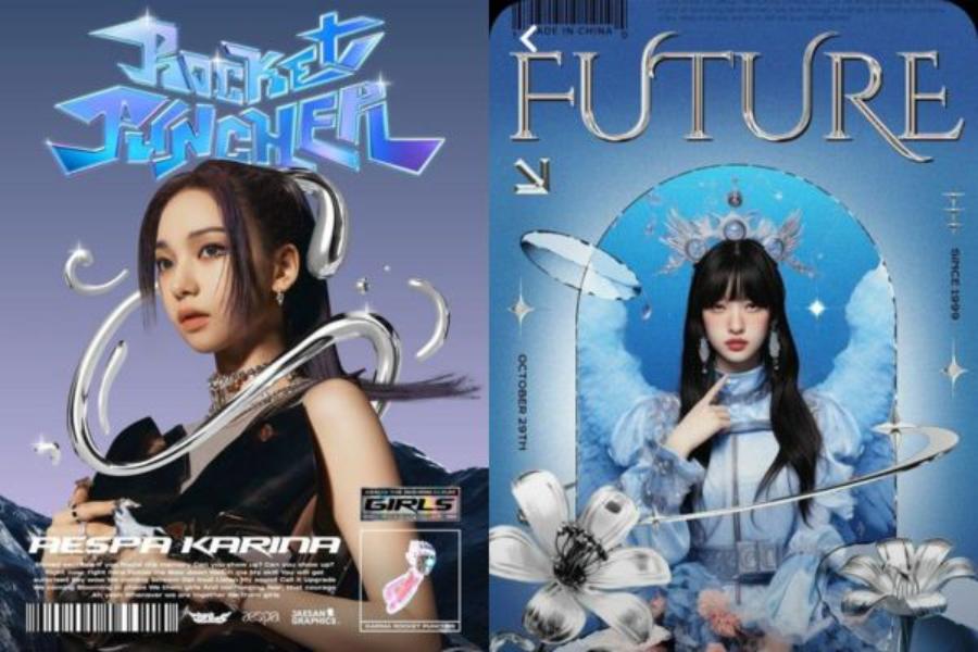
Colors are an integral part of any design, from logos, websites, to advertising or product packaging. They not only help beautify and highlight products or services, but also play an important role in creating an emotional connection with viewers. Each color has its own meaning, which can directly influence consumers' perceptions and actions. In this article, we will delve into the meaning of colors in design and how to use them effectively.
.jpg)
Color not only affects aesthetics but also has a strong impact on the emotions and perceptions of viewers. Choosing the right color not only helps to convey messages effectively but also contributes to creating a difference and unique identity for a product or brand. A scientifically and harmoniously constructed color palette can highlight content, attract attention and create a lasting impression on customers. Therefore, studying the meaning of each color, combining them intelligently and applying them flexibly in design projects is something that any professional designer needs to focus on.
2. Why is color important in design?
Color is one of the first things people notice when they encounter a product or design. It has the ability to attract attention, evoke emotions, and influence how we perceive the message the design is trying to convey. Color can help define a brand’s personality, differentiate products, and easily make an impression on consumers.
Color not only affects aesthetics but also has a strong impact on the emotions, psychology and perception of the viewer. Each color has its own meaning, helping to convey messages, create brand identity and shape the user experience. Choosing the right color can highlight content, guide attention and create a lasting impression. In addition, color also helps build emotional connections with the target audience, thereby enhancing the communication effectiveness and value of products or services. Therefore, researching and applying color scientifically and subtly is an indispensable factor in the professional design process.
Additionally, color can help increase accessibility and improve user experience in web or app design. A suitable color palette can make the interface more intuitive, easy to use, and easy to accept, thereby improving conversion efficiency and user retention.
3. The meaning of colors in design
Each color carries a message, a distinct emotion. Understanding their meaning will help designers make wise and appropriate decisions, thereby creating design products that are not only beautiful but also highly effective. Below are the meanings of some common colors in design.
.jpg)
3.1 Red: Strength and dynamism
Red is often associated with power, energy, and determination. It has the ability to stimulate feelings of strength and even urgency. Red is also often used in promotions or advertising to attract attention and motivate action. However, if used incorrectly, red can also bring about feelings of stress or anger.
3.2 Blue: Peace and trust
Blue brings a sense of peace, relaxation and comfort. This is a common color in the designs of brands related to health, finance and technology, because blue creates trust and stability. In particular, blue also helps reduce stress and creates a pleasant space for viewers.
3.3 Green: Freshness and growth
Green is associated with nature, life, and growth. It represents freshness, growth, and renewal. Therefore, green is often used in the design of brands related to the environment, clean food, or health care products. This color also creates a feeling of relaxation and helps reduce fatigue.
3.4 Yellow: Optimism and creativity
Yellow is associated with happiness, optimism, and positive energy. It has the ability to stimulate intelligence and creativity. However, if used too much, yellow can cause anxiety or discomfort. Therefore, designers often use yellow as an accent color in designs to create prominence, especially in advertising campaigns or logos.
3.5 Orange: Warmth and friendliness
Orange is a combination of red and yellow, giving a warm, friendly and energetic feeling. Orange is often used in designs to create a sense of closeness and approachability, especially in children's products or brands that need to express playfulness and enthusiasm.
3.6 Purple: Luxury and mystery
Purple is often considered a symbol of luxury, nobility and mystery. This is the color used in high-end, luxury designs or special products. Purple is also associated with creativity and high intelligence, so it often appears in artistic, creative or scientific brands.
3.7 Black: Strength and sophistication
Black not only represents luxury and elegance but also brings a sense of strength and power. Black is often used in high-end designs, fashion, or professional products. It helps create contrast and highlight other colors in the design.
3.8 White: Purity and simplicity
White is a symbol of purity, cleanliness and simplicity. With its ability to create a sense of openness, cleanliness and modernity, white is often used to highlight other elements in a space or product. It helps to highlight other elements in the design and create an airy space. White is often used in minimalist and elegant designs, making it easy for viewers to focus on the main message without being distracted.
At the same time, this color also brings balance and harmony, helping to create an overall elegant and professional design. The reasonable application of white not only helps to optimize aesthetics but also conveys the message of minimalism and creativity.
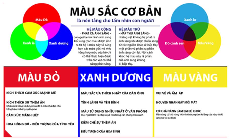
4. How to use color effectively in design
.jpg)
Choosing the right color is not just a matter of personal preference, but also takes into account your audience and the message you want to convey. Here are some tips to help you use color effectively in your designs:
Define your goals and audience : Before choosing a color, clearly define the goal of your design and the audience you want to target. Color can impact the emotions and behavior of viewers, so understanding your audience is important.
Use a harmonious color palette : A harmonious color palette will make the design easier to look at and more pleasing to the eye. You can use online color palette generators to find colors that go well together.
Pay attention to the feel of the color : Color is not only an aesthetic issue, but also has to bring a feeling that is appropriate to the design content. For example, if you are designing a health-related product, choose soft, pleasant colors instead of colors that are too strong.
Ensure contrast : Contrast between colors helps viewers easily recognize information. Especially in website or app design, you need to ensure that text elements are easy to read against the color background of the page.
Thus, color not only helps shape the style and mood of a design, but also influences how viewers perceive the content. For optimal effectiveness, it is necessary to choose a color palette that is appropriate to the project's goals and audience, while ensuring harmony between the color tones. Additionally, applying color theory, such as the principles of contrast and balance, will help the design stand out and become more professional. Always consider the cultural and psychological factors of the user to ensure that color is used in a subtle and meaningful way.
5. Conclusion
Color plays a very important role in design, not only affecting the aesthetic beauty but also strongly influencing the emotions and behavior of the viewer. Understanding the meaning of color and how to use it properly will help you create impressive and effective designs. Always remember that color is not only a tool for beauty but also a bridge between the brand and the customer, helping to convey the message in a powerful and emotional way.


VIP Products


Best Selling Products
Freepik Premium Account
59 USD
Copyright Adobe Lightroom Account
59 USD
ChatGPT Plus Account (GPT-4)
16 USD
MidJourney Account
29 USD
Adobe Premiere Pro Account
99 USD
Windows 10 & 11 Pro Key
36 USD
Genuine Adobe Illustrator account
99 USD
Genuine Cheap Canva Pro
39 USD
Plugin Retouch4me
69 USD
Upgrade Genuine Office 365
49 USD
Capcut Pro 1 Year
39 USD
Upgrade genuine Capture One account
120 USD
Autodesk All App Account Copyright
120 USD
Upgrade Duolingo Super
29 USD
Adobe Photoshop Copyright - Full App
120 USD