Best Selling Products

Upgrade genuine Capture One account
120 USD

Capcut Pro 1 Year
39 USD

Plugin Retouch4me
69 USD

ChatGPT Plus Account (GPT-4)
16 USD

Adobe Photoshop Copyright - Full App
120 USD

Freepik Premium Account
59 USD

Copyright Adobe Lightroom Account
59 USD

Genuine Adobe Illustrator account
99 USD

Upgrade Duolingo Super
29 USD

MidJourney Account
29 USD

Upgrade Genuine Office 365
49 USD

Windows 10 & 11 Pro Key
36 USD

Autodesk All App Account Copyright
120 USD

Adobe Premiere Pro Account
99 USD

Genuine Cheap Canva Pro
39 USD
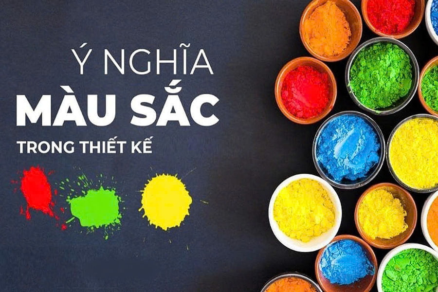
The Meaning of Color in Design: Essential Knowledge Every Designer Must Know
Nội dung
- 1. The origins of color meaning in design
- 2. The meaning of color in graphic design
- 2.1 The meaning of the color red in design
- 2.2 The meaning of the color orange in design
- 2.3 The meaning of the color yellow in design
- 2.4 The meaning of the color green in design
- 2.5 The Meaning of Blue in Design
- 2.6 The meaning of the color purple in design
- 2.7 The meaning of the color pink in design
- 2.8 The meaning of the color brown in design
- 2.9 The Meaning of Black in Design
- 2.10 The meaning of the color white in design
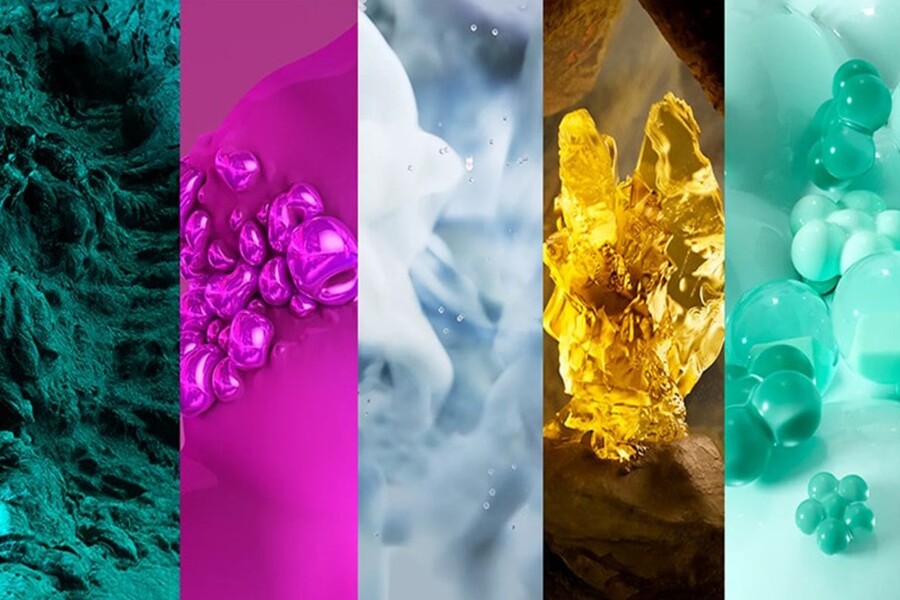
Color is not only for aesthetics but also a tool for conveying emotions and messages.
In design, color is never just an aesthetic element. Behind each color lies a whole system of meaning related to human psychology, culture, emotions, and behavior. A design may have the correct layout and typography, but choosing the wrong color can distort the entire message, or even backfire.
In reality, many designers, especially beginners, often choose colors based on personal preference: colors they like, trending colors, or colors requested by the client, without truly understanding their meaning. This leads to a significant gap between aesthetically pleasing designs and designs that effectively communicate their message .
For professional designers, color is a strategic tool. It directly influences brand perception, determining viewers' emotions within the first few seconds and potentially influencing behavior such as purchasing, subscribing, or brand recall. Therefore, understanding the meaning of color in design is no longer supplementary knowledge, but a mandatory foundation.
Buy Genuine Licensed Software at Affordable Prices
1. The origins of color meaning in design
The meanings of colors do not appear randomly, nor are they something the design industry "invents." They are formed from the intersection of biology, psychology, culture, and socio-historical factors.
From a biological perspective, humans react to color instinctively. Red evokes associations with blood, fire, and danger, causing a rapid heart rate and a sense of urgency. Blue is associated with the sky and water, providing a feeling of safety and stability. These reflexes have existed since prehistoric times, when color played a vital role in identifying the environment.
From a psychological perspective, color directly impacts emotions and mental state. Numerous studies have shown that color can influence mood, concentration levels, and even purchasing decisions. This is the basis for designers, marketers, and brands to use color purposefully.
.jpg)
Culture is also a crucial factor in shaping the meaning of colors. The same color can have completely opposite meanings in different cultures. For example, white in the West often symbolizes purity and new beginnings, while in many Asian countries, it is associated with funerals and loss. Therefore, designers need to understand the cultural context when using colors, especially in international projects.
In modern graphic design, the meaning of color is systematized and applied scientifically. Color has become part of brand strategy, user experience, and visual communication. Understanding the origins of color meaning helps designers avoid using color mechanically, instead fostering more flexible and insightful thinking.
2. The meaning of color in graphic design
2.1 The meaning of the color red in design
Red is one of the most powerful and eye-catching colors in graphic design. It's the color of energy, passion, power, and action. Just a touch of red can instantly capture the viewer's attention in an entire design.
In branding and advertising design, red is often used to evoke emotions, encourage quick action, and create a sense of urgency. This is why many call-to-action buttons, promotions, or important announcements use red.
.jpg)
However, red also has a "double-edged" nature. If used excessively or in the wrong context, it can evoke feelings of tension, aggression, or danger. For designers, red should be used sparingly, usually as an accent color rather than as a dominant, long-lasting color.
2.2 The meaning of the color orange in design
Orange is a combination of the energy of red and the optimism of yellow. It's a color that evokes feelings of warmth, friendliness, and vitality.
In design, orange is often used to create a feeling of closeness, youthfulness, and positivity. It is very suitable for brands that are community-oriented, educational, entertainment, or products aimed at young people.
.jpg)
Compared to red, orange is less intense but still striking enough to attract attention. However, if overused or combined incorrectly, orange can feel cheap or lacking in sophistication. Therefore, designers need to pay attention to the shade and context of its use.
2.3 The meaning of the color yellow in design
Yellow is associated with light, sunshine, and optimism. It's the color of joy, intelligence, and creativity. In graphic design, yellow often evokes positive and friendly feelings.
However, yellow is also a "fussy" color. In very bright shades, it can be dazzling and difficult to read, especially when used for text. In very dark shades, yellow can evoke a sense of warning or danger.
.jpg)
Therefore, yellow is often used as a secondary color, an accent color, or combined with neutral tones to create balance. When used correctly, yellow helps designs stand out while still maintaining a pleasant feel.
2.4 The meaning of the color green in design
Green is the color of nature, growth, and balance. It's a color that evokes feelings of freshness, health, and safety.
In graphic design, green is often used for brands related to the environment, health, clean food, and sustainable development. This color helps to build trust and a sense of closeness with users.
Green is also a pleasing color for the eyes, helping to reduce visual strain. However, if used incorrectly, it can appear bland or lack impact. Designers need to combine green with contrasting or neutral colors to create depth in their designs.
2.5 The Meaning of Blue in Design
Blue is the most popular color in modern brand design. It represents reliability, stability, professionalism, and intelligence.
.jpg)
Fields such as technology, finance, healthcare, and education often prioritize the use of blue to create a sense of safety and trustworthiness. In UI/UX design, blue is also a pleasant color, suitable for extended use.
However, blue can appear cold and emotionless if not combined skillfully. Designers need to consider using additional warm or neutral tones to create emotional balance.
2.6 The meaning of the color purple in design
Purple, a blend of blue and red, embodies both stability and passion. For a long time, purple has been associated with elegance, creativity, and spiritual depth.
.jpg)
In design, purple is often used to convey uniqueness, individuality, and sophistication. Brands related to art, beauty, or innovative technology often choose purple to create their own distinctive identity.
However, purple is also quite selective in terms of who can wear it. If used in the wrong shade or in excessive amounts, it can create a gloomy or distant feeling. Designers need to clearly understand their target audience when choosing this color.
2.7 The meaning of the color pink in design
Pink is associated with gentleness, emotion, and humanity. In recent years, pink has transcended gender stereotypes and become a color representing creativity and openness.
.jpg)
In graphic design, pink can take on many different shades, from soft and romantic to bold and rebellious. Choosing the right shade makes pink versatile and suitable for many fields.
2.8 The meaning of the color brown in design
Brown represents earth, stability, and sustainability. It's a color that evokes feelings of warmth, authenticity, and trustworthiness.
In design, brown is often featured in handcrafted, traditional, or natural product brands. It helps create a sense of intimacy and depth.
.jpg)
2.9 The Meaning of Black in Design
Black is a symbol of power, sophistication, and mystery. In graphic design, black is often used to create a sense of luxury and strength.
However, black can easily feel heavy if used excessively. Designers need to combine black with white and other colors to create balance.
.jpg)
2.10 The meaning of the color white in design
White represents purity, simplicity, and new beginnings. It's a popular background color in modern design, helping to highlight other elements.
White creates a sense of spaciousness, readability, and professionalism. However, overuse can make the design feel cold and lacking in focus.
.jpg)
Color is one of the most powerful tools in graphic design. Understanding the true meaning of color helps designers not only create visually appealing products but also convey messages accurately and effectively.
A good designer isn't someone who uses many colors, but someone who knows how to choose the right colors, use them in the right place, and for the right purpose . When you master the meaning of color, design will no longer be based on emotion, but will become a strategic, in-depth process that delivers real value to the viewer and the brand.


VIP Products


Best Selling Products
Upgrade genuine Capture One account
120 USD
Capcut Pro 1 Year
39 USD
Plugin Retouch4me
69 USD
ChatGPT Plus Account (GPT-4)
16 USD
Adobe Photoshop Copyright - Full App
120 USD
Freepik Premium Account
59 USD
Copyright Adobe Lightroom Account
59 USD
Genuine Adobe Illustrator account
99 USD
Upgrade Duolingo Super
29 USD
MidJourney Account
29 USD
Upgrade Genuine Office 365
49 USD
Windows 10 & 11 Pro Key
36 USD
Autodesk All App Account Copyright
120 USD
Adobe Premiere Pro Account
99 USD
Genuine Cheap Canva Pro
39 USD