Best Selling Products

ChatGPT Plus Account (GPT-4)
16 USD

Adobe Premiere Pro Account
99 USD

Windows 10 & 11 Pro Key
36 USD

Copyright Adobe Lightroom Account
59 USD

Upgrade genuine Capture One account
120 USD

Genuine Cheap Canva Pro
39 USD

Plugin Retouch4me
69 USD

Freepik Premium Account
59 USD

Autodesk All App Account Copyright
120 USD

Upgrade Genuine Office 365
49 USD

MidJourney Account
29 USD

Adobe Photoshop Copyright - Full App
120 USD

Upgrade Duolingo Super
29 USD

Genuine Adobe Illustrator account
99 USD

Capcut Pro 1 Year
39 USD
The Principle of Balance: An Important Element in Graphic Design
Nội dung
- 1. Shape
- 1.1. Visual weight of different shapes
- 1.2. Use shapes for contrast and balance
- 2. Color
- 2.1. Color value and saturation affect visual weight
- 2.2. How to combine colors to achieve balance
- 3. Texture
- 3.1. Visual texture and tactile texture
- 3.2. Use texture to create emphasis and balance
- 3.3. Position
- 3.3. Value/Tone
- 4. Logo design and brand identity
- 4.1. The importance of balance in conveying brand messages
- 4.2. Examples of logos using different types of balance
- 4.3. Website design and user interface (UI/UX)
- 4.4. Print design (posters, brochures, magazines)
- 4.5. Motion graphics design
- 5. Tips and Tricks to Achieve Effective Balance
- 5.1. Use grid systems to create structure and order
- 5.2. Start with the big elements first, then add the smaller details
- 5.3. Experiment with different layouts before making a final decision
- 5.4. Use negative space proactively to highlight elements
- 5.5. Evaluate the layout remotely for a better overview
- 5.6. Listen to feedback from others
- 5.7. Don't be afraid to break the rules on purpose to create uniqueness
- 6. Conclusion
Learn the principles of balance in graphic design, from common types of balance to how to apply them to make your work more harmonious and professional.
In the colorful and visual world of graphic design, the principle of balance acts as a solid foundation, ensuring that all elements on a design are arranged in a harmonious and pleasing way for the viewer's eyes. An unbalanced design can cause discomfort, confusion, and even ignore the message the designer wants to convey. On the contrary, a balanced design will create stability, order, and attraction, making it easy for viewers to receive. Let's find out with sadesign in the content below.
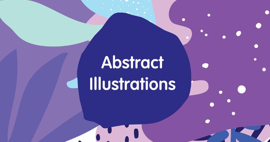
1. Shape
1.1. Visual weight of different shapes
Shapes are not simply the boundaries of a space, but carry their own meaning and visual weight. Squares and rectangles tend to evoke feelings of stability, order, and reliability, and have a relatively even visual weight. Circles and ellipses are soft, fluid, and often have a visual weight centered in the center.
.jpg)
Triangles and sharp-edged polygons feel dynamic and forward-looking and can carry stronger visual weight at prominent vertices or edges. Organic, free-flowing shapes often have less predictable visual weight, depending on their complexity and asymmetry.
1.2. Use shapes for contrast and balance
In design, combining different shapes can create interesting contrasts while also helping to achieve balance. For example, a large square can be balanced by a group of smaller circles. The contrast between regular and free-form shapes can create interest and dynamism in a composition. When using shapes to balance asymmetrically, designers need to consider the size, complexity and placement of each shape to ensure that no part of the design becomes too heavy or overlooked.
2. Color
2.1. Color value and saturation affect visual weight
Color is an incredibly powerful element in graphic design, with the ability to attract attention and convey emotion. The value (lightness) and saturation (intensity) of a color play an important role in determining its visual weight. Bright, highly saturated colors tend to stand out and carry more visual weight than dark, less saturated colors. For example, a bright red patch will carry more visual weight than a light gray patch of the same size.
.jpg)
2.2. How to combine colors to achieve balance
To achieve balance through color, designers can use different color schemes. One approach is to use a dominant color with complementary or contrasting colors to create emphasis and overall balance. A color with a large visual weight can be used for a small but important area, while larger areas can use lighter colors to create balance. Additionally, using different shades of the same color can also create a subtle and harmonious balance.
3. Texture
3.1. Visual texture and tactile texture
Texture refers to the feel of an object's surface, which can be visual (perceived through sight) or tactile (perceived through touch). In graphic design, we primarily work with visual texture, which is created through the use of patterns, lines, or shading effects. A surface that is textured, rough, or highly detailed will often have more visual weight than a smooth surface.
3.2. Use texture to create emphasis and balance
Texture can be used to highlight a particular element in a design, drawing the viewer’s attention. It can also be used to create balance. For example, a large area with a simple texture can balance a smaller area with a complex and prominent texture. Contrast between different textures can add interest and depth to a design.
.jpg)
3.3. Position
Relative position of elements on the layout
The placement of elements in a composition plays a key role in creating balance. Elements placed closer to the center of a composition tend to have more visual weight than elements placed at the edges, because they naturally attract the viewer's eye. Similarly, elements placed at the top of a composition tend to feel "heavier" than elements at the bottom, due to the way we perceive visual gravity.
Use negative space to create balance
Negative space, also known as white space, is the empty space around and between design elements. Not only does it allow elements to “breathe,” it also plays an important role in creating balance. A strategic amount of negative space can help balance an element with a lot of visual weight, or create separation and highlight other elements. Using negative space effectively is an important design skill for achieving subtle visual balance.
3.3. Value/Tone
The difference between light and dark shades
Value, also known as tone, refers to the lightness or darkness of a color. Differences in value between elements in a design create contrast and affect visual weight. Areas with darker values tend to be “heavier” and attract more attention than areas with lighter values.
Use value to create depth and visual balance.
Using different shades of color can create depth and a three-dimensional feel to a design. It can also be used to create balance. For example, a large dark area on one side can be balanced by a lighter but similar sized area or a group of smaller bright areas on the other side. Contrast in value also helps to hierarchy information and guide the viewer’s eye through important parts of the design.
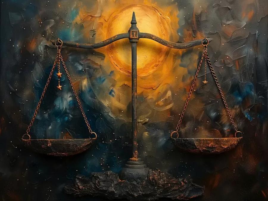
4. Logo design and brand identity
4.1. The importance of balance in conveying brand messages
In logo design and brand identity, balance plays a key role in conveying a brand’s message and personality. A balanced logo feels stable, trustworthy, and professional. Symmetrical balance is often used for brands that want to appear traditional, formal, and trustworthy. Asymmetrical balance can feel modern, creative, and dynamic. The choice of balance and how elements are arranged will help create a strong and lasting first impression of your brand.
.jpg)
4.2. Examples of logos using different types of balance
Symmetrical balance: The logos of Chanel (two interlocking Cs), McDonald's (arched M), Starbucks (symmetrical mermaid image) often create a sense of stability and familiarity.
Asymmetrical balance: Apple logo (bitten apple), Nike (swoosh) give a dynamic, modern and recognizable feel.
Radial Balance: Some symbolic or spiritual logos may use radial balance to create focus and harmony.
4.3. Website design and user interface (UI/UX)
Balance in website layout to ensure good navigation and user experience
In website and user interface design, balance is key to ensuring a smooth and easy user experience. A balanced layout makes it easy for users to navigate, find information, and perform desired actions. Distributing elements such as headings, text, images, and buttons in a balanced manner helps avoid a website that is cluttered or overloaded in a particular area.
How to use balance to draw attention to important elements
Asymmetrical balance is often used effectively in web design to draw attention to important elements such as calls-to-action, promotions, or featured content. By strategically placing these elements and balancing them with other elements of lighter visual weight, designers can guide the user’s eye and increase conversion rates.
4.4. Print design (posters, brochures, magazines)
Balance in page layout for attractiveness and readability
In print design, balance determines the aesthetic appeal and ability to convey information. A well-balanced poster or brochure will attract attention at first glance and encourage the viewer to read on. A magazine layout needs to be balanced to create harmony between text, images and other graphic elements, making the reader feel comfortable and easily absorb the content.
Use balance to effectively organize information
The principle of balance can be used to create a clear hierarchy of information in print design. The most important elements, such as headlines or key images, can be placed centrally or in a larger size to attract attention first. Secondary information can be arranged around it in a balanced manner, creating a natural and easy-to-follow reading flow.
4.5. Motion graphics design
Dynamic equilibrium and the change in position of elements over time
In motion graphic design, the concept of balance applies not only to a static frame, but also to the changing position, size, and shape of elements over time. Dynamic balance refers to maintaining visual harmony throughout motion. Elements may move, appear, and disappear, but the overall composition should still feel stable and pleasing to the eye.
How to create balance in moving scenes.
To create balance in motion graphics, designers need to consider the speed, direction, and trajectory of elements. A large, slow-moving element can be balanced by multiple smaller, faster-moving elements. The use of blur effects, varying transparency, and other techniques can also help create effective dynamic balance.
5. Tips and Tricks to Achieve Effective Balance
.jpg)
5.1. Use grid systems to create structure and order
Grid systems are a powerful tool for designers to create well-structured and balanced layouts. By dividing a design space into columns and rows, grids provide a framework for arranging elements in an orderly and harmonious manner. Following a grid ensures that elements are properly aligned and spaced, contributing to visual balance.
5.2. Start with the big elements first, then add the smaller details
When starting a design project, it is a good idea to focus on arranging the largest and most important elements first. This helps to define the overall layout and create a balanced foundation. Once the main elements are in place, you can start adding smaller details and adjusting them to perfect the balance and create focal points.
5.3. Experiment with different layouts before making a final decision
There is no set formula for perfect balance. It is important to experiment with different layouts to find the best solution for each particular project. Move elements around, change their size and position, and observe how these changes affect the overall sense of balance.
5.4. Use negative space proactively to highlight elements
Negative space is more than just empty space; it is an active design element. Using negative space proactively can help highlight important elements, create clarity, and improve the overall balance of your composition. Don’t be afraid to let the space “breathe” around your elements.
5.5. Evaluate the layout remotely for a better overview
When working on a design for a long time, you can sometimes lose perspective. Try stepping back and looking at your layout from a distance or zooming out to a smaller preview size. This can help you spot areas that are out of balance or elements that don’t work well.
5.6. Listen to feedback from others
Getting feedback from a co-worker or someone else with a good eye for aesthetics can provide new perspectives and help you spot balance issues you may have overlooked.
5.7. Don't be afraid to break the rules on purpose to create uniqueness
While balance is important, sometimes intentionally breaking the rules can create unique and impressive designs. However, it is important to understand the rules before attempting to break them. The breaking should be intentional and have a desired visual effect, not careless or ignorant.
6. Conclusion
The principle of balance in graphic design plays an important role in creating impressive, professional and accessible works. From symmetrical, asymmetrical to radial balance, each type brings its own visual effects, giving designers flexibility in their creativity. Understanding and applying this principle correctly will help you create design products that are not only beautiful but also have high communication value.


VIP Products


Best Selling Products
ChatGPT Plus Account (GPT-4)
16 USD
Adobe Premiere Pro Account
99 USD
Windows 10 & 11 Pro Key
36 USD
Copyright Adobe Lightroom Account
59 USD
Upgrade genuine Capture One account
120 USD
Genuine Cheap Canva Pro
39 USD
Plugin Retouch4me
69 USD
Freepik Premium Account
59 USD
Autodesk All App Account Copyright
120 USD
Upgrade Genuine Office 365
49 USD
MidJourney Account
29 USD
Adobe Photoshop Copyright - Full App
120 USD
Upgrade Duolingo Super
29 USD
Genuine Adobe Illustrator account
99 USD
Capcut Pro 1 Year
39 USD