Best Selling Products
The Secret to Applying Visual Principles to Help Designers Improve Their Design
Nội dung
- 1. What is the visual principle?
- 2. "Decoding" the power of visual principles in design
- 2.1. Make a strong impression
- 2.2. Viewer Instructions
- 2.3. Optimize user experience
- 2.4. Enhance aesthetics
- 3. Basic visual principles and how to apply them
- 3.1. Balance Principle
- 3.2. Contrast principle
- 3.3. Repetition Principle
- 3.4. Proximity Principle
- 3.5. Emphasis Principle
- 3.6. Negative Space Principle
- 3.7 Principles of Grouping and Proximity
- 3.8 Rhythm Principle in Design
- 3.9. Applying Visual Principles to Conquer Clients
- 4. Applying visual principles in design
- 4.1. Logo design
- 4.2. Website design
- 4.3. Design of printed publications
- 4.4. User Interface (UI) Design
- 5. Tips to "grasp" the visual principle
- 6. Conclusion
Discover how to use visual principles to elevate your designs and make a lasting impression on your clients. Learn the fundamental design techniques that help designers win over clients with ease.

In graphic design, not only the tools and techniques determine the quality of the product, but also understanding the visual principles plays an equally important role. By skillfully applying these principles, designers can create impressive products, attract the eyes and easily conquer customers. Let's explore with sadesign the basic visual principles that help elevate the design and make customers unable to take their eyes off.
1. What is the visual principle?
Visual principles are a set of basic rules and principles about how humans perceive and process visual information. They are based on research in psychology, cognition, and human behavior, and aim to explain how we perceive, analyze, and react to visual elements in our environment.
.jpg)
In design, visual principles play an important role, helping designers create works that are not only beautiful but also effective in terms of communication, message transmission and user experience optimization.
Visual psychology is a branch of psychology that studies how people perceive, process, and process images, colors, shapes, and other visual elements. In graphic design, this principle not only helps designers create visually pleasing products, but also helps create designs that have a powerful impact on viewers’ emotions and behaviors.
2. "Decoding" the power of visual principles in design
Visual principles play an important role in the field of design, not only helping to create aesthetic appeal but also contributing to effectively conveying messages.
2.1. Make a strong impression
Visual principles help designers create works that are able to attract attention at first sight. By using visual elements such as color, shape, size, and composition in a harmonious and balanced way, the design will become more impressive and memorable.
Applying principles such as balance, contrast, emphasis, and visual hierarchy will help guide the viewer’s gaze, thereby creating a coherent and easy-to-understand visual experience. In particular, the harmonious combination of color, shape, and space not only highlights the design idea but also stimulates the user’s emotions and actions. Therefore, understanding and applying visual principles correctly is the key to creating design products that are both creative and highly applicable.
2.2. Viewer Instructions
Visual principles help designers "guide" the viewer's eyes in a certain sequence, from one highlight to another, helping them easily absorb and understand the message the design wants to convey.
By using elements such as composition, color, shape, size, and spacing, designers can guide the viewer’s gaze in a logical sequence, thereby conveying a message clearly and impressively. Applying visual principles not only enhances aesthetics but also optimizes the user experience, ensuring that every detail in the design serves the communication goal and creates practical value.
2.3. Optimize user experience
Visual principles help designers create products with friendly, easy-to-use interfaces that optimize user experience. By arranging elements in a logical, clear way, users will easily interact and find information on the product.
.jpg)
Furthermore, the correct application of visual principles not only makes the interface more aesthetically pleasing but also significantly improves interactivity, reduces confusion and increases user satisfaction. Therefore, understanding and flexibly applying these principles is the core factor in building high-quality design products that meet the increasingly demanding needs of the market.
2.4. Enhance aesthetics
Visual principles help designers create works that are aesthetically pleasing, with harmony in color, composition, and shape. Design is not only about function but also about beauty, and visual principles are the "key" to achieving that.
This principle not only supports the construction of a harmonious design product but also helps emphasize key elements, enhance memorability and connect emotionally with users. The correct application of visual principles is not only an art but also a strategy, contributing to the outstanding value of any design product.
3. Basic visual principles and how to apply them
Understanding and applying visual principles in design ensures that the product is not only beautiful but also effective in conveying the message. Here are some basic visual principles that every designer should master to create impressive designs.
3.1. Balance Principle
Balance in design is the first principle that every designer needs to focus on. Balance not only helps the design layout become harmonious but also creates comfort for the viewer. There are two main types of balance:
Symmetrical Balance: This is a simple form of balance in which the elements in a design are arranged symmetrically around a central axis. Symmetrical balance creates a sense of stability and is pleasing to the eye.
Asymmetrical Balance: Used to create dynamism and interest in design, asymmetrical balance does not necessarily adhere to the principle of symmetry but still maintains harmony between elements through the appropriate distribution of visual weight.
Application: Use balance to create stability and harmony for logo design, websites, and printed publications.
3.2. Contrast principle
Contrast is an indispensable visual principle in design. It helps create prominence between elements in a layout, thereby attracting attention and clarifying the messages that the designer wants to convey. It is a clear difference between visual elements, helping to create emphasis, attracting attention. It can be contrasted in color, size, shape, texture.
Contrast can be applied through many elements such as:
Color: Using strong contrasting colors like black and white, or opposing colors on the color wheel, will help create a striking focal point in the design.
Size: The difference in size between elements in a design creates interest, making it easier for viewers to identify important parts.
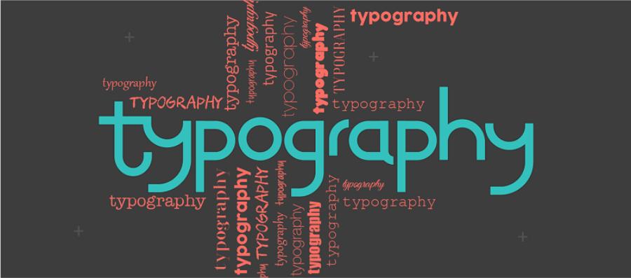
Typography: Combining fonts with different weights also creates contrast to emphasize content and easily create highlights in the design.
When the principle of contrast is applied correctly, the design becomes vibrant and easily attracts the viewer, helping them not to miss any important details.
Application: Use contrast to highlight important information, creating variety and richness in the design.
3.3. Repetition Principle
Repetition is one of the basic visual principles that plays an important role in effective design and communication. Repetition helps create unity, emphasize important elements, and enhance recognition in a design.
.jpg)
This principle can be applied through the consistent use of color, shape, typography, or other graphic elements throughout a product. For example, in branding, repeating a logo, key color, or style of presentation will help increase memorability and create an impression on the viewer. However, it is important to note that repetition should be used in a balanced and reasonable way, avoiding creating a feeling of boredom or lack of creativity.
Application: Use repetition to build brands, create recognition for products and services.
3.4. Proximity Principle
The Proximity Principle is one of the basic visual principles that plays an important role in information design and presentation. This principle states that objects placed close to each other are more likely to be perceived as related or belonging to the same group. Applying the Proximity Principle in design helps to organize information in a clearer, more intuitive, and easier-to-understand way.
For example, in user interface design, grouping related function buttons together not only improves the user experience but also optimizes search and operation. Similarly, in the presentation of text content, arranging paragraphs, headings and images in logical groups will help readers easily grasp the main idea and create a more professional impression. Understanding and applying this principle correctly not only improves the effectiveness of message transmission but also demonstrates sophistication in design thinking.
Application: Used to organize information on websites and printed publications in a logical, easy-to-understand manner.
3.5. Emphasis Principle
Emphasis in design is the process of drawing attention to a particular element in a layout. This helps to define the focal point that the designer wants the viewer to focus on. Some ways to create emphasis include:
Color: Use bold colors like red and orange to draw attention to a particular area of the design.
Size: Large elements will often attract attention first, helping to emphasize important points.
Position: Elements placed centrally or at the top of the page are more likely to attract the viewer's attention.
Applying the principle of emphasis helps create clear hierarchy in design and makes it easy for viewers to identify important elements.
Application: Use emphasis to convey key messages, creating highlights for designs.
3.6. Negative Space Principle
Negative space is the empty space around visual elements that helps create balance and harmony in a design.
Application: Use negative space to create accents, highlight important elements, and add sophistication to a design.
3.7 Principles of Grouping and Proximity
Grouping and proximity are techniques for arranging elements in a design so that viewers can easily see the relationships between them.
Grouping Principle: According to this principle, elements that are similar in shape, color, size, or function will be grouped together. Grouping related elements helps viewers easily identify parts that are closely related.
Proximity: This refers to the placement of objects close together to create a visual connection. When related elements are placed close together, viewers will understand that they are related, thereby making it easier to receive the design's message.
3.8 Rhythm Principle in Design
Flow is a visual principle that involves making the viewer’s eye move through a design. When applied correctly, flow helps the viewer follow elements in a design in a certain order, creating cohesion and coherence.
A design with good flow will help guide the viewer from one section to another naturally without creating distractions. To create flow, designers can use elements such as contours, light direction, or the arrangement of objects along a diagonal or curved line, all of which can contribute to creating a harmonious rhythm.
3.9. Applying Visual Principles to Conquer Clients
Understanding and applying visual principles will help designers create impressive design products and easily conquer customers. Below are some tips to help you apply visual principles to achieve high efficiency in design work:
.jpg)
Identify your client’s goals: Before you start designing, you need to understand what your client wants to achieve. This will help you apply visual principles appropriately to convey your message most effectively.
Listen to feedback: During the design process, always listen to your customers' opinions and feedback. This helps you adjust the design to suit their needs and use visual principles to improve the product.
Create a strong focal point: Based on principles such as contrast, emphasis and balance, you can create striking focal points in your design that make it easy for customers to see the value of your product.
Ensure aesthetics and functionality: A good design should not only be eye-catching but also easy to use. Applying visual principles helps the product to be both beautiful and easy to understand, easy to use, helping customers feel satisfied.
4. Applying visual principles in design
4.1. Logo design
Visual principles are applied to create simple, memorable logos that convey brand identity.
4.2. Website design
Visual principles are applied to create beautiful, user-friendly, easy-to-use websites that optimize user experience.
4.3. Design of printed publications
Visual principles are applied to create beautiful, impressive printed publications that attract the attention of viewers.
4.4. User Interface (UI) Design
Visual principles are applied to create user-friendly, easy-to-use interfaces that help users easily interact and find information.
5. Tips to "grasp" the visual principle
Study, research : Study, learn deeply about visual principles through books, documents, and design courses.
Observe and analyze : Observe and analyze surrounding design works to recognize and understand how designers have applied visual principles.
Practice, experiment : Practice, experiment with visual principles in your own design projects.
Learn from experience : Learn from professional designers, join forums and design communities.
Always update : Always update knowledge and new trends in design to improve skills.
6. Conclusion
Applying visual principles not only enhances the quality of design but also creates impressive products that easily attract and retain customers. By mastering principles such as balance, contrast, grouping, flow and emphasis, designers can create designs that are not only beautiful but also optimize the user experience. Applying these principles correctly will help you not only convince customers but also make a strong mark in the design industry.


